
I decided I wanted one handy link to fire off to anyone who remotely expresses an interest in cover design. I’ve written dozens of posts on this topic over the last decade and change. This is going to be, hopefully, a springboard into the deep end of book cover design, which is it’s own specific and very important skill to have. Note that even if you don’t plan to create your own book covers, you should still read through this article, and this linked one by Dorothy Grant and I. You will need to know how to communicate with an artist and a designer (not often the same person) to get the cover your book needs.
And to hammer this home one more time: your book cover is not primarily about an artistic rendering of a scene in your book. Your book cover is a meta-image, which encapsulates all of the book, without giving away the ending or any surprise plot elements, and intrigues the reader enough to stop and read the blurb. Your book cover is a marketing tool, not a work of art.
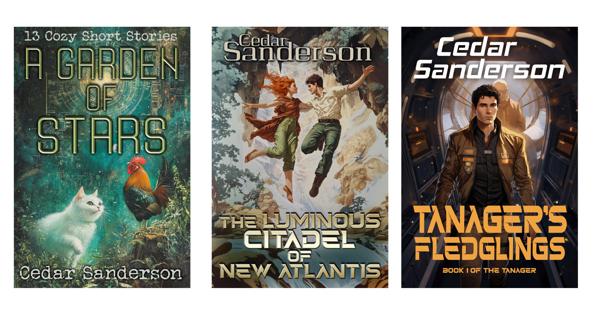
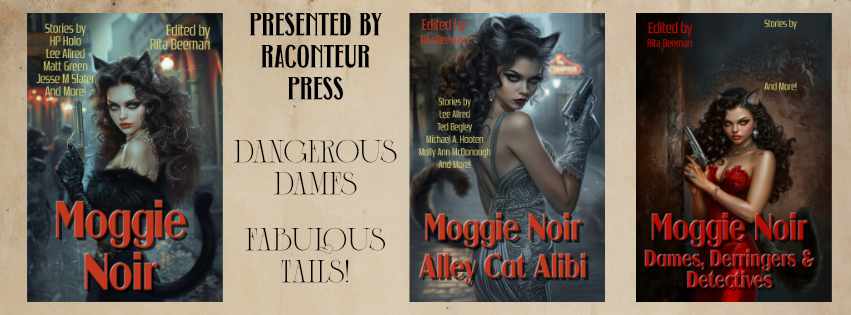
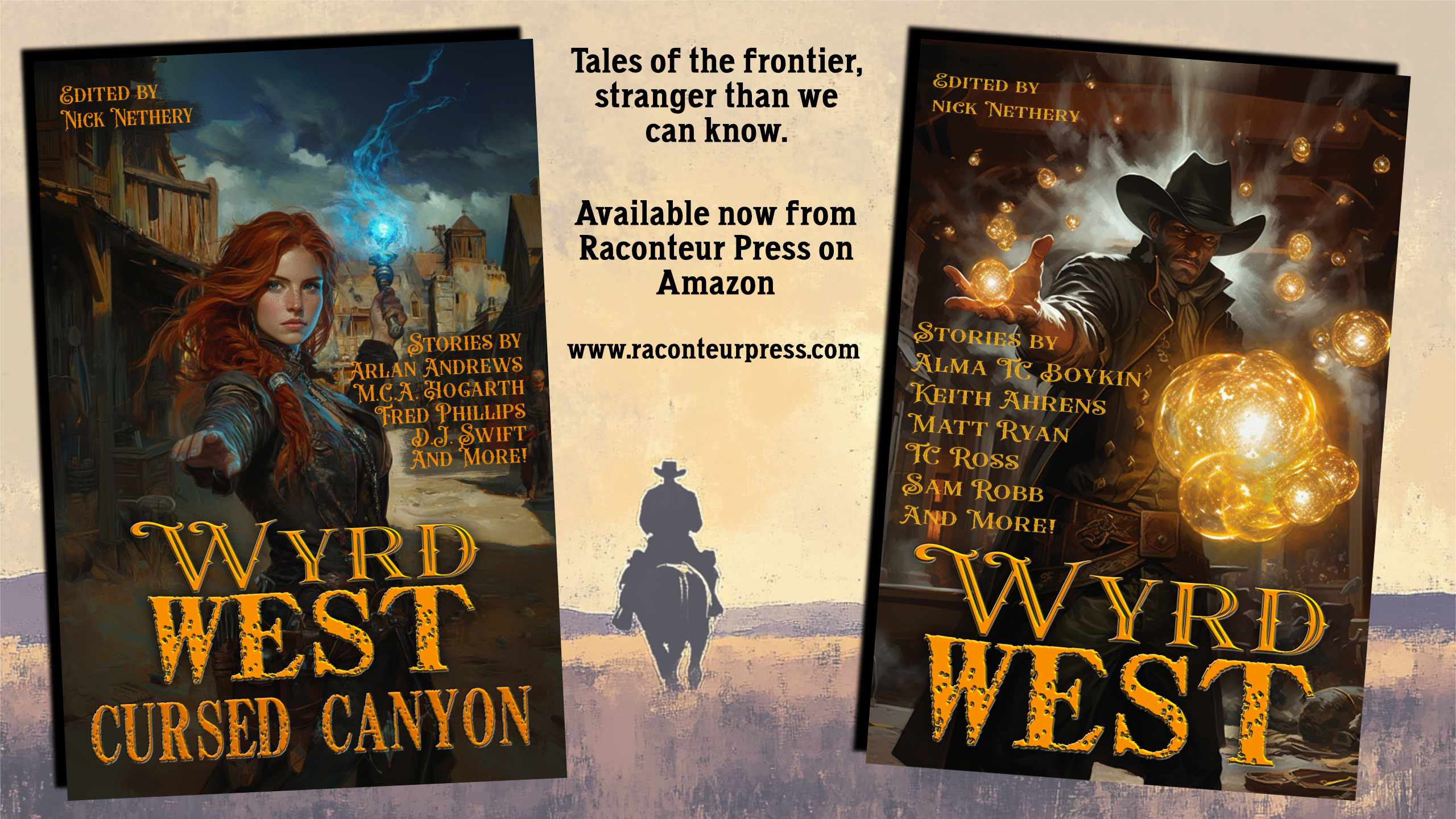
Now, this may seem contradictory, and it isn’t. Selecting the right art for the cover: know what the subtext is telling your readers. Know what the elements of design are and how they can affect what art is right for your book. Close up of a person’s face? That book is very intimate, maybe even first-person, and a story about that one person, no POV shifts. No person visible, just a space scene? Galaxy-spanning cast of characters more concerned with socio-politics than any specific characters (or something like that). Why does it matter for my book to have a cover that fits it’s sub-genre? Continuity of design is what people expect. It’s roughly equivalent to filing the rough edges off so people don’t get splinters, or trip. You can be eye-catching in a good way, while still maintaining some continuity. Speaking of filing off the rough edges, if you plan to pull several elements from different images together, learn how to photocomposite, and how to do it well. A cover which looks like a bad collage is not a good cover. Lighting matters, and will often be the killer in getting elements to look good together.
The book cover is the first thing your readers see, and no matter how often they might insist that they don’t judge a book by it’s cover, they are judging silently in their heads.
This post dives into a lot of the common myths about book covers. Read it.
Some of the etiquette in hiring an artist, and who owns the rights to the cover (hint: it’s the artist/designer, not the person or entity who licensed it).
The text is more important than the art (the art is important, yes) and the layout will make or break a book and a series if it is not consistent. Fonts matter! Detailed post on how to manipulate fonts, choose them, and make them sing. Do not, under any circumstances, use a font that you would use inside of the book. No Times New Roman, Calibri, Georgia… it will look wrong and put your readers off even if they couldn’t say why. Use a harmonious color palette for the font which complements the art.
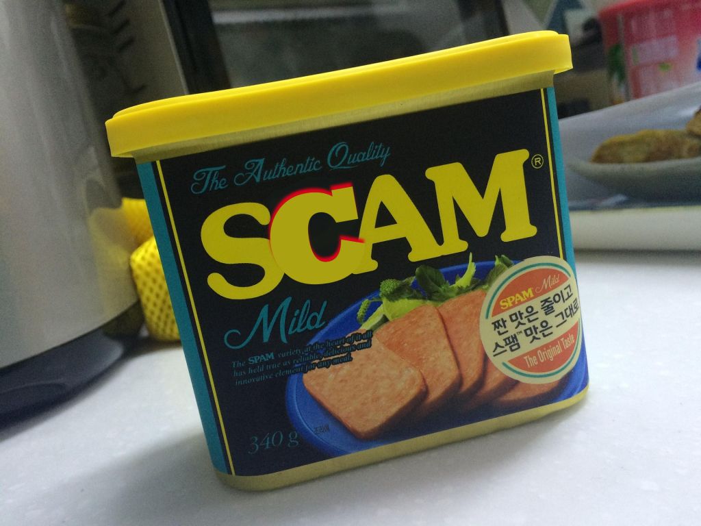
You should never, ever, use a photograph on a fiction book cover. However, non-fiction is a different kettle of fishies. Art style matters, too. Cartoons on a horror novel will lead to angry reviews, don’t do it, and so on… Do your research on sub-genre expectations, and look at a lot of covers to find what you like, what attracts you, and what is selling well. I’ll say it again: learn how to photocomposite, if you must. Learn how to find good art for a book cover, which is not the same as fine art. Stock art, AI, whatever it is, it should be quality.
Finally, know how and what you need for a full print cover. The linked article is using a kdp template, the same template will work for an Ingram paperback, I’ve done that too. Hardcover you will need to get the template from your printer and follow it rigorously. Keep in mind most POD printers print dark, and adjust your cover accordingly, a little brighter on the screen than you think it should be, and it will print up looking good.
- Book Covers are Marketing Tools
- Clearly Readable at Thumbnail
- Fits into Genre Conventions
- Use Legible Fonts
- Choose Good Art, or at least Clean Backgrounds
- Make the Author Name Bigger
- Never, Ever, Use an Unfiltered Photograph on Fiction
There is absolutely no excuse, with the tools available to Indie Authors, for any book to have a bad cover. None. I want all your books to look amazing, sell like hotcakes, and be a pleasure to promote. I can’t promote a book that looks like something scraped off the bottom of a shoe, and I don’t want to. If I have to use a disclaimer that I didn’t do this cover, that tells the readers the cover designer did a bad job, and I won’t insult that cover designer like that. They are likely feeling their way blindly. Well, they don’t have to. There are so many resources out there. Please, share this link-ful article around, and let’s ensure no book has to languish behind a bad cover ever again.


Note that I am traveling on the day this publishes, so I may be slow to answer comments, but please do ask any questions and I will answer when I can.

14 responses to “Cover Design: The Omnibus Of Links”
Thank you for pulling all these together!
What do you mean by “unfiltered photographs” in fiction? Here’s one of mine. https://shorturl.at/CGqLq May I get your opinion?
Thanks,
Holly
“Unfiltered photograph” means buying a stock image, or taking a photo, then just adding text on top and publishing from there. Some sort of filter is needed, be it to soften lines, add a painter effect, or otherwise push the photo out of “photo-real” and into “unreal image” in the viewer’s mind.
Picture, if you will, the following scenario, especially in pre-AI art days: “I can’t find anything in stock art sites that is what I want! Okay, time to tell my husband to squeeze into the ren-faire outfit that fit seventy-pounds ago, while I squeeze and safety pin into a dress that would have looked fabulous on me back before kids, don elf ears, go out in the overgrown back yard (with bright glaring sunshine), and tell our teenager to shoot a picture of us back to back while we hold swords like big action heroes!
Now I’ll just put text on top and call it good!” (Usually in an interior font.)
It’s okay, here’s a nice flagon of mead to help erase that image from your brain.
Unless you’re a professional photographer, nobody’s vacation photos look as good as the memories. If you are a professional photographer, you’re adding filters left, right, and center to make it look better than real life.
Why? Because You’re not selling reality, you’re selling a fantasy. A fiction.
And our brains know. If you give it a photo-real cover, the brain is about as enthused as you are when looking at other people’s vacation photos… not at all motivating to stick around for more.
If you give it a not-photo-real cover, but something that looks better than real, then your brain knows it’s a fiction, and that it’s promised to be better than the life they want to escape from for a few pages. Beyond the actual subject and composition, with fantasy, that’s usually starting with running an effect to make it look like an oil painting, while with science fiction, it’s often supersaturating colours, and then starting to stack and rack effects from there, often by subgenre.
What are the only genres where you see photo-real covers?
1.) historical fiction
2.) historical non-fiction
3.) Scientific non-fiction (mostly biology/zoology)
And even there, the photos are usually retouched and filtered. Actual historical photos are desaturated or sepia-toned to indicate “historical”, while pictures of animals are supersaturated, in order to look exciting.
Your cover is just fine. It does not look like a raw photo at all.
I’m going to share the heck out of this. I see so many bad covers these days and there’s zero excuse for it. All I can think is that self-publishers and small presses see how easy it is to DYI and charge ahead blindly. Literally blindly. They can’t see the difference between their slapdash-looking covers and a professional one. Un-filtered photographs, bizarre collages, inappropriate fonts (Comic sans, Papyrus, and Algerian should be illegal…and if you’re writing Steampunk you are forbidden from using Bleeding Cowboys). Oh, and while I’m ranting: the blurb on the back should not be a synopsis of the entire novel, complete with name-dropping every character involved. Oof.
Commenting on Blurbs, a Blurb shouldn’t be a bunch of quotes about “how special this book is” without telling the reader “what the book is about”.
Agree. I just don’t like back cover copy that’s a blow-by-blow, either. “And then he finds a magic sword, but his evil uncle kidnaps the queen and he’s forced to go on a quest to save her. Meanwhile, in an adjacent kingdom, Ragnar the Relentless teams up with the forest folk to….” blah blah blah.
Yep.
I’ve seen a few like those when browsing the Kindle store.
Didn’t buy them.
You should never, ever, use a photograph on a fiction book cover.
I feel like I’ve seen a number of contemporary romances that use photographs for the cover image. Is that okay? Or is my information on that just out of date? (Admittedly, it’s been several years since I just browsed the shelves at the bookstore, looking at whatever caught my eye.)
I went to the ‘Zon and looked. The big publishers all use 1) illustrations, 2) filtered photos (some kind of effect), 3) semi-abstract art, or in a few cases 4) landscape photos with what seems to be a light filter (softening the lines). Some indie romances use stock photos, mostly with a light filter. A few use straight stock photos, and those stand out as “Hi, I’m a home-made cover!”
B&N’s new-release romances, when I was there last week, had mostly illustrated covers for general romances. Paranormals had either filtered shirtless men, or symbols and images (like dark fantasy, but with hearts, or other romance signal elements). YMMV.
You CAN get away with an inside-font for your title — IF — this is incorporated into the art itself. If your cover shows an open book and the title and author are written into it.
If the title and byline are on top of the art, and the art shows an open book, you should make the font very different.
The fancier the font, the plainer the art needs to be — the fancier the art, the plainer the font. And even if you make the page look like vellum from an medieval manuscript, you had best not make the font too fancy.
The artwork is not done until you’ve figure out how to put the title on it, which means it’s not done until the title is cast in concrete. Short or long being the biggest issue.
You have come a long way since Pixie Noir.
Twelve years of dedicated learning and skill-building, I hope I have!
Nothing useful to say, except thank you!