It’s been a while since I talked specifically about this topic, but it came up in private channels, and I’ve been talking with friend and fellow author Peter Grant about it, rather a lot. You see, Peter is gearing up to release a new book, he’s gotten full rights back to the rest of that series, and it’s time to recover those books. I’m completely on board with this – not only did he not have full creative control over those covers, the time comes when you want to upgrade your covers. This is industry standard. Covers change. Styles change. What looked fine five years ago is no longer sending the right signals.
In the course of chatting with him about what would work best on a cover, what he wanted, and what my designer’s eye saw in the trends, I had another conversation. In that one, the art was fine. The font and layout… were not yet on point.
That crystallized a feeling that has been slowly growing. Art is absolutely necessary for a cover. However, the font and layout of author and title are, nine times out of ten, how I can spot a professional versus an amateur cover in a field of thumbnails on Amazon. Note I did not say traditional versus Indie there. I’ve seen some stinkers coming out of trad houses on covers where they wanted to slap a cheap cover and put it out. And I am increasingly seeing Indies or small publishers being very savvy with cover art and design.
You see, at thumbnail the art is far less relevant than the overall design of the book. In fact, overly complicated art can ruin an ebook cover. It might look fine at trade paperback size, but thumbnail is where most readers will first encounter it. The days of browsing bookshelves are long past… and even there, it was the spine most readers saw first.
So! Fonts are important. How do you choose a font?
First things first: go look at your specific subgenre on Amazon. Look at covers of books you like. Make notes about what you like, what you don’t, and start to keep track of what’s bestselling in that genre.

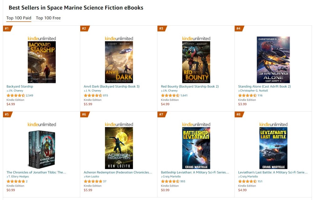
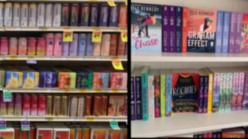
I’ve pulled up Space Marine because Peter’s first Laredo series book, War to the Knife, fits into this category per Amazon rankings. You’ll see the top 8 selling books in this category in my screenshot. Leaving aside the ‘box set’ which is it’s own thing, I find it funny I personally know most of those authors… and cheered by that. Indies on the rise! I’m seeing a trend here away from the big author name, which is interesting, but all of these have very detailed art, which sometimes is hard to make out at thumbnail. The Martelle books in the lower corner have great vivid titles that pop out at you. He has a fantastic cover designer, by the way, well worth looking up all his covers to study that.
And then there are the not-so-good. For these, I stayed in the same category, flipped over to the ‘free’ books, and scrolled down until I found a cluster I could screenshot.
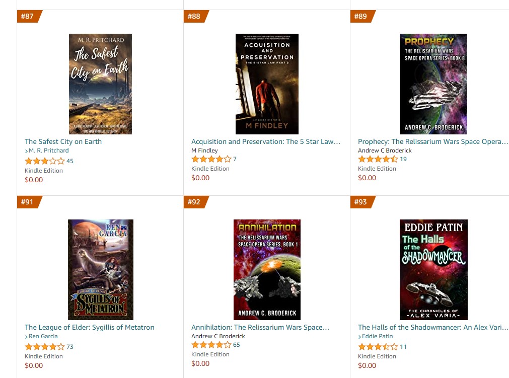
Two of these have wildly unsuitable fonts. Two (not the same pair) don’t signal science fiction in the slightest. None of them are easily readable at thumbnail. Mind you – none are abysmally awful, either, but I didn’t have time to dredge deeply enough to find exemplars of those.
So! Having looked at these covers, I’m realizing that Peter’s cover is going to work, but not so much for the Space Marine sub genre as it will be a more general Space Opera cover. Which is fine – that’s what he wanted.
Just the fonts and layout.
As for fonts? I’ve started using Creative Fabrica, which has great sales, as I prefer to have the licensing for a font. I’m still using a lot of the freebies I got from DaFont, but I’ve also got some donationware from there, so I feel better about paying creators. Licensing protects me and my author clients, paying folks for their work lets me sleep easier. Win win. I started out with no money to speak of, and if that where you are, there’s no shame in the freebies. Eventually with persistence you’ll be at the point to pay for it, too!
Right now for art I’m using mostly Dreamstime and DepositPhotos. I’m avoiding Pixabay or Pexels – free art tends to get used. A lot. And many of the rendered spaceships are being used over and over, so I see them on many covers. I’m seriously debating how much time I can spare to start making my own renders. Sigh… time.
In the interests of not making this post incredibly long, I’ll break it into parts, and come back next week with the nitty-gritty of laying out font on art, and how to make it thumbnail-friendly while still giving it dimension rather than a flat affect.
After that, I’ll get into covering a whole series with a complementary look, and how to plan for that even if you haven’t written the whole thing yet.
In the meantime, feel free to drop a link of what cover work you’re doing in the comments for critique and insights.

45 responses to “Cover Up: Part 1”
Several years ago I wrote a column called ‘Confessions of a Bibliophile’ one of my pieces was judge a book by it’s cover. There are books out there that I would never have picked up based on new covers. And there are two specific books by Corinna Turner, and 2 by Karina Fabian that come to mind that I had picked up and never got around to reading because I did not open the eBook until after the cover changed. I would see them when scrolling unread books and sort of shudder and skip past them. For the 2 by Turner once the covers changed and I updated mine I read them right away and loved the, So I completely agree that covers matter and matter a lot. I know one author who changes the covers on her series every few years and it seems to reinvigorate sales.
https://www.bookreviewsandmore.ca/2009/05/confessions-of-bibliophile-3-judge-book.html
Oh, people tell me all the time they don’t judge a book by it’s cover. They do. Everyone does. This is why I hammer the topic over and over. You don’t need a perfect cover, but authors do need to be aware of cover art and design, even if they are hiring someone to do it for them. It’s a critical part of a book’s success.
LOL
A few years ago, I saw a book cover that Screamed Stupid Movie and the Blurb Screamed Stupid Movie plot.
Oh and the book title wasn’t much better.
However (and a Big However), the author was Barbara Hambly which negated all of the negatives.
Oh, the book title was “Bride Of The Rat God”. Very Good Read. 😀
Parody has to show the genre AND that it’s a parody.
Well, “Bride Of The Rat God” wasn’t a Parody.
But the cover & blurb didn’t “draw me in”.
The cover for “Rolling in the Deep” by Mira Grant drew my wife and I into reading it, even though we don’t normally read horror.
https://www.goodreads.com/book/show/23634011-rolling-in-the-deep
It’s been a lot of fun working with Cedar on these covers. We agree on most of the important points, which is a very good place to start! If the author and the cover designer don’t see eye to eye, there’s bound to be conflict.
I agree with her that the look of the cover in Amazon’s thumbnail size (approximately 60×100 pixels) is absolutely critical. Most of your potential new readers are going to come across your books while browsing through other things on Amazon.com. If they see only a featureless blur, or unreadable name, or a central art focus that can’t be readily identified at first glance, then they’re going to let their eyes pass over your book’s thumbnail image and focus on something more eye-catching. Simple, readable fonts and clear images associated with your genre are basic necessities.
Of course, you can always use historical references in your covers where appropriate. For example, my Ames Archives Western novel series all use paintings or drawings by Frederic Sackrider Remington as cover art. It’s long out of copyright, which solves a lot of issues before they start (and is also as cheap as art can get!), and they look period-appropriate. Just seeing one of his images tends to shout, “This is a Western!” The use of a period-appropriate, yet readable font adds to the impression. One can’t get away with that in military science fiction or space opera, sadly. (Is there such a thing as an intergalactic version of Aida?)
Even with public domain art – and really, nothing I could create would hold a candle to Remington! – the layout is crucial to match it and make it look like a cohesive whole.
As a reader I’ve found that my biggest dislike is being unable to read the title and/or author’s name in the thumbnail and that the biggest cause of this is insufficient contrast with or separation from the background image. In your first screen capture, for example, Chris Nuttall, who should know better, obscures his last name by having it overlay a star(?). Another common problem is that the font used for the author’s name is too small. Combine this with insufficient contrast and the author’s name might as well be omitted. I also assume that I won’t be able to read any subtitle so it would be interesting to see a thumbnail of your design for Peter’s cover just to see if this is true (I suspect that “War” may be a little unclear).
Being neither an author nor someone with any artistic training or ability I’m not really the kind of person you are asking to comment, but I’ve viewed a huge number of thumbnail book covers and bought a shed load of e-books and my experienced leaves me with the belief that a lot of covers would be much improved by a mechanical rather than artistic attention to contrast and font size.
I don’t design the subtitle to be readable at thumbnail, placing the emphasis on title and author name. So yes, that will likely be invisible when it’s shrunk down.
Part of the reason I’m placing my emphasis on this tutorial series on the fonts and layouts is that complaint – you can really make them pop, or they can blend into the art. Oddly enough, I’m not so worried about them being readable. Simply making them stand out is enough and then the reader will click and read the subtitle and blurb… but the cover has to hook them in first.
“…a lot of covers would be much improved by a mechanical rather than artistic attention to contrast and font size.”
Yeah. First thing I noticed about the Successful Bunch was that they’re all relatively PLAIN and obvious, while the Unsuccessful Bunch are all fairly BUSY and need deciphering to interpret.
The simpler the art, the more elaborate the font can be, but even that is only some leeway.
I have seen some very attractive covers looking like medieval manuscripts, with the font as the major artistic element, but even those are readable. It helps that they are large.
And you can make the words bigger if the art is minimalist.
First impression on the first “free” title – It’s contemporary romance, except the title’s wrong. Or it’s is German “chick fic” (not their term but you get the idea.) I also see a violation of the “two fonts only” rule later down the list.
I know we had a knock-down, drag-out here a few years back over “art or genre signal.” As much as I love some cover art, well, it would work better as an album cover than a book cover (and even there, on Amazon, at thumbnail . . . .) Yes, there are authors and series that follow older conventions, because they are SuperAuthor of Massive Series and have the readership to do it. The rest of us can’t yet. 🙂
And I’m with Cedar on the “you need art.” The contemporary fiction covers with day-glow colors and four words in blocky fonts? No, thanks. Just because it worked for _Ready, Player One_ doesn’t mean it still works. [See the “pale or crimson object on shiny black background for all YA books” post-Twilight fad]
Whether it works or not, some designers will attempt it, as they imitate big blockbusters.
Well, I would argue that also signals a particular genre or target audience. Not one most of us would be a part of, yes, but an audience none the less.
Me personally, I don’t usually consciously notice the covers on most books I real, unless there is a glaring major issue with them, (and that included even the absolutely horrific cover ‘A Civil Campaign’ ended up with) but I expect that I do cue to them regardless.
Given that, I’d lean more towards making sure the cover conveys the correct genre, and at least obeyed the basic rules of classic art, while not being to terribly hung up on whether it is really great art.
*sigh* Covers. No, make that a whimper. Thank you Cedar, I need this.
No problem! More next week!
One thing I’m sure of it that when I publish, I’m spending the extra $$$ to hire an artist for a unique cover. I see so many stock images when I’m browsing Amazon that I find it hard to tell books apart by sight. I want something that stands out.
I started re-doing the covers on my books last year, and am much more pleased with them. Starting to re-do my hubby’s as edits get done when needed. I think, personally, from what I’ve been seeing, that certain genres are FAR more “cue conscious” than other genres. Like PNR, seems VERY cue conscious, while LitRPG doesn’t seem to be as much. Mystery/Thriller, seem to have far more subtle cues, while, as mentioned, Western has fairly specific cues.
Here is my Cover portfolio, some stuff is older, some are just “blanks”. I don’t mind them being held up as either great examples OR horrible warnings.
https://www.artstation.com/dak-imarts/albums/2998901
The other thing that changed from the past, that I haven’t seen many subscribing to is:
Title size versus author name size. It used to be that if you were big name, then name on book was literally big, and title smaller, and you were told if you aren’t big, then title big and your name smaller. And you still see that a lot. But, a few years ago, it was suggested that it’s better to put your author name larger now, even if you aren’t big, sort of a “fake it till you make it” kind of thing, but I still see a lot of folks holding to the old rules. Don’t know what folk’s opinions on that is?
Also, if you are looking for unique elements to put together covers, and you are going to do a lot of them (to make it worth the price) then Envato Elements has a lot of 2D, 3D, fonts, etc for a fixed price monthly, and you can get 1/2 off the subscription all the time if you look at artist’s on YouTube.
RenderHub, SketchFab, TurboSquid, all have some 3d elements, but you have to watch all of them for copyright issues. They try to take them down when they find them, but some people do put trademark/IP of various shows on their accounts.
And as for ships there are a number of ways to get unique ships, with a little knowledge…Such as: ship.shapewright.com
(This one is lots of fun!) And there are more and more online art generators to get pieces and parts to composite. If folks want more links, I can dig them up,
This one is my first foray into cover design, I THINK I have it finished. (Those of you on Cedar’s Discord have seen the original of this.)
Now to make a blurb that doesn’t devolve into silliness and get the copy edits finished.
That… was bigger than I thought it would be. *sheepish*
It’s beautiful! Fonts say “sci-fi”, image says “sci-fi” colors are clear and work well together and with the font.
Title also says it.
You have to make doubly sure that you signal genre on a cover if the title is ambiguous.
Thank you!
Looks really cool. 🙂
Thank you!
Right? They always come out huge.
Sooo much so!
Based on that cover, if I saw it in Amazons suggestions, I would click through and look at it at least. Since I now know that you are working on this, I’ll be buying it as soon as you tell us it’s available. 😉
The high contrast on the text vs background really makes it pop, especially in thumbnail size. Only downside is I have no idea what it is about, so the blurb better be good 🙂
Yeah. I’m working on that part as well. The issue is it’s a strange little story so that’s coming a bit more slowly.
Title could be larger. Kerning on this font is a touch off, you may want to try a couple other SciFi fonts out. And you really want a title font here that shouts Science! fiction! As your art at thumbnail isn’t clearly SF. You do not need to use the same font for author name.
I’ll play with the title fonts some more. (And I didn’t use the same font on the author name as on the title.)
Cedar, this is very timely. The Artist In Residence here at Chez Phantom is beginning to turn out some art for me. I get the first one for Christmas. Yay!
I get the fun job of doing all the text. I’ll be paying close attention to your recommendations.
What a great post-so practical and specific. Real world examples too. Reworking my cover immediately. Thanks Cedar.
I’m working on the cover for Book #3…it will have to change significantly from what I originally put together. I realized that it doesn’t work with the covers for the first two. Thanks for the tutorial.
“I don’t mind them being held up as either great examples OR horrible warnings.”
Whot she said. All corrections welcome. My first go at a cover.
Aw. super cute!
I like it but the text is hard to read. Especially the 4, it took multiple scans of the cover to realize it’s not a sparkle.
Adding depth to the background scene by shading each section of shelving a little darker than the previous one would probably make the whole feel less flat and make the creature the brightest part of the image & the thing you’d immediately look at (plus giving a bit more contrast to the white-on-light-shelves top text.
Exactly so. Overgrown Hobbit, push your shadows deeper! It’s hard to do in art, but we shouldn’t be afraid of the dark – it brings out the light side so!
I can do that! Thank you.
Does Amazon give you the option of specifying the image used for the thumbnail?
If so, it’s worth looking at tweaking the shrunken down version to make the text pop out more, or make the defining characteristics of the image stand out.
The thumbnail is the book cover file. While I am working on my designs, I toggle it down to thumbnail size frequently to ensure that the cover functions at that size as well as full size. I highly recommend this to anyone working on their own cover.
Just a thought that struck me (reader observation in this case)… It might also be worth exporting/looking at the cover in gray scale. My e-reader doesn’t do color so if I’m browsing on it vs. the computer a lot of covers get really muddy really fast.