
I feel like I harp on this topic. Covers, cover art, cover design… if it’s ever too much, tell me. Here’s the thing, though. It’s not just that I’m an artist and designer and I enjoy the process of book creation. It’s that even though people will say they don’t care about a book cover, they actually do. They will totally judge your book by it’s cover. And your book cover signals a lot about your book, whether you are conscious of it, or not. Every little choice, from font to color focus, says something about the book. I think by now everyone reading this knows the cardinal rule of a book cover: cover art is a marketing tool, not a scene from the book. Sure, there are rare exceptions where a scene depiction works as cover art. But it’s not common, and besides that, the second rule of book cover design is: it absolutely must be legible at thumbnail sizes.
- Book Covers are Marketing Tools
- Clearly Readable at Thumbnail
- Fits into Genre Conventions
- Use Legible Fonts
- Choose Good Art, or at least Clean Backgrounds
- Make the Author Name Bigger
- Never, Ever, Use an Unfiltered Photograph on Fiction
So there’s my seven rules of book covering. I think rule one is an umbrella rule that covers all the others, so I won’t address it directly. Instead, let’s talk about why the cover must be clear at a very small size. Most readers are not going to encounter your book cover for the first time on a print book. That’s not to say you cannot have a great cover which works all the way from thumbnail to poster or even banner size. You can, although it’s trickier than a simple, punchy ebook cover. However, when you look at your sales numbers realistically, where are the majority of them coming from? Ebooks or online purchases? What size is that cover on screen when you go look at it? Ok, now you understand.
Third rule, genre conventions. Genre may have evolved as a means to shelve books of a kind together, and you may not want to label your book as a specific genre. I get that. I really do. My Pixie for Hire series is technically Urban Fantasy although there’s nothing urban about it. However, by looking at books similar to yours, you can better design a cover that will attract readers who want to read that kind of books. The best way to do this is to take a look at the top 100 best sellers in your sub-genre on Amazon. This will give you an idea of the colors, styles, and general feel of art on the books that sell. Sure, rules are meant to be broken. But if you break them too hard, the results will be disappointing. Covers set the mood for the reader as they enter your book – think of them as a door. If you have a playful, colorful door on your book, but the material inside is dark and heavy, the reader is going to experience cognitive dissonance, and not in a good way. Also, the character on the cover is going to lead the reader to believe that’s what is is the book: put children or teens on a cover, and everyone is going to assume that is the target audience, even if you think it’s good for all ages.
Using legible fonts seems obvious, right up until it isn’t. There are hundreds, if not thousands, of fonts out there. If you go take a look at dafont, you’ll find yourself clicking through for hours (ok, maybe that’s just me). Font choice is huge. You can, in theory, signal genre and mood just with font choice, leaving out art or using minimal art. However, here’s where we come back to thumbnail. Step across the room. Can you still read it at a glance? Ask a friend. Can they read it? Worse, does kerning make it appear to say something you didn’t intend (imagine ‘flick’ in a very Bad Font)? You can use an expressive font without crossing the line into purely decorative. Some simple rules to keep in mind: never use more than three different fonts (and really, two is plenty) on a cover. Never use a font you’d use inside the book: i.e. Times New Roman, Arial, Helvetica, Georgia and so on.
Cover art runs the gamut from expensive and effective, to cheap and effective. You can certainly commission a professional artist to create art, but keep in mind that artists are rarely also designers, and a brilliant piece of art with poor design is almost worse than bad art. Almost. I have seen some phenomenally bad art, and if you want to see a gallery of mistakes to learn from, check out Lousy Book Covers. That being said – take a look at the latest versions of the Harry Potter Books, at the Game of Thrones books, and Twilight. The art is excellently executed, minimal, and leaves plenty of room for text to highlight what they are at a thumbnail size. I am not saying copy them – don’t! – I am suggesting that when it comes to art for an ebook, less is more and too much detail can make for a muddy thumbnail. Which is also why you don’t want to recreate a scene on a cover. I once had a potential client approach me wanting about six figures on the cover, telling me which celebrities those characters should recognizably resemble, and I politely declined. It would have been a hot mess, and a potential lawsuit. Another thing to keep in mind with cover art is that if you plan to have a print edition, the art will appear darker in print than it does on screen.
Make your name bigger. I really mean it! Bigger! Years back when I first got into this game, I took a workshop from Dean Wesley Smith on cover design. If he is still offering it, you should invest in it if you will be publishing multiple books – even if you aren’t doing your own covers. I wouldn’t spoil it and share all the secrets, but the one thing that really stuck out to me was the psychology behind making an author’s name bigger. It’s not just that it signals Best Seller status (see above minimal cover art examples), it’s that it sticks the name in the reader’s mind, so when they are looking for books, they remember your name. It’s that simple. You have to be remembered, and the best way to be remembered is to stick your name out there loud and proud. So make your name bigger than you think it ought to be. Seriously, don’t make me come find you and give you the Mom glare.
I am seeing this trend more and more, and I really hate it. Yes, I know that photos are cheaper (i.e. free from Pixabay or Morguefile) and you don’t have photoshop. There are other options to make your photo you really want to use as cover art into something that can actually be used as cover art, it’s just going to take time and effort on your part. Well, given the proliferation of art filtering apps for photos (take a look at the hastag #filteredaf on Instagram, for example) it’s actually neither hard nor expensive to do. Sarah Hoyt favors Filter Forge, which can be spendy to start, but it’s effective. Photoshop (which can be had for $10 a month, sucks, but still) has a built in filter gallery that can be layered up for useful effects. Look up double exposed effects, and spend some time playing with tutorials – there are more than you can imagine. Invest some time. But please don’t use unfiltered photos on fiction, it looks cheap, and crappy, and readers will be put off.
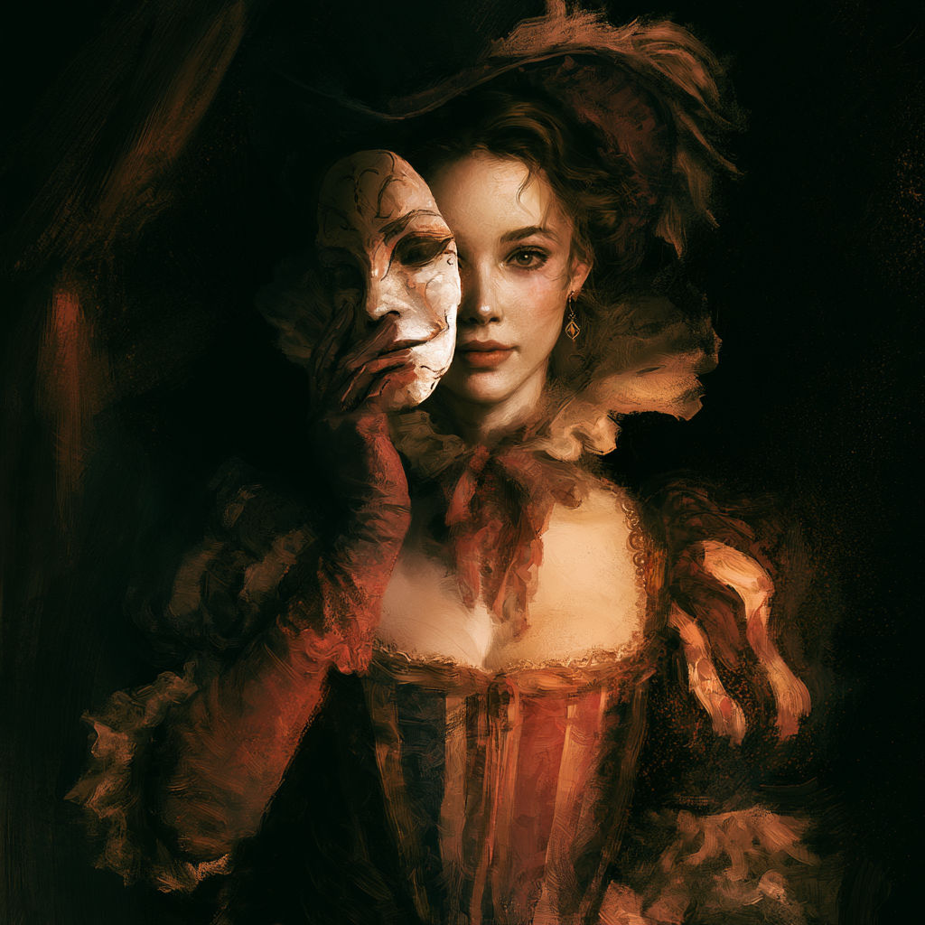
So that’s my seven rules, although I reserve the right to add more later! And this is my latest cover. It’s a blended piece of a photo (hah!) and illustration, and font to signal humor. The primary color of greens and yellows is to signal gross, and a bit creepy. But it’s not pure horror, so I stayed away from reds. Lab Gremlins is my latest novella, which will be released on Halloween day. I’m pretty excited about it!

Plus! Continuing my Halloween month of giveaways, you can click on this cover, which absolutely does signal horror, mystery, magic, and yes, a child… for a free novella.


42 responses to “7 Rules for Cover Design”
23 skidoo
Cedar is spot on with everything she says. I will add one more thing on fonts, well two. First, make sure you have the proper licensing for the cover font you want to use. Otherwise, you risk everything from a takedown demand from the rights holder to being sued for big bucks. There are attorneys out there who love going after authors and, yes, they will come after you and not the cover designer because you supposedly have the money.
The second is to make sure your font fits the genre or sub genre. Just as the images used on the cover will cue everything from genre and sub genre to audience, so does the font. So make sure you research that as well.
Yep. Did we do an article just on font choices recently? Seems like I recalled that, so I didn’t go in depth in this one. If not, maybe we should.
I think it’s been a while.
Well, then. I worry I over focus on this topic because it’s easy for me to rant on.
Vaguely remember one, but not too recently.
Also, make sure your font harmonizes with the art so that it’s not the clash that draws the idea.
A serif font for artwork with points, a blocky one for square and rectangular images, a slanted one for artwork heavy on diagonals.
Draws the EYE.
Like all marketing tools, looking nice helps.
“make sure you have the proper licensing for the cover font you want to use. ”
If you’re looking at free font sites, the key words to look for are “free for commercial use.” If it doesn’t have those, you’ll have to pay a licensing fee anywhere in public. (They don’t care about, say, birthday invitations.) Either use a free for commercial use font, or pay the fee.
Even if you pay the fee, look at the terms. Some won’t allow for use on ebooks. Others say that for a run of 10,000+ you have to buy a different license.
And some now include fine print that specifies not being used for anything that might be defined as “hate speech”. Dead serious.
Yikes. I have not seen that one yet but will avoid those because… how do you even?!
Belated addendum (because I needed access to my font files) Here’s one from 1001 fonts:
It appears to be a new boilerplate showing up in the EULA/Readme file, probably provided by 1001 fonts
2. Usage
ShoCard Caps NF may be downloaded and used free of charge for both personal and commercial use, as long as the usage is not racist [emphasis added] or illegal.
I save the EULAs / Readmes for every font I use (and if I ever start selling my artwork, I’ll definitely be paying for some of the fonts I used. Author Gets Paid (TM) after all) and just change the name to “[FONT NAME] Eula racist
Now if we could just get a ruling about a “free for personal use” font you’d be happy to pay for if the creator could only be found!
How impossible is it to just make your own font. Wow.
There’s a number of free-for-commercial use fonts out there, submitted or put out by their creators as tasters, much in the same way free graphics sites exist. Very good stuff too.
For our readers who publish for markets outside the US and Canadian markets – look at your local bookstores and “local” Amazon or Kobo. There are some major cover convention differences between the US and, say, Germany for fantasy and historical fiction/historical romance covers.
That said, there is also some overlap. Thrillers are similar in German and English for both translated and originally German books, for example.
My eyeballs may never recover from the year when every.single.romance in Germany had a hot pink cover or hot pink font. Unless it was set before 1900, they all looked like chick-lit light romances. Entire walls of hot pink covers… *shudder*
Lol! Horrors!
And that’s an excellent point. Any market research should focus on your local, or specific, market.
I suggest rule 8.) Always run the cover art past some other people first before settling on the image.
A lot of the bestseller covers are very dark and have a limited palette.
Indeed. I haven’t looked to see if their print versions differ from teh ebook.
I’ve passed on a number of books because the text was unreadable. Printing in colors across a colorful background, or printing “green” over “brown” or whatever, and sometimes I can pick out edges or bits of characters, but nothing readable.
WHITE generally stands out over artwork. BLACK usually doesn’t have as much contrast, but it’s readable. Anything else is a crap shoot.
Magazines are the worst, though. Whoever started the fad for printing spidery grey text over busy artwork should be given a fair trial and then shot.
Your cover is never done until the title is on it, and that’s not until the title is FIXED IN STONE.
For one thing, the space that looks neutral? Ain’t neutral until you plop the title on it; then, and only then, can you see whether it’s busy.
And length matters, not the least because it affects font size. It matters whether the title is “Lifestone” or “The Maze, the Manor, and the Unicorn.”
On the WHITE/BLACK, I have to say, depends on the art. Sometimes you have to darken or lighten it because as it stands, neither WHITE or BLACK really stands out. (And sometimes it has to be off-white or off-black because — clash looks ugly.)
There are ways to make the text pop. Red text is pretty much *always* a bad idea. hm. That’s probably something to add to the font post.
Strokes. Strokes are awesome when you have a variable background. A nice dark stroke with a light text and vice versa. And there is nothing wrong with black and white text. It’s not always the perfect choice, but it’s a lot better than guessing wrong.
Yes, black and white is safe and solid.
Usually. Sometimes it just looks amateurish — and “this is an amateur!” is not perhaps a good marketing tool.
Off-white and off-black often don’t have to be very far off to harmonize with the art.
Most programs have a paint dropper tool to sample colors, so if you go to a light portion of the background art and sample, then just lighten it a bit, you’d get a nicely harmonious off-white.
Yes! That is exactly what I do.
Somewhere between 10 and 20 percent of your market is red/green color blind. And some have a lot more trouble than that. And even people with “normal” color vision sometimes have problems with covers that look like someone ate their fingerpaint kit and threw up.
If you can afford to flick away 20% of your potential sales like a booger, hey, it’s your cover design, do whatever you like.
Somewhere between 10 and 20 percent of your market is red/green color blind.
Two colors I never even mentioned. So what on earth are you talking about?
Or is this comment not meant as a response to me? The system says it is.
I don’t know whether it is another rule, or just a “1b” – but covers are marketing tools, not gallery art. So many of the most horrible covers I’ve seen in the past, and many of those lauded by the “artistic” people, might have been good for selling in a gallery (when the fad for the type was still going). Absolutely terrible for a cover, though.
Actually, many of the art books that I have seen have a cover image of a kind that is not heavily represented in the plates once you open it up.
So… any thoughts on making your name *smaller* in order to make it bigger?
For example, I always do a middle initial because that seemed to be the thing to do in 1990 or so. But if I’m putting my author name on a single line I can certainly scale up “Julie Pascal” farther than I could scale up “Julie A. Pascal”. Or my joke pseudonymn “Bic Avery.” I could get old Bic pretty large on a cover.
And then people do the wrapping part like you did with Snow in her Eyes, which works really well, but probably not with a middle initial.
Depends on whether you are starting out or not. A starting out writer is wise to consider the shorter length means larger font is feasible. As with titles.
The already published writer has to consider also that it’s a change in byline. Someone may take it that Julie A Pascal was trying to distinguish herself from you. Or a computer program may take you for two writers.
I haven’t actually published or sold *anything* yet, so I do still get to decide one way or another.
I think that the reasoning behind the middle initial is “this one is really me”.
I went off to see if Google thinks there are lots of Julie Pascal’s in the world. It doesn’t seem so. And Amazon doesn’t seem to think so. But since I didn’t show up in the Google search either, there’s probably dozens and dozens who even also write stories.
Get in there first!
I’m thinking about trying to blog again. Have blogged and linked at Synova.blogspot.com. I don’t know if there is something I’m supposed to do to make a ping-back notice. Not as though I’ve been doing this for near on a decade. 😛
I put my my NaNo placeholder covers. I think they’re pretty but not particularly *good* and have listed some of the reasons.
I think ping backs only work within WordPress blogs but I could be wrong.
I have to add a qualifier. Your cover may not show exactly a scene in the book. But if it misleads the buyer and the book turns out to have no relationship at all to the cover the reader may very well not forgive you and remember it.
Also – I’ll point out some covers depict what is in the book very well. A lot of Baen covers do. Look at Michael WIlliamson’s covers – in particular “A Long Time Until Now”
That was the main things that are “wrong” about the covers I put up on my blog (http://synova.blogspot.com/). I think they’re both nice covers though not perfect but the first one especially signals the wrong type of sub-genre for the book that’s written.
Sure, I suppose someone could get sales on the strength of the cover alone… but if your cozy and quirky space mystery has a cover that says mil-sf, you’re going to end up selling mostly to people who will be annoyed at you.
My first cover example is a simple picture of an eclipse showing the “diamond ring” effect. And it’s an awesome picture. But it signals lit-sf to me. The story is space opera. It has tentacle monsters and genetically engineered super soldiers and mermaids. (<– not the same people, but now I'm imagining mermaid super soldiers… uh oh.)
Marketing tool. There’s a good reason why they don’t put strawberries on the frozen spinach container.
In fact, look at this one. There is actually a scene where there’s a young woman in a white dress in the forest — and in a discussion, people complained about how misleading the cover was. Not half so YAish as it seemed.