The art of covering a book, as part of the MGC practical series we’re running for a week or three.
We’ve talked about this many times, here and elsewhere. I think last time there may have been an epic troll war in the comments section, which I’m hoping to avoid this time. I’m going to do this in two parts, this one being the preliminaries, and next week, a hands-on tutorial style how-to create a cover. Something I’ve come close to doing before, but in a little more depth this time.
There are multiple things going on with a book cover. I’m going to focus on front covers for now, and if enough people want it, come back to spines and back covers later. Let me know in the comments.
First, you have to understand what a cover does. It does not convey a real scene from your book. Now, I’m not saying that if your heroine is a blonde, it’s ok to have a brunette on the cover, but I am going to say that the cover does not need – and indeed, SHOULD NOT be a faithful representation of something from inside the book. Instead, your cover art needs to convey a sense of what’s inside the book, as a whole. Your cover sends subliminal cues to your reader, whether they ever stop to think about it, or not. Is your cover very pink (or purple)? Probably a romance. Barechested male on the front? Probably a romance. Exploding spaceships? Whoops… probably not a romance.
But then you get down to even more subtle signs than that. There’s a spaceship, and a star scene, and a abstract representation of a face in genetic code… probably hard SF. One thing you will never, ever see on the cover of a legitimate SF or fantasy book is a photograph. It’s always an illustration. Only with Romance can you get away with a photo.
How can you tell what your cover art should look like? Well, the first thing I tell anyone I’m consulting with on cover art is to go to Amazon and search for your subgenre. Not the entire genre: all of SF is too broad. On the other hand, western space opera cowboy… that might come up with something more usable. Or simply dystopian SF, or… you get the idea. Now, look at the top 100 paid titles in that subgenre. You will see a certain pattern appear as you do so. We aren’t saying you should copy anything faithfully. But you ought to find the overall pattern, and make your art fit into it, because this is the unseen cue that tells your reader what they can expect when they start reading.
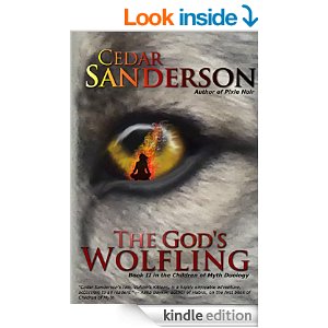
Yes, it’s difficult when your book doesn’t fit neatly into a genre. I know this… my Children of Myth series is both fantasy, and SF. I have opted to go with something that looks more fantasy, as it’s closest to the core of the stories. 
Now that you have a mental idea of what works – and not before this! Trust me, you will fall in love with an unsuitable piece of art, and that will only end in tears – you can go to a reliable site and look for stock art. Yeah, yeah, I know. You want an artist who will faithfully and lovingly render the perfect scene for you, with the biometrics of your main character perfectly aligned with your mental picture of them, and… you can’t afford it. Original art justly costs an arm and a leg, and until you are a blockbuster in the sales department (and then you can come back and write a guest post for us telling us how you did it!) you can’t justify laying out thousands of dollars on an artist.
If you find an artist who promises you cheap art, you need to get references – are they reliable? Will they deliver, or vanish with your cash? Are they capable of creating professional level art? – and you need to have a clear understanding of what’s being delivered. If you’re paying someone $50 to do a cover, you will get what you paid for.
So, stock art. You know what you are getting, with a minimum of skill in a graphics program you can tweak it to make it uniquely yours if you are worried about someone else having the same cover, and it’s very inexpensive. I recommend GIMP to most people for tweaking, and the text design a bit later, as it is freeware, there are a ton of tutorials available, and it’s not that difficult to learn. (Shh, all you out there. I’m teaching myself Adobe Illustrator, I don’t want to HEAR how hard you think Gimp is)
Those of us at MGC who do covers highly recommend that you don’t just grab a random piece of art you found on the internet. For one thing, you don’t know where that came from. It may be under copyright – most likely is – and you can’t just slap it on your cover and go. Whatever you pick must be licensed for commercial use. Make sure to attribute the art inside your book. Artists, like authors, have to eat and pay bills, and they can’t do that with stolen art.
For me, I can take bits and pieces of stock art and fuse them into an original creation. This is, I know, not that easy for most folks. And done badly, it’s almost worse than that teenage artist you found. I’ve seen some pretty bad cover art that was created from poorly joined stock pieces. However, there is hope.
Dollarphotoclub is just what it sounds like. A huge collection of stock, both illustrations and photos, which you can search for the right piece. Dreamstime is another good site, although pricier. For free stuff that will take a little more work on your part, try Morgue File. For small elements, I use Open Clipart. You need to keep a couple of things in mind as you are looking.
One, sometimes a photo can be modified to be used as an illustration. We who do this a lot and buy pro-tools like Filter Forge for this. But if you aren’t ready to lay out over a hundred dollars on a program, there are other options. I’ve seen some interesting results with Pencil Sketch, which is freeware. Gimp has manual filters you can layer on (just one won’t do, in this case) until it no longer looks like a photo. So keep that in mind as you browse.
Second, you need to make sure there is enough room for text without interfering with important art elements. The layout of the art, portrait or landscape, isn’t terribly important right now, because you will likely be blowing it up and shifting it around until it looks good, anyway (Oh, yeah, you need to be looking at high-resolution art. Minimum 300 dpi, to be able to use on print covers. Unless this is a short, and will never be in print. But KDP still has quality requirements). But there has to be room for text, which is arguably more important than the art itself. You also don’t want an overly-detailed piece of art. Most readers get their first impression of your book from a thumbnail sized image on the computer screen. Too much detail gets lost, interferes with the text, and looks muddy.
Next week, we have the art, now what? Or: the most important thing on the cover of a book is your name. Make it bigger, I said!


33 responses to “Covering Your Book: Part 1”
I paid for an original painting for my last novel (it’s actually 55k words which will always be a novella to me, no matter what the experts say). I think it was pretty cheap and I like it, though I’m not sure if it will help sell books. I did the text myself…
It’s a good painting, yes, you found an artist! Sadly, that’s a variable proposition at best. Hold onto him.
As for the text, yes, it could be better. I’ve seen worse, and likely you’re fine with it. I’ll be covering typography and layout next week, although if you click through some of the links in that first paragraph or two of the post, you will find a wealth of information, particularly with Dorothy Grant’s posts.
Looking at your cover, without clicking through to the description, I’m going to say that it’s epic fantasy, with a Far Eastern flavor, and possibly a YA. (although I might be getting YA from the font you’ve used).
Its more sword and sorcery but close enough. And the main setting (a city) is called Katamood– middle eastern sounding name, though it is a ‘tudor’ city. And probably not YA. Might have to read some of the links and change the font 🙂
As for the artist, I’m not sure he’s done a lot of covers. I know there are things I asked him to do that he didn’t do all that well– bleed space around the outside for eg (I want it for POD as well). And I probably should have gotten him to do a smaller main figure to leave more room for text. But I hope he’s interested in doing book two when I get around to writing it so I’ll be more clear on stuff.
For the price, I think it’s worth it.
Thanks for the comments.
I see the sword and sorcery, and it’s not a genre I’ve read (or done a cover for!) so I wasn’t thinking that right off the bat.
As for bleed space, yes, a good margin of nothing much around the central art is nice. I think you ought to be able to use this cover with a little tweaking for print. Something to keep in mind – and I’ll mention it next week – is that print tends to come out darker than what you see on screen. Not a bad thing with this painting, but if you had darker art it might be an issue.
I did know somethign about the ‘darker’ bit. Didn’t think of that when I was talking to the artist. And I’ll be reading next week then, after I proof one book. Then re-proof this one (It was on Immerse or Die today ( http://creativityhacker.ca/2014/12/12/the-last-great-hero-by-scott-j-robinson/ )– with mixed results. (yes, more pimping– it’s deliberate this time 🙂 )
One thing I’ve been told is that browsers, looking at a picture, have a tendency to follow the general direction of the gaze of the main figure on a cover. So have that gaze directed from the edge toward the center of the book. So for instance, if your figure on the right, was looking left, someone looking at it would tend to notice the title, not the book to the right of yours.
Shrug. Who knows?
Sorry, didn’t realise that was going to come up as an ad like that. You can buy it if you like though.
Did I come close on my genre guess? Don’t worry about the ad, a little promo is never a bad thing.
Sword and sorcery, which is kinda sub-epic fantasyish. So yes, close. With a bit of humour.
And I should say, not standard sword and sorcery (like there isn’t much actual sorcery in book one seeing it’s been outlawed.)
[…] #indiepublishing how-to contribution over at Mad Genius Club today is covers, specifically how to judge, find, and use art suitable for an […]
For my first cover, which I did myself, I applied FX Photo Studio, which cost $10 a couple of years ago, to a photo. It made it look like a painting but I lost a lot of pixels with over manipulation. This year, I paid someone a small amount to fix the saturation. The FX app is pretty cool. It has filters to make your photo glow, turn blue or any other color, look like sepia, become a cartoon, a mirror, and a host of others. If you want to see what FX can do, Goodreads has the FX cover of The Sky Suspended and Amazon has the better version.
Cool! Yes, there are a ton of photo manipulation apps out there. And one of the things you have to watch for is that reduction in quality, particularly if you ever intend to use it for a print cover. I have several on my tablet, but I’m pretty sure they’d look horrible blown up to 6×9 print.
I’ve collided with Amazon vs. B&N’s file size requirements. Amazon tolerates a larger file size, and sometimes Dreamstime (where I get most of my images from) doesn’t have the file size listed where I can find it easily. There’s nothing like getting everything tweaked, filtered, massaged, lettered, converted, uploaded and “BLAAAAT” file too large, game over, try again. Grrrr.
This is easily solvable by saving your jpg file at a lower quality setting, rather than the highest possible. I will, when I am sending a set of files to a client, include ‘web-ready’ lower quality jpg files that can be used for ads, and things like this, where you don’t want or need every pixel you can get.
Like (almost) everything, you get better at covers the more of them you do. I look back at my first one (Let No False Angels) and know it was the best I could do at the time, but it really needs to be replaced. The artwork makes sense if you’ve read the book, but it doesn’t signal what’s inside clearly enough at a glance.
If it’s for a book in a series, though, and you can manage a “cover format” that will carry across all of the books (like I’m doing now for Films That Never Were), a lot of the stress and hair-pulling go away — at least after you get the first one in the series down!
I need to take a week and redo ALL my old covers. My big issue though is the historical mystery because there are too few of them to get a sense for what it should like, and most of them have things like buildings on the cover, which is plain stupid with musketeer anything, so…
Just curious, but why didn’t you mention the Wikimedia Commons?
Wayne
Because you would have to look at every single image you found while searching to be sure it was usuable under commercial licensing. ” the Wikimedia Foundation does not provide any warranty regarding the copyright status or correctness of licensing terms”
It’s a whole lot simpler to go with a reputable site you can trust to not have pirated images. And… I’m an artist, both in text and other media. I like to reward the people I have working for me – even a stock artist – for the value they provide to me. Call me old-fashioned, but I’m a capitalist. Don’t muzzle the ox, and all that rot 😀
I’m old fashioned too. I remember barn raisings (yes, I took part in one). So I have uploaded pictures to the Wikimedia Commons. There’s stuff I want to make money on, and there’s stuff I do because I like helping people. Both coexist quite nicely.
As to checking licenses, that’s part of working in the 21st Century, and something everyone should be capable of doing. Mind you I’ve met enough people who seem incapable of doing it in meatspace. Some people, well, brick walls are smarter.
Wayne
Actually, planet + bare chested male + exploding space ship is a cover signal for the scifi subgenre of romance. NOT the same as scifi with a romantic subplot! Completely different genre!
Anyway, I thought I’d add an example of the tweaking to get a clear thumbnail picture. The second in the series was more heavily altered than the first, so it’s easier to see.
Innovari art: http://www.dreamstime.com/stock-image-escort-spaceships-image22865061
Cover: http://www.amazon.com/Ride-Rising-Tide-Maxwell-Saga-ebook/dp/B00DYUEEQE/
This particular innovari piece has also since been used by Dolf de Roos, but since we altered it enough from the original, they just look like two books out of the same series instead of looking identical. Which is a good argument, when using stock art, for not trying to put typography on it and leaving the image untouched.
Yes, yes, but no-one here is likely to admit to writing something that would require all those elements! LOL
Thank you, that’s something I didn’t know about Peter’s cover art. I’ve always thought he had the best ships, though!
As to paying the artist – we recently got a wonderful english-is-my-fourth-language letter from innovari, noting that we clearly were using his images bought from a royalty free site, but if we wanted custom covers, he is alive, available, and only 150 Euros for non-exclusive-rights covers, 200 Euros for exclusive-rights covers.
I made happy squeeing noises, first because I am always delighted to see artists reaching out to get paid more, better, and directly by the customer… and second, because he hadn’t put up new work in long enough I was getting worried something had happened to him or he’d quit. Between innovari now offering custom covers (our Maxwell series) and PhilCold offering custom covers (our Laredo series), the next book (cover already made) may be our last royalty-free stock art image.
Woohoo! I’m all for hiring affordable, reliable artists if you can find them. I keep thinking if I had time, digging through DeviantArt and finding someone would be fantastic. But I haven’t had time, and I did have an artist take my money and vanish (and I’m not the only author he did that too, but sadly we didn’t compare notes until later). Maybe when I’m ready with another series, after Dragon Noir.
Yeah, that’s why I quite happily bandy about the names of our cover artists. Because affordable, reliable, competent, and quality are such a winning combination I’d like to see them all over the top 100 lists!
Very nice stuff. Very nice. Thanks for the link, and the recommendation.
Wayne
Wondering if I can get away with cell shaded art for my novella? YA fantasy romance.
Friend of mine is an artist, and he actually, unlike many artists, READ the BOOK and gave me line art for a new cover for Kiwi. Gonna color it and make a new cover over the Christmas break, and of course add a cover credit.
I’ve got a better title for my WIP turning my fantasy short into a novel. I hope to get a lot more work done on that over the break too.
Reading this post coincided with an urgent desire of mine to draw a cover for a short story I haven’t finished edits on. (I… well, I’m probably a better artist than a writer, frankly.) And I’ve run into a problem.
The genre I’m going for is teen/pre-teen urban fantasy–a demon-deal brokering service. And every gosh-darn teen urban fantasy cover I’ve been looking at today takes itself *way* too dang seriously! All pictures (photographs) of teenagers looking moodily into the camera, or girls in utterly impractical dresses in the woods, or… basically, Something Deep and Probably Traumatic is happening here. (Probably involving love.)
…what do you do when your genre doesn’t mesh with your book? I think the story I’ve got is really more… y’know, kind of funny. Even if it does result in the forfeit of eternity by folks, well… it’s not a Deep and Fatal Thing.
(I may be a better artist than a writer, for now, but I have absolutely no idea what to draw…)
BTW: My friend, a YA librarian, did a cover mock-up post a while ago I really liked tracking the trends in that genre (there’s also a link at the top to the initial excercise): check it out!
http://fernwithy.livejournal.com/1202562.html
Excellent examples and commentary, thanks for sharing!
Check out the cover of T Kingfisher’s Nine Goblins. I suspect you’ll like it…
Ooh, I do!
BTW, I think I found out my problem: As you may have guessed from my “genre doesn’t fit my book”… I had the wrong genre. X_X
I’d always had in mind what I’d grown up with as “intermediate fiction”–11-13 or so. AKA the last time I remember being willing to pick up most anything and almost inevitably being entertained by it.
I couldn’t find the genre anymore, so I assumed it had gotten lumped in with Young Adult. I WAS WRONG! It got lumped into *Young Readers,* which I’d always assumed was… well, learning to read.
Went through that section of the bookstore today, though, and… yeah, judging at least by my concept of the book, it’d fit in right there, with one of the covers of that type.
WOO!
(I also need to go back with money and pick some of them up–I still find myself enchanted with most of the concepts. And… OK, I ended up really enjoying the copy of “Help! I’m Stuck in my Math Teacher’s Body!” I picked up at a yard sale for $.50 last year despite not being particulaly well-written–I think I can still get my enjoyment out of that genre. ^_^