
I took a design course over the winter term, and there were some points we covered which I knew would be useful to the readers here. Design is not just for Graphic Designers, artists, and engineers. Indie authors can use the knowledge of what works (and what doesn’t) to better plan and approve ideas for book covers, promotional material, and ad design. I’m not going to replicate the entire course here, but I can recommend the textbook (which was surprisingly affordable) and hit some high points that I think are useful.

The first one I wanted to talk about is the aesthetic usability effect. In a nutshell, people like pretty things. the books says that ‘designs that look easier to use have a higher probability of being used, whether or not they actually are easier to use.’ This may not seem applicable to a book – most people know how to use one, even ebooks. But the reactions of people to a book cover – that is where aesthetics comes in for the indie author. A beautiful cover will promote more positive reactions from the reader. So will a well laid out ad, or attractive art on promotional products. Striving for a more appealing overall look on your blog or website is worth the time and effort because the relationship browsers and readers have with you will be more positive. Here’s a very short video with some graphic examples.
Alignment, the placement of elements to line up their edges along a common (and usually imaginary) line, or their bodies around a center, is a somewhat intuitive thing for most of us. Alignment helps the eye connect related elements and speeds the comprehension when used with written elements. Area alignment is similar, but related more to images. When you are working with an asymmetric object, it’s better to line them up by the body of the shape rather than the edges.

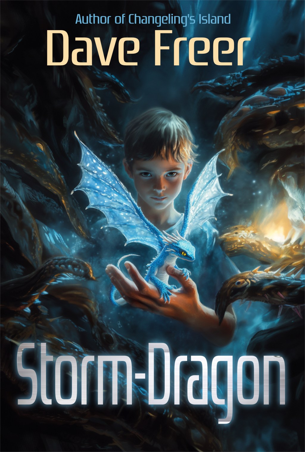
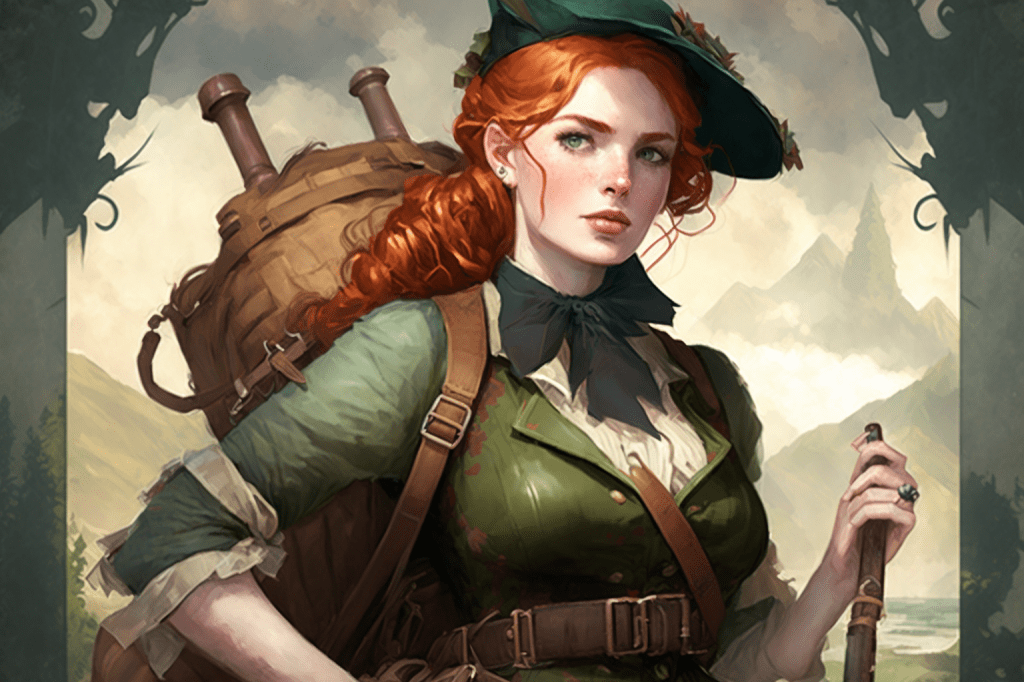
Ever wonder why all the images you see on book covers are beautiful people? That’s because we humans perceive attractiveness as being related to intelligence, competence, morality, and sociability. There is actually a known waist-to-hip ratio (0.70 for women, 0.90 for men) that is ideal for the perception of attractiveness. Also, women with exaggerated lips, and men in expensive clothing… I’m not making this up! A related principle, and one that is easier to see immediate applications for book covers, is the Face-ism Ratio. The ration of face to body showing in the image determines how the person is perceived. A high face-ism ratio with just the face showing rates as being more intelligent, dominant, and ambitious. A lower face-ism ratio, where the face takes up perhaps 25% of the image, is perceived as focusing more on the sensuality and physical attractiveness of the person.

Let me show you why this applies to your headshots, also. Something to keep in mind – as an author, you’re not just marketing your books, you are marketing you. Choosing the right headshot for book or website use, for public appearance announcements, is important. Never use a headshot that is too old, especially if you do public appearances, as it will deceive the viewers and leave a bad impression.


Moving away from imagery back into text, we should talk about Chunking, or why you shouldn’t swamp your readers with lots of text on promotional materials or the book covers. By using a limited amount of text and breaking it into smaller units, your reader will better remember vital information like your name, book titles, or website. Simplifying the design does not mean eliminating text elements, but rather keeping them short and tightly written – don’t waste a word of them. Consider the signal to noise ratio in your design. More signal, less noise, makes the message much clearer to the reader.
When it comes to catching the eye of the viewer, there are some techniques that you can use like Classical Conditioning, which provokes a response in the viewer based on the stimulus given. Kittens make people smile, an image with a badly scarred or wounded person makes them wince. I’m not saying kittens belong on the cover of your space opera. I’m saying that space ships, planets, and humanoids in space suits provoke a response to stimulus: oh, this must be science fiction! This is why we talk so much about cuing properly with the art on your cover, people are conditioned to react to elements they may not conciously recognize. If they pick up that cover with a spaceship and read about magic and fairies and… WTH? They are experiencing cognitive dissonance. While it can be used as an attention-getter, the design needs to alleviate the dissonance (say, in the blurb on the back) if the reader is going to be comfortable with it.
Which brings me to the von Restorff Effect. This is a phenomenon where things that are very different are more likely to be remembered that something commonly seen. A short video here explains it graphically, but you can easily picture in your head the effect. If you are driving down the road, you are surrounded by vehicles. Sedans, trucks, semis, but the one you will remember when you get home and tell people about, is being passed by the Oscar Meyer Weiner driving down the interstate. The thing that is different is highlighted (another important principle of design) in your memory.
Finally, we come to the Entry Point. Your book’s cover is the entry point. “The initial impression of a system or environment greatly influences subsequent perceptions and attitudes, which then affects the quality of subsequent interactions.” Yes, people do judge a book by it’s cover. A bad cover means that they are negatively influenced before they even begin to read the story you’ve worked so hard on.
Now, I’ve only lightly touched on the concepts you can use to make your output better. Do you want more? Let me know in comments and I will finish this up next week.
Oh, and Vulcan’s Kittens is free this weekend! If you’ve already read it, would you do me the favor of sharing a link for others to find?

And due to yesterday’s giveways with no promotional push – I had that scheduled for today – the rankings are already:
- Amazon Best Sellers Rank: #375 Free in Kindle Store (See Top 100 Free in Kindle Store)
- #9 in Kindle Store > Kindle eBooks > Teen & Young Adult > Science Fiction & Fantasy > Fantasy
- #19 in Kindle Store > Kindle eBooks > Science Fiction & Fantasy > Fantasy > Paranormal & Urban
I will update as I get insight from the promos I am running through Betty Book Freak and Ebooksoda.


29 responses to “The Art of Design”
Yep, your two “author photos” are very, very different. If I had to describe each in a word they’d be “class” and “youth”. Personally I *love* the Leon Jester shot, but it’s not as “friendly” as the Oleg Volk shot. So depends what image you want to project.
Leon really did a great job capturing that shot, it was outside with bad lighting at night… But in the end, the professional look of Oleg’s shot makes a better look for book covers and promo stuff. And yes, they both make me look younger than I am.
Well, I’m not so sure about that. Now, I don’t look at you in the mirror every day, so your opinion obviously carries more weight, but I recall being — is astonished to strong of a word? — how closely you resemble your photos, but also how much younger you come across than I expected. Make sense? Should I get coffee?
M
It does make sense. I found it really funny that my classmates were always surprised to find out my real age, and someone once told me they just knew I had a portrait in the attic. I’ll take it. It’s better than the alternative 🙂
So, how long have you been lying about your age? 😀
The only thing that’s not “professional” about Leon’s shot is the floating head in the background, and with digital, that’s easily edited away. OTOH, this same feature (along with your gaze not being directed at the camera) contributes to the impression of it being a candid shot at a gala event — and candid shots feel “real” in a way composed backgrounds cannot. Once I got my eyes unglued from the primary topic 😀 I immediately wondered what big function it was taken at??
Leon is a very good photographer, and this was poolside at LibertyCon 25, I was talking to John Ringo.
Yes, I want “More, more, more . . . ” 🙂
Well, darn. Now I have to go change my LinkedIn photo, which is for the day job.
Why do you have to change it?
Sad thing is, I could use one of the gray concealers, and use a photo from thirty years ago. (Sad, because that’s about when the “widowers peak” met the back of the head…) I haven’t changed very much at all since then.
But I still need to get a decent photo, thanks for reminding me. The one I have (on LinkedIn actually), looks like I’m smirking… Blech. It is very hard to get decent photos of me, as I have no idea that my face is not showing my feelings very well. Mirror practice, maybe…
Mirror practice, maybe. Decent lighting and feeling comfortable with the photographer really help. Outside in diffuse light on a pleasant day is ideal. Just have fun with it.
[…] up at Mad Genius Club today with an article on facets of design that can be useful to those who are creating or purchasing book […]
Smart, a great rack, and she can cook. That Sanford fellow is a very lucky man.
Sent my grand daughter (14) Vulcan’s Kittens. Waiting to hear back what she thinks.
Thank you 🙂 On multiple points, I think.
The one I remember from photography was “The rule of thirds” which was basically to put the focus of your composition at an intersection a third of the way from two edges, more or less.
Yes, I’ll cover that and the Gutenberg rule next week, it’s important for layout.
You can see I generally used that in the way I cropped those airshow pictures on my DA account.
Yes, it’s an important part of framing photos to make them look best.
And the best thing about photographing airplanes against a clear blue sky is you have a lot of options. ( I have thousands from that week, but doing a lot with them is way too much work for the return).
BTW, as for the Face-ism example, as a guy it’s obvious why the zoomed out picture “is perceived as focusing more on the sensuality and physical attractiveness of the person.”
You can see her boobs.
Men are easy to figure out that way. I think they even do studies tracking eye-movements on pictures like that. The results are exactly what you’d expect.
Interestingly, it does work for images of men, too, so its not just the boobs. In the course they used Calvin Klein ads as an example.
Yeah, but the guy’s photo they used — at least in the study on this I’ve read about — he wasn’t wearing a shirt.
There are a couple of studies. Men wearing executive clothes project power and inspire confidence. Women similarly. The notes about headshot remain the same – a higher ratio of face in the frame is a good thing.
Please Ma’am, I want some more. (of course I am holding a gruel bowl in my mental image)
After buying a craft cutting machine, I got interested in making shirts, and some other decorative items. I kinda know when a design is wrong, but I was not sure why a successful design looked right.
I jumped over to Amazon and ordered the textbook, and I will watch the videos.
Thank you!
I’ve had numerous requests to continue, so I will extend this next week, and likely give out homework to be due the week after. 😀
“A lower face-ism ratio, where the face takes up perhaps 25% of the image, is perceived as focusing more on the sensuality and physical attractiveness of the person.”
Hmmm. . . well, I read about the original study, and the thing I noticed at the time was the photos they picked were a woman in a bikini and a man without a shirt. My own impression was that it wasn’t they could see more of the figure– it was that the attire the person had chosen to wear for this photo seems to indicate those traits.
I would be real interested if anyone has done any such study where the person is wearing a business suit.
Oh, good. Now I don’t have to change my LinkedIn photo.
Now I really need to quit procrastinating and get that header drawn…
[…] I started this last week as a way of passing on the material I’d recently learned in a design class. Although much of this is quite broadly applicable, we indie authors can take it and use it for book covers, promotional materials, ads, and more. Even if we’re not doing the design work, the principles here will help us better understand how to ask someone else to make magic happen. […]