
Pick two. Only two. No more! You could go with only one, but really, two is best.
I’m talking fonts again, in this ongoing series about laying out a book cover (you can find part one here). I’m assuming you’ve already selected art, and now we’re getting into the nitty-gritty of choosing appropriate fonts. One for the author name, the other for the title. If you are going to have more on the cover for text (series identifier, pull quote, ‘author of…’) then that font should, rule of thumb, be the same as the author name font. Why?
Because for the author name font, you’ll want to keep it simple. Decorative fonts are best for the title, they tend to be eye-catching, and they signal the genre most strongly. Author names are very important, yes, but you don’t want them to be ornate. You still want to keep them genre-appropriate – I wouldn’t use calligraphy (well, ever, but…) on a SF cover, for example. My personal preference is to make them opposite the title font. If the title font is serif, make the author san serif. But this isn’t even necessary if the fonts are clearly differentiated.
With Peter Grant’s kind permission, I’m using my work on his covers as examples in this series. You should buy his books, of course, but that’s just an aside! We are re-covering his series for a couple of reasons. Firstly, he’s gotten his rights back from the publisher, and his current covers are licensed to that publisher, not to him directly. Secondly, he is going to be releasing another book in the series, and would like the entire series to have a complementary look. Thirdly, it’s standard practice to update covers every few years (five is a good number) to keep them looking fresh and modern to readers. Cover trends change over time, and you want to keep abreast of them. Unless you want to look retro on purpose, of course!
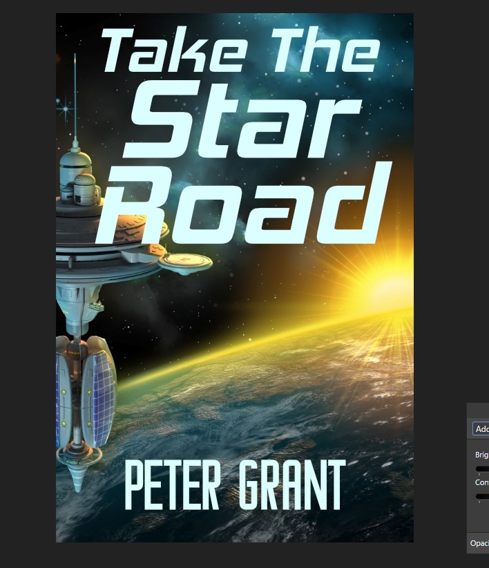
I’m just starting the process, here, with a font both Peter and I thought had some promise when we were sitting down and talking through the brief. I had the rare opportunity with this project to do something I can’t normally with a client – have meetings. It was great fun to sit with him, looking at pictures, and font samples, getting to know his likes and dislikes, and from there I was able to work off a platform of making his style into the book covers. Sadly, Avalea did not work for this title – it’s too rounded for one, a style I know Peter doesn’t like – and although we thought the sample looked sharp, I’m not happy with it on the art. This happens! It’s why I had a bunch of fonts in mind.
And then, I started to play around. For the post. Not just my general amusement! Although I think you’d agree it’s amazing how much font choice will change your perception of the kind of story lurking behind this cover.
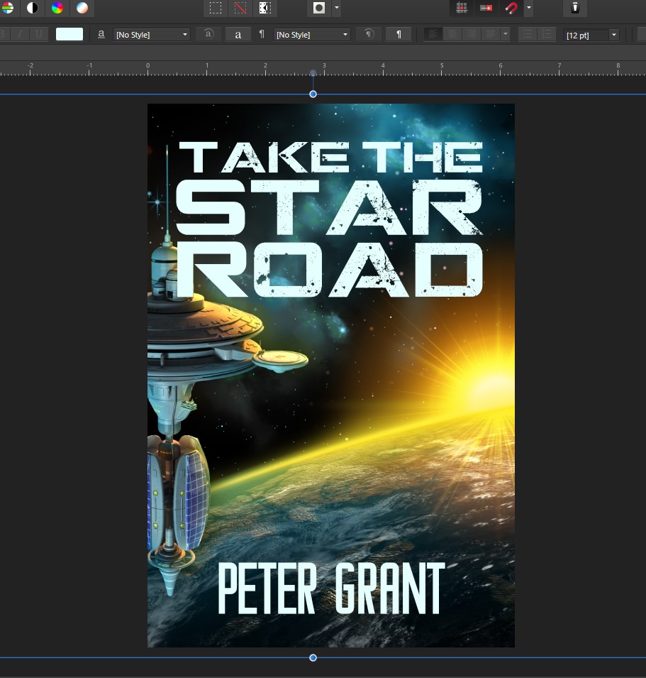
This font, CGF Locust Resistance, is a great font. However, Peter and I had talked about a more slender, elegant font for the title of this series, and this font implies, at least to me, much more MilSF action type than he wanted for the look. It’s a gritty font. You’ll note I’ve added Peter’s name now, in a font called Around. It’s a clean Sans Serif font I like for elegant readability.
This is also a good font! I think Hemi Head is great for signaling Science Fiction, although perhaps a touch on the retro side. I happen to know Peter’s not fond of the ‘open’ parts on letters, so I wouldn’t use this on his cover.
This font is called Marijan and, well, it looks familiar, doesn’t it? I had flashbacks to my childhood discovery of my Aunt Pam’s Star Trek novels as soon as I switched the title over to it. I’d forgotten about reading those! And I am fairly sure this is not the look Peter wants, unless he’s marketing for nostalgia.
Then again… OK, this was not at all serious. (I’m going to get such a razzing from Peter when I seem him next!) I was riffing on the retro theme, so I could show you all how to evoke that Golden Age pulpy paperback feel… the font is called Puppet Filled. Isn’t it great? Only not on this book. But still! So many awesome paperbacks pop into my head when I see it.
Again wanted to not be serious for a bit longer. This shows you how a typeface can completely change the mood of the cover. Pilar Typeface is a font I’d picked up for a completely different project (I’m helping my grandmother format and cover a book on Fire Lookouts of the West) and while it may work for that (I’ll be using it for exemplars next week, stay tuned) it’s not at all right for a SF cover.

Nikoleta almost made the final cut. I like the readability at thumbnail, the way the smaller wording on top fades back, giving it a dimensionality to the title, like it’s coming off the page at you. Ultimately, it’s a little more rounded than I think Peter would like, so I went with…
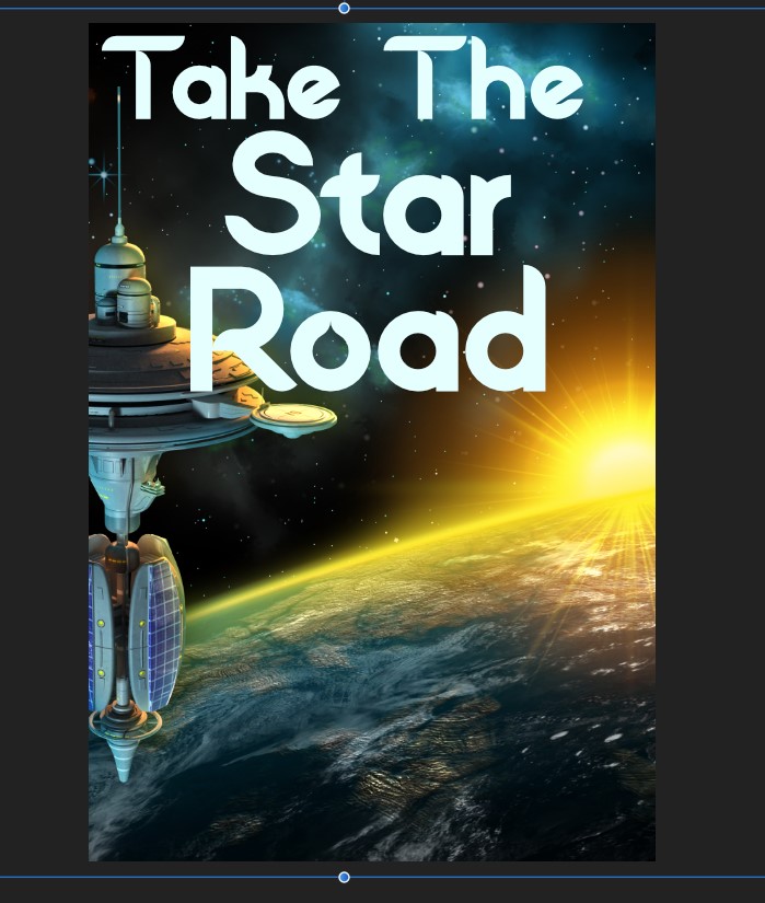
Venus Rising!
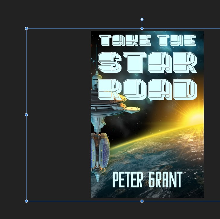
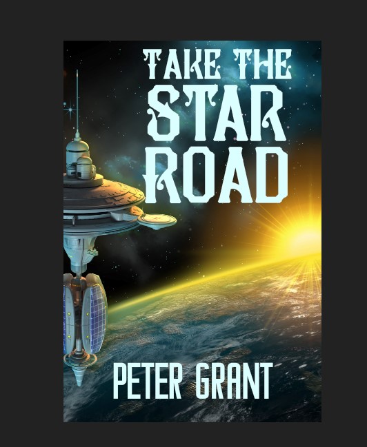
Peter and I had both liked this font when we were sitting down and it fits his aesthetic, while being futuristic enough to maintain a consistent SF signal on top of the space station and planet art. By itself on a more generic art, it would not be enough for a strong SF signal, but here it’s good. It’s subtly but clearly different from the author font, so that’s good, too. If those two are closely related it can become a bit confusing for the reader at thumbnail.
I’ll be back next week to dig more into how to pop text off the art, and make it look like it’s got life, not just pasted onto the cover. This is definitely an area where subtle is better than not… oh, and we’ll get into font colors (avoid red. It’s very tricky to get it right, and also, hard to read…) as well. I’m also planning to show some tricks for working with art that isn’t designed to be a book cover.
As always, questions in the comments are welcome!


20 responses to “Cover Up: Pick Two”
I’ve noticed that TradPub is leaning more and more on font over art for a lot of new lit-fic and “chick-fic.” Sci-fi and fantasy still seem to have genre-specific art on the cover, but that’s also shifting. More YA fantasy has comic/manga style art, or the “shiny black fantasy stuff” (think Twilight but with more detailed objects.) Otherwise, the font is becoming more and more of the signal, at least in what I see on the shelves at B&N.
I was on a panel back in September with a couple of artists who have been working with TradPub designing covers for a very long time, and they were talking about how the font is critical. Both of them would actually do the lettering on occasion by hand, to give the cover a unique look. I think that’s going to signal rather more literary, but it got me started on thinking about fonts, and how important they are on a cover. I still maintain that you could do very little art, with the right lettering, and have a fantastic cover. But that’s not easy to pull off – I would not recommend it to an amateur.
Always remember your art is not final until you figure out where to put the title and author.
People with long names and books with long titles have a lot less flexibility with fonts…. Which is a pain in the butt, especially for thumbnail readability.
Yes and no. For a longer name – like mine, for instance – I’d do a tiered layout. Emphasize the last name, stack the first above it, usually smaller than the last.
For a long title, I’d break it up as I have done here with Peter’s title. However, I’d also advise an author to think long and hard about a title of substantial length. Chances are readers won’t use it, anyway, they’ll ‘nickname’ the book, so why don’t you cut out the middleman and come up with a punchy, pithy thing to begin with? Also, likely more complimentary to the story than what the reader may choose!
Some titles, there are limits on what you can do by breaking them up. Especially if the art doesn’t play nicely
I always split my name, when I do my own covers (OK, when I go to SelfPubBookCover and get one.) Alma T. C. on the top line, then Boykin below.
Someday, I want to try one of those long, antiquarian, 17th century-style book titles that’s a plot synopsis as well as title. Someday . . . *rubs paws in anticipation*
LOL! and it will suit you so well!
Thank you for the tip about SelfPubBookCovers. Link saved!
You’re welcome. Sometimes their search function is a bit odd, (looked for “wolf.” Got lots of shirtless men. Sigh.) but they have a very wide variety for decent prices.
I’m almost finished with my first book, and starting to think about the cover. It’s an alternate history with the story taking place in the late 1930’s. Any suggestions for appropriate fonts?
You may want to look at the fonts that were in use then, https://fontsinuse.com/tags/378/1930s, and then look at Creative Fabrica or DaFont for something that evokes the same kind of look and feel.
Thank you, link saved for review.
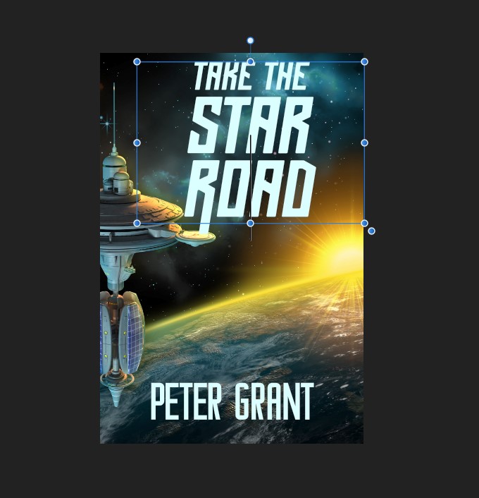
too much fill?
sorry, 3d artist in me coming out….
Too much fill where, Draven?
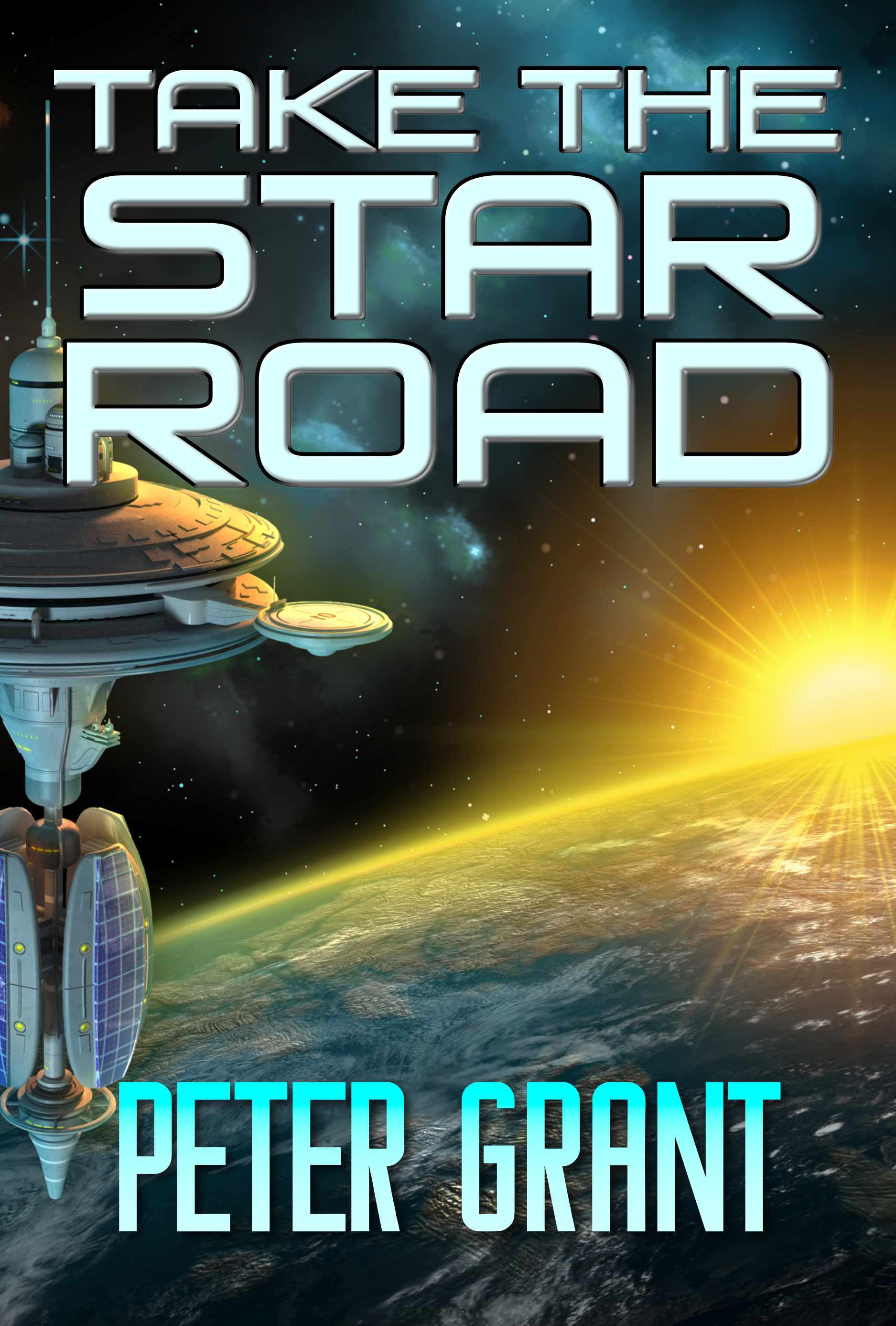
the space station has too much fill lighting for my taste . making it clear this is imo…
Ah! And that’s not me 😀 I grabbed the whole image from a stock site and bought it.
What font pack suppliers do you recommend, and how do you understand the licensing rules they give?
I’m thinking of a logo on your website, or a T-shirt design, or just hitting the jackpot and selling more than 10k of your books. It could happen!
This is why I’m currently using and recommending Creative Fabrica. Their licenses are easy to understand. I’ve actually talked to stock photo sites in the past about licenses when they were unclear, and have gotten prompt responses, so that’s always a good way to start if a site is unclear.
And here’s the license for CF. https://www.creativefabrica.com/single-sales-license/