
Today’s how-to is a non-fiction book, so it really is true! My grandmother had been working on this book for some time, and it’s part of my Grandpa Ron’s life passion, so I’m honored to be helping.
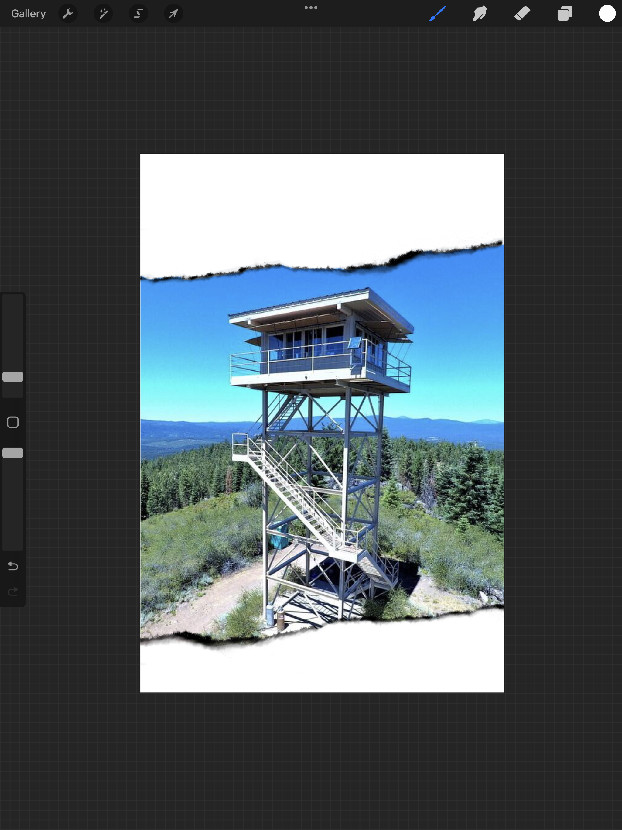
The criteria for this cover are very different than they would be for a novel. For one thing I’m using a photo – in this case, taken by Ron Kemnow of the fire lookout at Parker Mountain. I have several gorgeous photos my grandmother sent me that Ron took, but I am choosing to use just one, rather than do a collage on the front. As I told her, this has to pop at thumbnail… and from across the giftshop in the historical society museum. It’s a very niche book, and I understand that the market for it is going to be looking for a couple of markers: one, that iconic fire lookout image, and two, it has to signal history.
Ok then. Looking at Amazon for historical books to model the cover after…
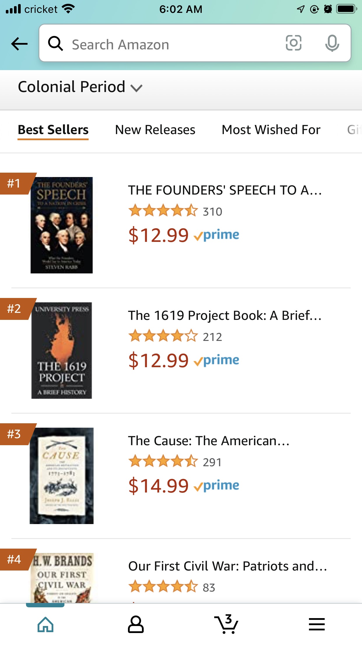
Well that’s not terribly impressive. Most are nigh unreadable at thumbnail and the art is, well, let’s not and say we didn’t.
Trying a different category…
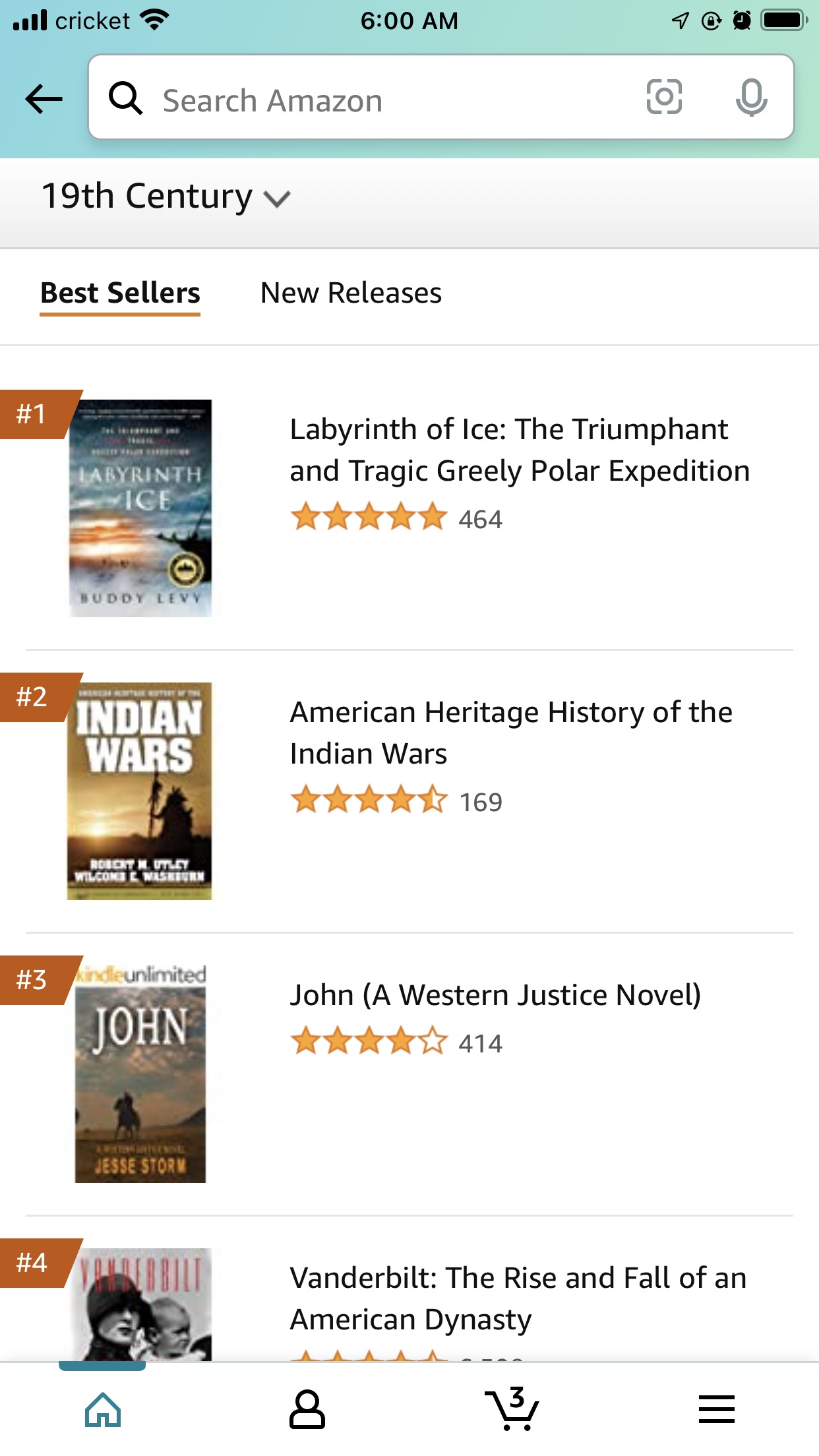
And again, not so bad but why is there a novel here? At least it’s a well-marked one as being a work of fiction. Indian Wars also signals novel, with that font and layout, but I don’t think it is. Confusing. Labyrinth of Ice really signals historical interesting well, but that’s not the right direction for the book I’m working on, which is (sorry, Grandma!) a bit drier than the historical drama the Labyrinth cover implies. So!
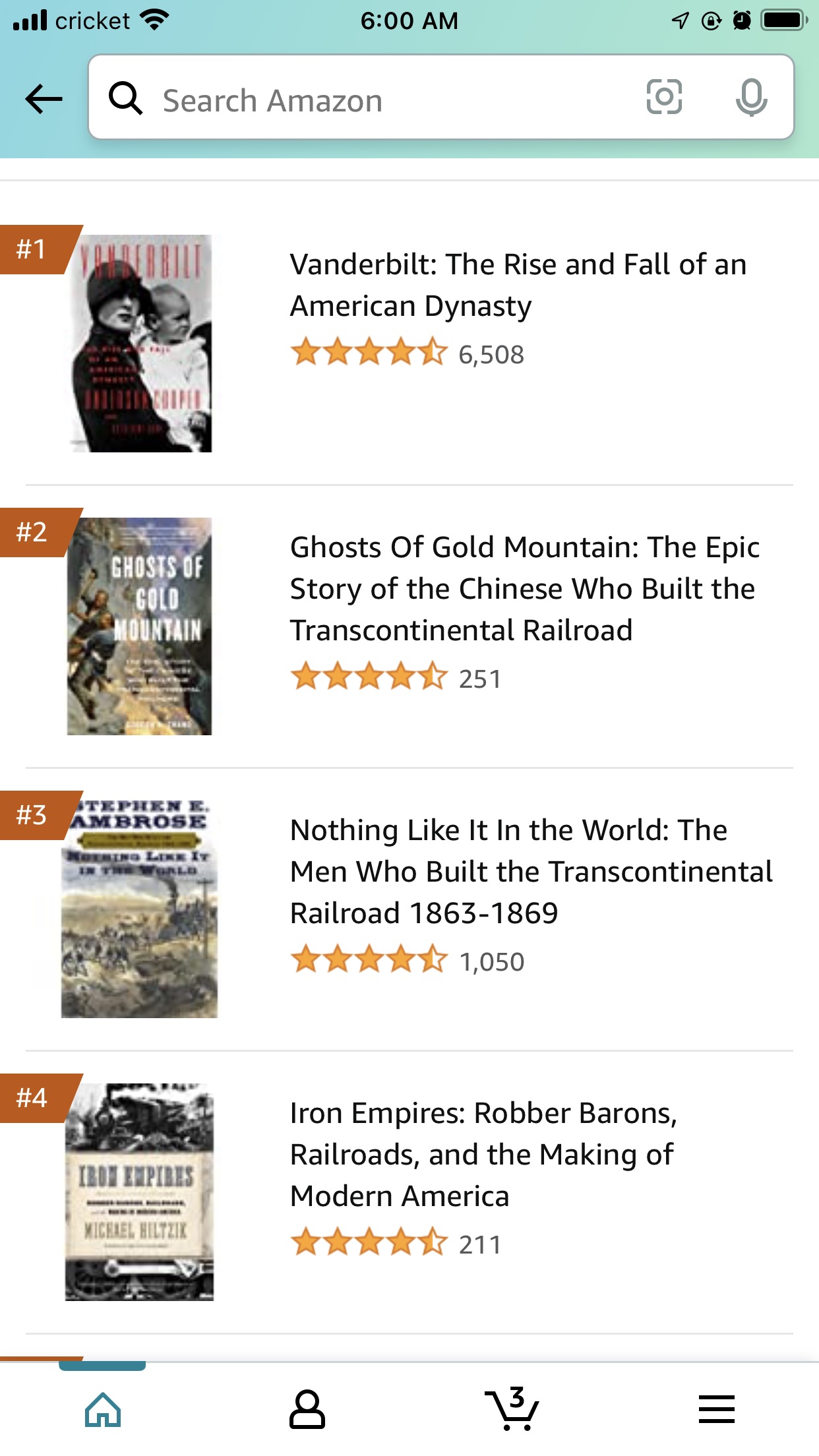
Railroad history, and I’m seeing a bit of a theme here. Using borders or blocks of plain color are a classic way to allow for font layout that is also readable – like Iron Empires, there, although the tiny font gets a bit lost, and Cause, up on the first screenshot which has the same issue.
Beginning to work…
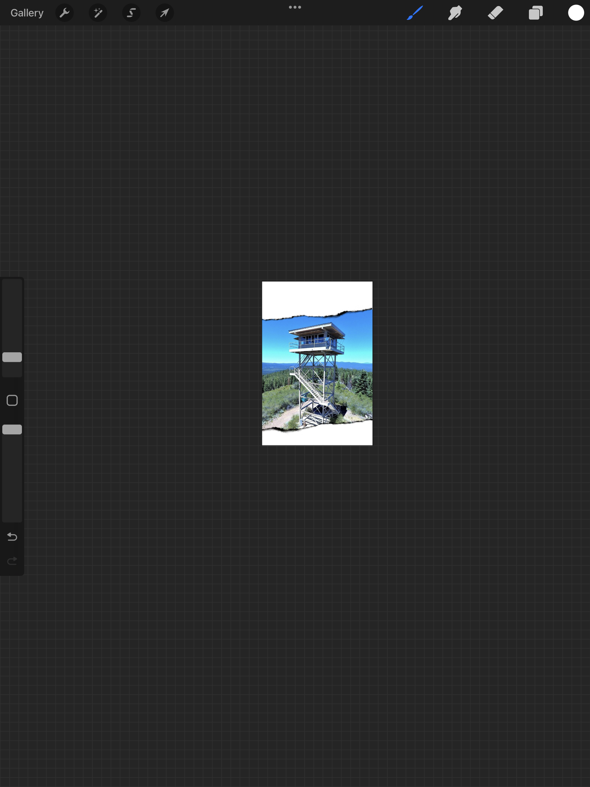
I’m screenshotting my workspace, so you can easily see the thumbnails. I do this while I’m designing, shrinky-dink the art, so I can make sure I’m on the right track. I’m using my Grandpa Ron’s photo as-is, with his edits to tweak the color, because it is so vivid and saturated it’s eye-catching. It’s not unreal, either, as anyone who has been hiking up in those mountains will assure you. I’m using a torn paper effect to set the photo off from the page, and give it some dimension while allowing me a little room to lay out text for title and authors.
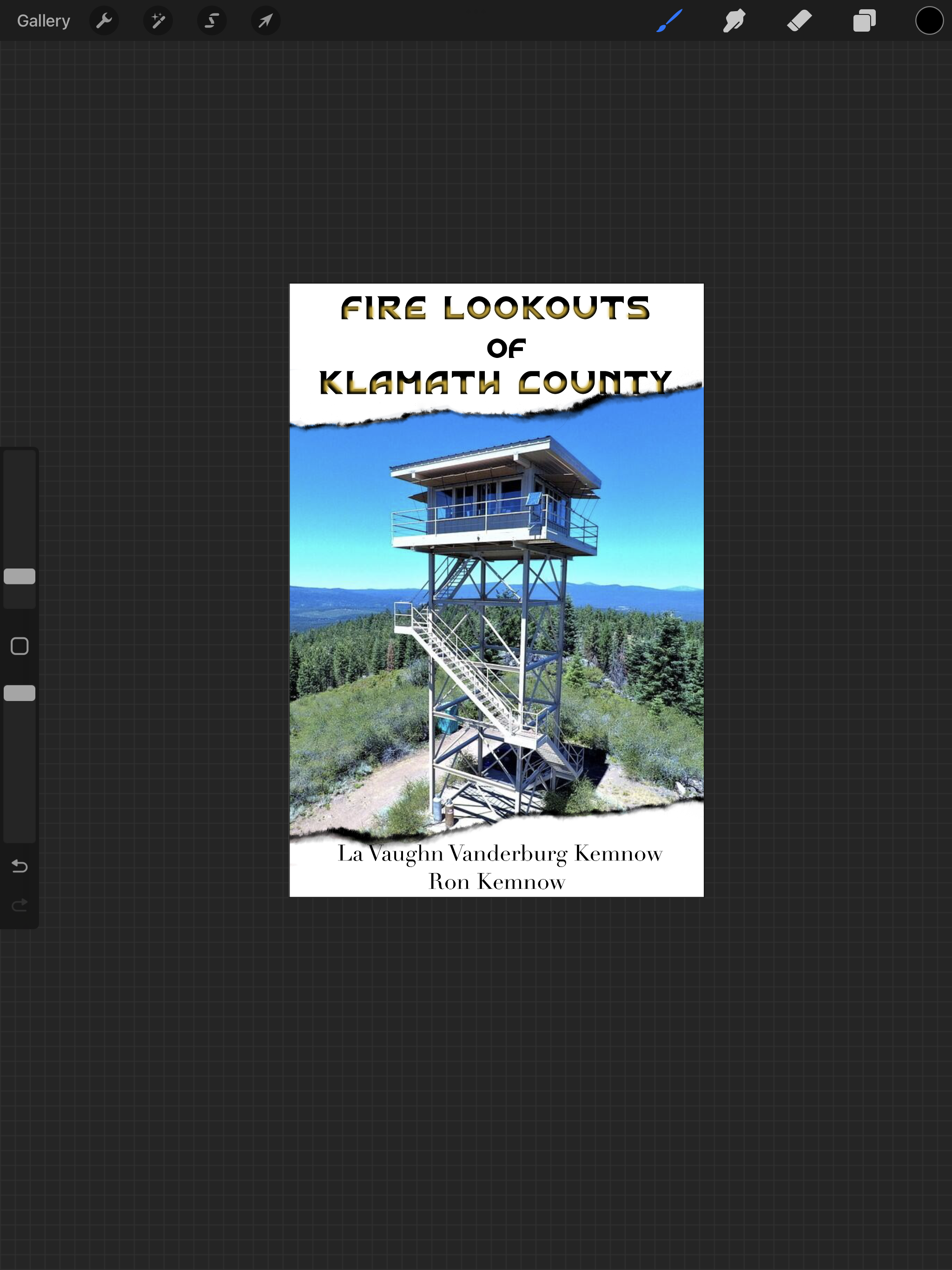
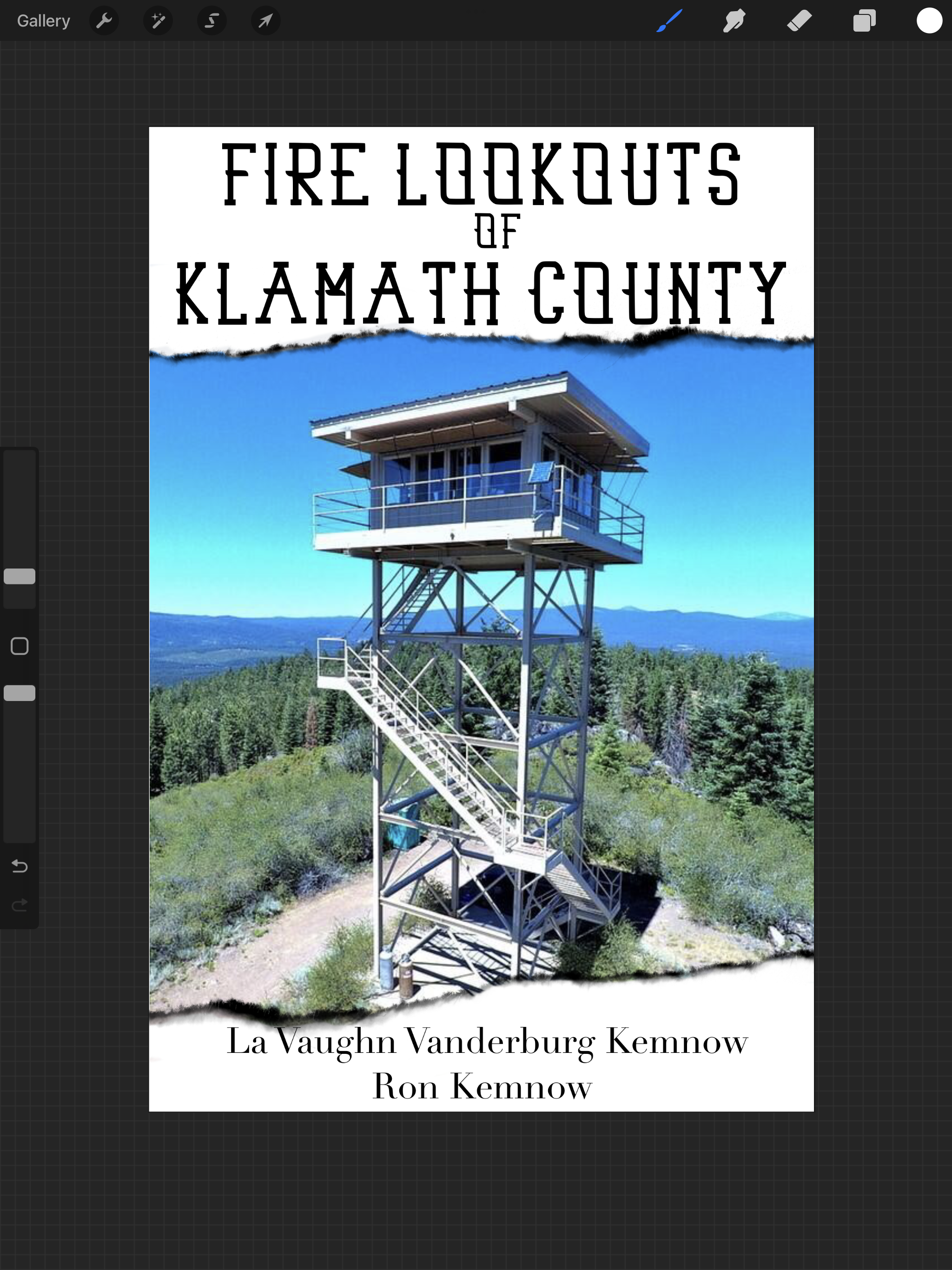
Now comes the fun part of trying to find the right font for signaling history, not looking childish, and remaining readable at thumbnail.
This isn’t a bad font (it’s Morgenwalsh from Creative Fabrica) but it doesn’t signal the era I want here. Much more an Art Deco look to my eye.
This font, Old Whisk(e)y, has an interesting double-layered effect, but even before I had that tweaked to where it should be, I could see it wasn’t right for this cover. I ditched it, and moved on.

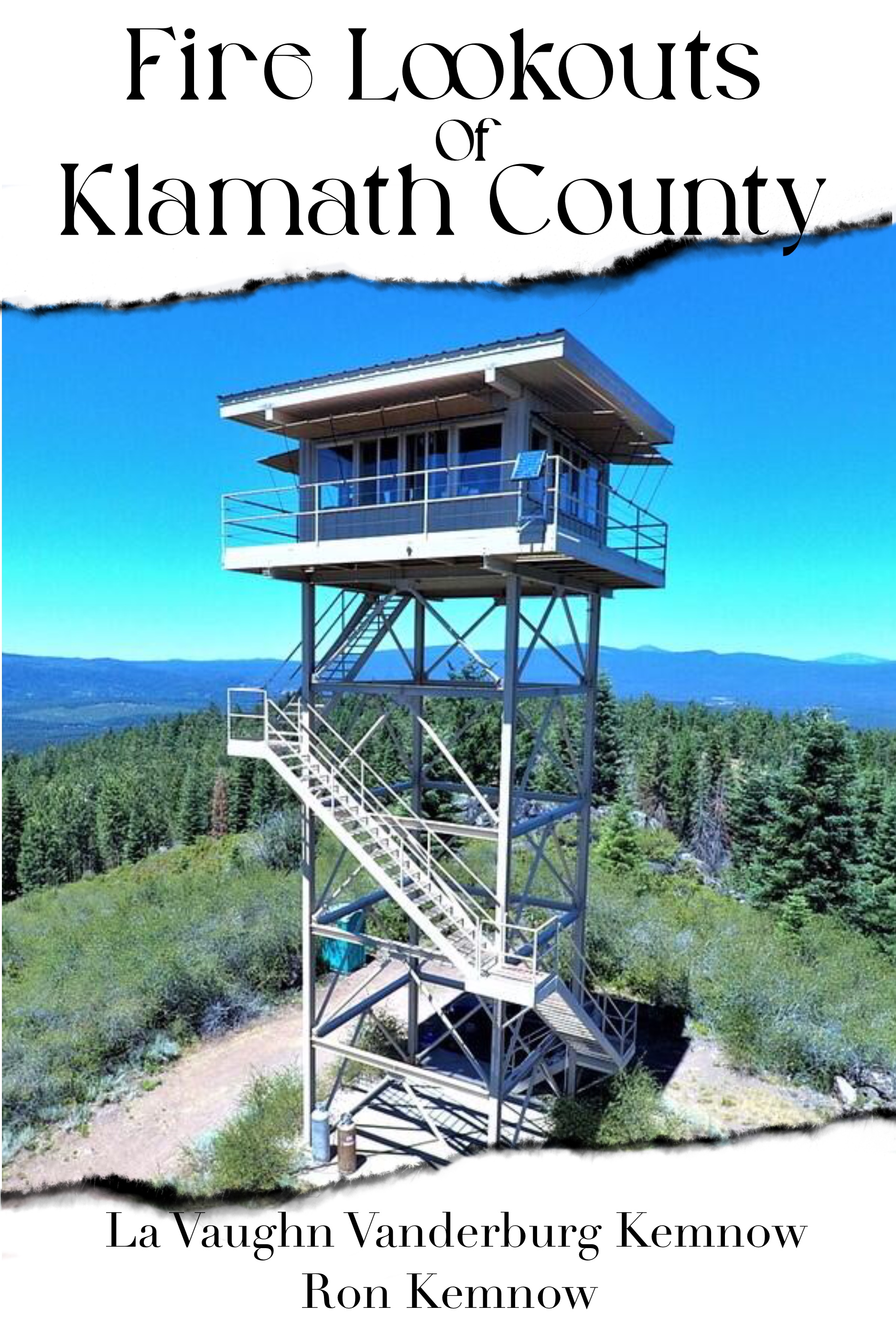
Here, finally, was something that was going to work, a font called Socaster. It’s got a touch of the Old West to it, it’s readable at thumbnail, and with some adjustment to my ‘tear’ line, it works pretty well. Final cover may vary – I still have to run this by my grandparents who are asleep in bed at this hour! I may also do a proper ‘paper’ effect on that plain white, with some sepia tone. But for the post, it was about finding the font and laying it out.
Next week, stay tuned for the final installment, which will involve a Honey Badger, as I lay out the cover for The Ratel Saga, the second coloring book I’m collaborating with Lawdog on. Children’s books, and by extension a coloring book, are different!
Hopefully you are enjoying this little series, and finding it helpful.
(Header Image: Photo by Ron Kemnow, McCart, Montana, Bitterroot National Forest, Ravalli County)

9 responses to “Cover Up: It’s True”
Photographs for photographable things!
Very interesting. I got exposed to magazine/newspaper layout in journalism school, but that was (gasp!) 40-odd years ago, when cutting edge tech was an IBM Selectric.
Hah! And this was done with Procreate on an iPad, my usual workspace is Affinity Photo. Add to that I have hundreds of fonts at my fingertips. It’s a change from highschool doing clip art and photocopies for the school paper.
Cover art for non-fiction seems a bit more consistent over time than does art for fiction. (Which might be due to the somewhat sclerotic administration of academic presses. Far less editorial turn-over.)
Very nice! I’m curious if instead of torn paper, but burned edges might signal the fire aspect? Or would that signal to much fire fighting action aspect in the work?
I use a very limited photo editing program (paint.net) so I don’t have access to too many fancy font’s or font tools, but one trick I’ve found is that I take the text, when it’s done, and I copy it to another layer, then change the color to something different (typically a darker color, but not always) then I shift it to the right and down a pixel or two.
It’s the poor man’s way of getting depth/shadows on a font to make it pop off the cover a little more.
I do that as well. If you have the ability to blur, you are mimicking drop shadow completely.
That is exactly how we did drop shadows years ago when computer graphics were younger than they are today. By the way Cedar, I just started reading your work, and I’m delighted. Good stories told in a easily read style. Very nice.
Thank you! I’m so happy you are enjoying the stories.