
Last week, I described my first foray into Fiverr in search of a cover. I admitted the process was both easier and more difficult than I expected. Easier because the process of finding someone and staying in contact with them during the creation process is seamless and, at least for me, quickly done. More difficult because a number of those you will come across may be good to awesome at what they do, but they don’t all know the technical requirements sites like Amazon place on covers. So you have to be up on that information and make sure they know what you need.
But, that post and a couple of conversations I’ve had since them pointed me to another issue authors have when it comes to covers. Now, I’m not going to try to tell you how to create a cover. I’m not a cover artist or designer. Been there, done that and know I don’t have the time or desire or money to get the programs I need (and learn them) to make the quality of covers I want for my books. What I am going to do is talk to you as a writer about covers and about what you need to pay attention to when looking for a cover artist.
First and foremost, if you are contracting with someone to do your cover you need know what sort of covers they have done in the past. If you write science fiction, hiring someone who specializes in mail order bride romances probably isn’t the smartest thing you can do. If you write romantic suspense, hiring someone who specializes in Victorian romances might or might not work. What you do then is look at their sample covers and see if they do anything that “reads” modern. If they don then you might be able to use them–note the “might”. More on that in a moment.
When you begin talking terms with the cover designer/artist, cost is only one of the things you need to pin down. Other facts to look at are:
- How many mock-ups will they initially send you to choose from?
- How many changes will they include in the cost of the cover?
- Will they do both e-book and print covers for that price or is there an additional cost to doing the wraparound?
- Will they add the blurb on the back cover of the print layout?
- Will they provide you with the source files for your cover (PSD files or similar with layers) which allows you to make minor tweaks of the files?
- Will they select the stock images being used (or select several examples for the main image that will be part of the cover and let you then choose) or do you have to provide the stock image(s)?
- Are you contracting for a one-of-a-kind cover or is it a pre-made cover that other authors can also license and use?
These are just a few of the questions you need to ask. Now, a bit more on each one.
The more money you invest in the cover, the more mock-ups and changes you are usually allowed. I suggest making sure you have at least two to three changes included in the contract. From personal experience, not only with Fiverr but with other designers I’ve dealt with either for myself or other authors, it sometimes takes that many to get the right feel for a book. The first image they present might not be the feel you want for the cover. Remember, it doesn’t have to be a direct scene out of the book but it has to signal the genre and what the book is about.
Then there’s the lettering. Ah, the lettering. It is amazing the number of cover artists and designers who don’t understand that the font they use has as much impact on a reader as the artwork does. Certain fonts signal certain genres and sub-genres. You, as the writer, need to keep that in mind.
Even if you aren’t planning on releasing a print book right away, I would recommend you go ahead and get a cover flat done. If you have the source files, you can manipulate it to fit the bleed, etc. All you need to do is give the artist the size of the book and a general page count. The rest can be fiddled with. (Yes, I hear Sarah and Cedar gnashing their teeth here but it is possible and it will prevent you from having to completely recreate and pay even more for that print cover later. It isn’t optimal, but it is there.)
If they do the text on the back cover, you have to make sure they understand the rules/requirements of whatever company you use as your distributor. In other words, the area for the bar code has to be left blank. If necessary, send them the cover templates available from whichever company you use. This also means you have the back blurb ready when you contract for the cover, or shortly afterward. However, if you are comfortable with programs that will let you do the blurb yourself, then do so. Just make sure the font you use is compatible with the rest of the fonts on the cover.
Source files. This is so very important. You want the source files so you can make minor adjustments if necessary. That means not only getting the jpg file but also the psd file. The layers need to be there and not merged down. But–and this is a big but–most cover designers/artists will not include this unless you pay an additional fee. Also, if you are buying pre-made covers, you very often are not given the option of getting the source files. So this is where you have to start looking at what your potential ROI is going to be.
For example, the cover the designer from Fiverr did for me had horrible fonts for the genre. By having the source files, I can change the font and placement of the text. Without that, I’d be stuck.
Here is where I’m really leery about using an artist/designer I don’t know. Stock images. Let’s face it. Most of us would kill to have an original piece of art for our covers. But that’s not going to happen, not unless the writer is also an artist (No, not Norm. Shudder) or has a family member or friend who will do the cover art for them. For those of us who don’t have that, we resort to stock art. I’ll let you in on a secret, so do traditional publishers. But that problem with using stock images is that those images or elements can be used on other covers. More than that, you must be sure the image is licensed and licensed properly for commercial use. If not, be prepared for not only a take down notice but a demand for damages from the artist.
So, you have to ask the artist if they have the rights to elements they use in the artwork. That might not be enough to protect you in the long run, but it is a start. The smart artists, however, will have you license the elements or images to be used. Some will find the elements and, once you approve them, give you the information about where to find it so you can buy the license. Others will ask you to provide the art/elements you want to use before they get started. In other words, be very sure you know what your artist wants and needs before you finally sign on the proverbial dotted line.
The least expensive way to get a cover is to go with a pre-designed one. These are basically, well, basic covers. They will usually run between $25-$100, depending on the designer and if you are getting exclusive use for the cover or not. These are generic and I would recommend against using them unless you find one that just screams to you that it is the right genre for what you’re writing.
Now, you’ve come to a decision about who you want to do your cover and you have received your mock-up. What do you do? The first thing is make sure everything is spelled right. Yes, you read that right. I was reviewing a cover design for someone the other night and one of the words in the title was misspelled. The author hadn’t caught it and was ready to approve the cover.
The second thing, especially if you write period pieces, is to make sure the dress of your characters comes at least a little close to what was worn during the period the story is set in. You don’t want a Napoleonic romance couple dressed in Victorian garb. Trust me, you will hear from folks who spot the difference. Another example comes from several years ago when a traditional publisher ran with a cover with the female main character depicted as being a different race than the author described her. The hue and cry was very loud on that.
Conversely, if your story takes place in modern times, don’t let your cover artist put your main characters in clothing that is a century or more out of date. I don’t care if you are writing a romance and the scene is supposed to take place at a ball. There is a difference between a modern day ball dress and what couriers and courtesans wore long ago. This is especially bad if your font is one that reads historical romance instead of modern day romance or romantic suspense, etc.
In other words, just because you don’t create the cover yourself, you aren’t absolved from having to know the basics. Your cover and blurb are what entice a reader to look inside. Don’t leave it in someone else’s hands without having the final say-so. Learn the basics of the craft and be prepared to speak up if something doesn’t look right to you. Sometimes, that means paying for a cover and never using it because it just doesn’t work.
Finally, you have to look at how much money you are paying for a cover. Well, let’s be honest, you have to look at how much money you are paying to put your book out there for people to buy. There are Indies who not only pay for covers but pay someone else to convert their book into the appropriate format to upload to the various stores (You’d be surprised the number of folks who don’t know they can upload a Word file or get free conversion apps/programs to use themselves). They also pay someone else to write their blurbs. Then they wonder why they are losing money on their books. More often than not, it isn’t just the writing of the book that keeps readers from buying something else from them or from recommending the book. It is the cover, oddities in conversion a and/or the blurb.
Again, it all comes down to you, the writer. I’m not saying to do it all yourself. I know there are folks out there who can’t figure out how to do a cover fo the life of them. Others, like me, can do them but know others can do them better. Blurbs are hard to write but you can learn to do them. Where I do hit my head against the desk is when I see authors paying to have someone convert their books, especially if they only put out e-books. All too often when I ask about it, they don’t even know they can upload a docx file and Amazon, et al, will convert for them. They don’t know because they never cracked open the how-to sections of each platform.
Let’s face it. You can easily spend $500 or more, lots more, if you hire out every aspect of getting a book ready for publication. If you add in the cost of a decent copy editor or proofreader, up that cost up more. Much more if you look for a content editor. But we’ll discuss those costs later.
When it comes to covers, know what the best sellers in your genre and sub-genre are using. Find examples to give to your cover artist/designer so they know the feel you are looking for. Don’t be afraid to tell them they aren’t hitting the mark for you. Most of them want to do their best for you because you will bring in more business for them if they do. But don’t continually nitpick because that will sour a relationship quicker than you realize. Most of all, know what you are contracting for. Finally, as amazing as that artist/designer is who is charging $500 or more for a cover, ask yourself the hard questions: are you earning enough from your writing to afford that much for a cover, especially if that is only for the ebook cover? Is the cover enough to increase your sales to not only pay for the cover but to then start putting money in your pocket?
Cover art and design is one of the most important things you will decide upon for your book. But it is also fluid. What works today might not work 18 months to two years from now. Keep that in mind as well when you start considering that very expensive cover. It might work now but when the book stops selling and you decide you need to put a new cover on it to give sales a boost again, will you be able to afford to?
Anyway, I’ve rambled on long enough. Time to get to the paying writing. Until later.

24 responses to “More things to consider when it comes to covers”
Your other solution is to find a writers whose covers you like, e.g., Chris Nuttall, and retaint ehs ervices of the same artist. See my novels Eclipse and Against Three Lands for details.
As I noted in my previous post, that only works if the author gives credit to the cover artist/designer. Many authors, including traditionally published ones, do not.
Do not just ask for source files unless you are willing to pay for them. And you will pay for them, more than likely. What you are getting is the raw work the artist used to create your cover, and which the artist is very aware you can and probably will use in order to not hire them for the next cover. I’ve given source files twice, and only twice, in the years I’ve been doing this. In one of those cases, it meant I never again heard from the author. Which I was aware was probably going to happen. So I’m very wary of releasing those.
I saw an example again today of a stock element on a cover that was definitely a licensed image, despite, I’m told, the cover artist saying they’d purchased it from a stock site. I know where they got it. I bought the same element. Only in my case I found out where the element had been drawn from, and didn’t use it on clients covers, much less double down on ‘no, no, I bought it and can use it…’
Cedar’s absolutely correct and I wasn’t clear on that point. Source files will cost you more but it is worth it. I also understand why she is wary of releasing them from an artist’s pov. However, from the writer’s pov, most cover designers only allow for a certain number of revisions in the contract price. So if you use up those revisions and later need to add a series title or tagline to the cover, you either have to pay more for them to do it or you can do it yourself if you have the source files. Frankly, it is also protection for you to have them in case something happens and the artist’s computer goes belly up, they drop off the face of the earth, etc. But, you need to be very clear on what sorts of changes you can make under the terms of your contract.
And if there’s 3d involved and you ask for *those* source files, expect more expense and huge files that may or may not be useful to you. If they are using prebuilt models from Turbosquid or whatever, they may not be able to give you those models.
Yep. But, again, it is all according to what you contract for. If they can’t/won’t give the source files, you have to make sure you get enough editorial chances to correct any major issues with the cover. In other words, you get what you pay for. The more editorial chances you have, the more files you get, the more you are going to pay.
Sure, and I can see lots of things i could do in giving you the raw rendered file just to give you additional options… like giving you the PSD slightly overscanned (rendered image larger than the image area, so you can play with positioning) and giving you the PSD at maximum bit depth (so exposure can be adjusted), etc.
The reason I’m not doing it, myself, is I don’t see how i can make you an image in a reasonable amount of time for a price that seems to be within the budget most of y’all can pay, and yet get paid reasonably for my time. So yeah, I have at least considered it.
I can offhand think of two novels in which the cover got the race of the lead character wrong. In Imperial Earth (Clarke) the error obscured a major plot point. In Emergence, Palmer, I didn;t pick up clues in the book, but the author later noted the issue.
How good an artist does a person need to be to do their own artwork? Are we talking “Took third at the middle school show” or “regularly sells art for $”?
How do you determine if you use the right media for your genre? Is there a list to look it up, or is it back to looking at existing covers? Paint never does what I want, for example, but charcoals and pencils occasionally do.
Are there any rules about using artwork you own in a cover? Purchased or inheirated or gift, artist living or dead or unknown? Are there best practice methods somewhere for scanning framed oil paintings for covers?
The answer to your first question also answers your next few. You have to judge by what other successful books in your genre and sub-genre use. If your art is of similar quality, use it. Look at the best seller lists in your genre and sub-genre to see what the more successful books are using as their covers. Look at it critically to see how it is signaling genre. As for fonts, you can google that. There are several sites that list which fonts are best for what genre/sub-genre.
As for using artwork you own, that’s a different matter. That would need some research but the safe answer is that unless you have received the rights to use the artwork for commercial purposes, don’t use it. The exception is if the art is old enough to be out of copyright protection.
Even if it is out of copyright, make sure you don’t include the frame in the scan or use it on the cover.
Someone made a Handy Chart:
Click to access BestFontsByGenre.pdf
Not sure how good it is, or whether the cited fonts are okay for commercial use. But it’s a quickstart point.
“Conversely, if your story takes place in modern times, don’t let your cover artist put your main characters in clothing that is a century or more out of date.”
Oh boy, I can’t tell you how many covers I’ve seen on Lousy Book Covers of Old West novels with people in modern dress or Amish Romance with ladies in less-than-Amish garb.
It wouldn’t surprise me at all. I’ve seen too many to count as it is. What gets me as much as that are the covers where the modern day heroine is dressed like she just stepped out of Pride and Prejudice. Nope, nope and nope again.
See the original cover for “To Ride Pegasus,” where the 60s-ish characters contain three woman dressed like ancient Greeks and one guy who looks like he just stepped out of a D&D source book.
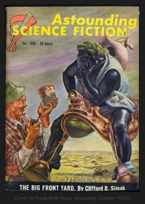
Ah, the 1970s and 1960s covers for sci-fi and fantasy… From “duuuuude, good weed” to “It says Pegasus so make it Greek!” to “just slap a dragon on it. Dragons are trendy.” http://www.goodshowsir.co.uk has some greats and… not so greats.
Actually, I would call many of those covers “wicked acid” and a handy kaleidoscope. (I mostly have examples of those for RAH – the Signet paperbacks being some of the worst.)
On the other hand, PV occasionally puts up examples of modern “literary” covers – and they just look like they lost the kaleidoscope, but kept track of their dealer.
ZsuZsa, I remember that cover. If it came out today, no one would know what the book was about if all they had to judge by was the cover.
Like I was just saying: https://lousybookcovers.com/?p=1772002#comment-area
I once had a story published in a magazine where the characters were all Victorians — and the illustrations had the female characters in pants.
Oops.
Does any check what a cover looks like on a Kindle e-paper reader?
I just picked up a Kindle Paperwhite 3rd Gen, and am looking at the cover of A Tapestry of Fire. It definitely can’t compare to the color version, but the text and the MC’s face are clearly visible. (BTW, I do like the black on white text quality and sunlight readability of e-readers; I just wish 13″ ones (for reading technical e-books) were affordable)
I don’t know what other authors do, but I do check the e-ink covers. I want it to be at least halfway legible on original Kindles, paperwhites, etc. However, I also don’t spend a lot of time worrying about it because that isn’t what is going to sell the book for the most part. How it looks on a backlit color screen is.
I have a Kobo e-ink reader, which by default uses the cover of the book you are reading as Screensaver when you put it to sleep (that is one of the selling points of the brand for me). Most covers translate ok to black&white, and you can identify the details of the art and read the title and author. Normally covers are designed for contrastbetween the different elements, so that translates well to a grey scale.
Remember, it doesn’t have to be a direct scene out of the book but it has to signal the genre and what the book is about.
This is often the problem an artist will run into, and rarely will taking a scene from a book turn out great as a cover, especially in signaling genre / building expectations. (TXRed’s Shikari book cover that I did was I think the best success I’ve had on that, and I had several elements from her world that signaled ‘not Earth, not Fantasy’.)
Regarding thumbnail size I try to zoom out as much as I can when checking for title visibility, roughly matching it to the size I see on Amazon’s webpage.