My brain is scattered, thanks to lack of sleep. Idiot animals have decided it’s a good thing to get me up between 0400 and 0500 every morning. While that gives me a jump on the day, after a week or so of it, the brain decides it doesn’t have to function even if the body is up and doing things. So bear with me as I try to make sense out of the mush that is my brain.
I’m going to start with some promo. Last month, Draft2Digital contacted me about possibly being included in a HumbleBundle for first in series SF books. I jumped at the chance. It was a way to get one of my series–in this case, Honor & Duty–out to potential new readers without me having to angst about promotions. What I didn’t know was who else would be included in the bundle. Let’s just say I did a bit of a fangirl squee to find out Brandon Sanderson, Kevin J. Anderson, Frank Herbert, Alan Dean Foster, and others I love to read had titles in the bundle as well.

Here’s the link for the Stars of Sci-Fi Summer. It’s really a darned good deal. 35 titles for a minimum of $18. The charity being helped by this bundle is First Book that helps get books into the hands of kids.
Next up is a big thank you to everyone who has bought and spread the word about Destiny from Ashes. You guys are great and I’d appreciate it if you kept spreading the word. It really does help.
Speaking of Destiny from Ashes, I want to piggy-back onto Sarah’s post about covers from last week. Well, not so much piggy-back as go off on a tangent. Everyone here knows the importance of having a good cover. Even for e-books, it’s important because the cover helps cue the reader into what your book is about. The image and the fonts used give indications about genre and sub-genre, audience, etc. But as writers, we now need to start thinking beyond just the book cover to other ways to use graphic representations for our books.
Some months ago, Amazon opened up the ability for authors using the Kindle platform to add promotional images to the product pages. This “A+ Content” is accessed through the promotions tab via your dashboard. It allows you to add the same sort of visual teasers for your books on the product page that publishers have been able to use for some time now. If done properly, it is another sales tool/promotions tool that grabs the reader’s eye and entices them to buy your book.
If you check out Amazon’s page about the content, you’ll see examples. You can use this new graphic content for author info, teasers about the book or series, show reading order in an attractive manner, etc. What you need to remember about the A+ Content is this is the sort of thing regular Amazon sellers have been able to utilize for years. It is basically an ad within your product page meant to encourage an instant purchase.
But it means paying attention to what other authors in your genre and sub-genre are doing, what sort of images they are using, etc. It also means not necessarily using–in fact not using, at least as the main image–your cover. This A+ Content is meant to be an addition to the cover image. So it takes time to learn what works, which format you want to use, etc. It is a useful tool and one I need to go back to using.
Another thing I’m trying to get used to doing and recommend every writer out there consider doing is making new headers for your social media accounts, blogs, etc., when a new book is about to come out. I’ve been doing that for the last several books and it, too, helps. It is a visual reminder that something new is coming and it should include the pertinent information like title, release date, etc.
And, no, you don’t feature your book cover as the only graphic on the banner. Yes, have the cover on the banner. But think of it as A+ Content modified.
Here’s one example of what I’ve done.

I did not include the book cover, but there’s a blurb for the book, the title, series name and release date. The fonts are the same as what I used on the cover. The image to the left comes from the series of images used for the book image. So it keeps the feel of the book cover.
Here’s another example from one of my books. Again, the cover isn’t present but that was a choice made to keep the banner from being too much. The background and the woman’s image hit the mark, imo, for what the book is. Yes, it needs work, but it is a learning process and i am still learning. But, putting it on top of blog posts and using it as a FB header helped push sales.

Another example is the banner for today’s post.
Here’s the key. You find images that fit the genre and sub-genre. You match the fonts to those genres and sub-genres. You learn to use layers so you can have one master image file you can change as needed for dates, etc. You start using the image/banner a month or so (more if you are targeting promotions) with the release date information. If you are doing a pre-order, you update the image with something along the lines of “now available for pre-order” and the release date. Then, when released, you can removed the release date information and change it to “now available” or something similar.
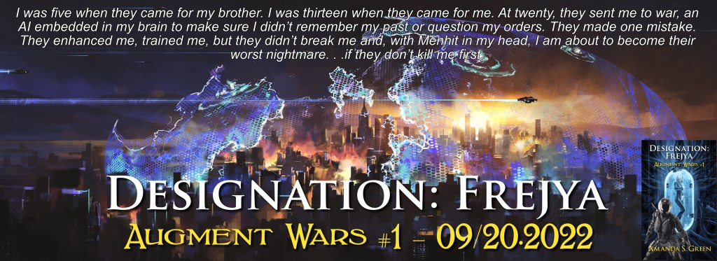
So, there’s a new header for today’s post. It’s the very first and very rough draft of the banner I’ll be using for Designation: Frejya. I did it in Affinity Photo and it took approximately 35 minutes, including time out to take the trash out because I forgot to do it earlier this morning. The base image is “A city attacked by aliens” by liuzishan.
The image is licensed via Adobe Stock.
There are some several layers. Each text element is a layer. The book cover in the bottom right corner is a layer and the base image is a layer. That lets me edit each as needed. The main information is all there: a teaser which is a rewrite of the blurb on Amazon and the other storefronts, title, series name and number, book cover, release date and the fact it is now available for preorder.
And that is my bit for promotions today other than hitting publish here and posting the link elsewhere. Then it is back to work. But, for half an hour’s work, I don’t think it’s too bad, although I will be fiddling with it some later to tweak a few things.


12 responses to “A little of this and a little of that”
*taking notes* Good information! Thank you, ma’am.
Not sure how helpful it will be, but considering how poorly ads are doing on a number of fronts that we used to be able to rely upon, I’ve been trying to find other ways that don’t cost more than the return on investment. Images like what I used as the header are multi-purpose and that makes them attractive, imo. They also do help grab the reader’s eye. So, finger crossed they continue to work.
I know from my perspective as a reader, they’re more likely to catch my attention than the ads. Especially since they also tend to be a little less screamy and in your face. Subtle and cool ways of putting work out there are always good to look at. Even if they don’t stay useful in that exact way. I’d rather have a dozen slow build tricks than two tricks that spike and then go POOF.
That’s pretty much the way I look at it. I’d rather take a few minutes to do a header image I can adapt as I get closer to publication date and then for post-publication than spending money on an ad that might not be seen by more than a handful of people (FB and similar sites). Review and recommendation sites like BookBub can be incredibly successful when you run an ad IF you run the right one at the right time and hit the right audience. Certain genres do better there than others. It all comes down to ROI and banners and A+ ads have more ROI for me right now than ads that might cost me hundreds or even a thousand or more to run.
Sigh.
I don’t doubt the truth of anything you’re saying, Amanda. Please don’t think I am, or that I’m complaining about you giving us true information. Rather, I’m complaining about the universe that has allowed the primary method of advertising print products be graphic. I’m not a visual person; if I were, I’d probably be hawking my pictures on fiverr rather than trying to write the stories behind them. Doing a cover for each book is straining enough. If I also need to be doing banners and “A+” content and God-knows-what-else…. It’s almost enough to make me wonder if this publishing thing was a mistake.
I hear you and totally agree. I hate this stuff. It’s why so much of it, especially banners, etc., is hit and miss. It is also why I try to find ways to save time and money doing them. And, while it seems like so much of our work is promotion and a lot of that is graphical, it really isn’t all that different from what it used to be.
Under the old trad model, if you were lucky, your publisher composed ads for your book and placed them in papers, magazines, etc., where you would get some exposure. They might print out bookmarks for you if you were having signings, etc., and cover flats.
Over the last decade or so, I’m seeing more and more traditionally published authors doing that part of the promotion wagon on their own. Publishers just aren’t doing what they used to–not that they did all that much unless you were a best seller or their new best thing. They might–might–give over some cover flats but not much else.
As for the A+ content, etc., that really is up to you. Some authors do it and do it well and get results with it. Others don’t do and don’t seem to suffer. Some do it badly enough I have to wonder if it hurts their sales. I know I’ve scrolled on by when I see an unprofessional looking cover or ad graphics.
What you can do, if you don’t want to deal with it yourself, is find artwork you like for the background image and license it, if necessary, have the text you want and then grab up an artist off Fivvr or similar site. Or do a deal with an artist or writer in return for something you can do for them–write copy for ads or beta read, etc.
For me, I don’t mind doing it when I remember to sit butt in chair and do it. Affinity Photo is one of the most intuitive programs I’ve worked with over the last few years and was easy to learn. I use Pixabay for most of my creative commons type images and Adobe Stock when I can’t find something there. Adobe is a pay site but, to be honest, I feel a bit better using images from there because I can prove I licensed them. The sites like Pixabay are usually reliable but I have found images that shouldn’t be there uploaded by folks other than the copyright holder.
As I said, the banner at the top of the page took me half an hour or so to create. I saved out a previous banner as a template. In another tab, I open the layered book cover and in a third tab the jpeg of the cover. Once I find a base image to use as a background, I fit it to the template and decide where the book cover should go–and note I don’t always put the cover on the header. From there, it’s just a matter of copying over the text layers from the original book cover and fitting them to the banner and placing them where I want them. If I use a blurb, that goes on last. Save it out as a layered image and then as a jpeg. And, yes, the first time I did it, I worked maybe two hours figuring it all out. But practice, as they say, makes it easier if not perfect.
Thanks for the link to the sci fi books on Humble Bundle. I’ve picked up some of their bundles before, but had not lately.
On an off topic, finished the draft of the fanfic thing and got it off to Margaret for edit. I cannot say enough how greatful I am for her work doing all of that.
The weirdest thing is I’m alternating between thinking *It’s probably ok* to *I want to burn my notes and wipe the hard drives to bare metal*. Ah the joys of anticipation…
Well, time to start on one of my original things.
So wondering, when you all are starting up a new project, and have several different story ideas, how do you all pick which to start? Just start on one of them until one of the wingers tackles you from behind?
One of them, I’m introduced by the setting, but right now the characters don’t grab me, and there are some things that may genre clashl. The other, the character is interesting, but it’s a mystery series, which isn’t a genre I’m comfortable writing.
I suppose I could start writing both and see if one of the other or a third really hooks me?
At your stage of the game, I would write what appealed to me most of the various projects. The key for me was to write. Only after I started publishing and had more than one series out did I have to start looking at what to write when.
Ok. Yeah, I think I’m kind of torn. The fantasy noir detective has a compelling character, and his stories are going to be mostly short stories, sort of Sherlock Holmes length things, but I expect it will require a solid amount of research per story to do a magic 1930’s New York or LA mystery.
The Worldlit Sky is an interesting setting with lots of room for low science fantasy, but the dwarven cheesemonger is mostly a humorous character. But I haven’t done much with him yet, so it may turn out he’s more compelling than I’d though.
Probably going to start with the worldlit sky setting, and take a read through Creating Characters, and Story Ideas that Beg to be Written, and start spinning shorts.
Don’t look at what work will need to be done to research, etc.. Ask yourself which one appeals to you the most–which do you WANT to write. Honestly, right now, you need to write what appeals and has the best chance of you finishing. The research, the fleshing out of characters, etc., can happen as you write or in the first pass edits. The key is getting the creative spark going on a project. The rest will fall into place, or it should.
Ah. I see. And the problem with the Worldlit Sky, was the world appeals to me, but the cheesemaker kind of didn’t. And the problem with the Changeling Detective was the left-over monster from and old war trying to make an honest living in hiding also appeals to me, but not 1930’s magic New York.
But if I crank the dominant tech level forward to something closer to the old west, now I can use the embittered detective paired up with the naive cheesemaker (which makes sense, given he’s basically gotten entangled with a very high end crime ring) so now a I’ve got both characters and settings that are appealling and will be fun to dig into.
I think I’ve just glued a high fantasy and a fantasy noir together and ended up with a space western? So, that happened.