
Okay, I’ll admit it. I started November off with the best of intentions. I wasn’t going to officially do NaNoWriMo. But that didn’t mean I wasn’t going to write. I needed to finish the next book in the Honor & Duty series. Then there was the next Eerie Side of the Tracks series to work on. And the next fantasy novel. Well, you get the idea. Lots to work on and not time to start a new project. However, I wanted to hold myself accountable and pledged to do the 50k words, just not on a single project. Then came the end of last week and Myrtle the Evil Muse infected me with a new story, one she demanded needed my attention NOW! For once, however, she let me off with only 5k words (mainly plot notes) and a cover mock-up.
Here’s the cover I came up with. As noted above, it is a mock-up only. So there will be changes made to the text, etc. The key here is it shut the evil muse up, for a little while at least.
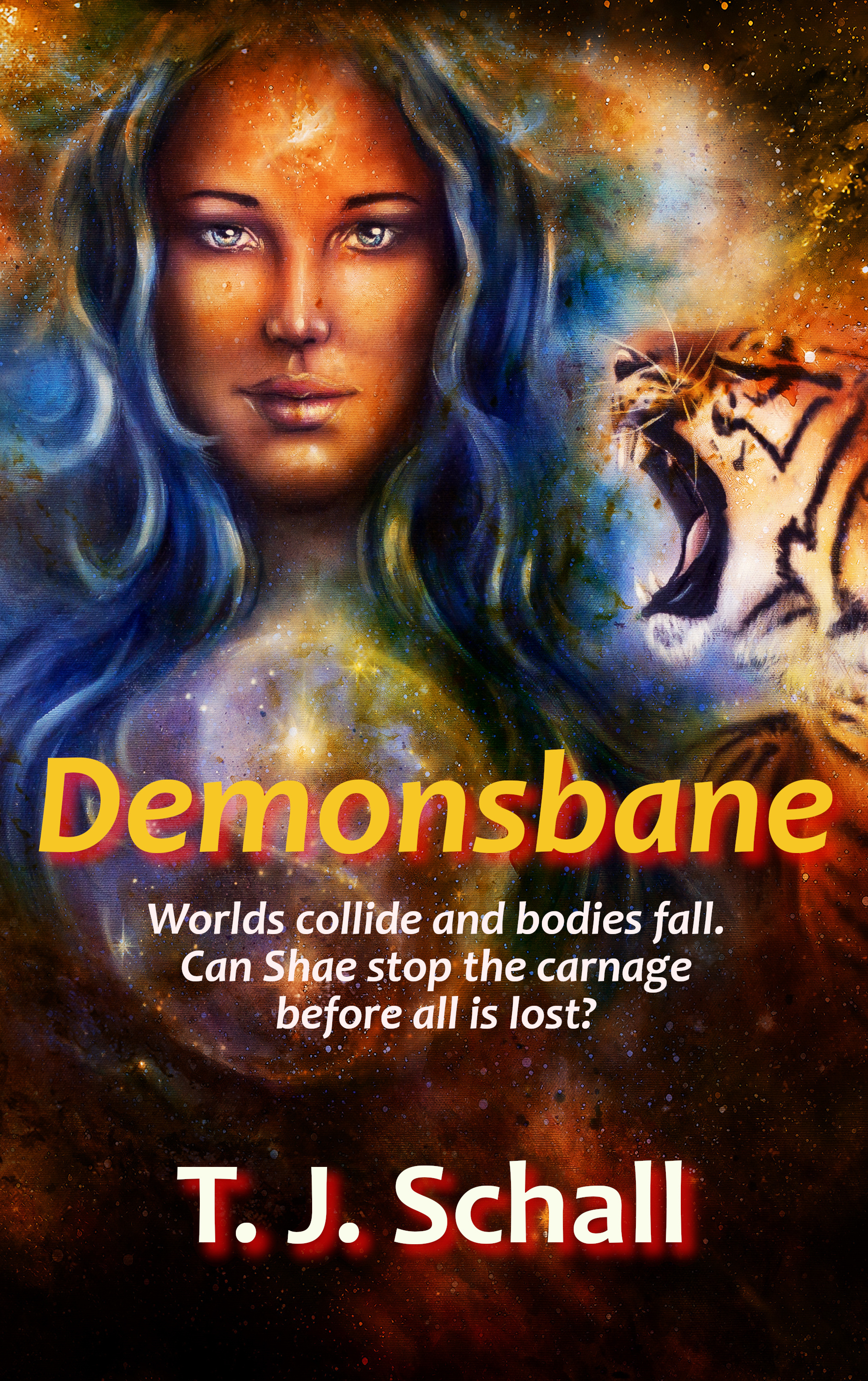
The image comes from Adobe Stock. It is titled “Goddess woman and tiger and symbol Yin Yang in cosmic space” by jozefklopacka. I took the original image, snipped out the part I wanted and did some size manipulation. Now, for folks like Sarah or Cedar, this would have been a quick job. They are the artists among us. For me, who has avoided doing my own covers like the plague, this took a bit more time. But I like the result and it will be used in fairly short order, after some finessing.
Of course, my evil muse being, well, evil, she reminded me that I had a series of books that needed new covers. So, since I was already playing with art–guffaw–I might as well keep at it.
All right, I’ll admit it, I was avoiding writing because I needed to let a certain plot point near the end of the next Honor & Duty book percolate a bit. So, I spent much of yesterday doing, you guessed it, covers.

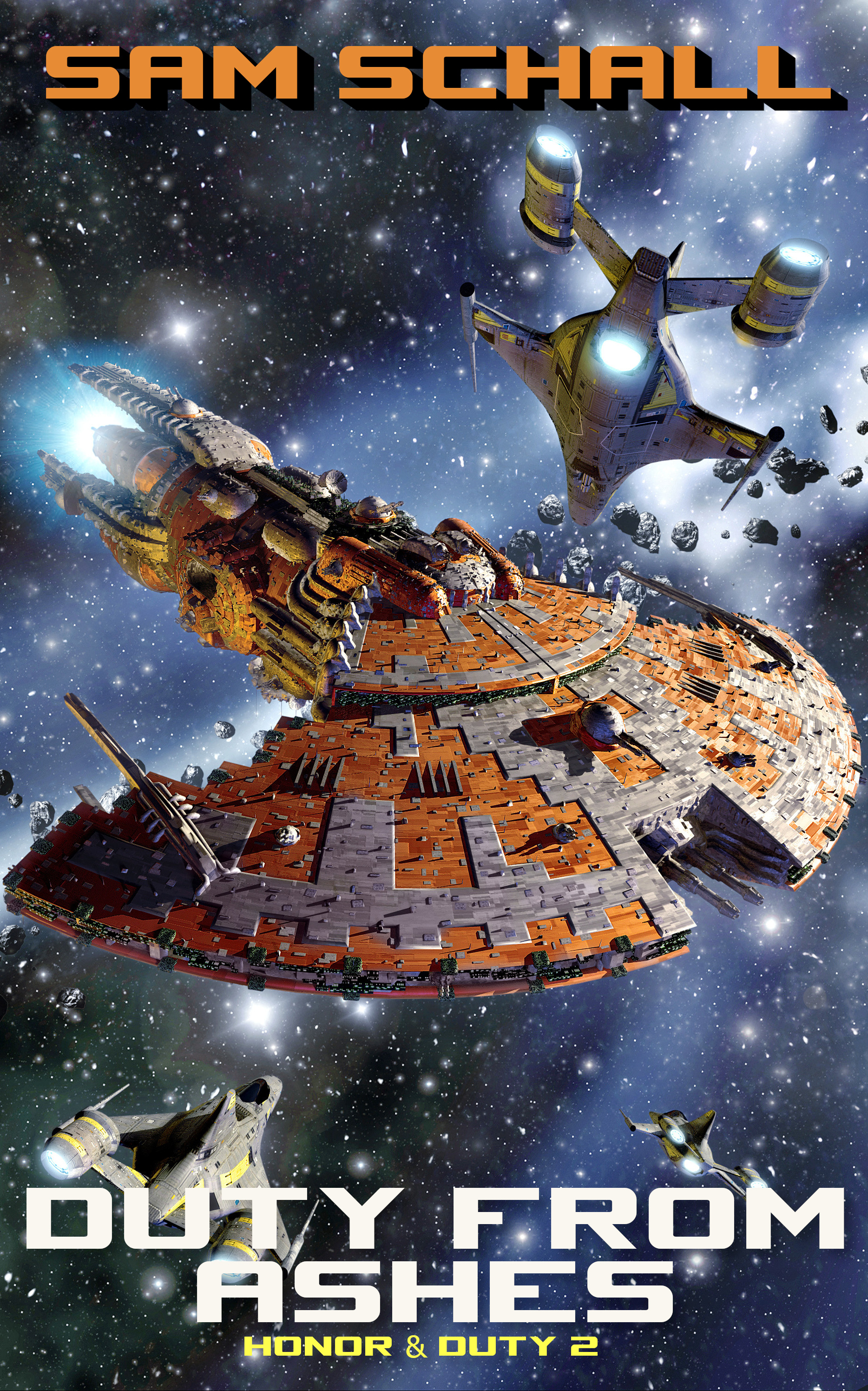

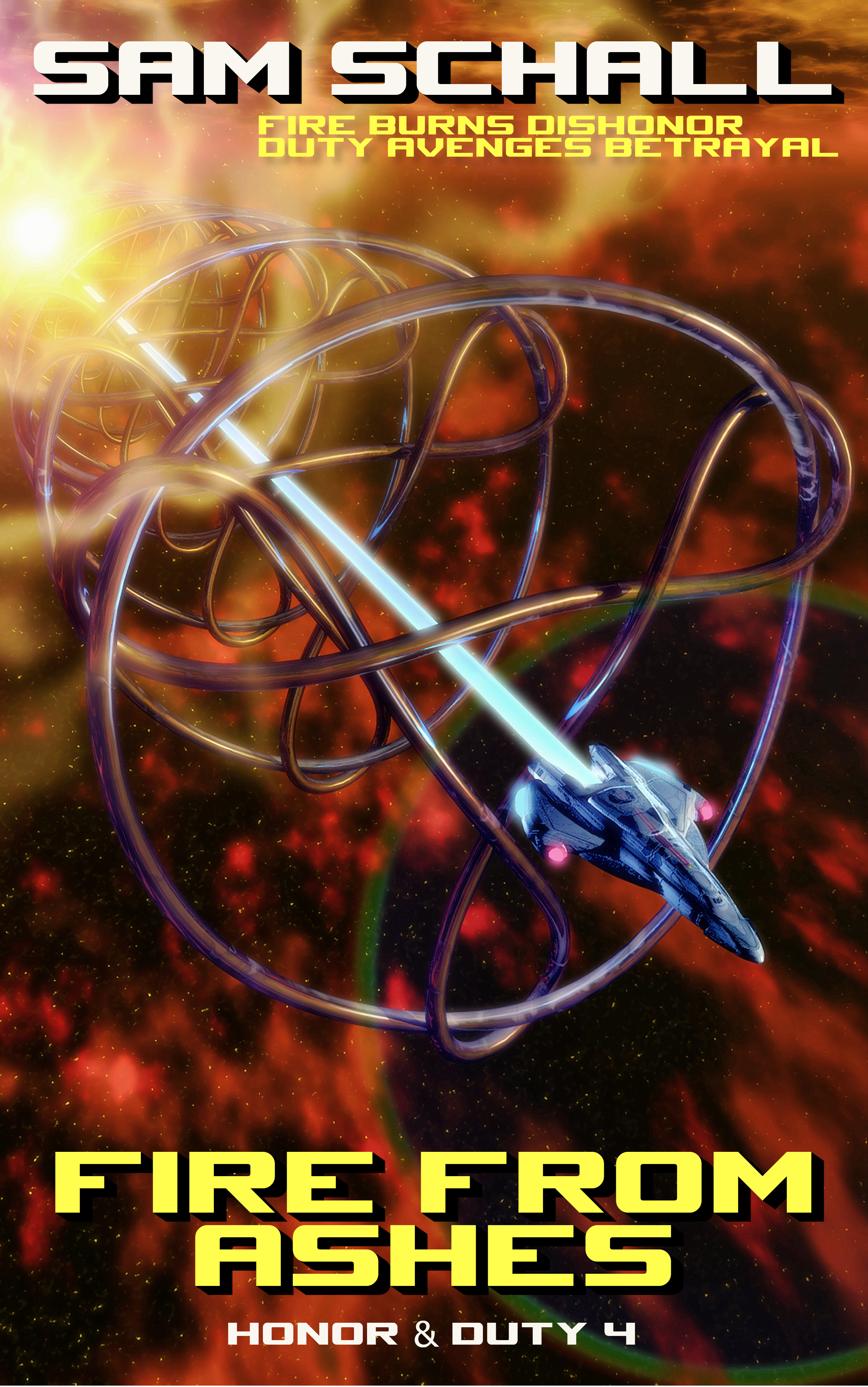

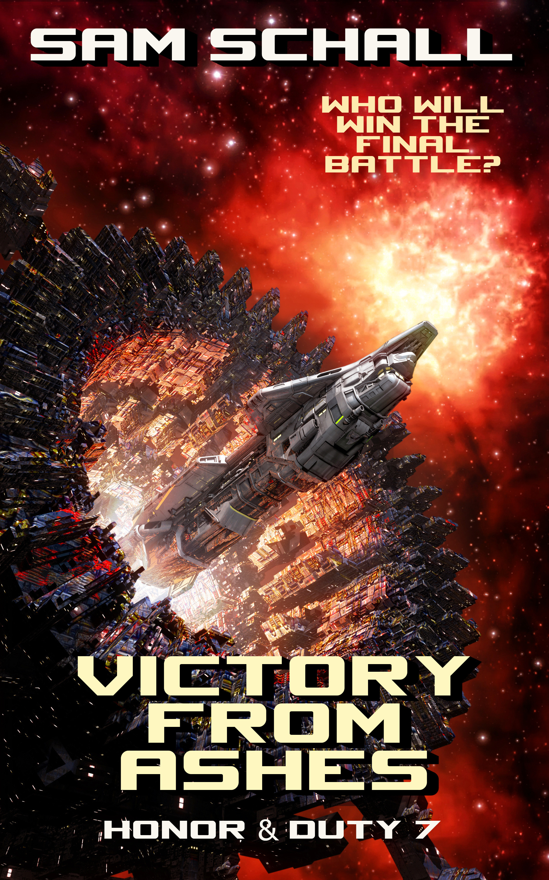
Each of these images comes from Adobe Stock. If I broke down the monthly fee for a subscription, we’re talking about my having spent approximately $5 per image. When you consider how much a lot of authors pay for covers, that’s nothing. The fonts are all open source or free to use. Yes, the font work and text placement needs work. These are mock-ups to see if I liked what I was doing. That means there will be changes before the books go live.
Here’s the thing. Over the last couple of years, I’ve discovered a couple of things where book covers are concerned. First, it is important to review your covers every year or two. You need to see if they are still cuing genre and sub-genre properly. In other words, are they in line with what newer books are doing?
Second, and this is personal to me, I do better in the writing phase if I have a cover to remind me I have a goal in mind. That’s why there are covers for Risen from Ashes and Victory from Ashes. Risen is written–well, the rough draft is finished–but Victory has yet to be written. But the covers resonated with me because of what the book are (or will be).
One thing I hadn’t realized as I did the mock-ups was the trend I had going with the placement of the text. Until I got to Risen, the title alternates from top to bottom through the first four books of the series. (The fourth book isn’t shown because I didn’t need to redo its cover). Risen follows the trend of the alternating placement. I don’t know if the final versions will keep that going (it will mean changing the text on Victory)
Anyway, this is all a long-winded way of saying you don’t have to shy away from doing your own covers if you are pressed for time or money. There are a number of sites out there where you can find royalty free images you can manipulate–or use just as they are–for minimal outlay. Some sites, like Dreamstime, allow you to buy credits used to pay for images. This avoids the subscription model other sites like Adobe Stock use. I’ve used Dreamstime before and had no problem making sure they didn’t continue charging my credit card. Adobe Stock charged me once, a couple of years ago, after I canceled my subscription. I’ve rejoined there a couple of times since when I’ve needed to pull and image or two for image elements. Each time when I then cancelled my subscription, they’ve done so without any problems, often offering me a free month or two if I stayed with them.
The biggest problem with using stock images is making sure you aren’t using an image that a number of other authors have already used. That’s another reason why you want to make sure you keep an eye on covers in your genre or sub-genre. Also, keep a file showing not only what images you’ve downloaded and licensed but that have the licensing information included. I know more than one author who has had another author contact them, threatening to sue because they’d used the same cover image. In one instance, the author laughed them off, pointing out not only that they had licensed the image but had done so and published their book before the “offended” author had.
And that points out something else to remember when using sites like Dreamstime and Adobe Stock. You aren’t licensing for exclusive rights for the image. So you need to make sure you somehow make that image unique enough to stand out when someone else uses it as well. Because it will happen. That’s where adding additional elements to the cover–something I’m not good enough to do yet–or text and text placement come in handy.
For now, before the evil muse by the name of Myrtle decides I need to spend another day playing with covers, I’m going to leave it to you. Don’t be afraid of doing your own covers, or at least of pulling together mock-ups to show your cover artist. Just don’t get lost looking for art. It is as easy to fall down that rabbit hole as it is to fall down the research rabbit hole.
Until later!
Featured Image by David Mark from Pixabay


45 responses to “What happens when you are avoiding NaNoWriMo”
As always good advice! Am also struggling with NaNoMo productivity.
I’ve been saying for years I need to redo covers . . . but then my Muse dangles an irresistible idea . . .
Same here, which is why being hit with the “must do covers NOW!” bit surprised me so much yesterday.
are they in line with what newer books are doing?
This seems some what futile. It means that a cover is never ‘done’. I suppose it costs nothing additional to keep up with current trends/newer books, since that must be done anyway for new books. If one keeps the layered graphic file, changing fonts is easy. But is redoing the entire cover worth the cost?
I suppose this comes in three flavors:
1. New book by new author. These tend to have mediocre covers and redoing them once income starts arriving makes sense to bring the early cover(s) up to one’s current standards. It’s very similar to updating the text, itself, with another editing pass once one can afford (or thinks so) an editor.
2. Old series by established author. Does it really matter? The Verkosigan (sp?) books are still selling and they have terrible covers. New readers might be put off, but if the covers also signal era in addition to genre, is it enough to matter?
3. New series by established author. It’s pretty much the same as #2, but slipped in time. The covers should reflect “best practices” at the time of publication. In five years, is it worth updating the entire series because styles have changed?
#1 seems obviously worth it. I can see the theoretical arguments for #2 and #3, but does it really make a sales difference?
I posit to you that you’re making one fatal error in judgement: You’re thinking of books by time of publication. And it’s true, when I pick up old favourites whose paper versions have been lost to time, a move, or a spilled cup of coffee, the cover is irrelevant because I already like the content. And yes, you can sucker me into getting a leatherbound edition of a favourite, well-worn mass market paperback I already have.
But books, aside form special leatherbound and signed editions, aren’t sold to people who’ve already read them. Books are sold to people who’ve never read them before. And to those people, you want something that’s looking fresh and interesting, current and good – and it doesn’t matter if it was published first in 2019 or 2001. You’re marketing to the reader who’s looking at it for the first time right now.
The Vorkosigan books, by the way, have had at least 3 different cover designs. I don’t happen to like the current ones for ebook – I think they skew much to far to the “literary” infection in cover design that signals more wannabe-upmarket-“literature”-“speculative fiction” instead of the good pulpy space opera fun that they deliver, but no, as the market changed, they’ve been through several variations as well.
They’re also a bad example, as not only have they been through multiple cover design changes, but the author got the rights back to the ebook, although the publisher is still selling the print – so the ebooks licensed through Open Road Media are completely different from the print covers through Baen (as the artist didn’t license the cover art for the ebook edition from the same artists. Remember, when you get *your* rights back, you don’t get the artist’s rights for free with that!) As Baen is *only* selling the print edition now, they’re unlikely to pay for more cover art to update the books to current market.
A much better example would be the Laurell K Hamilton Anita Blake series. Those covers have been updated at least every 5 years, to keep up with changes in tone in series direction and market trends. (And again, I don’t like the current covers; I preferred the originals, and rolled my eyes at the “fitting in with the 50 shades’ cover trend” when it happened, and shook my head when they went to the “Game of Thrones” trend, and the latest just make me go ‘how’s that possibly attract readers?’ …but again, they’re not selling to me. I bought that book back in 2003. They’re selling to the person who’s seeing it for the first time in 2019.)
Dorothy is right on all points. I will add one more very important point. Most of us are in this business to make money. Because of that, we have to at least consider updating our covers from time to time. It follows the same reasoning as retailers changing the packaging on even their best selling products. You want it to look new, to match what is selling at the time, in order to draw in new customers or, in our case, readers.
I’m going to add one more thing. I take exception to your comment about new authors and mediocre covers. You are lumping a lot of folks together that shouldn’t be–and leaving out traditionally published books that have more than their fair share of bad covers. For example, I looked at one yesterday. This particular book is published by a traditional publishing house and the cover “artist” is fairly well-known. The cover for this book however, was nothing more than a bunch of elements from different stock art put together. Nothing wrong with that if it is done well. However, in this instance, you could see where the layers, the individual elements, were not blended in. It screamed amateur and yet it wasn’t and the publisher probably paid good money for it. The cover also didn’t follow the “branding” of the previous book in the series. This is what you seem to expect from indies and yet it was from a well-known publisher for a book by a best selling author.
I’ve SEEN trad covers fracture and try to imitate clueless indie recently, so that cover might be trying to do that.
And that, ladies and gentlemen is HOW we know we’ve won. Statistics can be faked, numbers can be bullshitted, but they’re trying to look like what sells. And what sells is indie.
Except for lit-covers (which f*ck it, I need to do for the Shakespeare series, I know) we’re seeing more and more Indie-like in traditional.
Which means we’ve WON. And how.
Indie f*ck yah!
Please, Sarah, don’t repress your feelings so much. We don’t want you to hurt yourself. 😉
Thanks. This makes sense. I also agree that I over-generalized with “first book cover”, but they do tend to improve over time.
Yeah unfortunately, the Creative Cloud subscription plans don’t include the basic Adobe Stock anymore.
“The biggest problem with using stock images is making sure you aren’t using an image that a number of other authors have already used.”
No kidding. There’s a couple of spaceships I’ve seen several times on indie covers and on more than a few tradpub covers the past couple of years.
So true. That’s why you have to look at how you crop the image, manipulate it and even how you use text elements. You have to find a way to make it your own if at all possible.
NaNoWriMo has had me pull an old story off the back burner instead of the one I was trying to end.
NaNoWriMo has presented me with a dilemma. I have sworn off writing other things in favor of working on my series, but I am tempted to edit and “Finish”one of the earlier books in the series just to do it. But while I will have to write some, most of the project has been written prior to November. Isn’t that cheating?
In a way. But the way I look at it is NaNo was designed to set a goal and accomplish it. So does that mean it has to be a brand new project? In my mind, no. But then I’ve never been one to always follow the rules. VBG
the dilemma i am looking at is whether the villains i want to use are sufficiently villainous.
Aren’t the most perfect villains in some ways admirable and comprehensible? They are not the villians when telling their own story. Even Genghis Khan thought he was justified.
I want these guys to be slightly alien to our way of thinking and … squicky.
I understand you wanting it to be so, (Insert Picard, “MAKE IT SO!”). But as Terence said, “Homo sum, humani nihil a me alienum puto.” Translations differ, but to me the best is. “I am human, so nothing human (humans do) is alien to me.”
As humans, we are eager to associate ourselves with acts of nobility,bravery, or altruism, but are reluctant to claim villainy, cowardice, or selfishness. I won’t be so foolish as to speak for you, but I know that as for me, were I born in say, Syria, Saudi Arabia, or Iran, there is a chance I’d be a staunch supporter of jihad, Hamas, and suicide bombs.
We are each born with the possibility to be heroes or villains, or to put it in writing terms, protagonists or antagonists. Both are possibilities. Wishing away one-half of our nature won’t change that.
i should also note that even as a Batman fan, I am not going to see the joker because i don’t want to see him portrayed as a sympathetic character.
i am looking for my bad guys in this series to have a certain nonhuman/inhuman element to them that makes people want to say ‘we’d never go there, or take it that way’
(I’m also, sorta, trying to poke a little fun at some other recent sf where doing this stuff is declared to be ok)
And if you succeed, your hero won’t be heroic. See that classic Star Trek episode, “The Enemy Within”.
https://www.imdb.com/title/tt0708463/?ref_=ttls_li_tt
But making your villains sympathetic is exactly denying those things. The evil even in you is not, in fact, sympathetic.
Case in point: A Syrian man loses his entire family as collateral damage in a drone bombing, and embarks on a revenge arc. Am I making him less of a villain to give him a reasonable, “sympathetic” motivation?
Case #2: A Mexican man grows up in an impoverished town. Deprived of other options, he becomes a soldier in a cartel. There but for the grace of God.
So you are saying it would be wrong for an author to write about a man who embarks on a revenge quest because he kills everyone in his family by burning down his house and then decides to blame someone else?
I’m not “saying” anything. I’m asking questions, specifically about writing villains that are grey, not pure black antagonists.
False dichotomy.
I’m just a rookie, trying to figure things out, asking questions, What is the false dichotomy, and what would be a true dichotomy?
And yes, I have seen stories that did not work because they gave the villain that sort of sympathetic backstory.
We’ve all read stories where the antagonist was poorly drawn. That does not prove a thing. I’ve read stories that were poorly written for any number of reasons. I do not think that proves that all stories are a waste of dead trees.
What really does not prove a thing is a non-sequitur. They were not “poorly drawn” — they were failures because the villains had been given a sympathetic backstory and that ruined the story.
How on earth can you speak with confidence about which stories I’ve read or not read, and offer characterizations about those stories? You have no idea of my reading history. False dichotomy, non-sequiturs? I guess I’ll try a strawman next, and see if I can get the hat trick.
Maybe I’m stupid. I dunno. Are you saying it is bad writing to give an antagonist any sympathetic qualities?
We were talking about the books I read, not the ones you did, so — read your own comment.
WE weren’t talking about the books you’ve read. I was speaking of the too many to list stories that I’ve read/seen that feature villains that had a sympathetic trait or two. I’ll name one recent popular one. On Amazon Prime they feature a series called “Jack Ryan.” It’a a derivative of Tom Clancy’s work. In Season 1, the terrorist they are trying to stop had his brother killed as collateral damage in a drone strike. (The EXACT scenario I used as an example) It made the Bad Guy somewhat more sympathetic, though you were still rooting for him to lose. It made his motivation more understandable. Maybe by your lights it made him a poorly drawn character. I enjoyed the season, but what do I know? I’m a noob.
Mary, I have thought on this, and I cannot help but think we are talking past each other and wasting time better spent writing our stuff. I’ll write my characters as I feel best, and you are welcome to do the same, of course. Best wishes.
Direct quote from me: “I have seen stories that did not work because they gave the villain that sort of sympathetic backstory.”
So, yes, we were.
I was going to stay out of this, but I feel the need to step in. Yes, you can give a villain motivations that can make them sympathetic. And, no, if done well, it doesn’t make them any less of a villain. In fact, some of the best books have villains who aren’t completely “black” in their motivation.
Mary, just because you have seen books where it hasn’t worked doesn’t mean that it can’t. People aren’t black and white in their motivations (usually) and the best characters in literature aren’t either. However, it takes talent to write a villain who isn’t all evil and not spoil the book.
Mark, don’t ever hesitate to ask a question. This was a good discussion and something we should all consider. I’ll add one more thing. If you give a character a singular motivation, whether that character is your hero or your villain, you turn them into one-dimensional characters and they are not nearly as interesting to your readers as a fully fleshed out character is.
Excuse me? Where did I say it can’t work? I said that it is not necessary, and it is sometimes harmful. If Sauron were “a fully fleshed out character ” he would be far less interesting than he is.
Amanda, thanks for the reply. I figured a multi-faceted hero OR villain is an order of magnitude more difficult to write well,but a man’s reach should exceed his grasp, or what’s a heaven for? 🙂
It’s very possible I might screw it up, buy I would hate to think my first books will be my best ones.
Mark, the best advice any of us can give is to always try to stretch your wings as a writer. That is the only way to improve. If you don’t, you stagnate. And, as I said above, never hesitate to ask a question.
Mary, I disagree. I gave my opinion. You are the one trying to argue. As Mark noted, he was speaking about books he read. You chimed in with your opinion, which included “they were failures because the villains had been given a sympathetic backstory and that ruined the story.” Add in your comment about Sauron.
You may not like villains who are fully fleshed out characters. Others do. Let’s move on.
Not the best villains I’ve seen. Some of the best start to lose their humanity in their evil.
This may be a stupid question, but when you say that one should make sure to license the image, you’re talking about the entire cover, text and all, as an image to be licensed, right? Since the base image and any others added in are “free to use for commercial purposes”?
Some images are available under Creative Commons licensing, which means you aren’t paying for the right to use them. Others, like those from sites like Dreamstime and Adobe Stock are royalty free but do require licensing to use the image itself.
OK. Gotcha. I think. I’ll dig around a bit more before I bug you again.
Never hesitate to ask questions. We’re more than glad to help–or say we don’t know but will try to find out.