I started this last week as a way of passing on the material I’d recently learned in a design class. Although much of this is quite broadly applicable, we indie authors can take it and use it for book covers, promotional materials, ads, and more. Even if we’re not doing the design work, the principles here will help us better understand how to ask someone else to make magic happen.
The Rule of Thirds is usually applied to photography, but it works with any visual image. If you want to add interest to your layout, don’t center the main focal point. By offsetting the focus, you draw the attention more naturally to the main object of the picture. “Two distinct, equal lights, should never appear in the same picture : One should be principal, and the rest sub-ordinate, both in dimension and degree : Unequal parts and gradations lead the attention easily from part to part, while parts of equal appearance hold it awkwardly suspended, as if unable to determine which of those parts is to be considered as the subordinate.” John Thomas Smith, writing in 1797 to first enunciate the concept. It’s been around for a while.

The Gutenberg Diagram does a similar thing, but with text. The concept is to describe the pattern a reader’s eyes take when presented with evenly distributed information. If you divide your page into four imaginary quarters, the eye will begin at the top left, drift across the page, diagonally back to the left, and finally to the bottom corner. If you’re laying out, say, the back cover of a book, or a postcard, this can be very useful in telling you where to put the vital pieces of information, and which areas are less likely to be noted by the reader. 
When you’re putting text elements on a cover, in addition to the rule of thirds and Gutenberg diagram, you want to keep Proximity in mind. It seems obvious – the closer two things are spatially, the more they are related – but it makes a difference. If I’m going to have a title, my name, and ‘author of Pixie Noir’ on a cover, where do I put that last element? What about “Five Space Opera Tales”? If I reversed those and put the ‘author of Pixie Noir’ next to the title instead of my name, it could be confusing. 
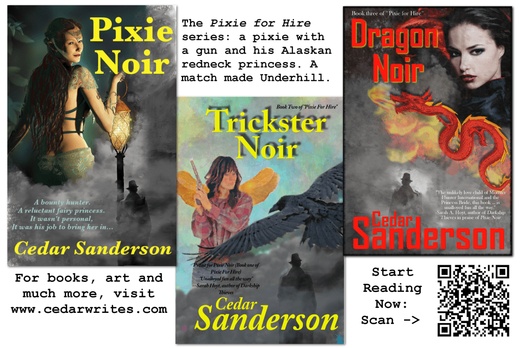
This handsome cover (Ok, OK, I’m biased. But it’s a handy prop) also shows propositional density. Propositional density is the amount of data a design is conveying. Designs which have more density are more interesting than designs which are very simple. There’s a fine line here, you don’t want it to become cluttered. But you can say a lot with iconic representation – I have a space ship, so that’s science fiction, and the red white and blue seems obvious (although it’s not actually part of the stories in an implicit way). The art doesn’t have to be highly detailed, relatively simple elements can be rich with meaning on a subconscious level.
The next principle I’m going to talk about is somewhat tricky. It’s related to branding, which you should be doing for yourself and your books, and it’s called the Exposure effect. The idea here is that a concept people are neutral on, or even lightly negative toward – will through repeated exposure become more likeable. The reason it’s tricky for Indie Authors is that we all know that one person who never does anything except blare ‘buy my book!’ on social media. Instead, this is about making people familiar with you in positive ways. The strongest effects are seen with pictures, meaningful words (buy my book would not seem to be the right ones here), names (you! and not Author Jane Doe, no, make YOUR name the one people recognize), and logos. How many of us can instantly recognize a Baen Rocket on a shelf full of spines and gravitate toward that book? However, be aware that the exposure effect can be overdone and it will bore people and weaken if it is repeated too often. Which means you need fresh material to put in front of the readers, whether it’s new promo, ads, books, or just blog posts.
While you are exposing yourself (heh! No, not like that!) you should keep the performance load in mind. “The greater the effort to accomplish a task, the less likely the task will be accomplished successfully.” (Universal Principles of Design) In other words, people are seeing your stuff and they like it. How easy is it for them to actually give you money? Do you have a clickable link that takes them to a buy button? Are there clear places on your blog where folks can select and purchase your work? If they look for you on Amazon, is all your work in one place with a clearly recognizable you in the Author Page? You wouldn’t believe how difficult it can be to make sure you’re tracking down the right person, with the right books, from people who really ought to know better. Keep in mind that humans, like water and electricity, follow the path of least resistance. Make it easy, or leave money on the table.
Oh, and don’t forget that the picture really is worth a thousand words. I know it sounds trite. But the Picture Superiority Effect is well documented, and it makes a big difference when people are looking for you. People remember that logo, or photo, or book cover, when the words that accompanied it have long faded from memory.
And finally, since I promised, homework.
I’ve been debating what to give you all that isn’t too terribly hard, doesn’t require website design (not for the faint of heart) and will be immediately useful.
Postcards!
So here’s what I want you to do. In the program you’re most comfortable with, be it GIMP, Photoshop, or what-have-you, lay out a 4×6″ postcard. You should use book covers for the graphics, a logo if you have one, and just enough words to ease the performance load. Keep the visual principles, and the Gutenberg diagram, in mind. Also, you want to keep your legibility of any text high, and the signal-to-noise ratio low. I’m going to suggest you create and add a QR code to the postcard as well. It’s your choice if you want to do front and back, or just front. Save it as a jpg or png file, and if you want to send it to me, I’ll put them up next week for open critique (and not coincidentally, promote you as well). If you don’t feel like public critique, don’t send them! But do follow along to learn how to make yours better.


23 responses to “The Art of Design, Part II”
I notice that your book covers are similar layouts, but not as closely related as most series books I’ve seen. You use a different typeface and text color on the third, and the layout of you name is different between the first and second. Since I’m so used to seeing covers that use much closer resemblance used in series books, it’s not immediately obvious to me that the books are related. Is that deliberate?
It was, but that was partly because I’d planned to go back and correct the first one – Pixie Noir – and I haven’t had time. I’ve learned a lot since that book and it needs a makeover.
Oh, but don’t hurt the fairy princess. I love her.
If I change the art, it will only be to fix the bad dye job… LOL
I dislike the title font, it seems too harsh, but otherwise that’s my fave cover of the three.
Design of this sort seems to have much in common with usability studies — eye tracking and memory and so on. Useful articles:
https://www.nngroup.com/articles/
(aka http://www.useit.com)
The first one? I was trying for ‘noir’ and had been looking at a lot of pulp covers from back in the day – I buy them because they’re fun – when I set it up. I will go back and fix the font, using the same font I used for Dragon Noir, on both TN and PN but it’s not a high priority.
Cool. I had thought about bookmark-like cards, but not doing a series postcard.
I like them as hand outs because they are less likely than business cards to get lost, and I do bookmarks as well but there is more space on these, and they are different.
I’m trying to grok the postcard thing. When I think postcard, I thing something like “Hello from Sing-Sing. Stop by and spend some time.” Have never seen anything like the above until now. Don’t know if I could make an effective one, because of the preconception and I keep thinking two-sided. Maybe like a brocure with a teaser on the outside and advertisement on the back?
A trifold brochure? Sure. I just wanted to get people thinking about design, and possibly leave them with something they can use.
Not exactly a trifold brocure, but a similar idea. On one side is a teaser and on the back is the advertisement. But wouldn’t the drawback be that the customer has to flip the card over to see the advertisement?
Is this more like those product deck cards that use to be the rage? You got a packet of plastic wrapped postcards, and on one side was the ad and the other you filled in mailing information. Except in this case the QR is serving as a means to get more info into the customer’s hands.
Question: What if the QR not only directed to a website, but to a page with a free story or a book? That way the customer has a tad more incentive to visit the site.
Dig into the site that Cedar gave us, and you can apparently do anything you want (extra cost for them to set it up – it is their server that is actually handling whatever redirects or special actions you want).
I’ll be looking into that when it seems worth it; added the link to my “Writing Tools” folder in the meantime.
If you want to send someone to a site that offers a freebie and links to buy, no reason you can’t. But the free QR codes generally only take you to one link. I would caution you against multiple redirects, that usually trips warning bells on firewalls.
No redirects needed. For instance, let’s say we put a free story on our web page and have the QR direct to that. On the page with that free story we have our other books on display, with the appropriate links. Or the QR takes the customer to our author page on Amazon, or, if we want to do a promo for a new book, the Amazon listing for that.
That’s if QR is essentially used the same as a URL. Until this column, I never gave QR a thought, and really know next to diddly about it. Is that essentially how it works?
Yes, it’s simply another way to encode information. I usually use it as a weblink but there are other things you can do, I just haven’t explored too far.
For general info for all:
Have just discovered that Inkscape has QR generation. So does the later versions of CorelDraw, but CorelDraw costs a lot of money. QR generation may be a part of other drawing packages. In Inkscape it’s under Extensions>Render>Barcode>QR Code.
The thing is, not only is there thirds, there is also fifths, and a golden spiral… there’s a reason there are bunches of college-level design classes.
And the Fibonacci sequence! I was trying to hit the highlights here, and if you want to dig deeper I’d recommend the book as a good start.
Great info! Thanks! That helps with understanding cover design and why what goes where. =o)
I’d do the homework, but my postcards are basically each book’s cover on the front with the cover copy on the back left and the traditional postcard ‘address & stamp’ space on the right. I’ve started using a catch-all bookmark for ‘here are all my books and how to find them’. I keep them in my purse and pass them out to anyone who seems interested.
Whatever works for you 🙂 I was just trying to come up with something that would give people a starting point.
Remember that not everybody has a smartphone (What? Why do I need to spend $100 a month on a phone when nobody calls me? And I’m internet addicted enough as it is.) so include a human-readable URL as well as the QR-code. And there’s no good way to read a QR-code on a desktop computer (or laptop that I know of).
I agree, and always put a url on as well.