Guys, with the understanding that I’m not wonderful, not even close to the best at this — the best at this is Kevin J. Anderson, which is a good example of people getting natural gifts when (theoretically at least) they don’t need it — if you want to post your covers here, and your blurbs, and have me critique them and maybe change a few of them to show how to improve them, feel free.
Again, ideally, you’d have a designer do this. And again, ideally, the person offering to do a clinic wouldn’t be someone like me, still struggling with it. But sometimes the partially blind helping the partially blind works — witness my first writers’ group and all their ignorance and yet together we all managed to get published… eventually.
I hope Mark Alger, if he’s around, will pitch in on the comments. Again, I’m not an expert, but between Goldport Press and now Naked Reader Press, I’ve designed a lot of covers. Below are some of them in more or less chronological order:

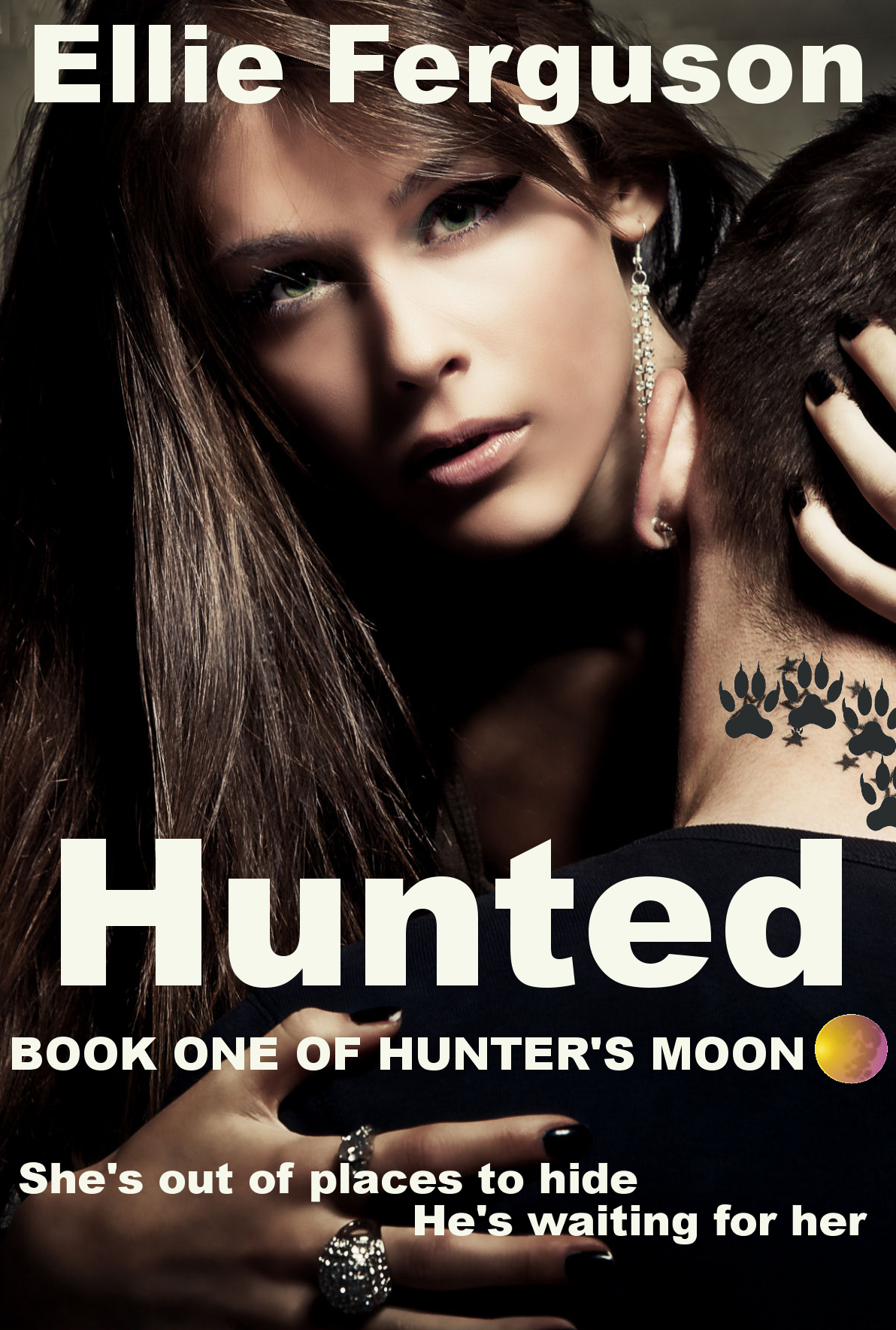
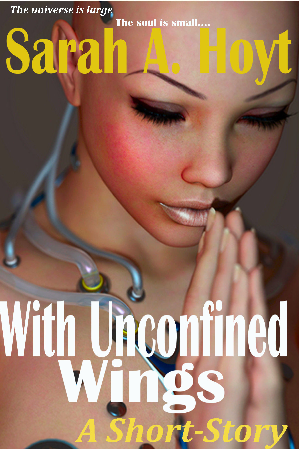
Update: I redid my With Unconfined Wings and Callan Primer’s (did I screw up the spelling?) Indigo novel covers. (BTW, Hunted is doing obscenely well. For it I tried to copy Paranormal Romance covers (Which it is.)


251 responses to “Cover And Blurb Clinic”
[…] UPDATE: In case you’re confused about the disappearing post: it’s over at Mad Genius Club, where I’ll be conducting a Cover and Blurb Clinic. That is if any of you want to play. […]
I’m sure there’s some clever way to neatly cut and paste, but this is all I came up with.
That one was for the YA Cyberpunk series.
Below we have the much more adult SF/F crossover style:
Okay, first we consult the record. Go to Amazon, look under hard cover and recently released or most popular. Why hard cover? Because that’s the impression you want to convey subliminally. Now, for the record, I find most cover design these days horribly ugly. However, http://www.amazon.com/s/ref=sr_pg_1?rh=n%3A283155%2Cn%3A!1000%2Cn%3A25%2Cp_n_feature_browse-bin%3A2656020011%2Cn%3A16272%2Cn%3A16273&bbn=16272&ie=UTF8&qid=1370102585 looking at these, I’d say the main problem with this cover is that the tag line, title and name of author all run into each other. Even the different color on the author’s name doesn’t save it. You need to make the title a unit, and the author name a unit, if that makes sense. One trick I’ve seen (though not in the current crop on Amazon, but I think that’s GRRM’s fault. Well, his cover designers) is to make the title capitals and the name normal, or vice versa. Also, I’d take the tag line, make it a little smaller, and fit it in a line at the bottom.
What’ font are you using?
Zoey gets Ar Essence and Pam gets a highly, personally modified Wide Latin, both from commercial drawing programs.
I’m wondering if the flat black backgrounds aren’t a problem? I think I need start with some texture or color fades and rebuild.
What Mark Alger told me — and I think he’s right — is never have unbroken color. that’s the mark of an amateur. OTOH I do see them in pro covers. On the third hand even very subtle texture seems to improve things.
Doesn’t even have to be a texture. In fact, sometimes textures can be problematic. At Otto, we call the process “adding noise.” Just adding noise in Photoshop can make a solid color glitter, for example.
M
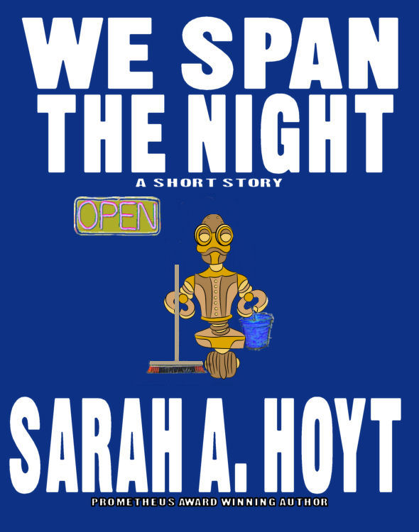
You’ll want my wife (the fine-arts almost-grad) to offer the substantive commentary, but I’ll say this…seeing those covers on bookshelves, I’d buy “We span the night” for myself, might buy “The girl with the golden lute” for some hypothetical friend who I thought might like that kind of thing, and would pick up “Hunted” and read the first chapter to see what kind of story it actually was.
“With unconfined wings”? Sorry, but it’s only your name that would even slightly tempt me about a book with that cover. Indeed, with or without the “Sarah A Hoyt could make a ripping yarn out of the phone book” factor, I’d be less likely to buy that one than if it had _no_ cover art. (The subtitle intrigues, while the picture screams “this is not a book you’ll enjoy”.)
The cute janitor robot actually helps sell the book, I think. The others merely help the buyers to self-segregate.
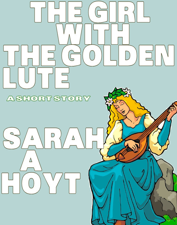
Actually that’s my consistent bestseller, but looking at it I realized it was from the “must have solid color bands at top and bottom” and it’s now on the list to be redone. So is The Girl With The Golden Lute which — ick — is not nice fantasy. In fact it’s d*mn close to horror. But this was the time of “oh, must have elements referenced in the title.”
…and that’s why you want my wife, not me. 🙂
(Worth noting also, of course, that “helping buyers to self-segregate” is probably the highest achievable goal of most marketing. In as cynical an age as this one, “you’ll like this” is a really tough message to convey persuasively, while “this is [or is not] intended for people like you” is both much easier, and yet nevertheless frequently quite usefully informative.)
If “Golden Lute” is “d*mn close to horror”, then I’d actually feel pretty guilty about selling it under that cover. The way I’d feel guilty if I tried to market “Animal Farm” as if it were a novelization of the nursery rhyme about Old Macdonald. (No…actually, I’d feel guiltier than that. There’s a part of my brain that screams out that we _ought_ to be reading Orwell to five year-olds, if we ever hope to win our culture back.)
as I said, this was from my “we’ll make it sound like the title” Eh.
FWIW, the only reason I ever use solid bands of color is to frame an image that, even in a resolutely vertical frame, desperately wants to be horizontal. I think of it in terms of letterboxing, like they do sometimes with widescreen movies video’d for old-scaled TV sets.
So me, the most compelling thing about that cover is the central source image. If it relates to the content of the story, I would want to make it the most prominent thing in the design — have it bleed all four sides and crop it as tightly as can be and still see enough detail to get the sense of it. (I carry in mind what George Lucas said about how they edited the original Star Wars — he said he wanted to show the least possible of a given scene or object that would still permit the viewer to get it. If you think about it, that’s excellent marketing technique. You want your cover to convey its impact to the reader’s eye and mind with the mininum of distracting detail. The larger the core object of the image is within the frame, like a face, the more impact it will have.
Then, I would knock the type out of the image, either to white or some consistent color or texture, and position and size it according to A) its importance to the purpose, and B) a flow of cognition. (Sorry if that’s confusing. I don’t have a term for it. In composition, they talk about how the eye travels over an image. You want to do the same thing with the words on your cover. I would, for example, place a marketing tag at the top of the cover, above either the author’s name or the title. I would treat any quotes or blurbs as pull quotes — place themoff to the side, with a different justification than the rest of the title, and in an italic or script, where the rest of the type is Roman. (But be cautious of the ransom note effect.)
And I would make the background based on some kind of a photographic texture, with a shadow gradient over it to give it depth and interest. If the background image can be implied to be relevant to the foreground image, um so besser, but it’s not necessary.
M
the story is the nuns in space series. I wanted something that implied both “devotion” and SF. But it’s a nice image.
Hmm. That might make me want to play with lighting effects — haloes and glows.
M
It would make me want to, but I’m only learning to use GIMP. Anyway, I redesigned it was I would do it now. I’m 99% sure it’s not professional 😉 and 60% sure it’s better than the first iteration.
Personally, for author name and ‘a short story ‘, I suggest pulling a very light blue grey from the highlight on the tubes, possibly with a drop shadow or outlining. The yellow fades into the picture and is hard to read at thumbnail size.
The tagline also dissapears at thumbnail; needs to be bigger so you can even see is there. Personally not convinced that short story needs to be advertised on cover, but have no experience in that market, or dog in that fight at present.
Have looked at your re-iteration of the Unconfined Wings cover. Opened it in Photoshop. The red is over-saturated. When that’s toned back or the image is converted to CMYK, the skin tones on the angel/nun look more natural — albeit somewhat sallow, but OK — but now the author slug is unreadable at 100 pixels. I suspect the type needs to be a cool color to contrast on that background. Did a magic wand select of the title type and rand Hue/Saturation on it and rotated the hue all the way around the color wheel and almost any color BUT yellow contrasts better. The one I like best for visibility is a lime green, but cyan, red, and dark blue also stand out well.
Speaking of background, I did a magic wand select of the gray and painted it black. MUCH more dramatic. If a solid black doesn’t turn you on, may I suggest you drop in a star background? Like a shot of the Milky Way.
I also feel a lack of wings. Of course, if you can’t get the traditional vulture’s wings in white from the right perspective, it’s probably better to let it slide. But I’d consider it time well spent to try to find a workable image. If you could, that would also fix the background problem — or, at least, most of it.
I’m not entirely convinced of the upper and lower-case headline type. Maybe small caps? Play with it. Also, perhaps a gothic face, rather than a grotesque (even stroke weights as opposed to thick-and-thin) might be more readable. There’s a reason that Helvetica is so DAMNED popular. Y’know?
I would also STRONGLY urge you not to distort the two lines of type in the title two different directions. Make “Unconfined” the determining element for the weight and size of the title and match “Wings” to it. Make “With” smaller and offset, (perhaps nestled above Unconfined between the U and the F, small, all caps maybe (play with it) but with increased tracking so that the line of the word JUST fits in the space. Make sure you pay attention to the negative space around the word, too.
Watch your margins. Make sure the type’s position on the page matches its alignment/justification. If you’re using the type with a center alignment, then it needs to be strongly in the middle of the page. If you want to balance it to the left or right (and I don’t see why you would in this case, although experimentation is never amiss), it should be justified in that direction, with a ragged margin on the other side.
I’m not certain that “A Short Story” belongs on the cover, or as prominently as it is. Were I designing for print (understanding that eBook covers may be a different animal), I would definitely be composing around a publisher’s colophon and items like “Short Story” or “Novella” or “Fantasy” or”Science Fiction” or whatever would be in small type (sub 10point) in association with that logo. I see Baen does that on the spine, but not on the cover. I can’t help wondering if it belongs on the front BECAUSE of the thumbnail or cover display on Amazon. Not in the 100 pixel size, but in the “click here for a larger view” size.
Not persuaded that splitting the blurb into two lines is a good idea. It looks a little herky-jerky. If it were separated by some other element, the author’s name or the title, in a contrasting or complimentary color (say, white, where the larger type is yellow), one line above and one line below, it makes a bit more sense to me.
And it’s time for me to go to bed. Gnight, all. Hope this has been helpful.
M
FInal bit of staircase wit for the night. I promise. I notice in the image you posted here that there are severe compression artifacts in it. To reinforce what Dorothy mentioned below about Oleg Volk, you MUST work the image until it is as close to perfect as you can make it. Yes, it’s hard to keep track of all the myriad details while you’re simultaneously trying to learn how to ride the damned bicycle, but it must be said. And it might, indeed, have to do with tools. When you pick JPEG compression, be aware that you are using a lossy compression algorithm (it degrades the image) and only the TOP quality (largest image) compression ratio will do. This will usually get you about a 10:1 ratio from the actual bitmap, but it will also usually not induce those horrific artifacts that make it look like your picture has leprosy or pimples. I would advise that, if at all feasible, you NOT use JPEG compression, but use PNG (which is lossless) instead.
M
er… I did not do compression. Cheap electronic art?
Did you save the file? What format did you use? Those artifacts are from JPEG compression. If you didn’t do it, then, yes, the art you got had them. However, as they appear around your type, I suspect it happened after you composed the image. As I type, a thought occurs that it might have happened in the Word Press upload. I never allow Word Press to touch my images — only display them. It may be that’s where they were induced.
IAC, it *is* an important point. Compression artifacts get WORSE when an image is reduced. They add random noise to your image that can make it look cheap, ugly, and amateurish at small sizes.
This might be a point to research for me, as I haven’t actually uploaded images to Amazon. But were I to be doing it, I would want to make specific images in Photoshop from the uncompressed original, resampled to the specific sizes required, and upload them individually. If Amazon allows that. The reason for that is that, working from an uncompressed image, you won’t have those artifacts, and the image is as clean as you can make it. Photoshop’s resampling algorithm is the best. That would ensure that everything displayed at Amazon was as clean as I could make it and uniform in appearance across all sizes and interfaces. Yes, I really am that picky. Yes, it really does pay off.
M
Yeah — again, probably not worth it for short stories. They pay almost nothing individually — the money is in the aggregate. And this one is selling well for a short. (It’s probably the theme, not the cover. Gun packing nuns, I mean.) I also did not compress the type — I stretched it. I’m going to guess WP since I don’t see it on the cover. Now, whether Amazon does it too is beyond my ken. I haven’t looked at my ACCOUNT in about a week.
Anyway, I’m taking notes for novel covers. Again, for short story, simply not worth it. I’ll clean the bands of color and stuff in the original cover, but other than that… not worth it.
Again, for ebook-covers only and short stories only (short stories, individually, earn about $5 a month, though this one is pegging at closer to $20), I try to keep cover images around five. Novels, it’s entirely different and I buy the largest image they have, of course. But for short stories, I buy the extra small, which for this one runs around $7, if I remember correctly. But it is designed, MOSTLY to be viewed as a thumbnail. (A little bigger when you buy it, as an inserted cover. Never as a printed cover.)
That makes sense. No point in throwing money around to no good end. However, I would, if the artifacts prove to be in the original, I’d either ask for my money back (and stop using the image if they require that), or just stop buying from that source with a “FY — strong letter to follow” to the owners of the site. Images for sale with zits is just stealing.
M
A short story has to be on the cover. On ALL the covers. Because otherwise you get truly HORRIBLE reviews. Trust me, people are too stupid to figure the size of the file. And these are only ebooks, of course.
I do understand the “modify the background thing, but in this case I am not 100% sure I could, with the image rights I have. (Some you can.) It’s one of those things.
The image rights: I would eschew any image whose rights-owner did not permit it to be altered in any way or composited with other images. That’s just dumb. In fact, proper stock images should be made to make it easy to composite them. I don’t think I’ve ever bought an image that didn’t.
M
I’m buying bottom price, mostly from abroad, for the short stories.
On that — I just wish the ones that allow compositing would have the equivalent of a “green screen” and easy-cut lines. WHY on Earth would anyone do a soft-variance background when it’s clear what they’re selling is a person’s picture, or an object’s drawing. It makes me want to scream. I now don’t buy those unless the picture is PERFECT because it’s not worth an afternoon of cutting and cleaning up.
If you have Photoshop, it lets you get rid of background.
I don’t. I have Corel Paintshop and JASC paintshop and GIMP. BUT I suspect that photoshop does it the way other programs do? With picking a color or a line to cut at? (A reason many vectors have a “cut line”) Which is why I was objecting to background not of a solid color.
I did this a month ago, but, IIRC, you click on what you want to keep, and it highlights up to a line. If it didn’t get it right you click again (and again, perhaps) until you have what you want. If you search in help in Photoshop on deleting background, it tells you exactly what to do. I was importing a planet, and when I just tried to use the clipping function, I got this darned white ring around it and no Whisk to get it out. So, mine was a simple shape (but with several colors) and I only had to click once, but the help function showed that you could do more complicated images. It might be worth looking at next time you have a chance to see someone else’s version.
Ah — that I know, unless the stuff has “cut path” my programs don’t do that. But I’m but an egg in GIMP still.
I’ve stuck with the thought that each part of a title must pull its own weight – that if it’s referenced in the title, then skip it in the cover elements. The Girl With The Golden Lute sounds fantasy or historical, so I’d then rely on cover art to tell me it’s dark fantasy/horror, with an unrelated image to the title.
Yes. This was one of my very early covers — as I said, I was going “must have girl with lute”…
I understand! After I came up with TTSR, Peter was looking for images that had a star field or planet and a road.
My twisted mind immediately changed “We Span The Night” into “We Spam The Night” an equally great title, but with a very different flavor.
These are tentative covers, and while the quotes are real I have not yet double checked that I’ve got permission to use them, but here are the rough design of the covers for my two books
Make your name MUCH bigger — big names is how the house signals “important writer.” Why short change yourself?
Oh, and I can’t read the blurb (which is not the quotes, it’s the book description.) This is not a problem, but if you want my opinion, you’ll have to cut-paste. Also, you should have a quote, or at least part of one on the front cover.
> Make your name MUCH bigger
I’ve heard conflicting advice here, and I’m not sure which way to jump.
Some people say “look at what the big publishing houses do, and follow that, to subconciously indicate to the viewer that you’re real and legitimate”.
Other people say “that may work at an airport newsstand or in Barnes & Noble, but when you’re selling at Amazon.com they can already read the title and author name on the page, and so you should maximize the percent of the cover that’s your cool artwork”.
I see merit in both arguments and don’t know how to balance them.
If Kos wants you in prison (and Claire likes it), then I want to read it. So if I’m your target audience – jackpot.
> So if I’m your target audience – jackpot.
LOL! Awesome, thanks!
Okay, the small font makes it look more like a trad book, but a LOW LIST trad book. OTOH it can’t be read in thumbnail and that’s a huge “against” for Amazon.
No, they can’t necessarily read the title and author name on the page. Anybody linking to the book with an ‘image-only’ link will display only the cover. An illegible cover is a bad idea.
Not only that, but if I’m skimming a list of images, like an also-boughts or “recommended for you” – I’m not reading in depth, I’m looking for something to grab my attention. A muddy or illegible cover with an unknown-to-me name, unheard-of-title, and rating beneath will not entice me to click on it.
I love the artwork on both. Might I suggest the ebook have the very large and overwhelming title and author, and the print version show more art?
You might try carrying the art theme through to the background of the back cover and spine.
For the quotes, I agree that the negative ones might put a lot of potential reads off. Perhaps just the Daily Kos quote would warn people this wasn’t a liberal feast, while minimizing the dubious recoil?
I want to double up on what Pam said. I like the covers and I really like the art. But I agree that the author name should be larger. Carrying the art over the back and spine would really look good. (Did I mention that I liked the art?) And I’m torn on the quotes. The Daily Kos one made me smile as I started reading up from the bottom, but by the time I got to the third one I’d gone from delighted to dubious.
Also, what the art signals to me is that the stories are near-earth space and probably a little political and by political I don’t mean *political*, but that the main conflicts between people are between people at the level of corporations or business or government, and not people vs. environment and not aliens, also not interpersonal where we get inside feelings and emotions. Not *intimate*. I expect a certain level of technical info-dumps.
Not sure I would go with the quotes under the “About the Author” header. For political junkies, those might be something that would provoke the response you’re looking for, but for the average person, they would be off-putting.
That is entirely sane advice.
On the other hand, I’ve heard from a dozen or two libertarians who’ve looked at the book cover things like “Oh, God, those quotes are HILARIOUS. I’m definitely buying the book just to piss off XYZ”.
So, yes, I agree that these quotes are not the thing to sell a book to an airport browser…but if I’m aiming hard and fast for a very narrow demographic, it might be the win.
Thoughts / rebuttals?
If that’s your target audience, then go for it.
Are you marketing solely to your target audience or do you want to reach beyond? While the author blurbs can pull in the anarchocapitalist and libertarian crowds, I would change the ad copy about the story to give a person, a desire, a setting, and a problem to hook the reader. Who is the story about? What do they want? What is the first plot point or what pinch they run into? That will convince the audience that there is a good story behind this cover, not a Rand-style screed or political rant.
I like the author BIO quotes. I think they scream “authentic and funny” to your target audience. Instead of “About The Author”, you might title it something more whimsical, like “Throw the Author in Prison!” or some such.
The cover images are great. I had a similar reaction to someone else, that you’d be better off with bleed of the image around the spine and into the back, but there are contrast issues that come with that style as well.
Definitely enlarge your name, possibly add a subhead/partial quote, etc… as Sarah recommends. You want people to be able to remember your name long enough to find and buy your next work.
For Powers, there is lots of space for a much large version of your name across the bottom. Causes is a little more difficult because of how busy the image is. Perhaps try out a vertical stack of your name between the flag and the vehicle?
Even if you just put your last name only on the spine, make it bigger. Just be careful you aren’t cutting into the gutters required by the publishing process.
I’m pretty sure I’m in your target audience, and I’d grab and read these both from looking at the covers.
Frequently, someone who is moderately experienced, yet still learning, is a better coach than the one who has perfected their art.
I don’t have proof, but I suspect that the reason for this is that the highly experienced professional has largely forgotten the learning process, and expects the ones who are still learning to understand things that they take for granted.
Also, since it becomes a learning experience for both the student and the teacher in the case of the less experienced coaching the beginner, there is generally more excitement, and more energy, in the experience
I’m not even sure I’m MODERATELY experienced. I’m just slugging away the same way I did with writing 😉 In thirteen years, I’ll be GOOD 😉
I’m still bringing the groceries in and then I have to fix and eat breakfast before I sit down to compose a cogent comment, but this is an EASY, high fast one, right across the middle of the plate, so I’ll take a swing at it.
You are dead-on right. One of the reasons I’ve been struggling with this subject myself is that, after a career of doing this stuff orvery much like it, I can sit down and do one or ten in my sleep, but have NO clue how to explain it to someone else. And, I amd convinced, if I can develop that skill, I can enhance my own abilities with my own art.
I can, for example, object to Sarah’s samples as looking, to me, unprofessional. And, in fact, a lot of self-designed and freelance covers look that way to me. (Which implies to me that the pros have more to teach than we know.) But (and I anticipate this happening) were she to brace me with the “WHY!?” question, I can’t answer. About the best I could do would be to play with the design and see what I could do to improve it and hope that my results teach a lesson.
But to be able ot articulate it is a challenge. And I’ll be back in a bit to see if I can.
M
The only claim I can make for my covers are “I’m getting better” and I couldn’t find some of the really early ones, which are appalling.
Well, of course. We’re all getting better. We hope. You should see some of the stuff I did back in the ’80s. ::shudder:: But if this is to be a learning experience of value for all of us, I should NOT say “That sucks” without offering first a reason why and at least some hints as to how to fix it. Otherwise, it’s just an exercise in cruelty.
M
I keep reminding myself that the Average Target Demographic Reader is very like a housewife looking at the bargain meat bin. She may not be able to tell you exactly why or how, but she has a lot of experience and a keen sense of what’s already “off”. I’m not trying to design the cover or ad copy or blurb to market standard, or to good enough, but to such highly tuned professionalism that I can escape the reader’s detection of “something’s off.”
Which drives my dear husband up the wall, because like matching shades of black on a beautiful goth outfit, I’m criticizing things he can’t even see, and couldn’t care about if he did.
Part of my issue is program. I worked for years with JASC paintshop for the simple reason I knew it. Now I’m trying to learn GIMP and it’s not easy. Meanwhile, I sorta see it, but can’t figure out how to fix it.
OTOH I REALLY can’t tell from fonts. All fonts seem inadequate to me, and I can’t tell which font the pros are using.
I would A) Urge you to patience and B) work with as many different programs as you can get your hands on. I started using DTP apps 25 years ago. I am still but an egg. It takes awhile. If patience is hard, then use your IMpatience as a goad to greater progress. The more different outlooks and metaphors you deal with to accomplish your aims, the deeper your understanding of the process will be. This, too, is hard and demands patience, but is well worth it, in my opinion and experience.
Also: LOTS of projects make the learning go faster. Remember, I do 5,000-10,000 individual designs for 1,000-5,000 projects a year. Even someone as slow and thick as I can learn under those conditions.
M
You mean, like the year I finally “got” the novel as a form was the year I had to write six of them? Okay. Maybe I just need to set a day a week aside and play with covers.
This is a VERY good point. I work in a medium similar to book covers which is essentially a postage stamp, but which is expected to “work” in meat space at 6-to-10 feet distance. I constantly get complaints from customers in the proofing process that their [work] is too busy. (Because of the detail that I’m adding.) And then, when the things are modified per their wishes, they get feedback that the designs are kind of bland. The smart ones (Well, I call them smart. They call me a genius, which — you may guess — is why I call them smart. ::grin::) leave me a freer hand and come to understand that, at distance, the whole thing blends together and the busy-ness doesn’t detract, but, then, close up — which is where the end user sees the thing forever after — it’s a richly-detailed tapestry. And, even at a distance, the detail shows, even if you can’t pick out the individual bits of it. Which is why I work at 600 dpi and print at 200.
M
I learned it from Oleg Volk, Who can go nuts over a speck of dust on a product or cat hair on a model… for an image that will be in a three inch by 4 inch ad. The first time I saw this, I thought it was a little obsessive. As of last February, he not only had the front and back covers for the SHOT show program, but a large number of the booths were using his images. I understand now: always create at the highest level, and the customer will be able to tell the quality.
And he’s right. I guess if I had to codify it, I’d say there is no such thing as a minor background detail. The whole thing has to work, or it doesn’t work. (How very deep, Alger.) (Go home, Alger; you may not be drunk, but you surely need sleep.)
M
Hey Mark, thank you very much for everything you’ve contributed! I learn a lot over Oleg’s shoulder, but he doesn’t work with book covers that often. So I’ve learned a bunch from you.
It’s not on Amazon just yet, but a cover image of Pulse Chaser is here:
http://acotwf.blogspot.com/p/pulse-chaser.html
Should I remove the “chronicles of a multiverse vagabond” ?
No, but you should find a less “in your face” font. That seems a little too too…
I’d object less on the basis of the font’s “in-your-face” ness. That’s actually good. I’d object on the basis that it’s hard to read. Like real estate, good design has three prime criteria: clarity, clarity, clarity.
M
Personal opinion: The font of the Title is fine, though moving it away from the coronal glow in the background would help, for the clarity Mark mentions. However, I don’t think I would use that font for the Author Name, because to use another would introduce a distinction between it and the title.
So it’s an even heat between bad font and poor clarity – got it. I’d really like to keep the font because (and maybe i’m crazy) but the little pointy sections in it made me think of little solar storms – or perhaps a hedgehog was stuck inside.
My problem with it — and it’s because I used to be an editor — is that it reminds me of the “fun fonts” that people used for their submissions in the nineties. Also, Kris and Dean, who apriori know more than I said “no truly weird fonts” which this qualifies as.
I suspect that is advice directed at those without experience in using said fonts. You develop a sense as to what works and how the feel of a particular font fits in with the whole design. As such, it strikes me a little — all due respect to Kris and Dean — like “I’m a professional, don’t try this at home.” May be true, but is unhelpful for the seeker of knowledge wanting to learn the lore involved.
M
No, I think it’s more that they’re like me: they know good design when they see it, have no idea why, can’t pay designer for every short story (I have around 170 to go up, still), know their knowledge curve is huge, and are giving us the laws that would apply to them “KISS” Keep it simple — which will save you from really bad mistakes, until or in case you never learn how to do it with flair.
Actually, the rules are, as I said in my other post, sensible in the short term. I don’t see that the problems with most lacking designs is the use of type or the choice of subject matter, or even how the elements are arranged on the page.
What I see that — I’m coming to guess, here, so am not entirely convinced yet that this is *IT* — makes the designs lack something is that the designers seem to lack conviction.
What I strive for in my own work and look for in others is that the image look tough. Hard to explain. You can hear it in music, particularly in rock. What used to be called hard rock and is now just plain rock-and-roll makes certain demands. The Who after Who’s Next. Huey Lewis and the News. KT Tunstall. They all record songs that have a strong beat, do not shy away from being loud — brash, even — but are infinitely accessible to all but the stickiest of stick-in-the-mud types. Motown had that, too, although mostly latter day covers capture it better than the originals. In country, I hear it from people like Rodney Crowell, Charlie Daniels, or Martina McBride. Or Sugarland.
In the visual arts, it’s pretty much a requirement to get hired, which is why, I suspect, well-done pro design usually has it.
Another way to describe it is sexy. Not that there’s anything remotely erotic about it, but that it excites a similar aesthetic sense. (If that makes sense to women; I don’t know. Tell me.) To behold it excites you.
But there’s also an immediacy to it. (Your “In your face”, Sarah.) I once heard a museum curator describe the process of getting to know a painting. He’d hang it somewhere in his environment. At first, he’d stop to look at it whenever he passed it. Then it was just occasional glances, but he’d spend long periods of time contemplating it. Then, eventually, he’d start to talk to it. And when it started to answer him, he said, he knew he was in the presence of a masterpiece.
I’ve been into visual beauty my whole life and have never had a painting talk to me. I guess I’m not patient enough. But I’d also maintain that commercial art and design do not have TIME to let a viewer get to know a work that well. So there’s a demand for a certain shallowness in that there has to be an IMMEDIATE impact or the thing has no value.
Of the examples before us today, the cover of Martin’s A Dance With Dragons (Is that the pretty blonde witch in the TV commercials? Her dragons? They’re cute.) has a toughness about it. The background is not a repeating tile, nor yet a field of solid color. It’s a photograph of some material — salt, marble, limestone, ice — and full-frame to the entire cover. The central image is a photo-realistic rendering of a 3D model of a brooch which has been posted to make it look more like a painting. The type is dimensionalized and shaded — as well as shadowed against the background and the badge. All of that ties the whole thing together into a single, unified image.
The choice to dimensionalize and shadow the type, BTW, was made very early on in the design of covers for the series. I seem to remember the MMPB of the first book having a very similar styling to it. It’s what I mean talking to Garrett about choices made in styling type for use in a series of designs.
M
I know what you mean about “indecisive” — it’s the same thing with a novel’s voice. Most of it is not sure of itself. THAT can take years to learn. I’m only NOW learning it as a writer, I think. You can see it before you know it. Read Heinlein in order of writing and somewhere around double star you suddenly get the clarion call. He’s found the VOICE.
Actually what I meant by “in your face” was “decoration in favor of legibility.” I’ve been thinking about what made me object to fancy type in stories in the nineties and it was “the type detracts from my attention to the story” — I think that’s what the sunbursty thing made me feel about the type. It was “Must focus harder to read.”
Of course, I’m aware that’s a hell of a narrow ledge, between “nice” and “can’t read it.”
Also, George RR Martin’s covers… If you manage to look at “fantasy” covers, excluding his you get a broader range of “acceptable fonts” — it’s hard as hell to do when it’s ALL dominated by a single author’s style. (well, his cover designers.)
You know what occurs to me is that you need to work up a branded packaging for your shorts. At least, until they can support paying for a custom illustration every time. Come up with a pattern for what goes on them, a consistent background whose main color can be easily altered. (What we at Otto call “codable” for color-coding systems.) Then, the only element of the design you need to change is a central iconic image. Like that badge in the GRRM cover. You can do this so that the central icon is quite simple and graphic, Doing it this way, you could do a new cover in fifteen minutes or less. Or you could do a whole raft of them in advance, lacking only to set the title in type that’s already there in a placeholder and drop in the icon to finish a new one.
M
A lot of the houses have gone to that, and in fact I’ve found a simple iconic image for Witchfinder. I think the houses have gone to that because they’re not willing to pay top designers price…
Reminds me of when I was learning to strip (prepare lithographic film to burn printing plates). I asked my guru what was the proper way to do something and he said, “Whatever works for you.” Hard lesson to learn if you don’t know what whatever is, let alone what you is.
The correct question — and answer — should revolve around what is to be accomplished. The purpose of a cat’s head bobs prior to a charge is to move the eyes around and get a better 3D image of the target area. Discussing whether to bob front to back first or side to side, or left-right or right-left are all distractions UNTIL you know that first, salient fact.
The thing about fonts is that they have to work with the subject matter, the themes of the work, and the perceptions of the reader. You have to develop a sense for all those things. It’s mostly done by working for years in jobs that require you to handle type in a wide variety of circumstances, under the guidance of a more-experienced (or of several more-experienced) teacher(s). If you have a good aesthetic sense or some training, you can teach yourself by exposing yourself to a lot of type in difference circumstances. Otherwise, you get advice like: no more than two fonts on a page. Don’t mix faces in the same word or line. Sans-serif for headlines and serif for body copy. Fancy type is hard to read. The former process teaches you the latter — mostly by osmosis. But, if you’re unwilling or unable to undergo the apprenticeship, then the arbitrary-sounding rules are it.
Whatever works for you.
M
Well — When they told me that, the normal covers on Smashwords had ten distorted fonts, etc… So, “keep it to “normal” and legible fonts” was good advice. 😛
I suspect I’m lacking the aesthetic sense or the capacity to reason visually. Or it could be lack of training — but the problem is those stories that need to go up without my having the money to pay a designer OR the time to spend learning (which I think would take like ten hour days for at least months, maybe years) to develop the “eye” needed. So all I’m trying to do is not suck so badly people’s eyes cross… 😛 I suspect if it were easy, people would be taking courses in this. (And/or there would be books out by now with “formulas”.)
Mind you my prejudice as an editor in the 90s should not apply to most people. It just bugs me.
Archer, There’s another point to be made.That font looks an awful lot like one that’s been very popular in a lot of circles for a couple of years, now, called Bleeding Cowboys. If the “overused font” thing doesn’t scare you, I’d use THAT instead of what you have, as it *IS* clearer and easier to read, and still has that distressed and out-there look. You shouldn’t, however, use it for body copy or anything below a headline-sized slug. IWC, you need to find a clean serif font to go with it. (Off the top of my head and without looking, I’d say Clarendon, but look around.) AND, if you want to do logo work, modify the type set in the right font with your touches, like flares and beams of light, or whatever you’re picturing. That way YOU control the amount of the effect you use and how it affects your readability.
M
Oh, and I agree with Travis about the slug. There’s something both tough and romantic about a multiverse vagabond that draws me in.
M
All good points. Grrr… I’m modifying now as opposed to finishing the last chapter 😉
And finished: http://acotwf.blogspot.com/p/pulse-chaser.html
Here’s a take. Try outlining the type, the way you did on the Western Front. Choose your stroke color to enhance the contrast between the sun flare and the fill of the type.
You have to be careful with type treatment for a lot of reasons, not least of which is that a particular treatment can become almost a trademark — part of your branding collateral. since you already have outline type on existing covers, then you should continue the practice until such time as you redo ALL your covers at once in some new style.
That’s going to cause you problems which you’ll have to work out in the future, but from such challenges come brilliant solutions. If you’ve chosen to use bold or black sans-serif faces knocked out to white, then a particular design is going to look off if you give it a thin black outline or a drop shadow in order to make it stand out against a light-colored background. So you’re going to have to paint faux shadows on your main image in order to give yourself a dark field for your light-colored type.
In this case, however, using your established outline style will help you realize your design properly. Then I’d explore ways to integrate the type into the art. Possibly play with transparency. Make note of how cutout or gobo objects appear in front of an extremely bright light source. A lot of the time, the foreground object will appear utterly black and the light will flare around it. Other times, depending on the angle of the light, you’ll see a specular highlight — a “whiteout” glare of the light reflected at the camera or eye observing the scene, creating a glare. And then, if there’s smoke, fog, or other particulates in the atmosphere, the back light will beam through the smoke with an effect quite familiar to viewers of ’80s glam rock videos. (Stevie Nicks’s Stand Back comes to mind, frex.)
M
How about the transparency? That’s part of what makes it less readable on that background.
I like the font. Agree on the lack of clarity. My only change would be increasing the vertical spacing. The extreme proximity of Pulse and Chaser is what makes them hard to read. Love the transparency.
I went back and checked the font. The font is great. It needs a SPACE between lines. Letters are touching each other top to bottom which may have seemed like a good idea at the time. Move them apart a little bit so that the letters don’t meet and it will be easy to read. It will be like magic.
Actually go look at books — they tend to cram the letters together. That “make them all one block” thing.
“they tend to cram the letters together”
The spacing between letters is known as “kerning”, so this is “tight kerning”.
(Disclaimer: I’m not a graphic designer, but I’ve been running two small ecommerce sites for a decade, so I’ve picked up a metric !@#$ ton of trivia on all sorts of stuff from typography to SQL databases to US Post Office DDM regulations.)
No, I meant space between lines.
That’s called “leading” after the thin strips of lead that compositors used to slip in between lines of type to lighten the overall “color” of a page.
Just to be a completist in the glossary department.
M
yes, sir 🙂
It’s usually a bad idea, even so.
Definitely do NOT remove the subtitle – “multiverse” is like crack to me. Nothing else about the cover screams at me (not because it’s bad; it’s good!), but the word “multiverse” is the hook that makes me want to read it.
I agree w Sarah re the font: it’s a bit too much. Maybe go with Papyrus or Comic Sans…
(no, seriously, don’t! Just a little graphic design humor about two utterly over-used fonts…but do pick some other font).
OK. Lose the font. Any suggestions? I don’t any shiny programs that cost money and whatnot – I use Picassa and their Creative Kit web addition. How about the font found on this one:
Can I regurgitate it, or is it no good either? Just a simple, standard font – like wingdings?
I really like this one–but I can’t pick out genre from it.
Not that’s what you were asking, so apologies.
It’s the third in a series, so I figured I could be a little abstract. Was hoping to invoke a little bit of the Constitution, since the Nine of the North are 9 mountain states that secede.
Now, in this one the words touch top to bottom too, but it’s different because you’re meant to read NineNorth and really not even see “the” and “of the” and the author’s name is in different colors.
I really, honestly, do not think that the problem with the other was a font problem.
I like this. Decent font choice, I like the vignetting (although at this scale I can see that the blur on the vignetting resembles 1950s “screentone” dots, which is acceptable but not wonderful). The color choice is really good. I really like the distressing on the type.
As another commenter said, the graphics aren’t telling me the genre. I wonder if a subtitle, or a slightly more suggestive background might work? If I was hard pressed, I’d guess Civil War historical fiction. How close am I?
A modern civil war and a refounding – close. Yes – a subtitle would be good. I have plenty of room in the center.
The background of a hand-written document works well to evoke the Civil War. The TV show Firefly used that effect to evoke the same resonance in the logo. I wonder if there might be a way to evoke the old/new civil war a bit more: maybe find an image of the Confederate Declaration of Independence (or whatever they had) and then retype it in a modern font, and then do a fade from one to to the other, or something?
Just my 2 cents; feel free to ignore.
Genius.
And any person that you have to couch “Firefly” with “the TV show” ain’t worth talkin to. ; )
If you’re a graphic designer — identify for me (by going to Amazon) what friggen font they’re using now. I’m really bad at seeing THAT.
I’ve been trying to figure this one out for hours. What font are you talking about? Amazon’s Web font? Or the cover of some book there?
M
No, no. If you look JUST at books published this year, I’m told — I don’t know, I can’t identify it — that every year all the houses in NYC go head over heels for ONE font. Usually a proprietary font and its variations. (You have to find the series started that year, mind you, otherwise, series branding.) I’ve tried, but I can’t identify it. However, get the old pros together and they all go “2013 that’s blah blah font.” It’s very weird. (This might no longer apply. This was… five? years ago. Business has changed. But it used to be a thing, just like “green covers!” or “no one does red covers this year!” was a thing.)
Hmm. I see. Yeah. You can do that in any field of design. It’s sure not the Martin cover. That’s been standardized ten or fifteen years ago. And I’d be bad at dating book covers based on fonts, since I work in the music biz, which is heavily influenced by European avant garde designers. By the time the book biz picks up our tropes, we’ve moved on two years past. Like Bleeding Cowboys. it was abandoned in music back in … 08? I’m just now starting to see it used on book covers and in magazine print ads. I expect any day now, it’ll turn up in an AT&T TV ad.
I can usually identify a common font, but not date a design by its use.
M
I can’t identify the font past transformations. Each of them has what? 300 variations? I just go “urk. Can’t tell.” You mean, I should look at album covers from two years ago, and then try to find similar fonts? Um…
I’ve had good luck identifying fonts using
http://www.identifont.com/
There are other, similar tools – just google for something like “what font is that?”
For example, I just used identifont to look up the font used on “A Few Good Men”
and identified it as Heron Serif.
Oops. Meant to put in a link for Heron Serif over at Identifont:
http://www.identifont.com/identify?34+%20+6XA+1LA+56V+4O+41+9J+99+PAE+2ZGL+6ZR+G39+1U6+1QN+JI6+76Q+1KS+8W+4A+19V+DH+19+53K+7P+7S+7VR+1KI+8N+3WQ+8F+1QY+8B+7G+A0
(Sorry for nesting so deep)
Just noticed over on the identifont page:
“Heron Serif…among the typefaces chosen as “Our Favourite Typefaces of 2012″ by the on-line journal Typographica.”
Sarah – you’ve got a good eye. That’s not just a “last few years” font, it’s a LAST TWELVE MONTHS font. Nicely called!
No. Not even close. It’s Aachen Bold, by Bitstream.
http://www.myfonts.com/fonts/adobe/aachen/
Which illustrates the problem with a lot of font identification tools — they ask the wrong questions and give inaccurate results. I don’t know how many times I’ve yelled at them, “Ask me the shape of the tail of the capital R!” or the like, because THAT feature was THE most distinguishing one about the face.
M
Yeah… bleeding cowboy… sheeshh… **Hides Zombie Book AND Werewolf Book** …so passe….
You know part of my industry’s fascination with the new and shiny bugs me a little. If a typeface serves its purpose, so what if it’s old? So what if it’s been used a lot. I guess that’s a conservative attitude, whereas most of the young kids in the biz — the tastemakers, the young art directors who think they’re movers and shakers — are impressed with their own hip and edgy street cred. (AND whereas at Otto, where we’re secure in out dominance, we use the phrase “hip and ironic” in a sarcastic tone. Our canine mascot is hip and ironic. Heh.).
M
I like the color and the composition. The text needs spaces between lines, though. Desperately. I think that the “chronicles of a multiverse vagabond” is good… particularly if there might be more chronicles at some point.
What is the tone of the story? I really like the look of the art, like I said, and love the color and everything, but it depends on how lighthearted your vagabond is.
He’s lighthearted and a bit banterish at times.
Yes. More chronicles. Especially if it sells. It’s also written in journal form with some journal entries unrelated to the main storyline introduced early on to introduce the world and get into some quick action, before settling into a long, singular series of entries.
I’ll space it out as that seems to be a common recommendation throughout.
Mark – I REALLY appreciate all the time you spent responding here. Any thoughts on some good cheap/free software for cover work?
Tools. Wow. In theory, you can do the ceiling of the Sistine Chapel with MS Paint. To that extent, blaming tools is a cop-out. HOWEVER, you almost have to use a top-flight tool in a professional situation, day after day, in order to truly appreciate the value of such.
It really depends on what you want to do.If you want to just do a one-off cover (doesn’t seem like anybody on this thread wants that), then I’d say GIMP. For vector work, Inkscape. Both are free and fairly lightweight. But you pay for that sometimes in the power and features of the program.
On the other hand, GIMP can handle Photoshop files and do pretty much everything Photoshop can and some things it can’t.
On a step up from free, there’s the CorelDRAW suite. This is actually my go-to tool, and I got my most recent copy on an upgrade for something under $200 on eBay. (I think the list price of the current version runs around $700, but there are always deals if you look.) In my opinion, DRAW does a better job at PostScript output than any Adobe application — which is sick, since Adobe invented PostScript. BUT, if you’re not working in a high-end printing environment, that might not be important to you. But the suite has not only (IMO) the best vector app out there, it also includes a bitmap editor that its proponents swear is every bit as powerful and solid as Photoshop. Me, I don’t know, since I use Photoshop, but these are people I tend to take at their word.
And, of course, there’s Adobe Creative Suite. If you want to do that, drop the cash now, on CS6, because, starting with the next version, Adobe’s going to subscription, which means you pay so much per year. Fine for pros, but if you’re not able to write it off on your taxes (and if you’re not earning enough money to be able to write ANYthing off on your taxes), then it can be a major hit to the wallet. But CS has one thing nobody else has and that’s InDesign. And if you’re going to be seriously designing books — including setting type and doing page layouts and all that, you MUST have a page layout program. There are others — or have been in the past (I don’t know if Ventura is still out there or not) — but InDesign is the gold standard. Jack CHalker once said that you’d have to spend $10-$12K on extensions and plugins for QuarkXPress to get the functionality of the core distro of Ventura Publisher. But Ventura was (is?) such a complex program,with a truly opaque interface, that, even though it was decades ahead of the rest (it anticipated the Web, frex, by including the ability to use SGML tags), it struggled to maintain traction.
But I degrease.
I’ve always believed that money spent on tools to make money is never wasted in the long run. On the short run, though, it can leave you dry for beer on occasion.
M
I have CorelDraw but I don’t like the latest update. They actually took functionality away. And GIMP has capabilities it now doesn’t seem to have.
Adobe… is not worth my marriage. No, seriously. Dan says it leaves “trash” in computers and… you don’t want to hear it.
Corel. Lose features. Wow. I find that hard to believe. I haven’t seen it myself. I’ve been using it from v2, though, so my memory of when something came in may be spotty. One thing I don’t like that they do is they don’t let you bring your interface customization forward. So in X6, I’m not able to use all my normal keyboard shortcuts — but that’s due to my own laziness. I haven’t programmed them in, yet.
And, of course, I don’t use Paint, so I can’t speak to that.
I agree that Adobe is a poor inhabitant of people’s computers. They seem to think THEY own the computer. But, if you want to use their programs, you learn to make accommodations. They’re a perfect illustration of the “That’s not a bug; that’s a feature.” mind set. In fact, I think the phrase may have been originally coined in the Adobe support forum on CompuServe. I even wrote an article for Deke McLelland’s Photoshop Bible 3 on how to wrassle Windows around to make PShop run better on it. Why should you have to do that? If the program’s well-behaved, it uses the computer’s resources well and politely.
But nobody ever said software publishers weren’t arrogant pr*cks.
M
Tons of people — not just me — complained about the latest version of Corel. Of course, it COULD be that it’s the casual users. I.e. it’s not gone, it’s hidden. Kind of like when Corel Word Perfect (yes, I used to use it till this year) started becoming more like Word, and I couldn’t figure out how to do things I’d done for decades. They were there, but some took me months to find. (Yes, reading manuals is for SISSIES. Actually the issue is I don’t learn that way. I’ll read how to do something, space it, have to look it up again… rinse, repeat.) It’s possible it’s that.
I find Paint.net er… not good enough. Robert manages it, but since his hobby is designing logos — anyone need a logo for their publisher? He’ll do it for free. He’s building a portfolio — he is a naturally gifted visual artist. I’m not.
Well, (using X6, if that makes a diff) I use a subset of the whole suite of features, so there might be items I’ve missed. Or NOT missed, as the case may be. I have, however, been able to find everything I *do* use in the new menu arrangements without too much trouble. Even found a few new dockers. Though, as I said, I haven’t gotten around to bringing my interface customizations forward from v12.
And I wouldn’t waste time with a CorelDRAW manual. They move the damned versions so fast that the docs folk never get caught up. And why should they? It’s a major cost center with no ROI. Doncha know.
M
Thanks, by the way, for all that you give back to the community.
Er… I just try to help…
What Archer said; it’s really wonderful how open and willing to help you are – we all appreciate it!
Here’s the first and second collection covers. No blurbs. (I’m going to take DWS’s Pitches and Blurbs course in August, Lord willing and the creek don’t rise.)
First one: http://www.amazon.com/A-Cat-Among-Dragons-ebook/dp/B00AMNB0N6/ref=sr_1_1?ie=UTF8&qid=1370105933&sr=8-1&keywords=Cat+Among+Dragons
And Second: http://www.amazon.com/Justice-Juniors-Among-Dragons-ebook/dp/B00CA95AP4/ref=sr_1_2?ie=UTF8&qid=1370105933&sr=8-2&keywords=Cat+Among+Dragons
FWIW, I think I’m going to go to back to the first style for the next two books.
I know you said not blurbs, but I can’t resist…that…one…nit!
“Now she’s on the run, felling back in time…” Is that “falling” or “fleeing” you meant?
TX red, I took the pitches and blurbs workshop. Totally worth it, but I can give you one hint up front NO PASSIVE VOICE.
Arrrrrgh. *headdesk* Thanks. It’s corrected. *SIGH* I hate typoos.
The first one looks like it’s probably more fun than the second.
The Hairballs cover is pretty good, though the picture doesn’t really say “cats” or “dragons” to me. But I like the style of it quite a lot.
My opinion… chose the first Cat-Amoung-Dragons or the Hairballs style and stick with it (and redo the others) so that everything “cat and dragons” is visually branded as belonging together.
I’m still not happy with the font, but I can’t think of a better readable at thumbnail / scifi balance yet… What do you think in general?
I’ve told YOU too that I have cover envy 😉 What font?
Peter’s cooking dinner for our cover designer tonight (Oleg); I’ll write down the answer this time!
If I cook him dinner (clue zero how to do it from here. Deal.) would he design my covers? (runs.)
Bet he would – you know how the barter economy works.
He won’t be out for Blogorado this year, sadly, so you won’t have the opportunity to kidnap him on the way out from Denver and feed him in return for covers. But if he ever has time again open with the event, I would be very amused to get the russian expat, the portugese expat, and the south african expat together (All very American now and proud of it!) over the dinner table… Dan and I might have to go hide with the cats.
> What font?
Folio (URW)
http://www.identifont.com/identify?55+%20+2G+F5H+KBY+DG+1IV+7B+4O+908+DAL+58C+2JQ+5BU+39+4C+1JU+30C+B6F+7UX+571+57D+JPK+PAF+6ZQ+4PV+NEW+PLM+1JY+99+8YZ+J4S+1LA+56V+8W+1R4+26RA+G39+8E+74+1KS+75+1U6+7W+2E+8B+7S+8N+6X6+53K+6XA+79+1KI+1QY+7G+9Z
At a guess, condensed? Or semi-condensed? And probably bold.
Helios condensed
ah.
Know a better one, or thinking of using it too?
will consider using it, when TB&TF is ready…
Ah. That’s really really close to Folio URW, but slightly nicer. Great choice by Oleg! (this is why I’m not a graphic designer)
The two authors mentioned in the blurb make me want it.
Nice.
Agreed. That’s a really solid cover – certainly in the top 10% of self published stuff, and I wouldn’t blink for a second if I saw it on the shelf at B&N.
This cover shows how good it is to have depth and perspective in an image.
I swore I wasn’t going to touch this book again until I had the series finished, no matter what the siren call of Kindle Select or Goodreads giveaways or redesigning the cover one more time.
I am weak. I must hear what people think.
Here’s my painfully non-selling book:
Kali, send me the image, (sahoyt at hotmail dot com.) I’ll redo the text and then Mark can tell us both what we’re doing wrong 😉 AFTER he gets breakfast. 😉
Sorry. It’s almost late dinner. I missed this one earlier. I LOVE this image! It
‘s tough and sexy and gives me a notion that this might be a swords and sorcery, or a paranormal romance, or something like a Darkover story. Definitely attractive to me.
The typeface choice is definitely appropriate, but it’s a light face and presents issues of readability. We’ll definitely want it as BIG as possible. Personally, I’d loose the box at the top. We can make the type stand out by coloring it. I’d also think it worth some time to try and find a bold condensed version of the face.
First, the author’s name. Reset it in the bold condensed face. If you can’t find one, set it in bold and stretch it. You want it to FILL the space at the bottom of the cover. You’ll want fairly loose tracking. (How you get there depends on the program you’re using, but you want a pretty good space between the characters. We’re going to decorate the type to make it pop, and we don’t want the letters overlapping.
I’d say, set a guideline at your margin’s distance left, right, and bottom, and snap the type out to it and make it somewhere between 120 and 150% of its default height — whatever looks pleasing. (Do the tracking adjustment first.)
BTW: Glossary time again. Strictly speaking, the space between letters is just space. Tracking is a soft-font way of handling that automatically. You can adjust that from having the letters overlap out to having several increments of word spacing between them. KERNING, as alluded to earlier, is something more complex. It is the process of setting specific pairs of letters — f and i, P and o, etc so that the ACTUAL space between them matches the VISUAL space. A long and technical dissertation is out of place here, but just bear that in mind– tracking is letter spacing, kerning deals with specific pairs.
We’re going to give the face of the glyphs a fairly complex fill, but we can simply decorate them before that by doing this: give them a fati-sh outline. I’d say 2 points. You want it OUTSIDE the fill (or behind it), so if your app won’t do that, you’ll need to make a duplicate of the copy with the TOP layer being just the fill and the one behind that having the outline stroke. Then make a THIRD copy, give it the same outline and a fill of the same color. That color should be drawn from the illustration. I would say the same hue and two or three levels of tint darker than the darkest blue in the picture. The third copy should be BEHIND the other two and offset down and to the right at 45 degrees. I usually nudge 2 points for this, but experiment. You’ve just created a drop shadow.
Now, depending on how your app works, you want to make a gradient that goes from a light and warm color in the illustration to a deeper, but still warm color. Say, yellow to orange. Give that fill to the TOP copy of the type. We’re going to reset the title and tag copy and treat it the same way. But we’re going to get a bit fancy.
As I said, I’d put the tagline above the title. It should be around 14pt, or about 60-70% of the point size of the title. We want the title to fill the top of the cover, but not intrude on the woman’s head or arm, as the gesture is important. (You can run type over figures, but not to obscure them.) I would also say that you want to emphasize the two key words in the title, so you’re going to set two versions of it (or set it once and then break it up) so that you can have “A” and “out of” smaller, and perhaps offset from the rest. Here’s where you earn your salary. Experiment with it until you get a pleasing layout. Then take it one step further. Push it until it makes you horny. This is important, because it’s how you get impact. Then do the stroke and drop shadow, scale the whole so it fits in the same margins as the author’s name. Note: if you’re not going to have symmetrical margins top and bottom — and there’s no reason you have to — for visual weight, you should have the LARGER margin at the BOTTOM. Otherwise, it’ll look topheavy.
Step back and look at it from a distance. Check it out at thumbnail size. You may decide to go with the face that Sarah selected. Although I have no objection to graceful serif faces, they ARE harder to read in headlines, which is why the convention eschews them. I think this one is appropriate to the look, so it’s good to try to make it work, but just be aware, it may not. If you can’t EASILY read the thumbnail, dump the idea and go to the sans serif.
Sarah has chosen an oblique face. I prefer the Roman (or, in this case, Grotesque) — the straight upright face. It’s good for balance. However, that IS — and I readily admit it — a matter of personal taste. Certainly, an oblique face lends motion to a composition, although I wouldn’t use it to juice up an otherwise static composition. She’s jsut knocked it out to white, which seems to work, albeit without the pop you want. Try the same treatment — outline, drop shadow, gradient fill — and see if it doesn’t make the type stand out in thumbnail.
And for bonus points, if your app will let you, add noise to the gradient — a guaussian noise in monochrome (so the noise doesn’t do damage to your gradient colors). Mess with it until it looks right. It won’t read in the thumbnail, but it will JUMP off the page at closer to life-size.
None of this is absolutely prescriptive. It’s maddening to hear, but it really is a matter of what works for you.
M
At this size, I’m downloading a sample. The title and the subtitle suggest something interestingly poetic to me. This cover would work for me if I were browsing in a physical bookstore (something I haven’d done for years).
On Amazon, though, you can’t read the subtitle, and the title is blotchy. The background would suggest fantasy to me if I could see it in the thumbnail, but most of it fades into dark blue.
The figure would be improved by some more sidelighting and contrast, at any scale, so the parts in shadow don’t fade into the dark background. And at this scale, in order to make the background images visible, you need some sidelighting in a contrasting color.
The titleblock should probably be opaque (can’t make out the background images at thumbnail size), and I think you need a heavier display font for the title, with more contrast between it and its background. Likewise for the subtitle. I think it also needs a little bit more spacing between it and the title if you put in the titleblock, and it also probably needs a different font.
I like intricacy and subtlety. Alas, they don’t work in thumbnails.
Oh, one more thing: I’m not sure you can make the city, the mountain, and the water scene all intelligible, simultaneously, on a thumbnail. When you have enough light and contrast to pick out the objects, the effect may be cluttered instead. You may have to pick one; and I’d suggest something that makes your genre reasonably clear.
Great comments–I’ll keep these in mind when I redesign.
I raped your poor image. See update to post….
You can certainly read the title from across a crowded room …
Well… that’s mostly what I was going for. If you can’t make it pretty, make it legible. I’ll work on pretty later 😉 When I learn how.
What genre is it?
By which I suppose I mean… it’s a beautiful illustration, but I can’t tell from the cover what genre it is.
I wrote it as science fiction, with an Edwardian culture and level of tech–not steampunk though. But my beta readers kept insisting it was fantasy. So now it’s fantasy.
I pretty much hate the blurb but I haven’t had time to redo it.
and then there’s this one.
I really like the first one, and am jealous of how you made it transparent. I speak as a non-graphic person, just a reader intrigued by the cover.
Agreed. The fontography could be improved, but the image choices and the overlay are awesome.
Thanks! 🙂 The overlay was my favorite part, and super easy to do. I just could not find a font I liked to go with everything else so I went basic and just let it go.
How did you do the overlay? If one may ask.
Layers. Hill was one layer, lightning was the second, the lute was the third and then taken down to 50% transparency and resized until it fit over the hill. I was able to move the lightning around so it fit in the correct spots on the lute.
I did it all in GiMP, if that helps. There’s an opacity slide when you right click on the layer you’re looking at in the layers bar on the side. At least, in the version I was using at the time. I haven’t used it in a while.
Thanks. Gimp it is next time.
One comment on the blurb to Tone Deaf. I think you give the ending away?
🙂 Nope! Well… kinda? But not really and… well, I need to work on it.
I don’t know how to insert covers here, so I’ll put in my revision to With Unconfined Wings and the Unspeakable things I did to Callan Primer’s novel up in the test as an update. I will again repeat I’m not naturally good at this, and I suspect as with writing and languages my learning curve will be longer than most people. I go through “phases” and these redesigns is just the phase I’m in now.
In the Fear post comments, Sarah and Foxfier suggested increasing the font sizes. I’m happy to take more comments. I have had it up for almost a month and sold 19, twelve definitely to friends and families. This leaves the possibility (but not the probability), that I sold seven to strangers. Which is very exciting. I would very much love comments on both the blurb and cover.
This is the blurb:
A novel of asteroids, crowds, lawyers and a starship.
It’s the twenty-second century. Decades in the past, the people of Earth faced extinction by asteroid. After barely escaping the cataclysm, humanity sent out a single starship in response. Now the ship’s return galvanizes the population of Earth. The starship has discovered a new world, Earth-like and beautiful, and a clamor rises to build more ships. But bureaucratic barriers and secrets from a time of crisis threaten the dreams of those who also want to travel to the stars. Two lawyers and a boy from Alaska uncover old rivalries and more when they seek answers to arcane questions others do not want answered.
And this is the cover:
In the twenty second century humanity has barely recovered from a near-extinction event. A starship scouting new worlds has returned with news of a beautiful green world. The starship has discovered a new world, Two lawyers and a boy from Alaska battle old secrets and insensate bureaucracy to give humanity the chance it must have. Before it dies.
(Without knowing your plot better it’s hard to focus the blurb. The blurb should follow journalism rules, though: what, when, where, how and why? leaving the end as a question if possible. Yours seems incredibly unfocused. When you said they sent a starship in response to the cataclysm I wondered if the disaster was an alien attack. I love your IMAGE for the cover, btw.)
Thanks. I’ll work on the blurb. I do have a terrible time focusing it down without going on for three paragraphs. If you don’t have time to read it, I totally understand, but this is from the beginning of what I sent a publisher:
It is the 22nd century, and a generation has passed since asteroid scares led to the creation and launch of a single interstellar starship. The ship has returned, and brings with it video, data, statistics and visions of the Earth-like world it has found. People are star-struck, and three in particular are immediately affected.
Calvin Tondini, a new enforcement attorney with the Solar Power Administration, is far too easily swept up in the mania that grips his country. Although Calvin has a perfectly fine job ensuring that solar power satellite operators don’t radiate Nevada while supplying the grid with cheap and plentiful electric power, he finds himself envying his friend Sean Han. Sean works at the U.S. Administration for Colonial Development (USACD), which sent the starship out decades earlier, and Sean gets to tackle issues that Calvin can only comment on from the sidelines.
Tri Marlin, who has just finished high school and has his freshman year of college ahead of him, learns of the starship and flies to Washington, D.C. to stand in a line for a lottery to get a ticket on the next starship. There is no lottery, and the police regularly disband the line, but the people in the line are insistent dreamers and hungry for a chance to go. They come back every day and form the nucleus for the mass movements that build over the summer.
Sara Seastrom, a young lawyer in private practice, must ferret out proof as to who the real creators of the starship’s drive were. Was it Baldur, the holder of the patent and the company that built and flew the ship for USACD? Or, was it the upstart MarsCorp, the client of Sara’s law firm? MarsCorp may be right to claim that it should hold the patent, but it can offer no evidence.
Ooh, and thanks for the kind words on the image. That’s one of my sons. I was pretty pleased when he uploaded the raw photo to become his facebook profile picture before we even got home from the monument.
LOL. I can’t get mine to pose. Not even for drawings…
The other one absolutely refused.
A survey ship returns to Earth with news of a spectacular discovery, an Earth like planet, beautiful and pristine. As a desperate world clamors to be among those chosen to colonize this new world, three people must find their way through a maze of deception and lies.
So… I just sort of made up the “deception and lies” part… whatchathink?
Huh… I think that first line needs a semicolon. Or something.
Right after ‘discovery’ if I read that correctly.
Cedar Sanderson Cedar’s FaceArt & Balloons http://www.facepaintnh.com Cell: (603) 998-1647
On Sat, Jun 1, 2013 at 6:27 PM, madgeniusclub wrote:
> ** > Synova commented: “Huh… I think that first line needs a semicolon. Or > something.” >
Yes. 🙂 I posted and then read it through. There should be a semicolon after “discovery” and the first “world” in the second sentence replaced by “population.”
I didn’t realize this was your answer to Laura and not your own blurb
Yes, it was meant to be a blurb for Laura.
not a semi, a full colon, since the second part isn’t a complete sentence, but a fragment.
“Deception and lies” is a great hook, but the I found myself automatically tagging on a few extra words to the last line: “As a desperate world clamors to be among those chosen to colonize this new world, three people must find their way through a maze of deception and lies … ” to do what? Find what? Where is the majority of the action, ie, the maze, located? Earth or the new world?
So I looked it up. I think a colon looks really odd there, but it does seem to be correct. I took a grammar class last semester and I’d like to sell this book back because it’s a $130 book but darned if I don’t actually need it for reference. (Next semester I’ve got Editing with the same instructor, which will be fun.)
Anyway, I don’t know what Laura thinks of it but this is my thinking as I wrote it… The “why” of sending out the survey ship might be important to the plot, but I don’t think that the story itself is about an asteroid threat. So what seems to be new in the world, prompting whatever the story is, (there is a term for this, the “catalyst” maybe) is the return of the survey ship with the news. So I just stated that. But certainly I’ve left it hanging at the end, which is maybe okay because if a person who read it is asking questions maybe they’ll want to read and find answers, right? But mostly it’s because I really have no idea what the book is about. What it is about might determine what comes after “deception and lies.” “…,three people must find their way through a maze of deception and lies to uncover a decades old secret that could…” something… because it should say what is at stake, and I don’t really know what is at stake… “plunge the Earth into civil unrest.” Because “mass movements that develop over the summer” sounds a little bit like civil unrest, maybe, though “civil war” would be a bigger “stake” if it’s not an exaggeration. If the risk is something else, it would have to be something else…. “trap humans on Earth forever…” something… “doom the colonists…”
So my revised version, colon and all and with an assumption of vigorous civil strife:
“A survey ship returns to Earth with news of a spectacular discovery: an Earth like planet, beautiful and pristine. As a desperate population clamors to be among those chosen to colonize this new world, three people must find their way through a maze of deception and lies to uncover a decades old secret that could plunge the Earth into civil war.”
(I’m told some crit groups use stuffed animals as projectiles, so if Laura would like to toss a virtual plushy my direction, I promise not to duck.)
*sigh* Earth-like is hyphenated.
Man. Blurbs are hard. What I’ve written is bourgeois, legal science fiction with a heavy dose of space policy wonkery. No civil war. You have changed just a few key words and given it a whole new tone. This shows me how darned vague I was, and how much work I have to do. I have to find the right ending for your last sentence (good catch on the deception and lies). Something like “…that will determine whether ordinary people get to colonize the new planet or must sit and watch while the government thinks about how expensive it is.” But not that.
I gently hand Synova a fluffy plushy toy. It is soft and pretty.
Perhaps you could get “bourgeois, legal science fiction with a heavy dose of space policy wonkery,” in the description somewhere, as a quote or something. Or at the very least, when you send an email to Instapundit asking him to link your book say… “What I’ve written is bourgeois, legal science fiction with a heavy dose of space policy wonkery.”
If that doesn’t totally freak you the heck out, it might be enough to actually get him to read it, too.
Eeek! Ok, that’s scary. Although, I once read an article of his where an article of mine showed up in a footnote, so…. Hmm. No, very scary.
It will take me weeks to do smashwords,so maybe I’ll have the nerve by then. (Unless you were joking? I wouldn’t take that amiss, although I might toss a plushy toy from hand to hand).
If you don’t have the nerve, send ME an email, and I’ll forward.
Wow. You bet. Thank you. I will fix the blurb today and send it tonight! Sahoyt@hotmail.com?
I’ve never met Glenn, but he recently did a nice book review of The Laws of Spaceflight, which is by a couple of friends of mine, and he is a big expert on space law.
yep. And put that in the email.
I like it. How did you *know* about the deception and lies? 🙂
It had two lawyers in it. 😉
(No, really… you said “secrets” and since they must be bad secrets….)
Hey! 🙂
Wish I’d waited a few days.
Here’s mine:
My thinking was that, me being utterly unknown, the artwork is a lot more important than the title and my name. But I worry that the title looks awkward when the background goes from light to dark.
Here’s the blurb, which could really use a smarter eye than mine:
Nazis, Time Travel, and a Tuskegee Airman who won’t quit
“Don’t argue with me, Sam. Look where you are. You’re on a Luftwaffe starship. I assure you, the United States gives up on the war.”
By April 1944, Allied victory in World War II was a foregone conclusion. Roosevelt and Churchill would accept nothing less than unconditional surrender. Giving up was out of the question. Defeat was impossible.
Lt. Sam McHenry, a black American fighter pilot, was about to see a lot of impossible things. Presumed dead after crashing into the sea, McHenry awakens aboard a Nazi starship from the future. They tell him the war will end very soon, and how the entire world will one day be ruled by the Nazi regime. And then he learns the worst news of all: The Allies did not simply lose. They gave up.
Hitler once said the Third Reich would stand for one thousand years. But McHenry knows that if Nazis could rule for one thousand years, they will rule forever. Sam McHenry will not let that happen.
Ok, I’ll stick to the blurb. (The cover is cool). This is a dynamite concept, and makes me want to read the book.
To consider: I come away a little confused as to how the Allies were going to win but gave up. I’m figuring you mean “In McHenry’s timeline the Allies couldn’t lose.” But, you don’t want us having to think about it.
Really good: “Sam McHentry will not let that happen.” That tells me we are in for an amazing story.
That’s an excellent point. I was thinking the “They gave up” line was awry but couldn’t figure it out exactly. I’m probably going to scratch it.
In the book, WWII is going pretty much as it did for us up until D-Day. So, they did feel that they couldn’t lose.
That blurb was written in about five minutes. It usually takes me a lot longer than that to write simple two paragraph emails.
And, yeah, I’ve got to say I love my cover except for the text on it. And, frankly, that’s the only thing I can spot being off about yours. Your picture itself is perfect.
Guidelines for blurb: No passive. Make the action personal. I.e. form POV of your main character. Action verbs.
Thanks!
Reminds me of an old TV commercial or show or something: *Slap!* “Thanks, I needed that!”
This is fascinating. I really couldn’t see I had a text problem. Fixing it tomorrow.
I was thinking it might work better if your name was in upper case, even if you need to make the font smaller. That said, it’s just my inexpert opinion.
Being a doodler as a kid, and a procrastinator still, I had promised myself that I would not work on a cover image until the book was in the final stages. I made plenty of notes with different ideas for pictures and techniques, but no drawing of actual pictures.
One of my ideas was to look at the image in different sizes to be sure that the thumbnail would look okay no matter what size it was.
Another one, and a real biggie, was to be sure that it looks good in black and white, so that it looks good on Kindle.
Sadly, I don’t think I paid enough attention to what I was thinking earlier.
Thanks. I’ll play around with that.
How about:
When Sam McHenry crashes his [insert aircraft name] into the [insert body of water so where know where he is] in April 1944, Allied victory…[rest of your first paragraph]
Add to beginning of next paragraph: None of that is true when he wakes. [Then make tenses match up, and I think you can drop the “presumed dead” phrase ’cause that’s in his old timeline]
Nits: I’d drop the “simply” but that’s me; “if the Nazis ruled for…” “they would rule forever.”
Don’t know if that helps…. The substance is enticing. Makes me think Axis of Time.
At first, I didn’t really want to introduce McHenry in that paragraph. My initial inclination on reading that part of your suggestion was not to. But the more I think about it, the more I think you’re right.
He actually ditches into the Tyrrhenian Sea. Spelling that out would confuse blurb readers who might assume it’s a made-up fantasy element. (I know I would.) But I could just say “sea.”
BTW — off topic, but important for everyone: I noticed last night that Amazon’s Look Inside feature wasn’t working for my book after I made my last change. It still didn’t work this morning. I re-uploaded it, with another minor change to the HTML (long story), and Look Inside works now. I dunno if it would have fixed itself, but it’s a warning to always check yours after the upload is published. It had worked at the KDP site, but not at the one that the public gets to see.
I agree with you on “Tyrrhenian.” It sounds like Middle Earth.
On the “Look Inside”, mine didn’t work for a couple of days when I first put my novel up. Then it just did.
Ok, I’ll go… I have one short that I am not selling. It may be the cover, but more likely it’s the blurb.
A science fiction novella of exploration and first contact. A quartet of planetary scouts make a startling discovery on an uninhabited planet. If a being can appear human and act human, how alien is it? When an entire planet has a voice, what does it speak for?
I love the classic SF stories of exploration, and miss seeing them in more modern tales, so I wrote my own. Also, the central character in this story was inspired by a character in an L. Frank Baum story, with the lovely Art Noveau illustrations that went along with her. I changed her, though, making her warmly human rather than coldly vegetable. I hope you enjoy the end result.
Not sure how to get the cover to post. http://www.amazon.com/Plant-Life-ebook/dp/B008BMBF6W/ref=la_B006WFPHO6_1_5?ie=UTF8&qid=1370125113&sr=1-5
Make your name white and bigger. The cover looks somehow seventies to me, but maybe that’s what you’re going for?
No, I was using a fractal generator program for short-story form covers, something I will likely continue to do unless you all beat me for it. 😀 The colors can be altered, though. For my fantasy, I can do art. But my ability to do art of SF is more limited by my lack of experience and style. I don’t do photo-realistic on paper, and I don’t know how to do digital art. So another thing to learn. SIgh.
What program? I wouldn’t mind playing with some ideas for a cover. At least to the point that someone could take over & fix it up.
I don’t remember for sure which of these I was using, it’s been a while. Also, I am working on a Mac, so there are more out there if you’re using a PC. Fractal Domains, or Julia O’Matic. I also have a program called Oxidizer I may play with more, it looks like it may do cool background things. I really have to learn more!
http://selfpubauthors.com/2011/03/24/free-cheap-images-fonts-sound-videos-for-trailers-books/
I like the Stargazer cover better. I think just because I don’t care for italics. I’m inclined to answer italics with “Just say No!” but it’s just my feeling. I like that both covers keep with the fractal theme. Are the stories themselves related?
I like fonts with some movement to them, but yes, italics is not good. are not good? Meh. No, the stories are only related in that they are SciFi, and I’d decided to use fractals for all my SciFi, and art for my Fantasy. Also, the one straight mystery I’ve written, if I don’t try to shop it out, will have art.
If a being can appear human and act human, how alien is it? When an entire planet has a voice, what does it speak for?
A quartet of planetary scouts must make the call — but judging another’s humanity means evaluating their own.
A novella.
(leave the science fiction to the category picking. And the little note? Put it at the end of your story starting with Dear Reader, and then “if you enjoyed this story, you might also enjoy.”
Thank you again. This story needs my attention, I pubbed it a while back, but nothing. Except for my children’s story, the others all sell at least a little. The children’s story I didn’t *expect* to sell. And it has an atrocious cover that needs to be changed, I actually hired a cover artist, but she has no sense of time. Her concept is cute, though.
I missed this in the morning, but I don’t have any cover art for my novel yet – it’s being worked on right now, and since I’m in Texas and she’s in Florida, changes might take a while.
I hope you do this again. While I plan to publish Indie/ebook, I’d still like a cover that would grab attention.
Reblogged this on Cedar Writes and commented:
I’ve submitted one of my covers for a much-needed critique. There are pearls of wisdom here, not only in the blog post, but in the comments, so keep reading to the very end.
For a fantasy story, can I get away with digitally altering a photograph? The central character in the tale is a dryad. Work in progress, this cover, I’ve been beating my head against it for quite a while, mainly because I hate the working title.
depends on what the photograph is. Check out the free links…
I did, thank you for sharing them! I have sketches now for a painting to be done for the cover. Will decide in a day or two whether acrylics or watercolor. I just didn’t have a photo that was right for it. Although I could take one, I suppose, using Sanford’s battleaxe. The frustrating thing is that I love photography, have about 16K images, and can’t use them! LOL
Just a note for anyone with a photo, the free program Gimp (gimp.com) has functions to make a photo look like a painting.
I dunno if it does a good enough job for a cover, but it’s a thought that everyone might file in the backs of their minds.
I have been learning Gimp…
I’ve used that function to make fabric. Had thought it would make a pretty decent cover if done right.
Darn. I paid $10 for FX photo studio. I was able to wipe out Arlington with just my Mac.
Okay, I have done thinking about my current blurb, combined with the name – cover picture I am going to change anyway as soon as I can so I’m not going to ask about that.
Anyway, the current blurb:
Being the tavern wench in love with the barbarian mercenary from the far north was not what Tikka wanted to be. She wanted security, and a family, and stable income. None of which was likely to happen if she were to hitch herself to a man like that. No. Her ambitions went towards somebody like a trader, or a potter or a stoneworker or maybe a tanner (even if they tended to smell bad, but that was still a stable trade with a reasonably good income) – now, a blacksmith would have been just perfect – or… well, anything but a man who would most likely end up either dead or a crippled right after saddling her with a bunch of children and in debt to half the people living within an easy traveling distance.
Mercenaries, especially barbarian ones, just were not good prospects when it came to potential husbands (especially since there was no guarantee he would even be willing to marry her in the first place).
Not that she was in love with him, at all, no matter what her coworkers and her friend the ghost kept insisting.
But when he disappeared she could not just forget him.
She needed to find what had happened to him.
Even if it meant infiltrating the temple of the god she most feared in the city filled with the temples of a plenitude of gods and goddesses all of which scared her.
Demons, ghosts and magic in world of ancient cities, barbarian swordsmen and cursed families (and a bit of sweet romance), a fantasy novel.
Now it’s fairly descriptive, but at the same time perhaps slightly misleading, the romance is there but understated, and while the main character’s attitude is sort of cheeky for a lot of the story the story itself could be seen as more on the dark side. There are demons, and people do die, and the world is similar to Conans’ Hyperborea, most of the characters have gone through rather nightmarish lives, wars, plagues, they have lost their families and the main character’s two best friends (living ones, there is also the ghost) are whores. But they are survivors, so they haven’t sunk into self-pity.
And then there is the name – The Demons of Khemas – okay, I think I may have a problem here, most of the other books checked out by people who looked at mine seemed to be rather dark fantasies. I don’t think I’m reaching the people who’d like my story here. What I have now will probably draw either people who will be turned off by the blurb since they were looking for dark, or people who are looking for light fantasy and are perhaps drawn by the blurb could get disappointed since the world in which the story happens is rather dark.
Anybody has any suggestions?
Eschew passive voice.
Tikka wanted security, a family, and stable income. She wanted to love a trader, or a potter or a stoneworker or maybe a tanner (even if they smelled bad) – or… well, anything but a man who would most likely end up dead or a cripple after saddling her with a bunch of children.
Instead, in a dark and dangerous world of demons, dark gods and cursed families, Tikha falls in love with a Barbarian.
Which is about to make her life interesting in all the wrong ways.
BTW you don’t really need to put “novel” anywhere. I put in “short story” because some people can’t tell length of file, but novel is the “default assumption”
Thanks.
The novel got there because the other five stories I have are shorts, and I was a bit worried somebody who checked out my author page might jump to the conclusion this one was too. 🙂
I have done some work on covers for paper booklets . . . the printer wanted us to get Adobe InDesign, but I didn’t want to devote the budget to it (especially since at the time it would have had to go on multiple computers — I think we were talking about thousands of dollars that would have to be spent). As an alternative, I use Serif Page Plus to put together the designs and create the PDFs (I’m still back on version 4; the newer version is supposed to be able to do interiors of eBooks and costs $99 — and if you wind up calling the company, in my experience you get to talk to gents with lovely Brit accents).
For working on artwork, I rely mostly on PhotoFiltre Studio (although the free version, called just PhotoFiltre, is helpful as well). PhotoFiltre is a French program, some of the commands are in English and some are in French, so it helps to know a little French. (The cost of Studio is 29 Euros now — I have an older version and don’t recall what I paid.)
I use PhotoScape, too, but I have an older version (I think it was freeware/shareware) and I’ve seen some complaints that the newer version has adware.
Just my two cents, for those who are on a budget. I actually really wanted to use the free program Scribus for covers, but found it headbangingly frustrating. I may have tried GIMP as well, although I don’t see it on my machine now.
And I wanted to use either LyX or LaTex for the text of books, but found that my projects didn’t seem to be a good match (I did wind up learning a lot about structure and outlining while trying to make my square peg projects fit). I ended up using Atlantis Word Processor (currently costs $35, and so far, all updates and new versions are free). For my needs (primarily writing and editing nonfiction), it does a good job both of producing paper documents and eBooks (and, for those concerned about such, usually handles hundreds of endnotes well — although it can bog down with many pictures in a file) .
I too am reluctant to invest in InDesign not least because my husband hates adobe products.
Right now, I use GIMP. My older son does pro level work on paint.net. Go figure.
FWIW, (I just checked), Ventura Publisher — Corel Ventura, now — is still out there and the current version is supported on Win7. (Is anything supported on Win8? I get the impression you’re not supposed to do serious work with standalone apps these days.) There’s also QuarkXPress. They’re both, from my experience, hard to learn, but XPress is pretty easy to use, if you do it a lot. I don’t, so it’s always a struggle when I have to go there. And, of course, the Quarkians have the reputation of being real Ferengi in their business dealings, although I’ve never seen that and the late Kathleen Tinkle always spoke well of the founders, whom she knew well. (Kathleen was one of those people whose word I take at face value, at least on opinions in DTP and design.)
You know, with son(s) in college, you could maybe get your hands on student-discounted licenses.
M
You know, this is my issue with stuff like website design — the ramp up. Drives Dan nuts that I can forget EVERYTHING about how to do something on my website between one time and the next. The answer is “Well, I only use it once every six months. So every time I have to learn it all over again. So, a clunky but easy program works better for me than a WONDERFUL web design program with a LONG ramp up.” It drives the poor man nuts. For something like writing, I can use difficult programs because it means two weeks of pain and then I’m fine. But stuff I use rarely… I’m STUPID about gesture/visual memory.
It occurs to me from the programing POV there is a market for a program for designing covers in a rush. “Plug in picture, choose color of type. Experiment with different color. Go.” Now, a lot of people use a program whose name evades me (not enough caffeine) but I find it clunky. It’s a business image/slide program, and I want to say it’s adobe-suite. I used it for the cover of my only Non-fiction “May you write interesting books” — it works well for that. Amazon has the automated cover thing, now, but it also feels like “non fiction.” I wonder if it’s possible to write such a program/routine for fiction.
For all that I’m not particularly a fan of Adobe, InDesign truly is the bee’s knees in publishing software. We use it at work [big media company] for automated ad creation, and it can be set up to do so many things automatically, that it is scary. Templates are not hard to learn to do, and once you have your templates set up, you’re golden.
And InDesign is available (along with Photoshop and Illustrator and After Effects etc) as part of the $50/month Adobe Creative Cloud membership.
I might be persuadable to do some cover art for folks, I used to do artwork for White Wolf… like 14 years ago…
One thing people can do is keep their eyes open for things like Daz3D’s annual sale, just before they release a new version they tend to give away the older version for free. It also gives you a way to get at the massive amount of content on the daz3D store and Renderosity.
We have that. I just can’t figure out how to manipulate their models, and I don’t have time to learn. (We also own the… whatever is called. Pro version or at least paid version of daz. Mind blank. Insufficient caffeine.)
[…] SARAH HOYT PUT ON a Cover and Blurb Clinic. I went and partied like a guy who hadn’t been out in … ever. I may need to send some […]
I’d love a critique of my first cover designs, although I suspect I know some of the critical things that will be said, like not to use as many photos, get more depth, plan for more contrast, back cover blurb is too busy… still hopefully you guys can come up with more things I’m not thinking of in time for my next cover:
Book cover (check front and back cover.. I’m not where I can post the full file with spine easily, maybe I’ll do that later.):
http://www.amazon.com/Sharper-Security-Sovereign-Company-Volume/dp/0615730078jpg
Short Story Cover:
Appreciate any critiques or comments.
Ah, for an edit button….
Book cover again, may have to click through to view the back cover on Amazon:
I don’t know. Go look at the books put out by Wordfire. Kevin Anderson does a type of cover that I think would work for you…
Can you be more specific about what you mean? Hard to find much in the way of larger covers at wordfire.com.
Looking through Kevin J. Anderson’s books from his Amazon author’s page, I see a basic style of more of a life-like sketch look instead of a photographic look. It does say golden age/old-style SF to me.
I’m not sure I could get that as a digital effect vs. paying someone for an actual artist’s rendering of something. I wouldn’t mind something like that, but I’m not a good enough artist myself and likely won’t have the money to custom commission something very often. Hmmm… part of the current photograph style reason is that I can do it myself in Photoshop. Based on your previous comments and others, I’m thinking I should go much simpler for any new series, although I may not diverge quite as much for anything still in the Sharper Security series.
Well, are you selling the books digital or print primarily. If digital you want something that hits the eye in a little format — or rather, something you can see across the room.
You don’t have to be an artist. Go here and look: http://www.wordfire.com/books/ebooks
Then go here https://www.dreamstime.com/
Kevin buys from a different stock service, but not by much. I don’t know what you’d look for Sharper Security. I haven’t read it, but I’m going to paste a couple of searches, and it might give you ideas:
This is just “Security badge”: http://www.dreamstime.com/stock-images-security-guard-officer-badge-image14985724
A vector security shield http://www.dreamstime.com/stock-photo-vector-security-shield-icon-image19120320
Futuristic soldier http://www.dreamstime.com/stock-images-futuristic-soldier-image10438234 (you have to click off “photos” before you do the search to get the pictures.)
I have no idea what the appropriate search would be, so I’m shooting in the dark, you understand, but you can get drawings and at a decent price. (For the reissue covers for my first trilogy I spent a grand total of $40 and that only because I bought the REALLY big size (I’m going to take it paper, so it’s important. I wish I knew what to do for the Magical British empire. I might have to go “found objects.”…
These covers perhaps best looked at: http://www.amazon.com/BIC-Cristal-Medium-Point-MS11-Blk/product-reviews/B00006IE6X/ref=cm_cr_dp_see_all_summary?ie=UTF8&showViewpoints=1
The book cover was for print and digital. So it needed to be something that would look good on a physical object. That’s ultimately why I kept the full desert scene in the background. It made a nice wrap-around to the back cover. I tried to keep the font large and cut the front out to be the eBook cover.
I made it home where I can upload a half-size print cover so you can see how it’s laid out. It’s still a fairly large file size:

Ideally, I would have preferred the vehicle in motion chasing after a rocket car firing a missile, but my own artistic skills gave way to reality.
Essentially, wanted to use the cover send near-future military SF in the desert while including a reference to a scene from the contents. Probably only got halfway there and likely should give up on the “contents” so much in the future.
At design time, I was torn a bit between military SF and mystery/thriller in terms of signals, so I probably ended up with mixed signals as a result.
Not enough people on the cover, for sure. If it sounds like I’m making notes for the next cover, it’s because I am… seems like there’s lot of notes to leave. For sure need to think about inclkuding moredepth somehow. I do notice that a lot from the wordfire ebooks link you sent.
The other issue I have is wanting the cover to fit the book itself, rather than being so generic and just signaling genre. I know it’s a common issue, but I still have to fight with it when looking at stock art. 🙂
I could incorporate some futuristic soldier art into a simpler cover for the next book in the series. That’s close enough that as long as I can signal a bit of politics as well. Next book is mostly political fighting, just a lot of kidnapping, fighting dirty, etc… involved. That may save me a lot of time.
My basic problem is that I love a custom cover, but can’t necessarily spend the time/money to get it as perfect as I’d really like it. I’m getting some good ideas for how I can at least simplify things, though.
Oh yeah. And I’d love a cover designer, but until a) this stuff pays more b) I find someone who I can get to work for under 1k (that’s the hardest part) c) even then only for novels… I have to do my all-thumbs business. The cover isn’t bad, btw. It’s just that pictures tend to signal “home-made” unless it’s in romance. No, don’t ask me. It’s just what the publishers are doing, not my rule.
Corel Painter is the usual answer to that. My license is only on my home workstation, but i could do some tests once i get home on Tuesday
Yeah, it may be an artistic limitation I have, but I can’t seem to get it right. If I take it all the way to chalk-drawing style, I can make things look somewhat decent.
I’ve got Adobe Master Collection CS6, mostly because I work for large companies and have access to toys as a result, but I haven’t used most of the programs included in it. For this cover, I had to relearn Photoshop. The last time I really used it much was Photoshop 7, so it’s been a while. 🙂
It’s practice. Seriously. I have serious artistic limitations myself 😉
Sarah, I saw A Few Good Men in the bookstore today, and I have to say I did see one problem with the cover, since I could see it up close:
If you’re not already familiar with the concepts in it, the fact that he’s standing there like the conquering hero, holding the tattered flag over his shoulder, could be construed to indicate that he had conquered whatever was represented by that flag, rather than being victorious because of it.
I like it, myself, but I just thought that you might want to know that that could be one interpretation.
Wayne, it’s not like I could do anything about it either way!
When a house publishes you the cover is THEIR choice, and you have no say. Unless you’re King or Rowling.
I actually thought about that before I wrote the comment, but considered that it might have had some effect on sales. It’s just a data point I thought you might find interesting.
LOL. Sales if bad are the writer’s fault. Come on, you know that. But the fact that it’s on shelves is encouraging, and word of mouth should build, as should Through Fire where I intend to armwrestle Toni if needed. I mean the main character — Zen — is supposed to look like the birth of Venus. Imagine that, with appropriate weaponry…
Yeah, yeah, I know. Bad sales are all the writer’s fault. Good thing if I ever get anything done and put it up for sale, I won’t have a lot of emotional investment in it, because I’m not really a writer. 🙂
Yes, it was there next to DSR. They used to have DST, but I didn’t see that today. Just the other two.