
Kate is very busy today — she and I are collaborating on a novel, so we talk a lot. Don’t get hopeful, it will take us a year at this rate — so I’m high jacking the blog to give you a mission.
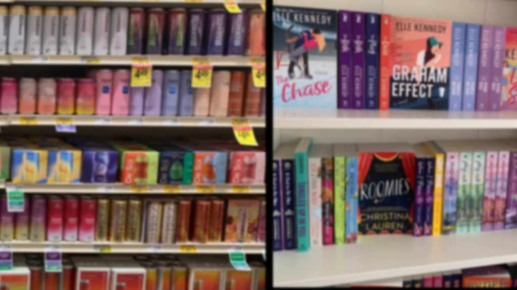
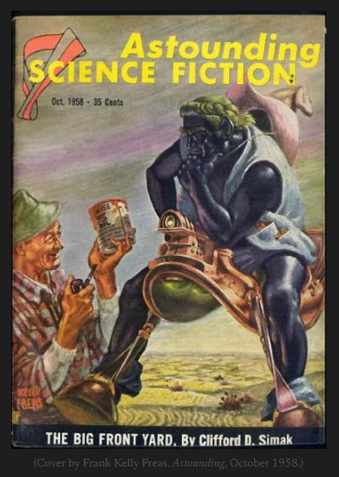
The last time I looked at space opera covers it seemed to me like they were all doing the retro look, sometimes to scoff marks.
There might be a few that were more “modern” look but none of them looked photo-rendered anymore.
This is so WEIRD that I can’t quite wrap my head around it, and I’m sure I’m seeing things.
So your mission if you should choose to accept it is to go out there and search. Space opera, not SF in general.
Tell me, gentle readers: Am I seeing things?

39 responses to “If You should choose to accept it”
I’m not sure what you’re seeing. I mostly see space ships on colorful space backdrops, often with battles going on. There is the occasional cover like “Space: 1975” which looks old school, but that seems a rarity. The other common theme is a group of well-armed individuals, usually in some sort of uniform, aiming their weapons in two or three directions.
I mean the processing and what you’re looking at is mil sf more than space opera, (armed individuals)
Do the covers look like they were scanned from an old, scuffed cover? Are they mostly monochromatic?
Well, I used “space opera” as my search term on Amazon, which of course doesn’t necessarily mean the books are truly of that genre. The only faded looking cover was the “Space: 1975”. It didn’t look worn or scuffed. When I do just a search outside of Amazon for 2020 space opera books I get some that have an older style look to them, but they’re all reprints of books by Hubbard, Card, Vinge, etc. Nothing actually recently written. There is one book actually titled “Space Opera” with a disco ball on the cover, but again not sporting the style you mentioned.
you also have to set them by order of publication.
And hell “regency romance” gets you mostly westerns.
*blinks* what?
instead of featured, you set them for newest order.
Not sure what you’re seeing, Sarah. Maybe give an example. When I look at the space opera listings for Kindle best sellers, I’m not seeing much of the “old, scuffed cover” sort of thing you’re talking about. The problem is space opera and mil/sf are being run together. But a lot of that is because there are very few “pure” space opera or mil/sf novels right now. They have elements of both and it’s only smart to tag it as both if you can.
Maybe I’m confused, but….
I doubt it. I just want to make sure we’re using the same search terms.
I just tried to refine it to “space opera” as much as possible.
Link one of the covers or give the name of a book or two. I’ll go trawling once you do.
Well, founders’ effect is a big departure for Baen.
And Wyrdbard says adding “Science fiction” to the description brings out those covers.
I might have done that when I looked.
As you know spaceships aren’t right for DST covers.
I dunno, I don’t look at enough anymore to have a good overview picture, but I do know I’m coming to dislike the 3D-rendered look that’s often overly plastic.
For me, it’s not “uncanny valley” as much as “blow-up dolls.” In the TRX Cover Evaluation Score, that’s a fail.
Then there are the… I guess they’re “filters”, that people run their images through, that makes them look like they’re both out of focus and covered with tinted film like a candied apple. That’s a fail too.
The newer models, you literally can’t tell. But most people are cheap and use vicky 4
I bought Character Creator 3….
You’re braver than I. I looked at it!
Scared me too.
I’ve had some fairly good results with exporting from that, importing to my 3d software and fiddling with it there. Also, i got the Headshot plugin, so i can select from AI-generated faces and then have it create models of them…
I’ve seen one–Fortune’s Fool by Henry Vogel (kind of a cool looking cover). It’s got pseudo-scuff marks. though I may have been put onto that by Sarah mentioning the cover a few weeks back, so I looked it up, thought it sounded interesting, it was on KU, so…
But even…. Look at the cover of Founder’s Effect, Baen. It’s more seventies than not.
Is it primarily Baen using that style? They tend to forge their own path.
No. I saw a bunch of similar when I looked the other day.
yes, i saw several similar… or 3d rendered ships.. was most covers.
Hope you like it!
I hope so! I’m working my way through my backlog of “really, REALLY need to read this book” and it’s still a few down, lol!
I just started reading your books and am really enjoying them.
Thanks. This comment got my Friday off to a very good start!
I am seeing a trend towards more illustrated looking covers when I search “space opera” under “books” on amazon. They seem to have a limited color palate (1-2 colors dominant) though few seem to be monochromeatic. Some are ‘scuffed’ but they seem more the ‘filter to make it look less like a photo and more like an illustration’ than truly trying for a ‘retro’ look.
Switching to ‘Kindle Store’ I see a similar trend, with some more truly ‘retro’ covers mixed in, though it seems to be more on books I recognize as actually being older (One of Asimov’s and Dune jumped out at me)
Adding “Science Fiction” to Space Opera definitely seemed to enhance the illustrated look. The… more DRAWN look for some of them. Also they’re getting more elaborate than I recall seeing the last few years.
Those are my observations. Your millage may vary. Void where prohibited.
I mean, I do have filters to make it look more illustrated. I think spaceships in space is wrong for DST, but….
I’ve been bouncing through Google Images (with some deceptive routing involving interesting clothing), and the covers seem to be in four big categories lately-
1-Mil-SF-style with starships, tanks, powered armor, etc, etc, etc.
2-“Retro” cover reproductions, with the “beaten up” style/filter.
3-3D rendered various things.
4-Abstract covers.
There’s been more “artistic” covers, but they seem to be a lot older, at least eight to ten years ago.
Short answer: Yes. Especially in YA. Longer answer: let me get to my desk and take a look at the current stack.
Second the Wyrdbard’s seeing more illustrated covers. Maybe carryover from manga.
Here’s a trad pub overview of 2021 SF&F
https://thenerddaily.com/fantasy-sci-fi-2021-book-releases/
There’s definitely some retro covers in there. Of course, signalling trad pub usually = ugh. Grey Goo potential so, eh? I’m having a hard time finding my “best of indie” publications site, so I should prolly hit the rack.
Yes, The Founder Effect cover reminds me of the Dominic Flandry series by Poul Anderson.
Covers, currently struggling. Bought Filter Forge on Sarah’s recommendation, and it seems like I can do something with it.
Which might be a reason for the grunge, scuffed look gaining ground. It’s very easy to hack together a photo/semi-realistic image and run a scuffing filter on it. Probably everyone is doing it now.
I’m about to start cover work on Book 2, very slow going with Rhino and Photoshop, but now I can take out a lot of roughness with some filters and make it more presentable.
Rhino?
ew ew ew ew ew
I’ve got Rhino it, so I use it, but I don’t love it. I looked at Daz3D and backed away slowly, not daring even to poke it with a 10 foot pole.
What’s better than Rhino these days?
Well first of all, for animation, NURBS is a tool of the devil.
Daz isnt really meant for modelling and most of the modeled assets for it are created elsewhere.
I use primarily Modo, but was a Lightwave user for years. Blender works but the interface is still quirky even after the rewrite, and it still has moments where to do things that are a single button in otehr software you need to hit three things in three different places.
Researching Modo now. ~:D