Maybe it’s because taxes are due today. Maybe it’s something else. But, for whatever reason, the last few days have been spent looking at my writing from a business standpoint. I try to do this on a regular basis, but I know I don’t do it nearly as often as I should. Part of the reason is because I would much rather write. After all, I am a writer, not an accountant, etc. But the business aspect is a necessary evil.
It also includes much more than simply looking at sales and making sure taxes are paid.
But it does include numbers — ick — and looking at trends, seeing what other authors are saying about their sales and making determinations about what needs to be done, if anything.
So, the short version of what I’ve done over the last few days is simple:
- Reviewed my sales for the last year
- by title
- by genre
- by price
- Looked at pricing for similar titles, including age of title
- Reviewed blurbs and keywords
- Reviewed covers and compared them with what is currently selling well, indie and trad published
- looked at the art elements
- looked at the font
- looked at overall cover design
- Reviewed my publication schedule for the next year
- made determinations about what should be released when
- made determinations about new titles (unrelated to current series)
- Reviewed my meager promotion operation with an eye to expanding it
Now, don’t start running to the hills. I’m not going in-depth into what I did and what my plans are. For one, a lot of those plans are still being made. For another, right now a lot of it is subject to change, at least until I work some more on it. Still, some of the things that are factoring into my decisions are, I believe, things each of us need to look into when it comes to our writing.
Because numbers (ick) are involved, I’m still looking at my sales figures and comparing them with the last several years. In some ways, this is an exercise in comparing apples to oranges. In others, it is interesting. For one thing, I can definitely see a trend. Once I hit 10 novels, my sales across the board went up. Also, once I started linking my pen names with my name, sales across the board went up. Still, numbers are involved, so this will take several more days for me to winnow out all the information I’m looking for. (sorry, I’m a writer, not an accountant and numbers make my head hurt.O
The next thing I looked at happened to be my product pages. Oh my, there is so much there we have to take into consideration and we don’t tend to. At least I don’t. Sure, I want to have the best possible cover to draw the reader’s eye. I want a snappy and interesting blurb to grab the reader and make them want to buy the book. But I don’t tend to check the product page on anything other than my laptop. I forget to look at it on my Kindle Fire or Mom’s iPad. I sure forget to look at it in my phone. Or, more accurately, I used to forget it. After the last few days, I won’t. What I learned is that the longer blurbs will work on a tablet or computer screen but, on a phone, they are a pain because you have to keep scrolling. Not good. Scrolling for a screen or two is one thing but for screen after screen after screen — nope. Not gonna happen. Fortunately, most of mine weren’t that bad and those that were happen to be on two titles I am going to withdraw because they were supposed to be short term promo titles initially.
Another thing I don’t always do, and it is now on my list of must do, is check the preview function for my books. I’m not talking about the downloadable preview (although that should be checked as well) but the “click to see inside” preview. A number of readers, myself included, use this to determine if we want to buy or borrow a book. This is where they will get their first real impression of that particular title. It’s important to make sure the preview doesn’t appear to be poorly formatted. Even more important is making sure there are no misspellings or outrageous grammatical errors present. I can’t stress this enough. This is a free promo and so many of us don’t bother checking to make sure it is accurately representing our work and that, in turn, can cost us sales.
All that showed I have some blurbs to update. As a reader, one thing that will stop me from buying a book is a badly written blurb. If I find misspellings or poor grammar or punctuation in a blurb, I’m going to assume the book is written in much the same way. Also, look at the formatting of the blurb. If there is no white space between paragraphs, you are basically screaming one of two things. Either you are in newbie who doesn’t know how to format blurbs or you are careless and don’t care. Either way, it isn’t the image you want to put out for your readers to see.
I also need to update my keywords on several books. This is important because the keywords help with the search function. Also, in case you didn’t know it, keywords can also help determine what genres and sub-genres your work is listed under. Amazon is starting to crack down on what keywords you use because they had so many complaints by readers about searching certain keywords and finding books that were not “romance” or whatever. That means I need to go back and make sure I have not run afoul of the rule by mistake.
Also, the keywords change from time to time. So to sub-genres. That makes it imperative to regularly make sure we are using the best keywords we can. It helps sales by helping readers find out books.
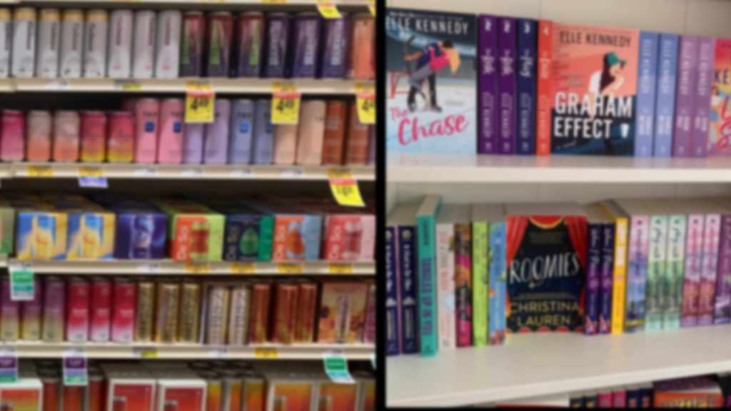
While doing this, I also looked at my covers. Now, I’m not going to spend any time on the making of covers because, duh, I’m not an artist. I will say this. Don’t be afraid to periodically change your cover. Now, I’m not talking every month or even every six months. But, just as sub-genres change and expand, covers for those genres change as well. As indies, we need to be aware of what the trads are doing in our genres, both with images and with fonts. While we don’t have to copy them, it never hurts to at least have the same “feel” as they do. Why? Because if you write books with the same feel as the Mercy Thompson or Jane Yellowrock books, it will only help for your covers to have the same feel. Why? Because readers of those series will see something that is familiar when they look at your work and the cover might just entice them into reading the blurb and buying the book.
But there is something else to look at as well. If, like me, you write series, your covers within the series have to relate to one another. It is another way of cuing your readers that the new book is part of the series they are already reading and enjoying.
Finally, even if your cover worked when the book came out two years — or ten — ago, it doesn’t necessarily mean it will now. So look at what is selling well in your book’s genre and sub-genre and then look at your book cover with a critical eye. If it doesn’t feel fresh, if it looks and feels dated (or worse, amateur), then change it. But do your homework. Know what works — both in images and in fonts — in your genre and sub-genre.
Now you see why I said I wasn’t going in-depth today about everything. All this was just off the product page. More than that, it was off the product page of just one one-line store. More than that, it isn’t everything off the product page that I’m looking at as an author. By the way, I am also looking at it as a reader, trying to think about what strikes me and grabs my attention when I’m looking for a book to read. If you guys want, I’ll continue with this next week. Otherwise, the next scream of frustration you hear is me when I once again return to the task of looking at my numbers and trying to see if I can make sense of their arcane magic.


56 responses to “It really is a business”
So to sum up… Publishing isn’t the end. Once you publish you have to continually check to see that your stuff is still grabbing and is up to date for the market. 🙂
Honestly, it’s good advice for those that don’t work a lot in these types of markets. Even in finances you have to continually fine tune the money flow to get the most out of it. Photography is keeping an eye on trends and making sure that you are keeping up and adjusting portfolios, images, and sometimes even gear. Not to mention your marketing strategies.
Absolutely. Of course, the problem is making sure you don’t spend so much time “tweaking” a title after it’s been published that you never finish anything else.
Covers! Ugh! By the time I finish updating my covers they’re going to be out of date again. :: whine, moan :: THUMP! Thanks! I needed that kick.
How long until “out of date” becomes “cool retro”? I know, too long to rely on that. Still, I keep thinking of grandma who had the kitchen redone in a more modern style… just before the black-white-silver/chrome look was “in” again.
Is it just me or are indie sf books undergoing a style change?
(yes i mean the covers)
Probably.
In what way? I know you mean covers but I could answer better with some more specifics.
Indie covers seem to be racheting up in complexity. I’m looking at some of them… C.J.’s Warp Marines covers, for instance… and figuring there’s no way i could do those myself cost effectively. I could do them, but they would take a month..
They seem to be becoming more action-y illustrations and less symbolic.
One of them I know is something that can be gotten from sites like Adobe Stock Photo or Dreamstime. How do I know? Because it is in my downloads right now. That’s the thing you have to remember. There are a number of really good images, or image elements, you can find on sites like those. Pixabay also has some great free images and elements that can be used. The key is knowing where to look or having someone who won’t charge you and arm and a leg who knows and who will look and put the cover together for you.
Sorry, hit enter before I meant to. I recognize elements of several of the covers from images that are available from sites like those I mentioned above. That’s the key. Finding things you like and learning how to mesh them into a single image — or finding someone who can and who won’t charge you a lot to do so. The key to remember is, whether you license the elements or the cover designer does, you have to make sure the license allows for commercial use, the number of times it can be used on something for “sale”. In other words, if you sell 1k copies of an ebook, do you need to re-license the art elements?
I’m honestly concerned i would be too picky for my own good.
It’s the learning curve for the meshing that is steep. At least for some of us. Which is why I look forward to Cedar’s posts and always clip them. (The last one I think solves a problem that I had in December, one that has me holding a story until this holiday season. Covers are still something that take way too much of my time and way too much of my focus – and make me timid.)
Making matters worse is the fact that the curve never closes to become a circle. So we are always having to learn and keep on top of trends. That is why, if you hire out your covers — or even if you trade editing, etc., for them — you have to be on top of what is happening in your genre and sub-genre. I have seen too many covers that have been hired out where the cover designer or artist accepted a project in a genre they didn’t normally work with. Even if the image worked, the fonts were all wrong or vice versa. So you have to know what is going on and be ready to detail what you want (and what you don’t like about the finished product).
That “thump” you heard was Sarah kicking me over the same thing. So you aren’t alone.
That’s one thing I’m dreading, because of the cost. I need to re-do at least two, probably six covers on novel-length collections or novels. That’s a significant chunk of change, since I do not do my own art for books. Yes, it needs to be done. Yes, it will be done, probably this summer, but saving up for it is daunting.
Waggles hand. It is if you are looking at original art. But you can do — or trade services like editing for covers — really good covers for little to no real investment. I doubt I have paid more than $10 in art elements per cover in several years. I have maintained my subscription to Adobe Stock mainly because I download a lot more images than I use but I use them for inspiration and to store in case I need them later.
Yikes. Makes me glad to be an artist who has had to learn to be super-fast in Photoshop. I can’t do spectacular fractal elements, but I have provably bashed out a cover in less than eight hours of screen time, including painting with a %^&(*% mouse.
Did you do the cover for ‘Minstrel?’
It’s lovely!
Thank you! I’d actually spent a lot of time earlier painting some letters for a custom font, then figured out that they looked really *awful* together, so I found a “free for commercial use” font.
Art is my skill set. Lettering, not so much.
You know, the Monoprice tablets are supposed to work pretty well, and cost less than 1/3 what Wacom charges, ijs
I have a tablet, but this was right in the middle of the year that I didn’t have a computer of my own (daughter knocked a glass of water over my laptop; data saved but processor fried.) I had to get a trial version of Photoshop, which only lasted a week, and I didn’t want to waste time by seeking out the tablet and setting up the driver.
ok i was just lettin you know…
I really hate that my depression keeps me from doing more art. I stare at the damn blank page. It’s like Nebezial, and his pointing at his screen, and going “It mocks me!”
And for that, I am so very, very sorry. /dogeza
Yeah, she kicked me yesterday. My covers were adequate for the early days of ebooks. _Now_ they are not just dated, they are flat bad.
On complexity . . . it’s a balance between a complex background that looks good large, and foreground figures that will show up well in thumbnail. Knowing that, and being able to deliver it are two entirely different things.
On blurbs, which I also need to redo, for my latest, I’m trying to be intriguing in a few sentences. Hook them before they have to scroll.
On the complexity/simplicity angle, we may have to get past the thought process of having the same cover for the ebook that we have for the print. Whether it actually comes to that or we finally figure the process out (at which point it will change again), I don’t know. Hell, I wish someone would figure out the rules and explain them to me.
And then freeze them in place. Ha! Like that’ll happen.
One of the values of working in Photoshop (and similar programs) is the Layers. You can have various elements on various layers—so if you have a complicated background, you could literally turn off some of the complications for a simplified cover for the e-book.
Always, always, always save a layered version, and clearly label your flattened versions as to their specific function. “TitleCover(E-Book)” helps a whole lot when you have to go back.
The main reason for me wanting to upgrade ever was coz of layers. I had a piece where I ended up with over 150 layers, and my poor PC was struggling.
A vote for continuation. Not that I have enough to review – but far better to have a plan for when and if I do. (Posts like this one get clipped and put into a writing folder – I’m tempted to name it “Eternal Truths,” but just might have a fiction piece titled that someday.)
Okay, unless something more “exciting” comes up.
This is really a good insight into what to expect after your book is in the shelf, all the post-publishing work. Here I thought writing was the hard part 😉
Please, please go into depth 🙂
I’ll look at your yucky numbers for you (I love numbers, spreadsheets and looking for patterns).
My issue is, I can look at see what books are at top and such, but I can’t tell if I need to change anything about mine. And I really can’t figure what to change it to.
I know I’m doing something wrong or just not right in my marketing, but I can not figure out what it is.
Honestly, a lot of what I’ve done has been trial and error. I also spend half an hour to an hour every morning looking at what is going on in the industry, reading the blogs, etc. When I get ready to bring a new book out, I look at what the covers in the genre and sub-genre look like and make sure mine is tracking pretty close to that. So much of it is first impression. Does the blurb grab? Does the title sound interesting and cue the genre/sub-genre? Does the cover cue the right things via the art, the font and what is written on the cover? Even making sure the “look inside” bit looks professional and includes your hook (you’d be surprised how often I never see a hook in the preview) is important.
Now I want to know where I complain to Amazon that “Game of Thrones” is NOT Space Opera. Badly. I will go through with a flamethrower. That nonsense peeves me *so much*!
It’s not about the ooze from sharp plants?
Oh, right, that would be Gum of Thorns.
And i need to tell Amazon that i don’t care how popular it is, stop recommending it to me, GRRM can do without my money.
Go to the product page and scroll all the way to the bottom. There should be a series of feedback questions there. Everything from contacting customer service to leaving feedback on the formatting or poor quality of the book to reporting it for inappropriate content and more.
C4c
So, how often should writers do such an in-depth review? Quarterly? Twice a year?
Once a decade?
Okay, it was depressing, in the early days, and I stopped. I really do need to restart keeping track and analyzing what’s selling.
My gut feeling is you need to take a hard look at it every six months with a full review once a year. I wouldn’t do it any more often than six months because a title needs time to build an audience. You also don’t want to give the reading public the impression that you can’t make your mind up by changing the cover every few months or making major changes to the blurb every few months. If you do that, it sort of looks like you are trying to pull a fast one and get them to buy the book more than once. Amazon is pretty good about letting you know if you already own the book but mistakes happen. I know. I have two copies of several e-books.
There also seems to be a lot of seasonal variation, with, most notably, a slump in early summer.
And several weeks before and after tax day.
The 1632 e-book covers are FAR too complex. I feel lucky if I can make out the year, let alone the title, on my Kindle. On a desktop monitor they still look overly busy for their size.
Whoever is doing the Kurthurian covers does an excellent job. The originals were pretty awful, but they’ve all be replaced.
Pam, I’d be interested to know if getting the shorter Directorate books out faster is working better than longer books. Personally, I like the longer ones, but having a new book every couple of weeks is also nice. (Yay, #5! – but it was over so quickly.) The only cover of yours that I don’t like is the boy on the horse; he’s a bit in the uncanny valley.
How about an omnibus edition? That’s only one new cover 😉 The price might be horrifying; there are what? 30 of them now? That’s an expensive e-book.
The frequent releases of the smaller works boosts my overall income, partly by themselves, but also by increasing the sales of the early books in the series.
Yes, I need to do Omnibuses. For instance, Black Goats, Explorers, Spy Wars and bunch of the short stories. Then Comet Fall and Dark Lady, again with a lot of the short stories. Purple, Young Warriors, Assassin, Heirs . . .
Amazon’s got them bundled–at $97 !!!
So I need to do it, but broken up a lot more than that, and I don’t know how Amazon feels about pricing of such things.
Pam, as long as you bundle them as a single “title” (or use the term boxed set), you can price it however you want and Amazon won’t quibble. At least that’s been my experience. Email me if you want to discuss how I’ve done it.
I’ll agree with you on the 1632 covers, especially for e-books. I’ve only read the first of the Kurthurian series and yes, part of what stopped me and had me looking at the book was the cover.
Not Pam but I can tell you that when I release a short story in the Honor and Duty series, it spurs sales of the novels. So I am going to try to be better about releasing at least one short story between novels.
From a reader perspective: two things about a cover are grabs:
1. A cover that is gloriously beautiful. Laura Montgomery’s ‘Manx Prize’ comes to mind, and I just looked it up, and “The Sky Suspended,” “No Longer A Mystery,” and “Erawan” also struck me as gorgeous at the time.
2. A cover that CLEARLY tells me it’s part of a series I love. I think Pam Uphoff could put a picture of a cat’s butt on her books, and it wouldn’t hurt her sales at all, because the Wine of The Gods is addictive. I’m thinking about the Alma Boykin’s Colplatschki Chronicles here which all have the same POV on the covers. That’s particularly important, if you are gonna make us remember some complicated name with too many consonants in a row. We find it difficult to type that into a search engine.
But the author name thing? I absolutely get it that there is a need for pen names, but seriously guys: y’all be jackin with us too much sometimes. Gimme a CLUE, if you want any cross-over sales!
I don’t know if it ever made it on-line, but there was a wonderful tongue-in-cheek linguistic history essay about the Mongols’ great vowel raid against Poland and Czechoslovakia, which explained what happened to the Slavic lands to leave us with things like Krzyzezski (“Shuh-CHEF-ski”).
And then there’s the divorce between the Welsh and the Hawaiians. The Welsh got the consonants and the Hawaiians got the vowels, right?
*wipes coffee from screen*
A Spokane announcer did a great riff on how to pronounce a college basketball player’s name. “The P is silent, the R is silent, the Z is… it’s all silent, just say Shemek.” (Przemek Karnowski.)
Conservation of Mass means that it’s likely to be the butt of a rather large cat, maybe the size of a black goat. 😉
Thanks, Pat! Phil Smith gets the credit for the beautiful art.
I did update the fonts on Manx Prize a couple months ago to make it match with the fonts in the rest of the Ground Based universe. And I didn’t have that font down until I released Far Flung.
_NOT_ going to test that theory!!!!
I am definitely not bored by the gory details. I mine this blog for the gory details. Also, this reminded me of my favorite professor’s favorite phrase: “It’s a business FIRST.” Of course, he’s talking about the television and movie industry, but the point still stands.