Yesterday, when I started looking for something to blog about, I made my way over to The Passive Voice. TPV is an excellent source of information for every author out there, traditionally published or indie. One post in particular caught my eye. It asks the question we have heard asked so many times over the last few years: Are self-published books inferior to professionally published books?
Now, without even reading the article, I knew I wasn’t going to like the post TPV had linked to. The title of the article itself shows a bias, not by TPV but by the author of the article TPV linked to. It assumes that self-published books, what we call indies, aren’t professionally published. Take that one step further. By phrasing the headline the way it did, the author of the article signals from the beginning that indies aren’t as professional or as good as traditionally published books. Otherwise, why not rephrase the title of the article as “are self-published books inferior to traditionally published books?”
So, without even reading the underlying article, my back is up. I can’t speak for anyone except myself but I am a professional writer. I make money from writing, enough to pay my bills. I simply chose not to take the traditional publishing route. That does not make me any less of a professional than any other writer who has chosen to try to find an agent, get a contract and publish with one of the Big 5 publishers.
But let’s move on and see what the article itself says.
Let’s see, the original appeared on Quora. The author of the post is Archie D’Cruz who, according to his byline, has “been involved in publishing all my working life.” Hmm. Could this be another indication of a bias? We’ll see.
So overall, how do the books compare? For the most part, self-published books do not even come close to what a major publisher puts out.
Wow. That’s a very broad statement without any sort of qualifications. It also sets the tone for the rest of the article. Our so-called expert has just told everyone who might be looking for good information that indie books don’t come close to what a “major publisher” puts out. Now, while this is true on some levels — indies aren’t restricted to writing to what publishers want to fill their catalogs, for example — it also skews away from the topic as put forth in the headline to the post. Remember, it wanted to know if self-published books were inferior to “professionally” published books. Now, suddenly, we have gone away from the “professional” aspect to “major publisher”.
Let’s see what else he has to say.
His first knock against indies is when it comes to editing. According to the OP, he is surprised “so many” indies see no need for an editor or proofreader, etc., to have a look at their work. I don’t know what indie authors he’s been talking to but I don’t know a single indie author who is serious about her work who doesn’t have beta readers, proofreaders and and editor look at her work.
What they [traditionally published authors] benefit from is having multiple sets of eyes review and make edits; often many rounds of edits. Copy is also checked for spelling consistency and reviewed using a style guide (typically the Chicago Manual of Style).
Pardon me while I laugh hysterically. Yes, there are some good editors out there but they are few and far between. I know several traditionally published authors who have taken to hiring editors to go over their work before they send it to their publishing house because the level of editing there has gotten so bad. There are stories from authors where their editors have not only missed errors but have made changes that were flat wrong, whether it was changing a foreign language word into something different and inappropriate for the context or using modern maps and landmarks for historical fiction. As for making sure the book follows the CMS, I think one of the commenters at TPV had it right. Most readers couldn’t care less if the CMS is followed or not as long as the book holds their attention and the grammar and punctuation isn’t so bad it throws them out of the narrative.
His next issue where he thinks indies fall short is cover design. I’ll admit, there are a number of really bad covers out there. Whether it is because of bad cover images, the use of totally wrong fonts, or what, indies have done some terrible covers. But so have the traditional publishers. I don’t remember the title of the novel right now, and I think it was a romance, but the woman on the cover had three hands. He does, grudgingly, admit that sometimes trads use stock art. But that is buried after he talks about photo shoots and multiple attempts to find just the right layout, etc.
I’ll even admit this is probably the one area where most indies are the weakest. However, a smart author, one who is serious about their work, will find someone who can help with cover design. It isn’t something that has to cost hundreds, or even thousands of dollars. What it does take is someone who understands how to signal the right genre with images and fonts. It is also something that an author has to understand.
Moving on.
Design and layout is the next area where the OP thinks indies fall down on the job.
The production values for the interior of the book are just as important. I cringe when I see the ghastly Times New Roman used as body type in a book. The same goes for type set too close to the binding (something that needs to be taken into account while laying out the book), or when hyphenations are set to ‘On’ when the type itself is justified, or when the type is set so close to the page borders that it is not allowed to ‘breathe’.
Now, do you see what I see here? Notice, nothing is said about e-books. Either he doesn’t think e-books are a valid form of publishing or he doesn’t think there is such a thing as production value for e-books. Or could it be that he realizes that indies know, often better than trads, how to put out a good looking e-book?
When it comes to print, it isn’t as difficult as he wants to it seem. Again, he is using very broad strokes to condemn a large number of authors for mistakes made by only some of them. He also doesn’t mention the problems I have personally seen with some traditionally published books where I’ve had the pages suddenly turned upside down or have had a section of the book missing when I bought it.
Here’s the thing, folks, I hate articles like this because not only are they a comparison of apples to oranges but are so overly general in their application that they don’t offer any valid data to support their allegations. Here’s the thing, there are some bad indie books out there. Bad in production values, bad in style and bad in cover design. But there are also bad traditionally published books out there as well. How many times have publishers given huge advances to some politician or celebrity only to have the book tank? How many times has a publisher put out a book only to find out the co-called true story wasn’t or to learn the story had been plagiarized?
As indies who want to be viewed as professionals, we have to treat our work as just that: professional. We have to make sure it is edited, proofed, well laid out and has the best cover we can find. It is our job to not only meet but to exceed the quality readers have come to expect from traditional publishers. It is our job to prove that folks like the OP are wrong.
***
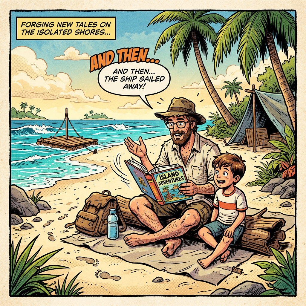
 Last week, I posted a snippet from what was then an untitled work. Since then, a title — as well as a series title — has been decided on. Witchfire Burning will be published later this week as an e-book. The print version will be available in a few weeks. Check here or at my blog for updates and a link when the book goes live.


79 responses to “Oh my, are they protesting too much?”
c4c
I forgot to do this earlier.
I certainly agree the article title is suspect.
There is a great deal of self-published material out there that is of variable quality. On the other hand, I started reading (and must force myself to finish to write a fair review) The Fifth Season, which appears to have a perhaps-good plot and abominable writing/editing decisions–and it was professionally published before it won its award.
George, you’re right. There is a great deal of questionable material out there. I do think indie writers get a bad rap and a lot of the reason why is because of folks like the OP. I haven’t read The Fifth Season yet and, after what you’ve had to say, I’m not sure I will. I’ll have to check out the sample.
So, what counts as a good font? I do use Times New Roman because it’s so very non-strange.
I wonder what he’d think of Comic Sans?
My Kindle allows me to choose fonts for my eyes. Hasn’t been an issue.
So do I … although for one of my clients I used Bookman Old Style because it had an elegant look. And setting up the margins, gutter, running heads, etc … not brain surgery, either.
I have seen some atrocious layouts, though – very narrow margins which were likely set to save print costs by cramming as much text as possible into each page … but not in a good few years. I always tell clients that page layout/formatting is invisible when done well. You only really notice it when it is done horribly.
You’re right. Gutters, margins, etc., aren’t difficult. What is funny about the OP complaining about them is I can go to my personal library and find a number of traditionally published books with problems along that line.
Another Bookman fan!
The concensus seems to be that as Times New Roman is generally the default font it sends a message that the author did not bother to change to something a bit easier to read.
I will note that TNR was our font of choice during my 25 years of generating government documents.
I will leave the discussion of serif versus san serif and which might be better for print or on screen to the experts.
Serif vs. sans serif is closer to a religious argument than a readability discussion, at least from the arguments I’ve accidentally walked into. (Sib does graphics design, among other things. Fonts are one of our “not at Thanksgiving Dinner” topics per Sib-in-Law.)
Just my personal observation:
I’ve read two textbooks and perhaps a half-dozen non-fiction books that were printed in san serif fonts, and I literally found it slower to read and harder to keep track of my place. Reading such for too long (more than ~90 minutes in a sitting) was giving me headaches; I had no problem reading works printed with serif fonts for hours on end. Onscreen I don’t care – I like san serif marginally better but either way I have no problems reading for hours on end.
I find san serif pleasing when I’m looking at the font as a font. Serif fonts such as Times New Roman aren’t as nice looking but I can usually identify words as words by the shape without much effort at all. I think you’re probably right, Sean. And I think that few people separate what pleases them when looking at a font and what actually requires the least effort to read.
I prefer serif at least for proofing – doesn’t matter which when reading, or not that I have noticed.
The easiest rule to remember, is this: use serifs for the body of the text, sans serif for headers, pagination, and one, and only one “art” font for occasional notes: the title and or chapter initials.
Yes, reality-trulio graphic designers break these rules successfully all the time. When you join their ranks, you can too.
TNR is still, as far as I know, the default font for business purposes. I think that is part of the reason a lot of folks don’t want to see it used in publishing — they don’t want the reader to have a subconscious association with work when they read.
I’ve always like Book Antiqua, but I’m thinking of giving Bookman Old Style a try. It would mean the dead-tree books are a bit larger–BOS takes up more space in a given point size than BA, which takes up more than TNR.
Both are good for print, imo.
My standard fonts are Garamond and Caladea.
The article was already off the rails, but slamming Times New Roman was the point where I wanted to roll my eyes and mutter, “Pretentious artiste.”
For interior, I use Georgia. However, I make sure my e-books are put together in such a way the reader can change the font to something they prefer.
I don’t have a problem with Times New Roman or visually similar fonts being used – either in print or in ebook. In fact, visually, I prefer it because I don’t have to puzzle between a capital ‘i’ or a lowercase ‘l’ – especially when proofreading. But this is entirely personal taste on my part.
Bookman Old Style and such are also nice fonts to use.
Some self-pub services such as Lulu have pre-formatted documents for you to use in writing; they’re already set up to take printing margins into account. There are some drawbacks – find that their margins are a bit too wide for my taste – but they are not horrible.
I remember reading about that romance cover with three arms, I think way back when I was still reading Writers Digest, so at least 20 years ago. The author was at first horrified, and then delighted, and probably sold more books because of that cover than she would have otherwise.
Found it!
http://www.christinadodd.com/christina-dodd-and-the-infamous-three-armed-cover/
Embrace your insanity!
*giggles behind paw* One of the favorite games at Photoshopdisasters.com used to be “spot the limbs”, because of the spare hands, and arms and legs that would appear in some shots. Bonus points for colors that didn’t match. I think I remember that book cover, or one like it.
I can think of *cough* scenarios where three arms could be quite useful, in a romantic setting… but then I’ve always been a bit Odd 😀 And don’t three-armed people deserve love too?
Not just romantic…..
Of course, that wasn’t an arm…
Actually would be a fun bit in a Soviet style story. Having 4 people and 10 feet at a table happened there
Bill Maudlin did a comic where the soldiers were denying being drunk and put an extra hand. He observed that some people regarded him as thereby disqualified to speak on the topic
Larry Niven’s tales of Gil the Arm Hamilton centered on a futuristic detective who developed a telekinetic third arm after he’s lost one in an accident and gotten a prosthetic replacement. I remember Niven including a mention of its romantic uses in one of the stories.
And then there was this girl who said in cinema,
“Please, take this hand away. And this one, too. Yes, and this one …”
Yanno, as bad as indie production values *can* be, I don’t recall any indie had an ebook where they just scanned a chopped print book–including the “Property of the Hoboken Public Library” stamp on the title page. Because the highly professional traditional publisher didn’t have a print copy of their own book and had to go to a library sale to find it. So they could OCR their own book to generate a crappy ebook. No, you need YEARS of industry experience to do that!
Oh my. I have to admit I’ve never seen that in an indie — any more than I’ve seen obvious OCR errors like I have from trad published e-books because they can’t be bothered to proof the e-book after scanning in the hard copy.
OCR errors can be fun, or just bloody frustrating. I can’t tell you the number of Project Gutenberg books I’ve read where “close” became “dose”. Scans of older periodicals can be amusing, especially if it fails to detect multi-column layout properly, or it decides to handle photos and illustrations – or there captions! – in interesting ways. Not to mention sporadic treatment of fancy fonts – the cursive-like font one periodical used in the late 19th century for the page headers and footers was handled especially poorly, but the results could be interesting. Page (mis-)alignment during scanning can also produce some interesting variations.
BWA HA HA HA HA!
I remember a bit over a decade back when publishers started making hardbound books where the pages had ragged edges, and were of inconsistent size.
I’d call it metaphorical, but it mirrors too many other examples of slipping standards.
I remember a bit over a decade back when publishers started making hardbound books where the pages had ragged edges, and were of inconsistent size.
I think the word you’re looking for is “artisanal”.
Which can in my experience be defined either as “carefully and lovingly hand crafted,” or “a rushed sloppy knock off because the rube buyers won’t know or care.”
Oh, the rubes know. They’re supposed to know. And pay more for the “authenticity.”
“Deckle edges.” When done right, this can be very beautiful. When done wrong, it’s a PITA to turn the page. If it’s the former, the pages themselves should be thick and smooth.
Give me the nice, smooth edges they used to put on encyclopedias (with the gilding, ah!)
Encyclopaedia? What’s that? (Yes, I miss the “ae” diphthong; did you know Brits still spell it “feotus”?)
I remember those. One of them a fantasy iirc, had such thick pages and such poorly crafted edges that the first several copies I picked up at the bookstore had torn pages because customers had a difficult time flipping from one page to another. Oh, and I think they charged more for the “fancy” pages as well.
I have a few of those; found in sales. I have a copy of Belgarath The Sorcerer with those ragged edges. For some reason, I rather liked it for fantasy books.
My experience as a reader has been that of the fiction I read from the major publishers and the self-publishers, they are of about the same value in terms of most “production values” save for cover art. Only on cover art would I give the major publishers a better rating on average, as they mostly turn out decent-to-great covers, although I’ve seen them turn out some disasters from time to time. Self-published books on average seem to have more variability in cover art quality.
OTOH, for science fiction and fantasy, on average I’ve more often enjoyed the actual story and prose of self-published stories vs. those from major publishers. Again there’s the usual Baen exception – they still usually publish stories I enjoy. For other fiction categories (mystery, historical fiction) the works put out by the major publishers are in a bit better shape, but are by no means necessarily better than indie – just more in the same ballpark.
ROMANCE is the only genre in which traditional, as annoying as it is is still consistently better. OTOH the indies still sell, so it’s just me, I think.
Historical, PARTICULARLY HISTORICAL MYSTERY, is head and shoulders above traditional.
I’ve only read maybe a dozen new pieces of historical fiction (none if it historical mystery) in the last couple years, so with a small enough sample set perhaps I lucked out in what I bought from the major publishers. There’s also a bit of selection bias – I read the blurbs and didn’t buy anything that sounded like it wasn’t my cup of tea.
Baen books are of course regularly mocked for their cover art by the sneering classes. Not realizing of course that Baen’s art is a large part of the branding and makes their books instantly recognizable.
This is extremely helpful for people like me who aren’t really interested in the crud the other “professional” publishers put out.
Some years back when both BIX and Jim Baen were still alive an author who was also on BIX sort of half-complained about the amount of a female character showing on the cover while she was in the middle of combat. This thread went on for a few days, with most of the fans (including me) arguing that we were beyond the need for such things. Baen’s response essentially boiled down to: “Most of you guys are going to buy most of my books anyway. I need to catch the eye of people who don’t go to the bookstore to hunt for all of my books each month.” As I recall he took time out some weeks later to crow about sales of that particular book. 🙂
Fifth or Sixth Belisarius book, right? I remember that cover.
Is this it? I just had to look it up, after that story, heh.
This kind of defensive yowling reminds me of a complacent 1970s auto-industry right before the sweep of imports re-framed the entire market in this country.
Good analogy.
Just one quibble, Amazon, the Kindle and ebooks in general have done precisely that to the trad pubbers. This isn’t “right before” the industry changes it is “during the period when” and what we’re seeing here is a bunch Detroit execs and hangers on desperately trying to stem the tide ofchange
Witchfire Burning, nice. Good title, lovely cover. But the book has so much more that what title and cover convey. A fearful single mother fleeing home to family and a sentient house to protect her daughter from a criminal and abusive ex husband, and seeking advice and training for the powers the little girl has begun to manifest. She herself a highly respected law officer skilled in canine drug enforcement and hurting from the loss of her four legged partner. Herself a mundane, she returns home to a house, family, and village of others for the sake of her daughter.
If it weren’t for the law enforcement thread I’d almost call it a paranormal cozy. And any typos or mistakes of grammar are on my head. It was such a good read that I found myself losing my copy editor focus.
Eerie side of the tracks also seems like a good series name.
Yeah, but it has a sort of woman in jeopardy/Gothic romance/paranormal look.
One final note. I returned the copy edited manuscript to Amanda a week ago. She got some help from someone I shall not name to gin up a cover and a final name for the book, and it will be up on Amazon, possibly others, next week.
In the traditional publishing world that process would have taken months at best, most of a year at worst.
Indie publishing of your work gives you access, control, and when compared to trad pub, immediate availability of the market response.
And she’ll be getting her first royalties for it a month or so later as opposed to 6 months to a year later
Not so long ago, I have seen a historical novel lavishly produced by a traditional British publisher. I counted as many as six spelling errors just in the frontispiece map. So much for professional editing.
The individual I use as final “beta reader” and copy editor uses CMS, but she also recognizes when strict adherence to the manual would disrupt the “voice” I’m using and to leave it alone. The ability to make that kind of judgement call is a pearl beyond price.
Yep. Felicity of style. Very few progressives enjoy it because it tends to interfere with propagandising
One of my authors (not Amanda) hands me manuscripts that make MS Word’s grammar and spell checker light up like a christmas tree. Mostly I check to make sure the words or phrases aren’t a real error then ignore the markups. This author is extremely fond of runon and partial sentences. But only in dialog, so perfectly appropriate, or so I believe.
The ultimate objective being, naturally, to entertain and communicate with the reader, not to get an A on Mrs. McGillacuddy’s midterm spelling test.
When the dialog is “perfect English” – I skip the book.
Conversely, when I encounter any poorly spelled words, or incomprehensible grammar, that are not inside their Safe Space of quotation marks, I’m quite bigoted and have a burning desire to pound the offenders with a baseball bat.
Hmm… Do I have a problem here?
Yes, you do.
Possibly with anger issues, but I’m not being held responsible for personal demons. ( 🙂 )
Dialog should be written as real people — the characters talk. But not so incoherently as to make it difficult for people to read and understand. Easy on the dialect, in other words. I remember as a young reader being totally baffled by Joel Chandler Harris, who went so heavy on the southern illiterate vernacular that I couldn’t understand it at all, OTO – Lewis Grassic Gibbon wrote in Scots vernacular, without a lot of phonetical misspellings and apostrophes. I could read LGG and “hear” the voices of the characters.
Probably a cultural thing, though – since I had a Scots-Irish grandfather whose accent was still fairly strong.
“Hmm… Do I have a problem here?”
Yes, a quite serious one. You are one short step from succumbing to the vice of copy editing, a thankless job, poorly paid, and earning the practitioner no respect whatsoever.
On the other hand I manage to make half a dozen ladies and a couple of gentlemen look good, and sometimes they even thank me for it.
A couple of “professional” (traditional) hilarities from my memory.
1. An entire print run of a book that was a biography of one of the giants of Japanese manga and animation (the creator of “Ghost in the Shell”, among others), had some sort of error that was either a really bizarre find/replace error, or they were using some sort of publishing process that went horribly wrong. One of the stories that was repeatedly discussed was one named “Avalon”, that was apparently contemporary with the book’s writing. Whenever it was mentioned in the book, it was in Italics.
EVERY instance of an italic lower-case “v” in the ENTIRE BOOK was missing. So “Avalon” was always spelled “A alon”, and there were several other instances where the italics were used, and all the v’s were missing in those. Confused the hell out of me. Apparently, this book made it to market with this error, and went through the entire shipping and retail process, before the book ended up in book clearance stores.
2. Early 80s, Asimov’s Magazine. The story “Aquila” by S.P. Somtow (under his other name, that I can’t remember how to spell on the fly) even managed to get nominated for a Hugo (according to the author), despite the magazine having about 6-8 pages printed OUT OF ORDER. And, you can tell it was a layout mistake AT THE MAGAZINE, as if it had been an error at the printer, odds are you’d have the other panels of the print sheet elsewhere in the magazine mis-ordered as well. Nope. The only pages messed up were in that one story (and the page numbers of the magazine remained consecutive through the error), as if between final edit and layout, someone was walking the story to layout, dropped the folder, the pages scattered, got bunched back up without being put in order – AND NO ONE CAUGHT IT AT LAYOUT. (Somtow and I got a good laugh about it at Marcon 21 or 22 (forget which), where he was one of the guests, and for some reason he chose to hang around in the GOPHER ROOM and eat pizza with the volunteers, instead of the green room).
Not quite the same, since this was a gaming book, but at one point Dungeons and Dragons changed from “mage” to “wizard” when they put out a new edition.
In one sourcebook, they put out stats of a lot of magic items. Thanks to find & replace, on some items this included how many points of dawizard the item would deal in the game.
There is this book that I still have on my shelf. One character there is named Nyela – most of the time. For whenever the name occurs in genitive case, it mutates into Nelé. Back and forth. All the time. And, mind you, it is Nelé in the list of characters in the Appendix, too.
I can imagine how this has happened: Exchanging the name by automated Search&Replace and forgetting about the genitive-s. But … this was not an Indie author. The book is “Limit” by Frank Schaetzing, him of worldwide “Swarm” fame, the publisher is Kiepenheuer&Witsch, one of the REALLY BIG players on the German publishing market, each of them being able to pay five high-class editors out of their trousers’ pocket. Those then are the people who sneer at Indie authors shunning the price for editing!
The worst about it is still to come: Schaetzing has repeated the VERY SAME type of mistake in “Breaking News”!
Because Replace All is easier than actually proofreading?
Replace All can have such interesting results, in documents and computer code alike.
Indie authors who failed to comply with the Chicago Manual of Style and therefore must be worthless hacks whose stories are unfit to read: Homer, Milton, Shakespeare . . . .
Hey now, the Chicago Manual has it’s uses – pressing dried flowers, keeping papers from blowing around . . . (has copy of 15th edition on desk for fast reference.)
Ha – the CMS was the bible for our late business partner, Alice, who was simply the best and most exacting editor I ever worked with. When we had a client meeting and the editing of their book came up, one of us was accustomed to make the point that Alice had been married three times … twice to mere mortals and once to the Chicago Manual of Style …
Funny (sadly) article… I use TNR, since I spent 40 years in the military/technical arena, and never thought twice about it. None of my readers has complained. I also pay a graphics artist (and a damn good one) to do my covers. She likes it and enjoys working on covers, especially in the series of books to keep them ‘different’ but recognizable across the series. Re editors, I use pre-readers and editors for my books, I know my limitations (40 years of tech documents)… And you can never catch all the errors!