It never fails. Talk to someone about self-publishing or indie-publishing, and the very first thing they tell you is “but the cover” or variants thereof.
And right now you’re going “But the covers of most indies suck.”
Um… yes, and so do most traditional covers. Particularly as the transition to digital occurs, most publishers seem to have no clue what to do on the cover.
Of course, the funny thing about this is that what you really should be worried about should not be the cover, but the interior formatting (your book is not an html document. Okay, it is, but it shouldn’t read as one – no spacing between paragraphs!) and the editing.
But the cover – that is what obsesses everyone.
Usually the objections go as follows:
- Can’t afford art. Good art costs hundreds of dollars at a minimum
- I have the perfect scene from my novel, that I want illustrated but I’d need to stage it for a picture.
- I can’t draw
To take it in reverse: no one expects you to draw. I have more training than most, but I am a good two years away from drawing passable covers – not great, but passable.
Um… this picture you mean to take… You are writing a romance, then?
As for art, there are no royalty art sites, and they have everything from drawn art to photos – but you have to learn to look. Using excluding words, and excluding the TYPE you don’t want (no drawn/only drawn) will get you a long way towards finding the right art. Dollarphotoclub is the cheapest, every image for about $1, but Dreamstime is easier to search. And then there’s fotolia, and a dozen other sites. There are even free ones, but those tend to be all pictures.
However, before you embark on your search, here are some things you should know:
- Your cover needn’t be – and in most cases shouldn’t be – a scene from the book. Yes, it might be highly significant to you, but it is not significant to the reader. Say you have a photo of some trees, because your story takes place in a forest-world.
What will this say to the reader? Travel book. Maybe inspirational. Why? Because that’s what travel books look like. So, the first thing to do is
- Go to Amazon and browse the traditionally published books in our subgenre. Look carefully. Do they use pictures? No? then you can’t use pictures either. Now look at the type of picture they use, and what it conveys. Realize too that any small enough cover will make it impossible to see details of a scene.
So, way you want a picture of two girls fighting with a knife in front of a dragon? Too detailed, particularly for ebooks.
Think of books like The Door Into Summer. The cover I remember has a young girl, in obviously futurist attire, cuddling a cat. No man throwing switch on time machine, while impotent scientist tries to stop him. Just something that says “this is about a girl and a cat and it’s sf/futuristic.”
This is why so many “space opera titles” just have spaceships or someone with a burner.
- After that you’ll need to get more sophisticated and select art that has a space for the title, and pick a proper font for the title and all that. A good way to operate at first is to steal someone else’s cover. No, I don’t mean take the picture and the font. I mean pick a cover that you like, in your genre, then find elements that will sort of make yours evoke (not imitate) theirs. And then pick a similar font and strive for the same composition.
But whatever you do, don’t tell me that you need to spend thousands of dollars on art. You don’t. You might need it for the ideal pie-in-the-sky cover, but no one gets that, not even/particularly those going through traditional publishing.
This is partly because there is no perfect cover.
There is the cover in your head, the cover that would perfectly represent your darling.
But that cover might leave the readers/potential buyers completely cold.
Oh, sure, if they’d already read your book, they’d go “Oh, wow, yeah, that’s perfect.”
However, you’re trying to get them to PICK UP your book. A book they know nothing about.
That makes for a completely different set of priorities.
What you need is a cover that signals genre and general theme/mood.
You need a packaging, that will make people buy the book. Not an illustration that will encapsulate it.
So, go ahead, give your book a selling cover. And then use the money to commission a beautiful painting of JUST that scene.

80 responses to “A Cover Story”
Good covers will attract buyers, though not as much as crappy covers will repel them. When I’m browsing books, a bad cover turns me away before I find out anything else about a book. After all, if the author/publisher doesn’t care enough about the book to make it look attractive, I see no reason I should care enough about the book to buy it.
There are far too people producing good ebook covers at reasonable prices for any indie publisher to let their book out with a poor cover. Without really trying hard, I can find half a dozen graphic artists selling generic covers in the $40 to $75 range. Those same graphic artists will create custom covers for a somewhat higher price. It’s also not hard to find artists who will draw a cover to your specifications — and format the title, byline, back cover copy, etc — for $250 or less. To put that cost in perspective, if your self-published ebook sells for $2.99 on Amazon, you only have to sell 125 copies of the book to recoup the cost of the cover.
And 90% of those artists will give you a “literary and little” cover. If that’s what you want, great, but if not, the cover will actively turn away readers. This is not “good cover-bad cover” — yes, there are awful covers, I made some of them when I started out. We all did! It’s “is the cover suitable to your genre and style? If not, it’s a bad cover for you no matter how beautiful the art.
I have to say, this is actually getting better! I’ve seen the first round of book cover designers resigning, saying it’s too hard / they don’t want liability hassles / they’re going t o focus elsewhere.
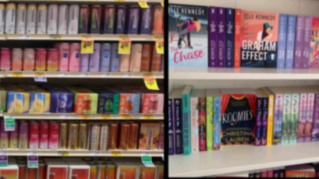
If you’re looking for romance, the competition has driven the freelancers to keep up. SciFi isn’t there yet, YA Fantasy is. Thriller is pretty good at premades, Mystery really depends on the subgenre.
“Far too people”? Do you mean many, or few? Because I am one of those designers. I sell a cover package, full print spread, ebook, and webready graphics, for about $250. I don’t use ‘custom’ art in the way most people think of it, but I do make covers that are uniquely suited to the genre they are in, and that sell the book. A cover is marketing, and that’s a lot more than simply the art you put on it. If you hire custom art, you are going to pay far, far more than letting a good designer work on the cover, and you are likely to wind up with something that is a detriment, not an enhancement.
We’ve had many conversations here on this topic, if you have missed them, let me know, and I’ll put up links to them.
And even if you’re going to pay a designer, I recommend you educate yourself about covers. You can engage in self-study of your genre, or you can take a WGM workshop on covers, which will enlighten you enough to know what you’re looking FOR. (If you want to design covers it will also take time, and like with all arts and crafts, some will be good, and then you’ll have an off day. But after you practice a bit, even your bad ones will be better than if you never did it.) For me, it wasn’t a choice. I can’t pay for 120 or so covers, which I need if I put all my short stories out. (And short stories don’t pay back that much, so…)
Yes, you simply must take the bare minimum time to see what the top 100 sellers in your specific sub-genre look like. Otherwise, well, I was once sent a cover, with a ‘please fix this’ and I can tell you, they got cheap, but it wasn’t good!
So you did your own covers? That’s impressive. Remind me to look you up if I ever finish one of my own monsters. I love the covers on your books. *Makes note to self.*
Yes, I do mine, that is what got me started, but it’s also a fun thing to study and create, so now I do it for a few others. I haven’t time to make it a big thing, but when you are ready, I’ll show you my portfolio.
You missed the point of the post. Yes, there are artists out there who will give you “generic” covers for what looks like a relatively small price. However, those generic covers will look like how many other covers out there? But that isn’t the point Sarah was trying to make. What she said, and something I agree with her on, is that the cover does not have to be a scene out of the book. The point of the cover is to draw the reader’s attention. It has to cue the reader as to what sort of book it is. That is all. As for the rest of your comment, there are a lot of indies out there just getting started who will not sell those 125 copies right off the bat. Are you actually suggesting that they give up any income they might make just to have a cover designed for them by a graphic artist?
It’s been busy at work so I’m only now getting back here…
You’re right, I read too quickly and missed just enough of the content that I got it all wrong. That’s what I get for reading during short breaks at work. I do agree with you concerning generic covers — if you can’t find one that’s right for the book you’re not helping yourself by choosing one of them.
As for the cost of a good cover, I’d say there’s a definite trade off between an ‘okay’ cover and a ‘good’ one. Even on Amazon, where people can download samples, the cover is still the first (and usually only) thing people see for any given book. I’m not suggesting authors must spend a lot of money on a cover, but sacrificing a quality cover solely for monetary reasons may end up costing an author money in the long run. Much as I hate to say it, no one read my prose unless the cover catches their attention first. (And I do realize — now — this is the point of the column.) I was trying, poorly it seems, to point out that there are a lot of fairly inexpensive options available to authors to make sure their cover doesn’t actively drive away potential buyers.
I saw the perfect generic fantasy cover at B&N last weekend. It is a photo-looking medieval interior – gothic arches, tall windows, I think there were a few banners hanging to the side – the title, and the author name. It had to be fantasy or historical romance. Turns out it is fantasy, with the single least informative jacket copy I’ve read in a while. But you know it is high medieval fantasy in a GoT sort of setting.
c4c
The Celery Stalks at Midnight– stock up on toothpicks.
Ooh. The romanian import store carries double cream sheep’s cheese, which comes in a block surrounded by whey. It has the texture of cream cheese, but the tang of sheep cheese. It is utterly awesome on celery! And I still have half a pound. Send that stalking celery my way!
I haven’t had enough coffee yet but as a reader the most “glorious” piece of art on the cover is junk if it gives me the wrong idea about what the book is about.
YES. Exactly.
Speaking of bad covers…before the glorious time of ebooks I would scour used bookstores for copies of Georgette Heyer’s regency romances, and found a vast range of books published in a range of 30-40 years. The art guidelines for those paperback books must have been “make our target reader feel like she’s on the cover” and nothing more. The game I played was to guess the publication date of that edition by nothing more than the gawdawful cover art, and I usually guessed right by +-5 years. Please tell me what regency style involved: a)the colors orange and pink, electric, together b) blue eyeshadow, up to the eyebrow (even Regency *prostitutes* wouldn’t have done that, assuming they could even FIND blue eyeshadow) c) shoulder-length, curled-under-at-the-end hair. If I hadn’t already known the author those covers would have sent me screaming into the night.
Don’t scare your readers.
Oh, yeah.
You forgot to mention that the guys are usually in wonderful historical costume…. The women are the same faces and hair on medieval and on Victorian Gothic.
I do like the technical skill of a lot of the old Heyer covers, though. Commercial artists could really paint back then. Some of the paperback cover background colors were very pleasing, too.
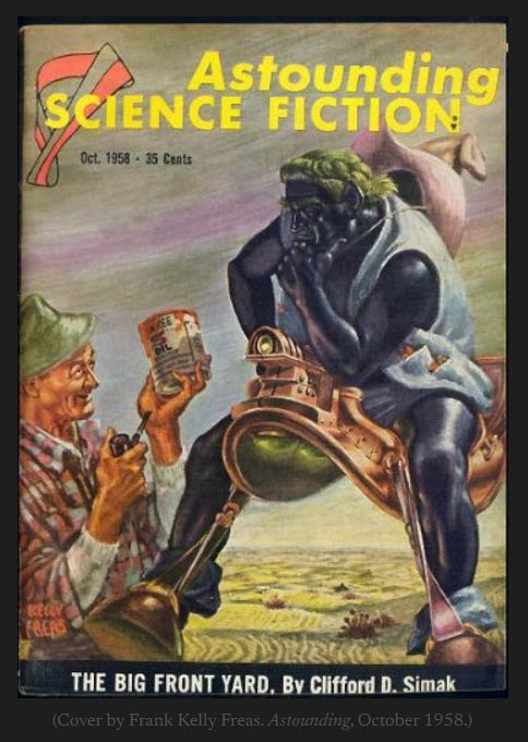
And then of course you have Baen.
Toni sinks a lot of money into original commissioned art for Baen covers. It’s sort of their trademark. That and the exploding space ship of course.
But then Baen is in so many ways the exception that proves the rule. Probably why tradpub are such rabid haters on such a small insignificant publishing house.
And for a Baen cover – I know an author who asked one of their cover artists – you will pay 1-3 thousand dollars just for the art. Which is amazing, granted, but you will still have to worry about layout and design, and then how to sell enough books to pay the artist! A cover alone does not make a success. It helps, yes, but there’s a whole lot more.
Not at all suggesting high end commissioned art as a valid path for indie writers, but Baen covers are also a great learning tool in composition and layout.
Anyone has the chance to catch one of Toni’s traveling Baen road shows at one of several Southeastern cons I highly recommend attending. Each is a mini course in the philosophy behind Baen covers, not to mention a great shot at a bit of swag. Just don’t mention nipples. Toni has an extreme and totally unfounded fear of nipples.
Er – wouldn’t dream of mentioning nipples. And I second the study of Baen’s covers. And of course, at the Roadshow if you’re good, there is usually swag.
FYI it’s a running joke that some Baen cover artists occasionally try to slip one over on Toni. Have it on credible authority that some Baen Bar Flies will even go over cover art with a magnifier just to be sure. One must after all have interesting hobbies to keep things lively.
Which is why neither Thena nor Lucius show theirs in their respective covers.
Random thought:
Baen and some similar covers are nice enough that people are willing to buy the original painting.
If someone knows a really good artist who is suited to their book style, they might be able to work out a “you can use part of this image for all your books, as long as you include a link to where they can buy my prints of the art.”
Most of the big name cover artists seem to make a good chunk of their money by selling prints, including prints of portions of the book covers. (Michael Whelan comes to mind, but if you are Michael Whelan you are not likely reading this blog for advice on making cover art. I, on the other hand, am trying to soak up all the good info I can.)
I’ve tried to strike that deal. i’ve given up.
It’s all in the contract! Read the fine print at stock photo sites, and Nolo Press’s book on copyright, and you’ll have a great common language to discuss with your artist which rights you wish to license or buy.
For example, when dealing with innovari direct instead of through a stock photography site, we can negotiate the right to print the original or altered image on t-shirts, mugs, or other swag, as well as for print and ebook covers. He’s going to insist on keeping the right for him to reproduce the image, and we negotiate on whether the image is exclusive or can also be posted to a stock photo site to give him extra income after our use… It’s all in the contract. The contract doesn’t even have to be complicated, but you do want to know what rights area available to be purchased, and clear that’s what you’re paying for.
Good contracts make good business relationships.
Something a professional photographer of my acquaintance advised two things in regard to contracts (I was doing art for a local convention to use and needed a simple contract):
1) if you aren’t a lawyer don’t try to use legalese, clear plain English is the best. “You may use for an ebook cover for one project, and may also use it on up to 10,000 printed copies of the book’
2) use bullet points to aid clarity. Including specifying anything not specified is granted. Apparently paragraphs can get muddy.
Yes, but even Baen doesn’t always do “scene from the book”. Take Darkship Thieves, for instance.
“Study your genre” is vital, even if you’re working with a good cover designer? I worked with Clarissa Yeo of yocladesigns for the current book (which I have still not hit the “publish” button on. sigh) and her first interpretations of my directions were grim and dystopian. After all, that’s what YA SF is all about, right? It took a fair amount of argument to get a brighter cover that conveyed optimism, space opera, and young adult all at once.
So the question mark gremlins attacked when my back was turned …
Are they related to the comma chameleons? 😀
comma comma comma comma chameleon ….
Argh. Now it’s an earworm attack.
This will help!
Cedar, I sooo did NOT need that earworm.
*evil giggles* Me, I’m listening to Agatha Christie, so my mind can’t accommodate an earworm too.
AHA! I didn’t understand your comment even after reading the comment about question mark gremlins, until I went back and read it about four more times.
Finally, it got through that your first sentence was a statement, not a question. 😛
Sarah is right. Covers are HUGE. I accidentally discovered one of my favorite authors one while walking through a Barnes and Noble. There was a drawing on the cover of a book showing an F-22 with swastikas on the wings. This elicited a quick WTF??!?!?!? from me and a desire to know more about the book. I picked it up, read the blurb and bought the thing all on the strength of a cover.
The other thing Sarah is right about is that it doesn’t have to be a scene from the book. At no point in Designated Targets is there a depiction of a Nazi-piloted F-22. It just doesn’t happen. It’s still a really good cover that sold a really good book. Think about that.
Thena in DST NEVER walks naked in space.
Probably wouldn’t be a good idea, anyway…
What? You think? Sudden decompression?
But the picture does CAPTURE the book 😉
The wandering around in space did trouble me a bit, but then some of my background *is* in vacuum science 😉 I just figured it was a local environment thingy for the power pod system. On the other hand, my brain kept interpreting the darkship as a manta ray about to devour Thena. Which only goes to show that under the most carefully controlled conditions the deranged reader will go haring off in all sorts of undesirable directions no matter HOW careful you are. Or that I’m Odd. (sigh) You guys won’t tell, will you?
My first thought on seeing the cover was “CRINGE. That’s vacuum.” So you’re not alone.
FWIW, when I saw it my reaction was more along the lines of “space, chick, shredded clothes; she’s floating, so there’s Something Out Of The Norm here, and whoever pissed her off is about to die.”
Tend to figure there’s dramatic shorthand going on in covers, even if they’re not as obvious as anime manages. (Or even things like Avatar– it’s funny to see folks trying to figure out actual relative size, because there was so much Drama Dependent Height going on.)
‘S OK, my first thought was “pulp cover – SPACE OPERA!!!” But I’m Odd.
Gives another meaning to “skinsuits” 😉
“However, you’re trying to get them to PICK UP your book.”… What? Are there still people who meander thru bookstores, paying no attention to genre section they’re in, or author names, just picking up books because of the cover? Might be fun, I suppose, but I haven’t time – 95% I buy online from search in a specific genre on an author I know or have seen recommended (here or ATH, etc.) so that kind of cover design is kind of a waste on me.
As a result, the illustrative content IS more interesting: “Hmm, what does this cover art do to expand what the blurb says about the story, to set up my expectations? ” and later “hmm, so that’s what the author visualized in that scene – close to what my imagination saw, but not quite; did I miss something?.”
I’m sure you’ve spent ‘way more time analyzing your customer base, so I’m the oddball here (but there may be others…); I have always assumed the differences between cover and story were because artists didn’t have time (or didn’t care) to read the story in sufficient detail, rather than that they were deliberately trying for something else.
No, but people get pulled in or put off by the thumbnail on Amazon. Heck, I do. The way to grow your fanbase is to have buys from the “people also bought” and that needs to be attractive.
Yes, you’re an oddball but so are most of the rest of the regulars here. [Wink]
Seriously Alan, I often browse on-line book stores looking for e-books that I might want to purchase and do “select” for genre for browsing.
Now, I’m looking first for authors I know and then looking for something that appeals to me.
Book covers and book titles are very important when I don’t know the author.
The cover and title must give me some idea that the book is something I might enjoy.
After that I check the blurb and then for reviews.
There are thousands of books out there in the genres that I enjoy.
Lacking knowledge of the author, the covers and titles are something that I use to decide if this book is worth learning more about.
Of course, as always YMMV (your mileage may vary). [Smile]
Have you noticed how horribly wrong bookstores and libraries are in where they PUT stuff, lately?
They had the Dresden Files in the Horror section, for love of Mary!
Genera can give you a big boost in finding a “type” of story, but the cover tells you more. If I’m (fruitlessly) looking for a decent mystery, and even if they have a cozy section, the cover is going to give me some kinds of hints– twenty years ago, if it had baking stuff on it, it would probably be good; now, it will probably have me screaming from the Did Not Do Research/Fake It going on. If it’s got a top hat or something, it might be first-half-of-the-century English cozy, etc.
Browsing in the store or on line– they’re similar activities, just different considerations on how to get spotted.
I’m wondering if Urban Fantasy hasn’t become the same as Horror in the minds of somebody important somewhere. The latest MHI novel was nominated for Best Horror Novel by Goodreads. The books all rock, and I voted for it, but it’s NOT horror.
It can’t be Urban Fantasy, because it’s not text-based pr0n starring a PC twenty-something female.
Point.
So, generalizing from your (and several other) comments, an appropriate cover especially for on-line bookstores:
– contains a generic graphic (generally out of a small set) that suggests or evokes the book’s genre, with one or more sub-graphics to suggest a sub-genre where appropriate to assist with sorting (seems kinda like hieroglyphics, eh?)
– easily read text for author, publisher, series and/or world
– attractive enough to not put buyers off
– retains the most essential visual features when reduced to a thumbnail
– and has enough custom uniqueness of design to help with grouping, e.g. not all Baen space operas should look the same, but it might not be bad for all of Sarah’s Darkship-universe novels to look more like each other than they do like someone else’s series.
OK, as package marketing graphics, that all makes sense; but I’d still like the details of the artistic representations to reflect or illustrate the story, thus adding to the value of the book as well as its marketability. [An example that comes quickly to mind is Noah’s Boy – the cover had me looking for that scene!]
I guess I’m just greedy!
First one, not as I understand what you’re saying– it shouldn’t be generic, it should be recognizable as suggesting the type of book.
Think about how stores are named: a coffee shop I really liked went out of business in part because nobody had a clue what “The Striped Donkey” was. The following one was “The Pink Zebra.” (so they could keep the really nice paint scheme) Also went out of business.
The new place has lasted longer than the two prior combined, and their name has nothing to do with stripes or animals, but DOES mention coffee.
Yep.
That scene is not actually in the book, though. Kyrie wasn’t there in human form. Which, again, is what I meant about the scene doesn’t have to be there.
Also, while that is probably the most handsome cover I’ve ever had and I love it to pieces (that amusement park — I sent the pictures to the artist for reference — was where we took the kids when they were little) in thumbnail, which is where you’re going to be bought if MOST of your sell through is Amazon (which it is for all indies) it’s not actually a very god SELLING cover, except for the part that screams Baen. As in take the book, put it up on a wall. Walk twenty feet away. See what I mean?
It works for baen for OBVIOUS reasons, but for indie having a detail-laden beautiful scene that is a scene from the novel might or might not work. The “detail-laden” part won’t. People can’t see it in electronic.
So, that’s it.
Sequence when deciding whether to pick up a book in the store (or clicking the “Look Inside” thingamabob).
1) Text element (“ah, ‘Sarah Hoyt’, take a look”).
2) Text element (“ah, ‘Baen Books’, take a look”).
3) Text element (“ah, ‘Naked Space Chicks’, take a look”).
4) Graphic element (“ah, mostly-naked chick with an AK, take a look”).
How… how do you feel about a chick riding a dragon and firing a Lewis? I’m asking for a friend. Yeah, that’s it… a friend.
Works for me. 🙂
Don’t mislead the poor man–she’s wearing clothes while riding the dragon, right?
she’s wearing WWI like flyer uniform. Sigh. Caught.
Oooh, Leather….
🙂
blinks. Actually, yeah.
Does anyone else hear the sound of a stampede of closet geek leather-guys charging toward Amazon and Powells yelling “take my money?”
Sounds like… clicking.
A Lewis? Off-hand? I’d call that INTIMIDATING!
Reminds me, though, of a cover for a different Baen author (initials JR if anyone doesn’t know right away).
Seriously, though, there was a point to the last two. In the days when dead trees reigned supreme, the title was FAR more important than the cover graphic – because that is ALL you saw at first glance for the vast majority of books. You didn’t want to leave anything to imagination, there, whereas the cover graphic you did want the bookstore browser to supply some imagination, after they were prompted to actually pull the book off the shelf.
Perhaps that is not quite as important for Amazon publishing – although the thumbnails you usually see are frequently not all that good at stimulating the visual centers, either.
I saw a TED presentation about brilliant book covers, and they used the raptor skeleton from Jurassic Park as an example. Now, that’s pretty minimalist, but instantly recognizable, and it’s the feature found on all the merchandising.
There’s some woman (I think it’s a woman) who keep’s photo-bombing Amanda’s covers, either semi-nekkid, or in the process of becoming semi-nekkid, or maybe in the process of getting un-semi-nekkid; at any rate, she doesn’t appear in the Nocturnal series anywhere except the cover. Now, she’s only visible from the back, so nipples aren’t an issue.
David Weber, an “A’ list writer by pretty much any definition, gets these beautiful covers which probably cost several grand, but he notes that they don’t get the uniform right.
Isaac Asimov, who published a new million seller every three or four days. and who was meticulous with his non-fiction to the point of insisting that he write the indices himself, wrote “Murder at the ABA” (also released as “A Whiff of Death”), and the cover had a picture of a dead blonde and a smoking gun, neither of which figured in the story.
I wish I could find it now, but can’t; one of Baen’s books has written in the cover blurb “‘Here’s where they told me I should have a friend tell you what a great book this is’ – Author’s Name.”
I friend of mine had a cover done for her novel that she wasn’t crazy about, but DAW liked it and the artist and insisted on going with it. She later found out that the artist reused the picture, with little changes, for the german version of a man-kzin wars. Which was why he did it the way he did.
She told DAW, and from what I gather, that artist won’t ever be doing work for them again.
But yes, it’s not uncommon for coverart to have little relevance to the book they cover.
I hate it that there isn’t an error function when I find an apostrophe error right after I post.
Okay, my review of Sarah’s “Wings” (Nuuuuns in Spaaace, plus so much more) just went up on Amazon.
I still can only read and review Kindle Unlimited, but I’m gonna start a change jar, because I really, really want to read something of Kate’s, and when the change jar gets enough coin in it, I’ll apply that to a purchase.
Other than that, gonna rock down the MGC list, and see who is next on my rotation.
I’m hoping kiltedave is david e. oascoe, writer of ‘baptism by fire,’ because that’s what I just got.
And I know that Liliana Begley is a nom de plume for one of the mad geniuses, because I read ‘farmhand’ last month and gave it a smarty-pants review.
But I wish you guys had a wiki of pen names. It might not matter to anybody bit me, BUT having said that, this IS a thread about the art of the cover, and frankly, the most IMPORTANT aspect to me of a cover (at least when operating in my review-boy persona) is YOUR NAME on the cover.
Off to read “Baptism By Fire.”
Pascoe. he is.
Liliana is our own Cedar.
There are either more, or fewer people than I thought on this blog….
by definition
I second the request for a blog handle/published name equivalency list. In part because I have a tendency to go, okay, someone mentioned a book he wrote I wanted to get a few weeks back, I’ve got the money now, and once I’ve come up with who it was I have to figure out what name Amazon thinks belongs to that handle.
I came here late but… I paid $275 for an original picture. I think the pic is great, but the guy hasn’t done a lot of covers so the layout (in terms of trying to fit in text) was a bit questionable. I’ve also put myself in the position of needing to pay $275 for the cover of the sequel as well, if I want them to match.
I started off by making my own covers. Two of them came out rather well, one I’m not happy with and one of these days I’ll hire someone else to redo it.
On book 4 I paid someone, but was never quite happy with it and recently had it redone by the person who did the covers for the books in my POI series.
The redone cover is a photoshopped picture with a background and two people in the foreground, all photo’s. I like it because it fits the genre which is modern fantasy.
The three books they’ve done for me on the POI series are all artwork. I knew what I wanted the books to look like, because I was copying the style of all the -other- books in that genre. And those covers look great and have helped me get a lot of sales. And the price wasn’t that high at all!
(ebooklaunch.com btw, tell then John Van Stry sent you).
Now for the tawdry romances I write under a pen name? I do ALL of those covers myself, they’re all photoshopped, takes me about a day to do one. They’re tacky, they’re blatant, and they work very well. But that’s the standard for cheap tawdry 10K word romances.