
There is a recurring and recursive argument I have with other writers about covers. (This is the post I should have written last week, only I was too tired to even process.)
It started with my then BFF when she first struck out indie (a decade ahead of me, because I still had a lot of contracts and it’s hard to leave that safety behind) and it goes on every time someone sends me a book to promote on Sunday whose cover is so appallingly bad that I can’t put it up as is.
It goes something like this: “No one cares about covers. I don’t care about covers, so no one cares about covers.”
This — she said — is nonsense. And that applies to all of you out there who think you don’t care about covers. Because you do.
No? Then how do you shop for books? If you buy in paper, your selection is relatively limited. “Whatever is on the shelf, I read the back cover and then decide” is a valid method. But if you’re indie mostly you’re selling to people buying an ebook on Amazon. This means you will find yourself scrolling past possibly hundreds of books. You’re not reading EVERY back cover. You’re just not, sorry.
So, without even realizing, you DO apply an heuristic of elimination you might not even be aware of. It goes something like this: Title I can’t read, no. Funky title, no. Cover with indistinct stuff, no. Dear Lord, is that a parrot or a sex toy on the cover, no. Is listed in sci fi but looks like travelogue, no.
It is the ones your eyes go to that you’ll even read the back of. Whether you know it or not.
And the ones your eyes go to have a combination of factors.
We’ll exclude immediately “I know the author” and “I have read the other books in this series” because DUH you’re going to buy those, even in a plain green cover with yellow Times New Roman letters. (At least supposing you like the author and the series.)
So from there, there are several factors that influence your buying. In no particular order: The cover is attractive in and of itself. The cover perfectly matches the genre and feel you’re looking for. The cover is easily read. That’s an intriguing cover. That’s an interesting title.
Of those, when you’re looking at an eye-glazing infinity of books, I’d say the most important are two: Matching the genre and feel AND having something interesting that stands out, in combination. (Ie match the genre and feel, but not so much you look like “generic cover number 21”.
And here I’ll digress for “feel”. Last week I told you to go look at covers of the bestsellers in the fields you write in (Appalling covers in the bestseller slot mean the field/genre/subgenre is under-served, btw.) but …. There’s always a but, right?
Having self-identified what I actually write in science fiction as “Gonzo retro-futurism” my covers are…. well…. there isn’t a subgenre for that. When I brought Darkships out indie all the space opera covers were two ships facing off in space, or planets with a ship…. which is great if you’re writing either “exploration” SF or mil sf. But that’s not what Darkship Thieves is. It’s a character-oriented science fiction setting intensely human story. So…. I went to when such stories used to be published for the cover. Same, btw, with bells on for No Man’s Land. Having tried three covers and having people interpret them as either mil sf or YA sf, I realized it was going to be a b*tch to cover. And honestly, I considered the “high class” cover of a ruby held by a hand type of thing. BUT it didn’t really work, partly because those highly symbolic covers don’t work without big-budget push. Until I was in a conversation with my first readers and they pointed out that “What it needs is a seventies cover, because this is the type of book that did well/was published in the late seventies/early eighties and no one has published since.” So it got a retro cover. This makes it a bit of an odd duck, but matches the FEEL of the book. (Which is a big time odd duck.)
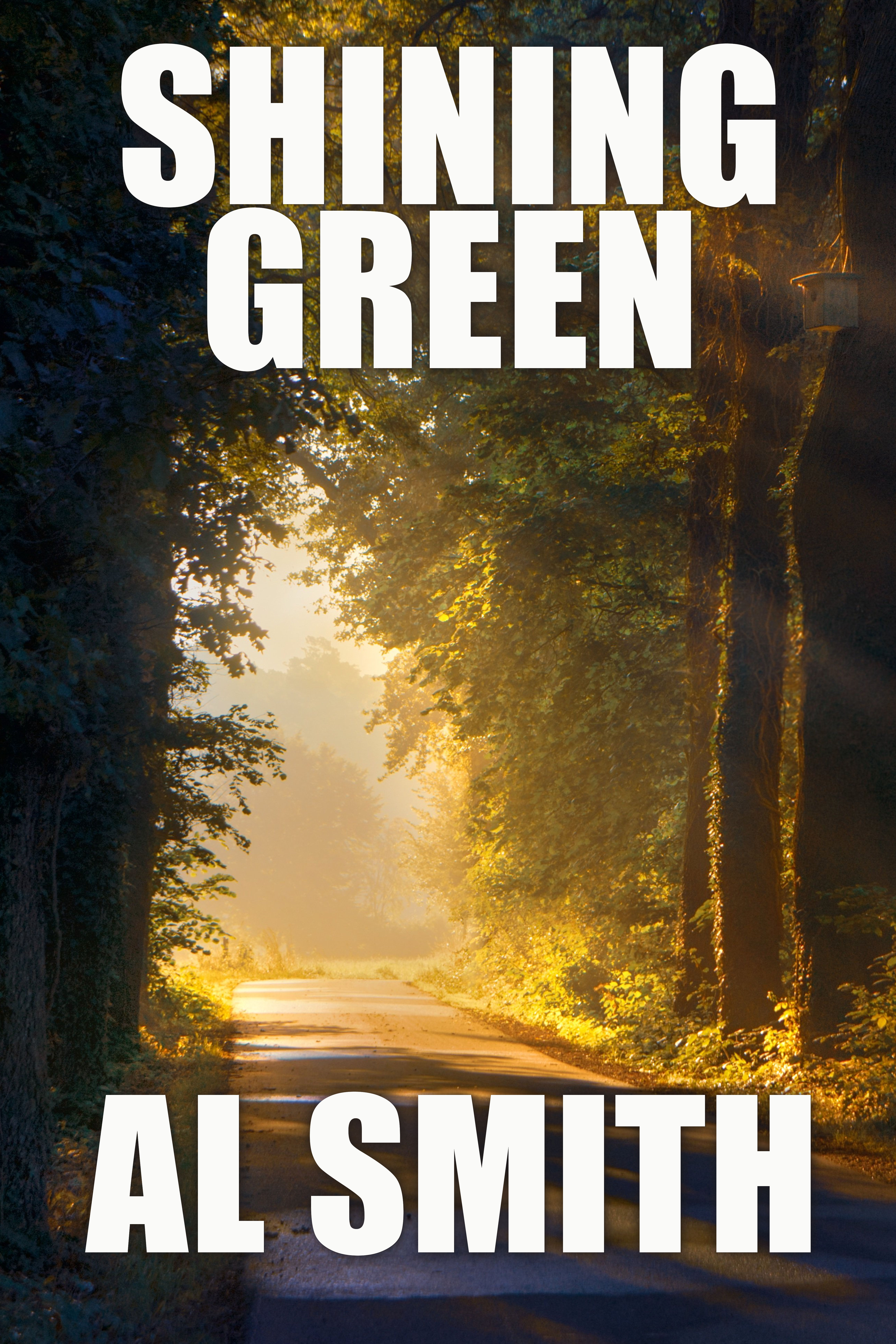
Anyway, to illustrate — and trust me, I could do this entirely with my own attempts at covers, except my main computer, which has those is still stored and… hopefully will be unpacked today — I’m going to post a series of covers and I want you to tell me what genre/feel you think they have. I’m using the same title, author name for all. BTW, the title sucks. It just does. Note also that I’m not doing things like optimizing the front, doing different pairings of fonts for title and author, etc. I’m simply not putting in that much effort for samples. Also I want you to concentrate on the picture for now. The rest will come.
Now, what you’re looking for is a fun science fiction adventure, which is what this imaginary author has written. It also has a race that looks like elves, a strong romance component and a mystical feel.
(We’ll discuss all of these next week.)
These are your covers:
#1
#2
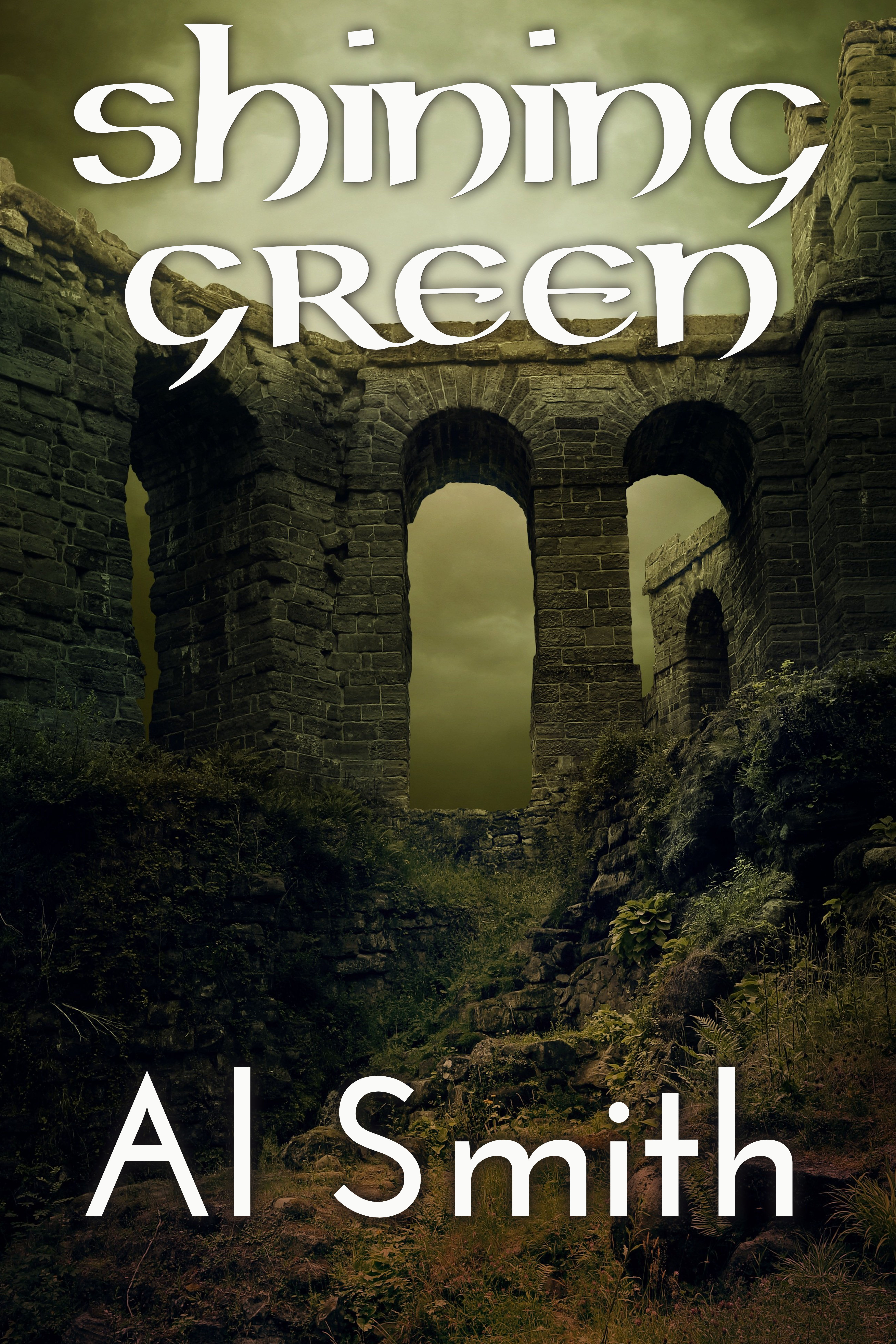
Sample 3
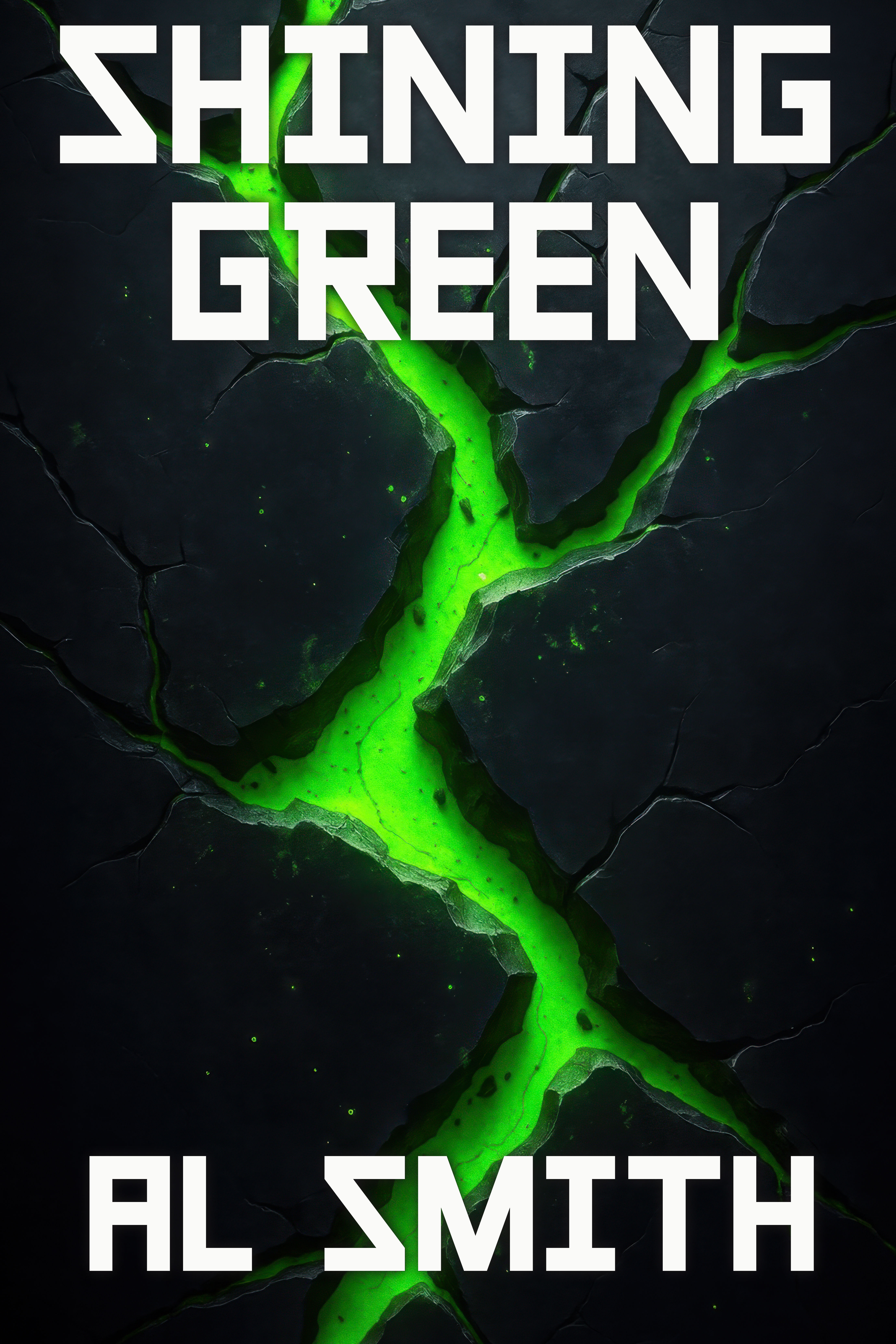
Sample #4:
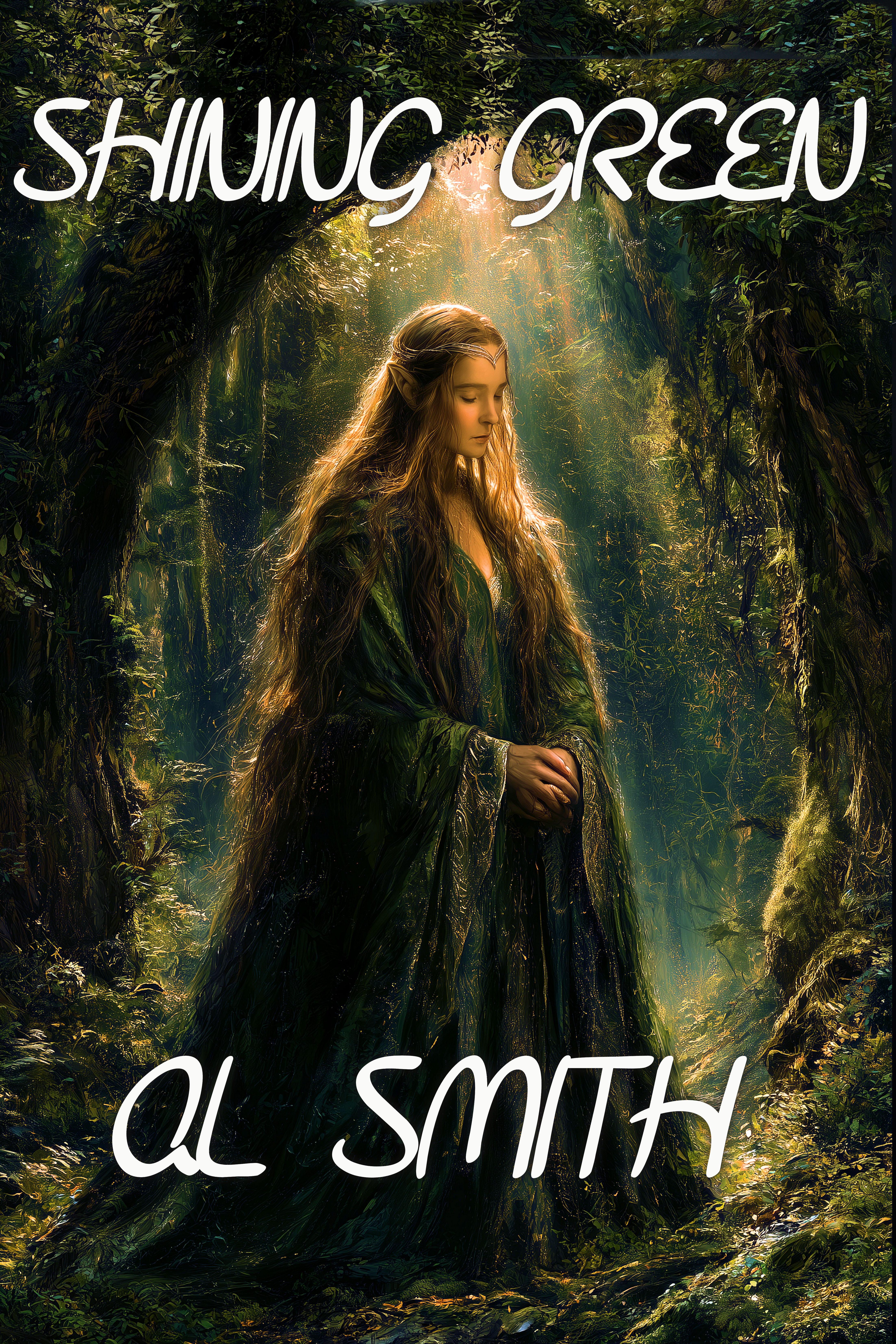
Sample #5:
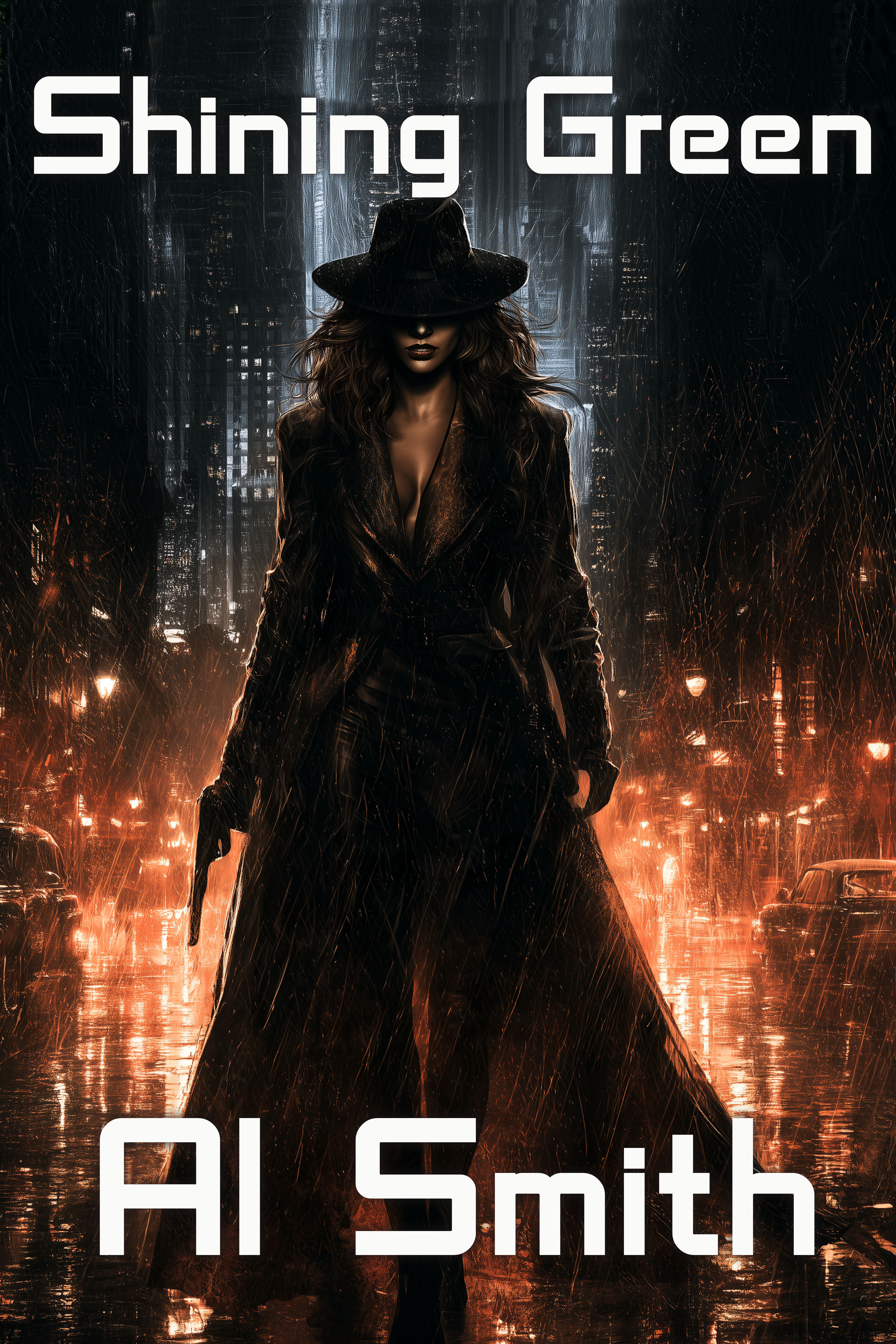
Sample #6:
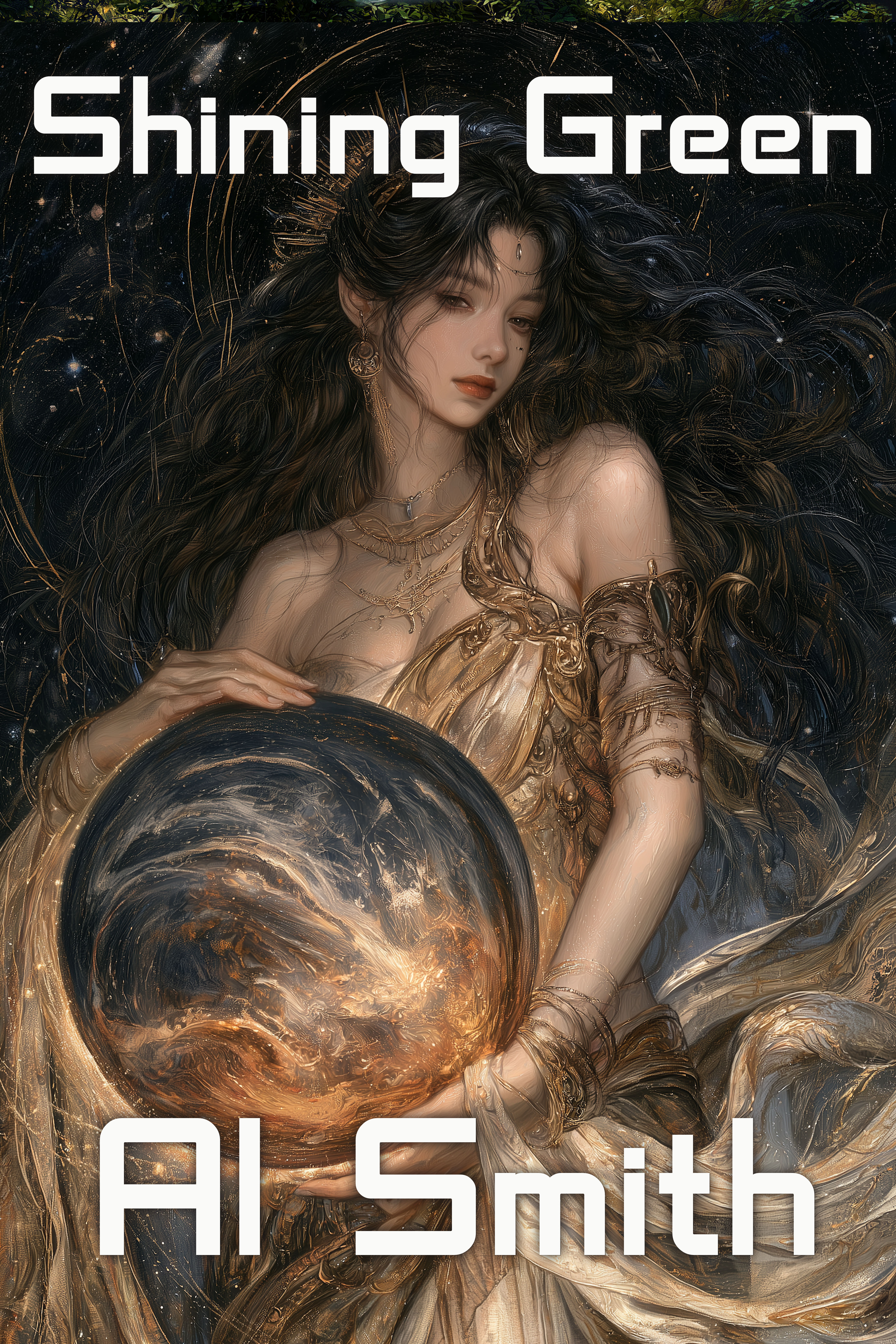
Sample #7
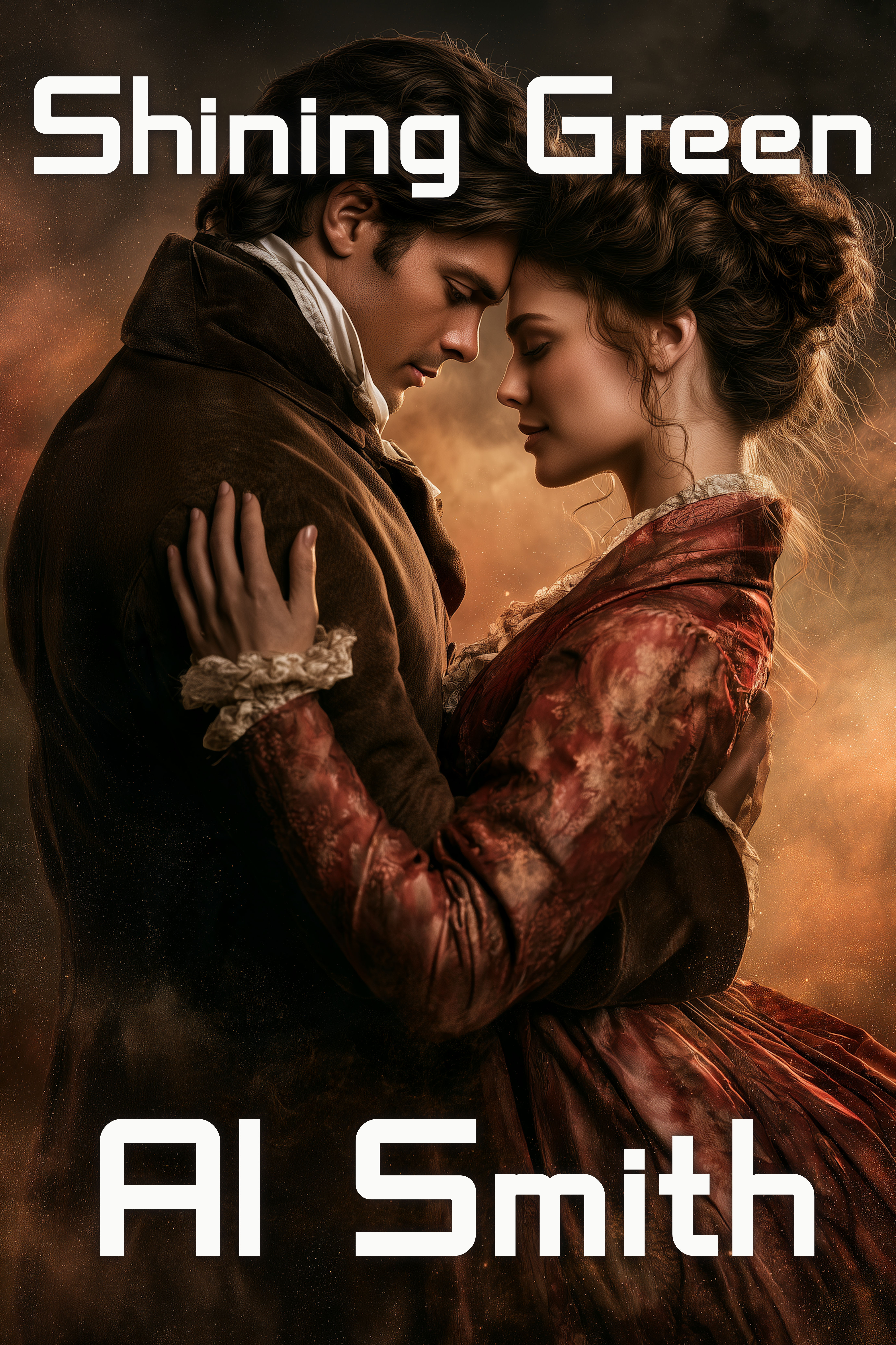
Sample #8:
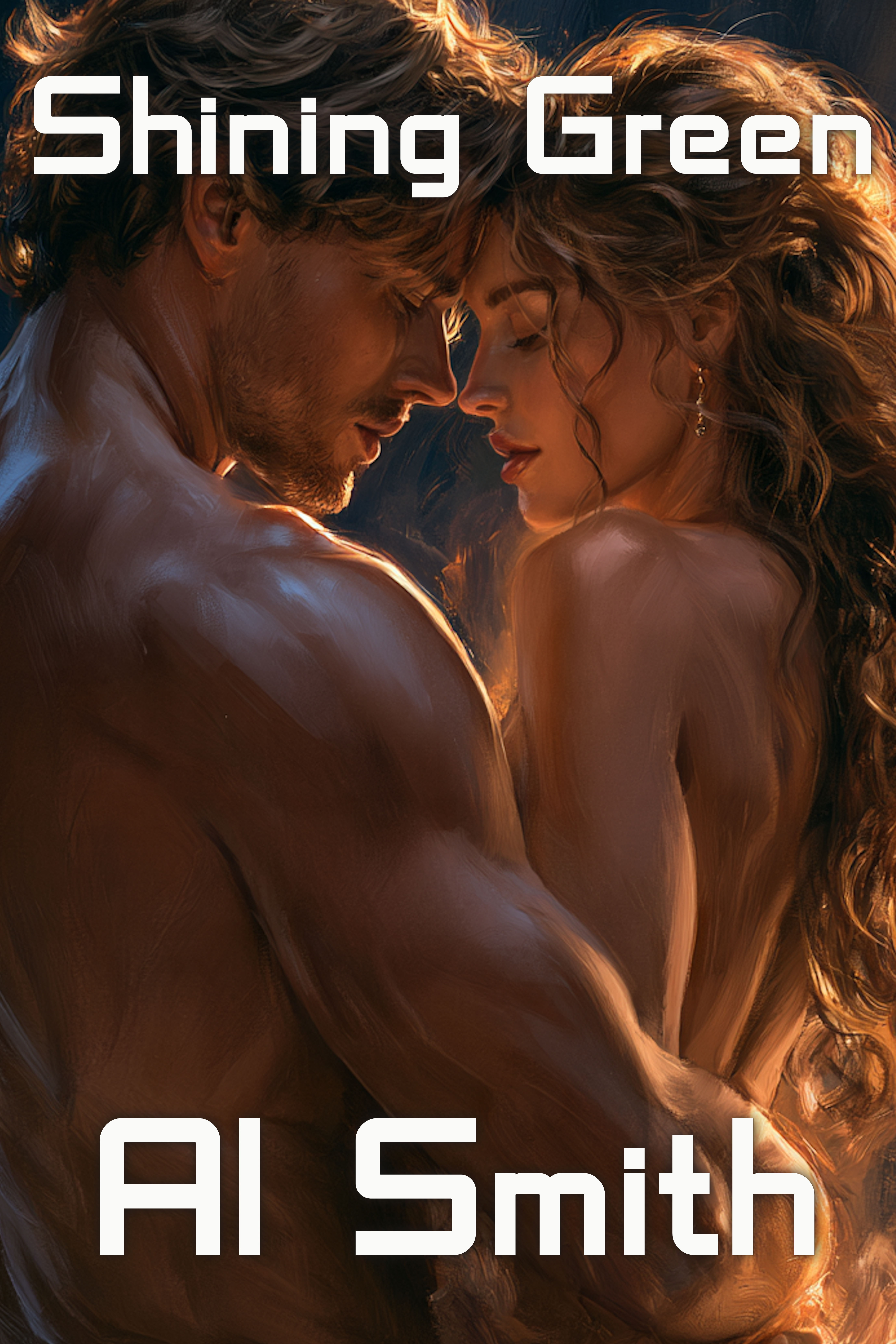
Sample #9:
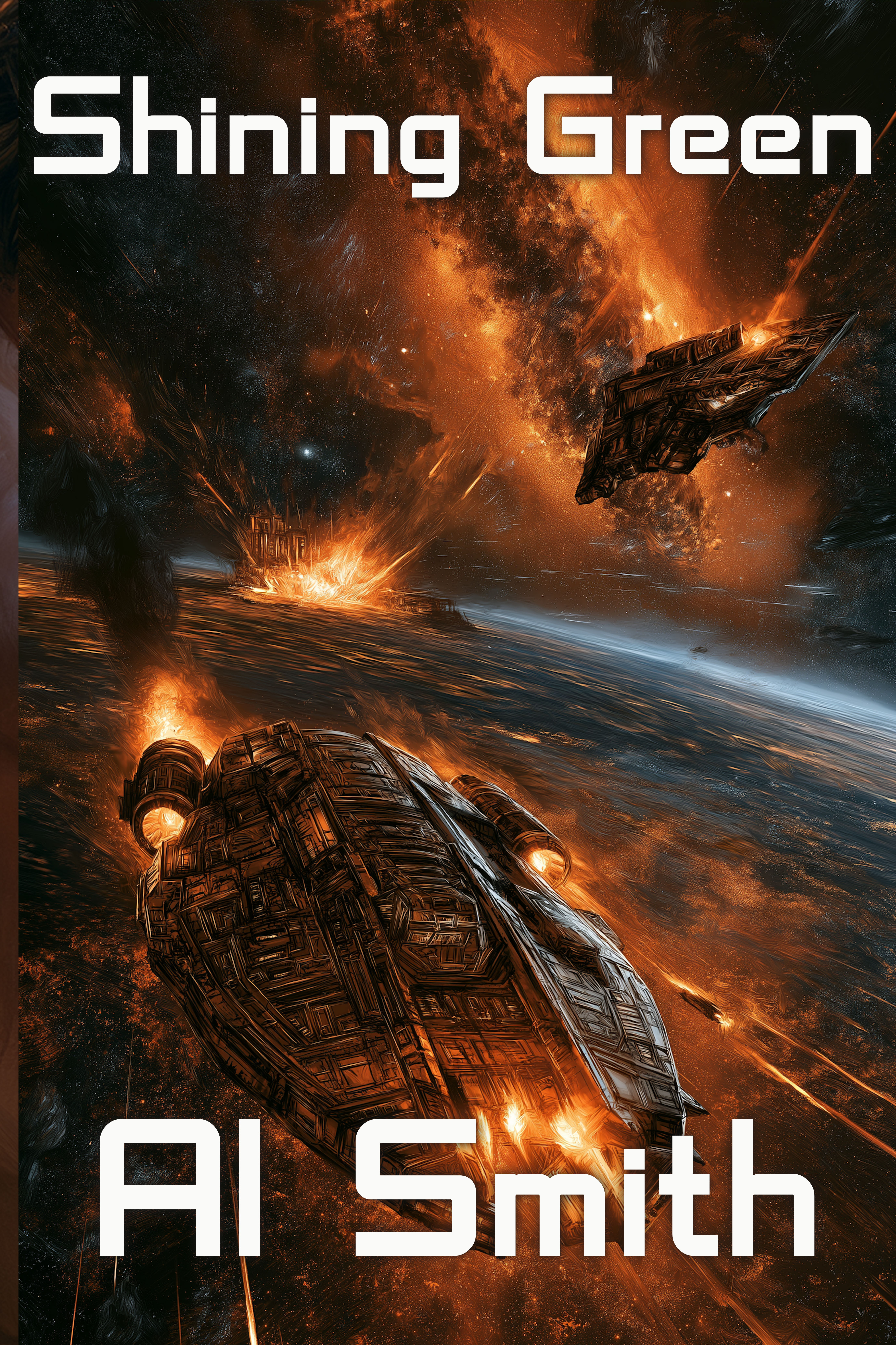
Sample #10:
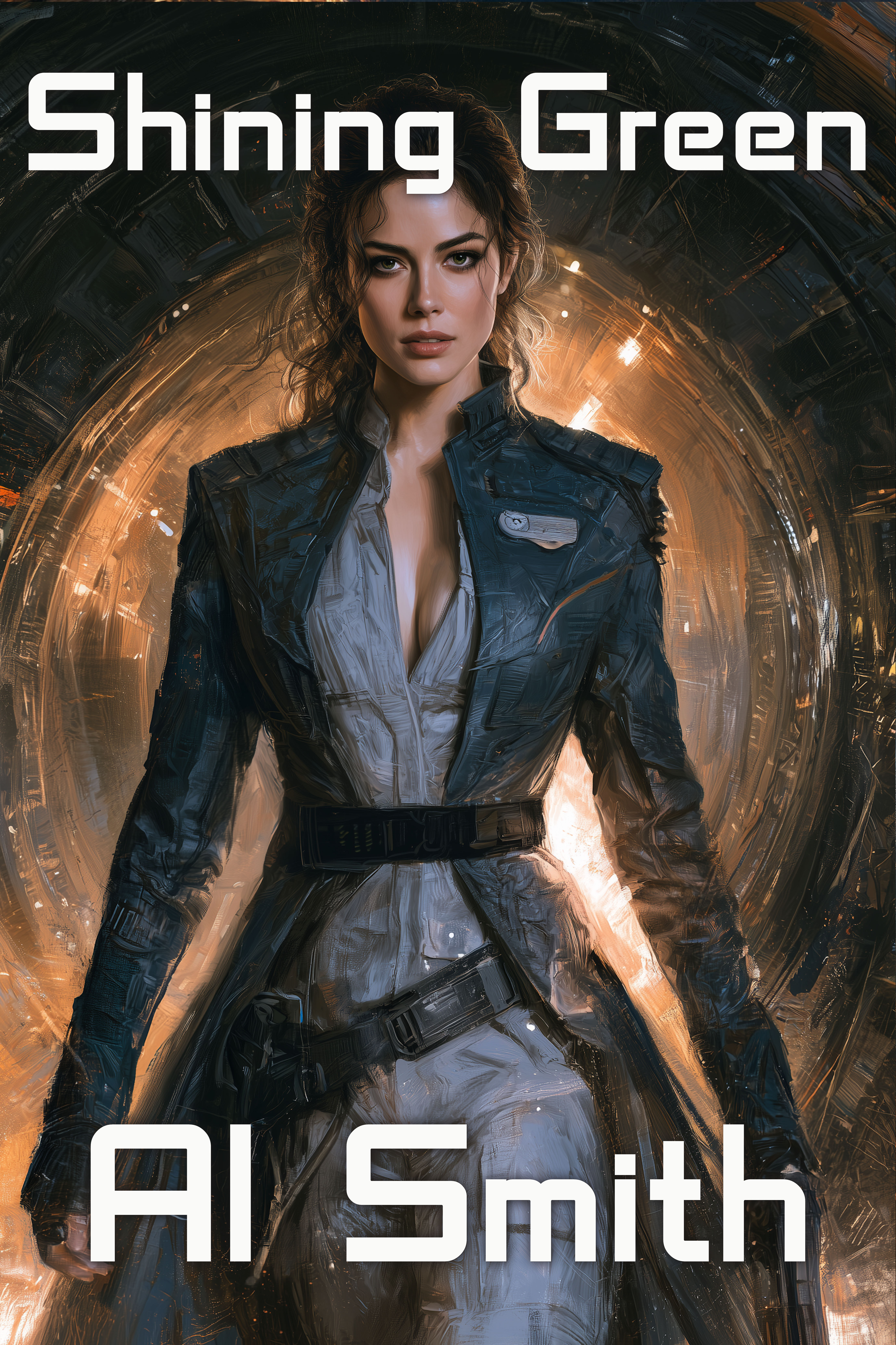
Sample #12:
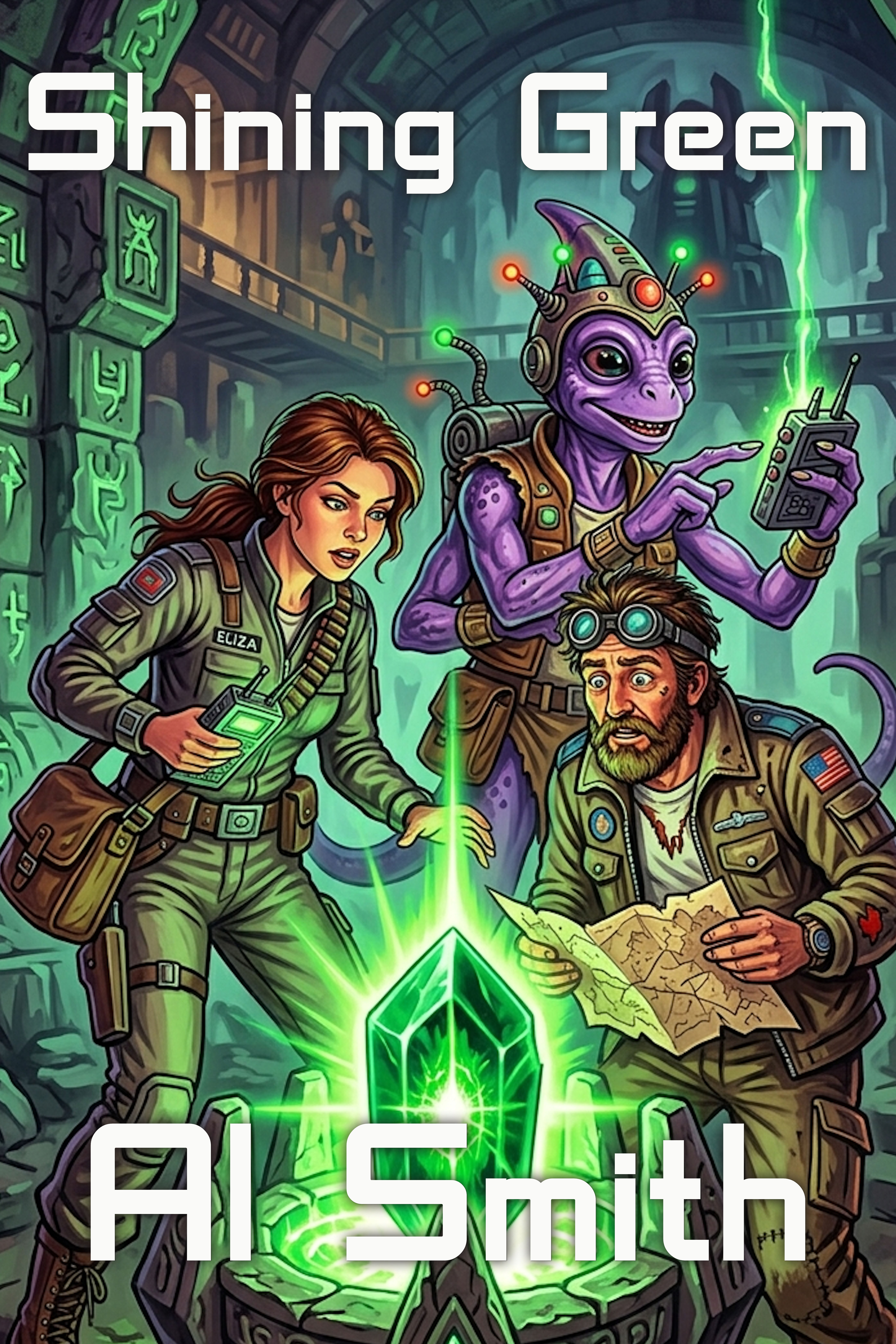
Which one would you use for your book, if you were Al Smith? And why?


 Mad Genius Club
Leave a comment