*Sorry for missing last week. Seriously. It was the first moving day. We were doing to do two more, but instead I’m putting myself through heck this week, so we only have one more this weekend. I want my life to resume a space in which I write, at least in the afternoon. I’m getting writing withdrawal with VIVID dreams, and no one wants that 😉 – SAH*
Once you’ve decided to go indie with your book, got it beaten into shape (the shape being one you’re not afraid of the public seeing. Its beach body, you could say) and made accounts with the various services that allow you to sell your book to said public, you have a very important task in front of you: the cover.
Look, there is one more thing at least as important for the selling of a book: the blurb.
There is a reason both these things are important and it’s not “because stupid Amazon demands that I put it up.”
The reason I’m starting with the cover is that, running a promo post for (mostly) indie writers on Sundays on my own blog, I despair of y’all understanding covers.
Look, it is perhaps inevitable that we who labor in words think that visual arts are a lesser branch, or that people who are buying our book should buy it for the words, or…
The worst part, the absolutely worst part when you tell a writer that his/her cover is inadequate, is when they’re confused “but why do I even need a cover? it’s an ebook!”
These are writers who SHOP for ebooks. But apparently never catalogued their own selection process to see what they need to convey with a cover.
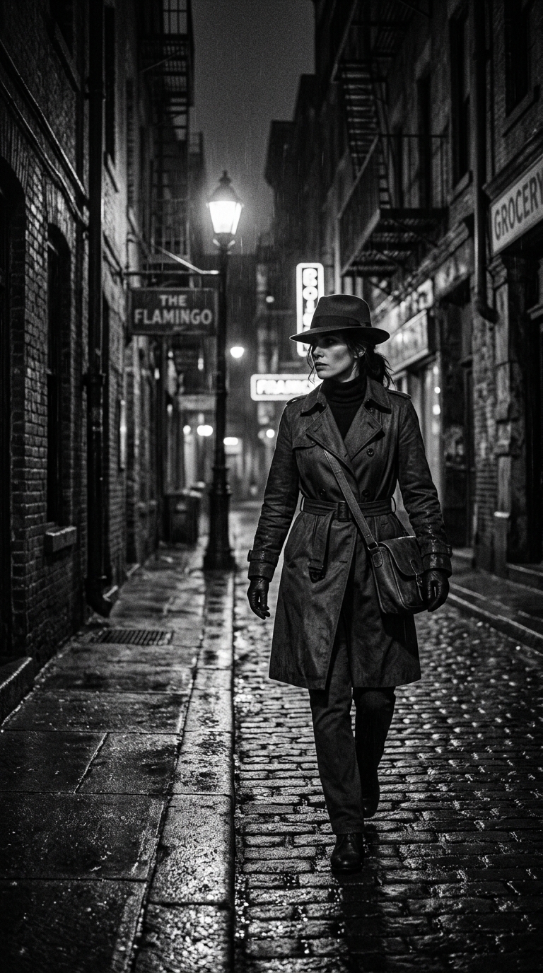
Look, I’m out of it, so no practical examples today, but look at the image that illustrates this post: can you not see this as the cover of a noir mystery with a female detective?
That’s because the image is doing its job: cuing you as to what kind of post this is (Undercover!) and being sassy with it.
Your book cover is your packaging, and in any product the packaging is the first advertising space.
Your cover is supposed to do three jobs:
1- Tell people what kind of a book this is by showing genre, tone and slant. A romance cover is different from a mystery cover, is different from a science fiction cover, and all three are different from a travelogue cover which weirdly is what most indie authors slap on all three genres. A drawn, cartoonish cover signals funny, while an oil painting with beautiful detail signals serious or possibly lyrical. Etc.
2- Tell people you are competent, professional and don’t half ass things.
3- IF POSSIBLE, as a stretch goal, be intriguing enough that people can’t wait to open it and see the inside. This is a stretch goal because few books achieve it, indie or trad.
I’m going to give you homework in preparation for a test. This week I want you to go to Amazon and look at the best sellers in each genre (and particularly in your own genre.)
Next week, there will be a quiz. I promise your answers won’t go on your permanent record.
(Yes, there will be more detailed instructions once we figure the broad, obvious signals.)




7 responses to “Under Cover”
Looks like a spy thriller to me.
The cover also needs to be legible. Beautiful art, with text over it, can become a mess at thumbnail size. If I can’t even see the design, I have no clue what you are trying to sell me! (TradPub has gotten bad about that, even in print.)
THIS! No matter how pretty your cover, if reading your title is like trying to decipher hieroglyphics, I’m giving up and finding something else!
It can be a danger when an author falls in love with a font and either doesn’t ask or won’t listen when someone else tries to say, “That’s not a good idea.”
Or if neither the author nor the cover artist understand fonts and what they signal. I’ve had to teach new-to-covers artists about fonts, standards, and what works for the genre of the book.
Plus the font should not clash with the artwork.
What I’ve learned:
First, remember that people see your cover before they read the book. If your cover picture is something that will be deep and meaningful AFTER they’ve read the book, make it the back-page illustration instead. Whatever the cover signals, it has to do it on its own, with only the title and author name to help. (Ran into this recently, with a spiritual self-help book that had a picture of an Old West general store on the front. It clearly made sense to the author—the book was using the metaphor of church as a supply depot, where you got the tools you needed to face the world—but it made the book look like a bad Western).
Conversely, though, that means that your cover doesn’t need to be a perfect illustration of one of your scenes. If some details don’t quite match up—or, heck, if the scene on the cover doesn’t actually happen in the book—that doesn’t matter. People might make fun of your cover after the fact if it doesn’t get things right, but by that time, the cover won’t make or break your sales.
Second, going with what Sarah said about professionalism, NEVER use the Amazon templates. They announce to the world, “I’m a self-published author with no idea what I’m doing!”
Ideally, both the title and the cover should indicate genre. But one of them MUST.