So, my cover artist and I went to the range recently. On the way back, we found the time to tackle things even more difficult than shot placement and proper grip: cover art. She’d sent a mockup of what would be a great cover for someone else’s book, and I had to think for a few days about why I didn’t like it before I had an answer.
Me: “The problem with the cover is that it clearly conveys military scifi, but this book isn’t modern MilSF; it’s an homage to Andre Norton, Leigh Brackett, Lovecraft and Jack Vance and Scientifiction. Back before the genres were near as split as they are today, and you could have psychic powers and fantastic alien ruins of unknown races and remnants of the eldritch… If modern readers pick it up expecting a MilSF full of modern tropes, they’re going to be unhappy. But how do we signal a pulpy retro Astounding and Weird Tales vibe?”
My cover artist: “Challenge. Accepted.”
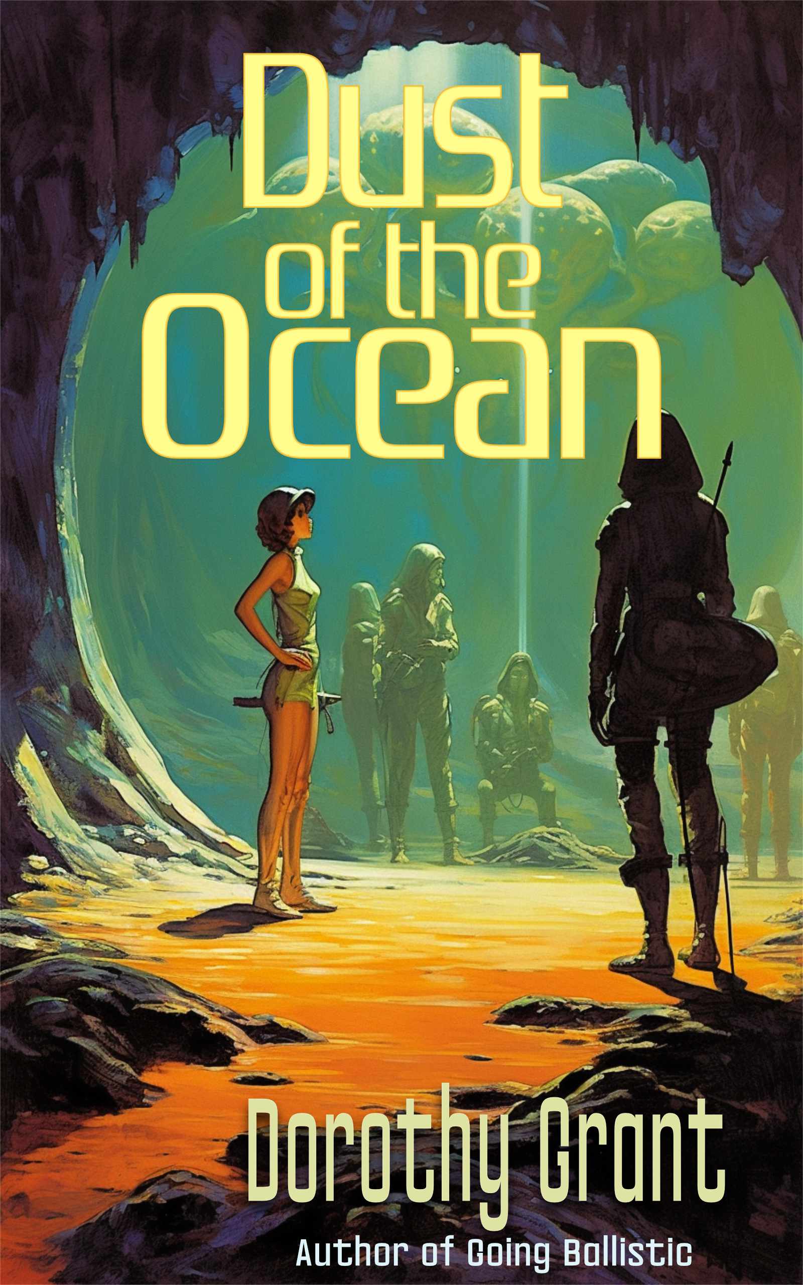
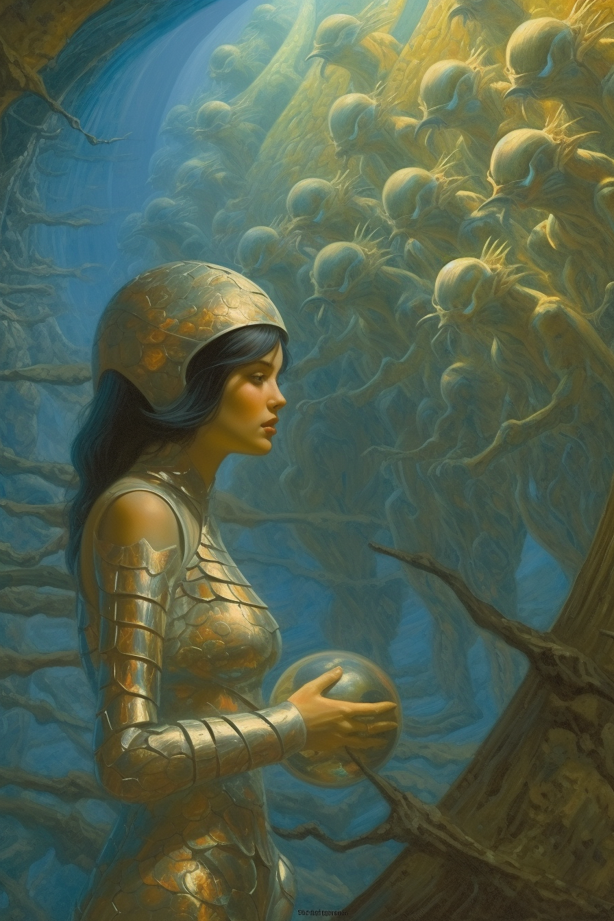
alternate cover:

21 responses to “Challenge Accepted”
Oh nice… I’d love to see more art like this, and more stories meant to match it!
(Still and always a Norton fan.)
Me too. Both of those strike me as “Andre Norton” and the first one doesn’t even strike me as military.
I really love the first one. It’s very reminiscent of classic SF covers.
I’m not really sure what the second one is trying to convey. Is it extraterrestrial SF, or possibly Fantasy?
What I wonder is what exactly about it is triggering that? Is it the muted color palette that’s doing it?
Because it really does look like those scifi books from the 70’s that that I could pick up off any of the shelves at my Dad’s house.
There was a “thing” in the 90s with a lot of fantasy-or-sort-of-literary-sciffi that looked something like that– I don’t know years, I just recognized it.
The first one looks more 70s to me.
Oooh, could it be the second one looks more like an e-painting? With the sort of glow on her chest?
You might be right. It might be the 90s vibe going on with the 2nd one. The first one does remind me strongly of the late 60s-70s stuff that our library had.
I definitely prefer the first as cover art, because she’s involved in something; it feels like the Darrell Sweet Pip&Flinx covers. The woman in the second picture is just standing there, deciding if she wants to take her ball and go home.
-j
I’m not sold on either cover but #1 is especially jarring to me. All the shaded figures are protective suits including hoods and breathing masks and the girl is in a jumper, barely wearing a helmet with a hint of a breather.
#2 does a much better job at a Wierd Tales vibe.
Continuity note: if this is in the same planet and tech as Shattered Under Midnight wouldn’t the girl be more obviously a redhead?
I told my cover artist, “If we use the second as is, you know I’m going to get a 3-star review complaining that the girl on the cover isn’t a redhead.” I am now going to poke her, laughing, and say “Yep! Didn’t even make it to publication!”
I’ve already altered the girl’s hair in the second art.
Red hair as a marker of being able to use the alien tech was major plot device, so kind of hard to forget. Now, if this is later and the alien tech genes have diffused into the population it makes sense.
Is there enough time implied, or, have the gene modders been busy now that they have more information on what works?
Those. Are. GORGEOUS!!
The second one makes me think of C. L. Moore for some reason.
My $0.02, for what it’s worth:
I think the first seems pulpier, and I like it better (not knowing anything about the story). Somehow the second one makes me think of dreams.
Neither one looks remotely like modern MilSF.
First one. Definitely. Hands down.
It’s “I’m not sure what’s going on, but I’m interested in finding out”.
The second is more, “Huh. That’s weird.” Followed by putting it back in the shelf.
“psychic powers and fantastic alien ruins of unknown races and remnants of the eldritch”
Wait I love all the stuff, we need more of that.
Love the first cover for composition, posing, palette, and suggestion of action. The second is … pretty but boring.
But on close inspection, the girl on the first one has the typical AI-art problems. Her right hand and right ankle are subtly wrong, and her face needs a bit more detail. And her garment seems to have a cutout toward the rear that leaves her cheeks totally exposed. And whatever she’s holding in her left hand should resemble something from the actual story. And the middle guy, with the bright vertical line behind him, is sitting on — air?
I guess my complaint is, the first cover is really good at grabbing my attention, but it should reward my attention once it grabs it. Can’t wait to read the story, though.
Kinda knew who your mystery cover artist was even before she outed herself.
Were you and Peter a part of the clan when she and what’s his name had their wedding at LC “ahem” years back? It was definitely at the Choo Choo, but an old duffer’s memory gets fuzzy after a while.
Peter officiated at that particular ceremony 😉
I agree that as a rough draft the first one has the “vibe”. And then once the Attention to Detail (AtD) is added it’s going to be fantastic! (I have coined this new acronym to stand for all the extra work you have to do with an AI cover to get it “right”)
I vote first cover