
I’ve got ten hours left, then I make another transition. Which is only relevant to writing in that it’s real life, and it’s really messing with the writing. One major transition in a year would be enough, but you know about making plans. You have to have backup plans. Something will go wrong… and that’s not just a fiction trope handy for creating plots, tension, and conflict. It works because it’s true. You can only plan for what you can control, and honestly there is a lot in life that you can’t.
You can’t predict that someone will alter the deal. You can walk away from the bad deal, though. You might have to cope with the consequences, but if you have a backup plan in place? That will at least minimize the aftershocks. We read to learn. Humans are a meaning-making species, and we will glom onto the oddest things to make a narrative out of. Even if, and sometimes in spite of, presented evidence to the contrary.
I’m attempting to console myself with the knowledge that this is all just a season in my life. It won’t be forever. I’ll get past it, and then there will be new transitions. Hopefully, life will get calmer, and the writing will happen again. I had a moment, last week, after 24 hours of… nothing. I had no one but the cat at home with me, no responsibilities, just sleep and food and finally the writing brain came back online. Briefly. But it did happen! And I know I can do that again. For anyone struggling with writing? Rest. Let it go. When you’re ready, it will come back.
The thing is, I’ve been writing here, for, what…. six years now? Seven? I’ve been writing over on my personal blog for fifteen years. I have always done this semi-sorta journal style post when I didn’t have something more structured to present. As a result, I have a roadmap to my past. I can glimpse my state of mind and it’s like looking into a parallel universe. I almost don’t recognize that woman. I’ve changed. I have always, though, had these fits of despair in losing my creativity. It comes and goes, but it’s predictable. Stress does bad things to my brain.
I’m not just telling all this on myself. I see you, out there. I know that I’m not the only one who struggles with confidence, and imagination, and finishing projects when things change. I forget important things, so I have learned to make lists. I need to get better at not losing those lists and checking them routinely – I used to be better at that! I need to not listen to the inner voice telling me to panic! and then telling me to just curl up and hide because I’m a failure. I’m getting better at that, with a little help from friends who point out when I’m going into snail mode and withdrawing into myself.
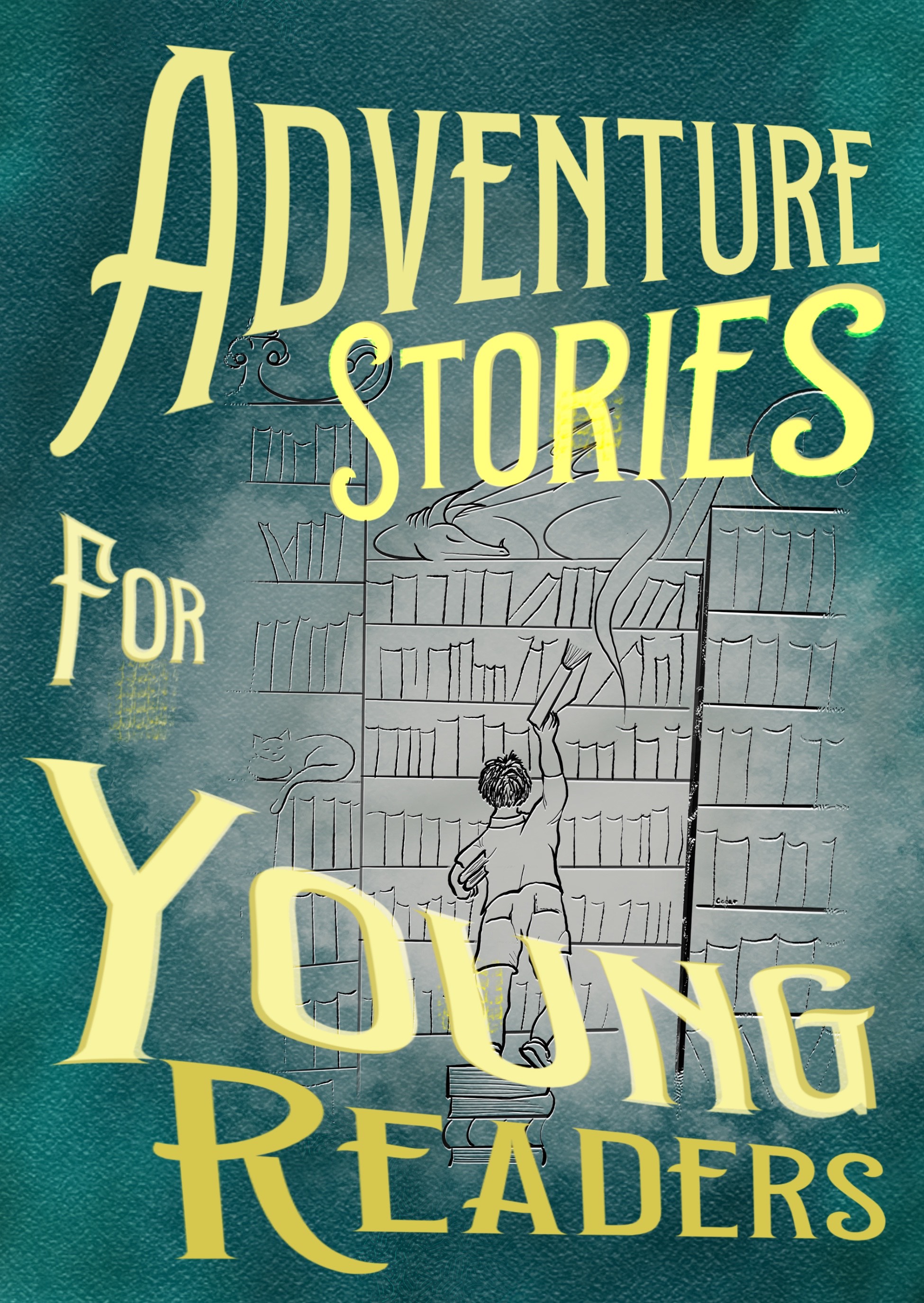
I’m curious what you think of this cover, while I’m being all vulnerable and everything. I can see several flaws, myself.
See you in the comments!


23 responses to “Transitory”
Do you scan in textures or paint them yourself? And how do you build the fonts?
The whole piece is delightful.
This was done in Procreate and the texture was painted in as a brush setting.
The font was manipulated using the warp/distort tools, which gave me the ability to put it in the shapes I wanted.
Which is not what you asked. Hmmm.. Putting my critical hat on – if you wanted this to pass muster on a print edition…
Adventure stories should be uniformly smaller to give you more of a border.
The naif-style line drawing should have a few more highlights to solidify the etched look and to draw the eye to the dragon and cat which will sing to the kid readers. I am torn on the lineart for the boy. There’s this dynamic quality that gets lost when one pushes for technical realism, and it’s a million times better to be stylistically unified and wrong than *almost* right. I’d ask an unrelated kidlet: “Based on the cover, what kind of stories are in this book?” And if he doesn’t see it, don’t sweat it.
“For” should be pushed in to overlap the line art (kill your darlings) and the bottom bit.. It has swing, but maybe too much? The “readers” could stand to be compressed… But I’m not sure about the “Young”…
Waaay past my bedtime.
Either way, it has grace, unity of expression and implies a magical old-fashioned adventure.
N.B. In other news, cpuld I send you a design ” off list” for your critique? I appreciate that you are swamped right now, so I am expecting a “no”. But just in case…
Definitely needs a small tasteful counter in a corner, something like Volume 21, or in Roman numerals if you want to go old school.
This would be vol 1 and yes, that’s a good idea.
Interesting composition. I generally like the idea, but noticed a few possible issues:
The top and bottom sections of the text pull the eye away from the illustration. The top two lines pull the eye up, and the bottom two lines pull the eye down — so it pulls the observer away from the figure in the center, which needs to be the focus for the cover.
And there seem to be some color shifts in the text (compare the “young” and “readers”, for example), and it makes me wonder why the change in the text — which isn’t something that a potential buyer looking at the cover should be thinking about.
It also might make sense to shrink the size of the text a bit, just so the illustration has a bit more space to breathe.
But all that might just be me overthinking things.
I can play with the font. The idea was to make the font the star, and give it some motion. The color shift is the beginning of a gilded look – in a vintage book this would be embossed or stamped and gilded. It’s still a work in progress, hence asking for input. Thank you.
I like it. I can almost hear the echo of an announcer in the text. Overall it seems a bit flat as though it’s not quite finished, although I have no idea how to fix it. If you changed nothing, I’d still pick it up.
It isn’t quite finished, you are right! I’d gotten to a point of wanting insight, and this is helpful.
The picture seems to disappear. I think that’s because my eyes are tuned to modern covers where every element is in full color. This is almost the older monochromatic cover, but not quite, so my eye is confused. I’m not sure that’s a bad thing, because it pulls me in. The thumbnail on-screen however might not work as well.
I’d lightened where the picture is, but I need to make that look more like fading than a fog. I’m going for the older, almost Victorian, cover styled.
Trials and tribulations come and go. What won’t leave is your ability to tell great stories.
I like the cover. It’s very retro, and signals “1880” (and well-worn due to everyone reading it) about as loud as it can get. You can almost feel the old-fashioned boards and binding, and the embossed texture of the illustration.
However, there’s something awry with how the “for Young Readers” part slopes away from the book, so to speak. The rising slope of “Adventure Stories” works just right. But the contrary slope of “for Young Readers” (and “Young” being shadowed) makes it sound in my head like it’s deflating. So I’d try putting that part in normal (unwarped, unshadowed) text, and a little smaller, so it’s a subtitle instead of being part of the title. Let “Adventure Stories” stand out as the rising excitement bit without trying to goose it further with the subtitle.
Might also try it with the illo in black and the lettering in embossed gold leaf (rather than yellow), to look even more authentically retro.
Oh, and the boy’s back pockets look upsidedown. And he’s putting a book back (hand below the book, pushing it onto the shelf) rather than pulling it out (hand on the spine to pull on it). I’m not sure that matters, but while I was nitting, I noticed.
But overall, it’s on an interesting track, and I find it a lot more attractive than most of today’s covers. (I’m very tired of current composition trends, that all look utterly the same and give me absolutely no reason to choose one over another. Mostly they just tell me I don’t want to look at any of ’em.)
Now, if I picked this up to look inside (and I would, just cuz Retro) I’d expect to find stories that feel as retro as the cover. That is, purely wholesome adventure in a straightforward style; what used to be called “Boys adventure stories” (but really were for everyone).
The stories were selected for just that style, hence the cover design to suit them.
I like it. Maybe reduce the size of “Young” and work over the colors of the words a bit so they all match. And leave room for the author/editor.
We plan to leave the editor off, and the author names for the back cover. Editor’s preference here.
I like the bookwyrm.
Overall, the image works and the font looks fine to me.
What I didn’t like was the drawing of the boy. His body looks deformed and twisted. Joints in the wrong places. Arms not correct. The shorts look wrong too, I’m trying to figure out how they were sewn together to get those seams and wrinkles.
The dragon on the shelf was a nice touch.
I can’t draw humans. Animals, even anthropomorphic, I can do. *shrugs*
Personally, I would flip the colors for the text and the “fade”. That would look more like parchment. You could then even have it the same color but not texture through the ink drawing, which might give more of the faded look you are after. There is a yellow patch under the “for” that is distracting, and other in the ‘R” of stories. There is also an odd fuzziness in the RIES of stories, that makes it partly blurred. Probably something the happened in the 3d or path manipulation.
As for people. Find a photo that is in that general pose and do a line tracing by hand, that will keep the hand-drawn feel, but get more of the clothing and joints in the right place. Drawing people just takes time and practice like anything else, and reference photos and tracings are a good beginning to help you start (and when you are in a hurry! You are not trying for any “copying” or “likeness”, just the pose and the anatomy generalities).
Your font is spot on for the genre, with those minor tweaks!
Just some thoughts!
I, too, have had to realize that the whole “seasons” verse/song also applies to me, even when it frustrates me. One of the things I have found is that all my creativity isn’t gone…it is just redirected into problem solving, instead. And once the problems are solved, then it can turn back to creating and solving imaginary problems!
You may see the flaws and OK, I could go look but I see the charm. I’ll let someone else help you with flaws today.
Oddly enough, I was wondering about picking out “Adventure for you” (or adventures?) perhaps in a slightly different color? Just seems like adventures stories for young readers is a bit lengthy for youngsters, and slimming it down might work? Or just emphasizing those letters, so it has two titles for the price of one?
If I saw that cover on a physical book, I would pick it up and look through it.