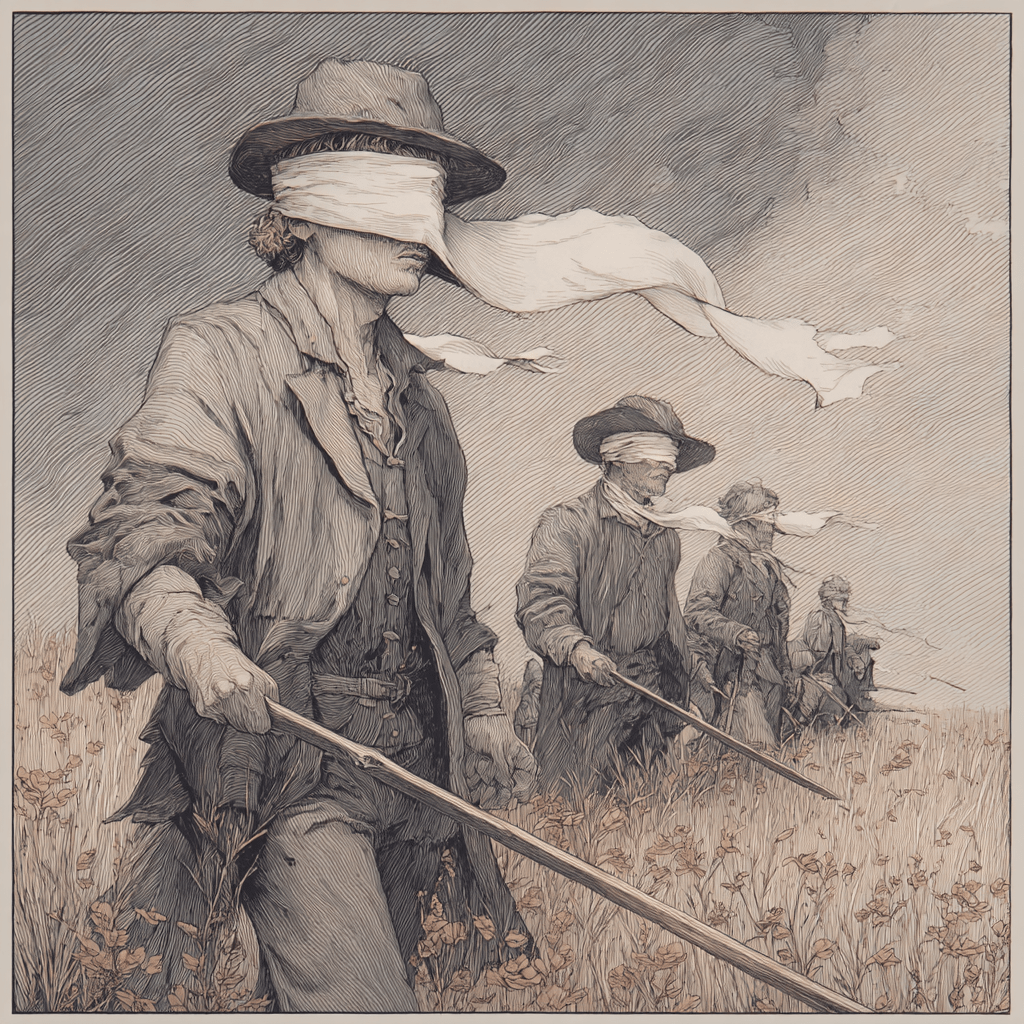
Okay, no, I actually don’t want to talk of many things. I want to talk about a new trend I’ve observed in covers, and how it applies to much of the greater world out there. I.e. how the new trend in covers is just a new way that traditional publishing has come up with to screw itself and the entire field of writing over.
They will have these brilliant ideas, and indies need to be aware of them. More importantly, they need to be aware these things are going on in other fields too, and having much the same effect.
So–
If you have been alive a long time, or even if you “just” read books for a long time, you’re probably aware that there are trends in covers, as there are in everything else. In covers, though, particularly in the era of mega-chain bookstores, that “look” not only tended/tends to be more uniform, but it changes completely.
For instance take the featured image in this post. I woke up with an idea for a blog — the idea being we’re living through a 70s phoned-in dystopian novel — and unfortunately it came with a cover. That beauty you see above is three images from Pixabay, run through a filter in filter forge. The hardest thing was getting it to be all ugly tones of brown which at least in Portugal, in the seventies, was the hallmark of dystopian science fiction. Non dystopian might have touches of green.
I know we have people here who worked in image manipulation if not that early, who studied it that early, and who could tell us why covers were like that for a while. I can tell you why mostly monochrome with yellow: it was cheaper to print.
In Portugal, for a while, the trend for mystery books was picture of random body part. No, not dismembered, just, you know, so blown up as to be meaningless. Like it might be a picture of some chick’s foot arch blown up till you looked at it wand went “Leg? finger?” against a bold color background and surrounded in a silver frame.
Ages have trends. I’ve disapproved without being particularly affected or interested when Baen decided to try out the new trend on some of their books, the trend at the time being something picked up from literary, which was “part of the image blown up to take up the whole cover of the book. Usually a portion or a woman’s face or eyes.” Tres …. literary and refined looking.
I actually liked the old style Baen book covers, some of which were magnificent (I rather like the original cover for DST) and some of which were appalling, but all of which harked back to the pulp years and carried an implication of “fun”.
At the same time that Baen was pursuing more ‘refined’ covers, the other houses were often slipping in the occasional Baen-like cover. Because they knew they weren’t selling, and they were hoping something would.
The newest trend is more …. interesting. I first noticed it with an indie writer, Henry Vogel. His covers look like aged paper covers, down to the creases. And the fact one of his series is called Sword and Planet Adventures, clearly evoking planet stories, it can’t be a coincidence. Note that it didn’t offend me, because I thought “Well, his books are pretty close to those covers in feel and style, so…”
I mean, I know when I went through cover-design-course I was told to make sure that my covers looked like they belong to now and not “they came from Guttenberg!” BUT for a certain type of book, perhaps marketing it as belonging to another era works best?
I do have, backburnered against when I have time (which will probably involve post-move getting someone to clean the house and do administrivia. Post-move because part of our goal is making life cheaper after the move) an idea for a 30s to 40s style British mystery, and the covers I have planned also look vintage. (And it will be done under a pen name.)
But then I noticed that one of the recent Baen covers also looked like a vintage cover. And I went “Uh.” But assumed it was Baen being Baen.
And then…. I kept running into more of these covers from other houses. Covers that explicitly try to look like they’re at the latest in the 50s.
Look, as a marketing strategy it’s brilliant. And stupid as heck.
Why?
Well, because now people are getting used to looking at Amazon for books that they remember reading/used to read/etc. they will be drawn to covers that are what they remember when they fell in love with a genre.
The problem is this: for most of the mainstream publishing, the contents won’t match the cover.
And yes, I can see them totally preening and going “if we get the rubes to look at our much superior product, they’ll love it.”
Because, you know, in the industry, it’s never about publishing what people want to read. It’s about “educating” the public. Which has taken them from 100K plus printruns for midlist to 10k printruns for high list.
The problem is it’s not a business plan. It’s a virtue signaling plan. By people so provincial they all graduated from the same cluster of colleges and all live in the same cluster of cities. And don’t know anyone different, even though the majority of the public IS different.
It will pay off. Brilliantly. For a very brief time. People will buy the books thinking it’s just like the stuff they loved. And be revolted. And throw it against the wall.
And then it will never work again. Not for me, not for Henry Vogel, not for you, and not for any trad pub.
In fact, there is a good chance, readers — who never look at copyright! — will decide they only liked science fiction because they were stupid, and that it was always terrible and boring.
This is a perfect traditional publishing solution: vast very short term gain, at the expense of poisoning the pool of readers for everyone else forever. But they will do it. Until the industry dies.
******
Meanwhile Kate Paulk’s Con Vampire books are back up. and no, they don’t have trendy retro covers. Deal.
In the second year of cancelled conventions, you might find them healing.
Con Vampire Series – by Kate Paulk

Jim (not his real name) is a vampire who has found the perfect habitat in which to hide his peculiarities of appearance and his strange dietary requirements: science fiction conventions!
Unfortunately other immortals have come up with the same idea, in order to avoid an increasingly more observant modern world. And not all of those immortals are benign.
Soon, Jim and his little band of misfits find themselves standing between the mortal world and those who would harm it.


31 responses to “Time has come to talk of many things”
Covers aren’t art; they’re marketing. When people confuse the two, you get series of covers that don’t indicate the contents, but which follow a trend so strongly that A Clockwork Orange has the same cover style as an Edith Wharton book or a Jane Austen book, and while people who want unified bookshelves might buy the series, it’s absolutely useless to new readers.
Somewhat randomly, I’m seeing that there are a bunch of new covers for the Pern novels, often replacing the Michael Whelan covers. While his covers weren’t always the original covers (especially for the earliest books), nobody can say that the newer covers are superior from a technical standpoint. That man is an artist of sheer excellence, and the new covers are… reasonably competent, I guess. Not really drawing me in.
I have occasionally bought books I didn’t really want SOLELY for the Whelan cover. Not only a true artist, but totally in the spirit.
OMG, I just looked at some of the new Pern covers. The one for The White Dragon threw me for a loop. It looks more like a cover for some sort of sea monster book. All you see is the tail. No dragon, nothing. Nope. Not impressed.
I always liked the Pern covers. But those new ones don’t sound like retro-covers, they sound like “you don’t want to be embarrassed reading this on the subway” covers. Except who reads paper on the subway anymore?
Okay, looked them up. I see the ones you mean. Sort of weird, I agree.
What’s interesting is that those weren’t the ones I saw. I guess I saw some newer YA covers for the Harper Hall books over on Goodreads.
CURSE you for making me look.
Yep The “artsy” way to covers. Sigh.
Hey, you can’t blame me if you decide to go look. You know better than to follow me down the rabbit hole. VBG
you…. dared me….
Did not. hehehehehehe
I looked too. It’s awful; Dragonflight looks like a bug’s eye.
Whelan was not the original. I remember the originals from my adolescence and the library.
Me, I think the vintage look is right clever… especially when I tried this Henry Vogel’s sample and discovered mad-dash Indiana Jones In Space. In this case, it’s perfect. I’m cued that it’s “SF like we used to read” and inside, so it is.
Of course if the trads do it, they’ll have a mismatch. But the day approaches when all the backbone readers know indy from trad, and which one to ignore as irrelevant.
We can’t let ourselves be constrained by what they’ve ruined. It’s ours to take back.
yep. I like what he’s doing — to the point I asked who his artist is — but the trads are co-opting it, damn it.
Wow, I have a busy Wednesday at my day job, miss reading Mad Geniuses, and discover I’m the (partial) subject of Sarah’s column! Cool.
I do hope she’s wrong, and these retro covers don’t stop working because of the trads. The covers remind of the books I grew up reading, and they’re representative of the stories I write.
Reziac, thanks for checking the sample! Sarah, thanks for the boost on Instapundit!
Conventional wisdom is that books ought to have a new and updated cover every ten or fifteen years – just to meet the expectations of new readers, tuned to current conventions. My first novel and the Adelsverein Trilogy are getting to that point … but I’ve always rather liked the covers that I have, and I don’t think they are dated at all…
Decisions, decisions…
Really, is there a current convention for non-steampunk historical fiction? Honestly, you could change them up a bit while keeping the same principal images. Are we back to borders yet?
[…] Link to the rest at Mad Genius Club […]
I remember really seeing it first in YA. After Twilight [white object on shiny black surface. Red object on shiny black surface], every YA had that combo. Even those that were not fantasy. Then 50 Shades of Turpitude – grey thing on shiny black surface. Now it seems to be “lit-fic clip-art covers” or “cartoonish flat art covers” for YA. Romance seems to be leaning toward the 1970s-80s Harlequin covers, unless they are PNR, when it’s still “shirtless man/critter, gal in evening gown.” Note that these are all on the shelf at B&N, so styles might be changing faster than these are moving.
That is “symbolic cover”to try to fit with ebooks. But there are crazier things.
I’ve always liked the Emsh covers on the old Ace paperbacks.
https://duckduckgo.com/?q=Emsh+sf+covers+ACE+books&t=ffnt&atb=v234-1&iax=images&ia=images
new covers for Kate’s Con novels… hmm, wonder who did em
It’s a mystery! Note the banner on the wall of consensual. It takes an awful sense of humor to do something like that.
For some reason, I only see the old cover of ConSensual (and ConFur) in the Kindle Store. 😦
ConFur is weird. They’re not putting it as part of the series.
My Mistake. The Covers have changed in the Kindle Store but the downloaded ebooks have the old cover.
Interestingly, Convent first showed up as a New eBook which I had to purchase but ConSensual & ConFur showed up as “already purchased”.
Crazy.
that mystery person should have a new book on their kindle.
Speaking of yellow:
The first edition of “Methuselah’s Children” in 1958.
(I really should finish up a blog post…)
Grr. Messed up the image link.
I downloaded Filter Forge on Sarah’s say so and behold, it is exactly what I need to finish my freakin’ so late covers for the next five books. I looked at the “comic book” filter, and it works perfectly for what I want. I’ve been trying to mix a few web jpegs with a 3D model and a photo of my own using Photoshop, but the filters were insufficient to get the obscuring/paintbrush-looking output I wanted.
Now, new filters! Woot!
I really liked the Vogel cover. For a story about a scoundrel-ish intergalactic Indiana Jones type, a pulpy cover isn’t misleading.
Note I’m not arguing it is. I LIKE Henry’s covers (note I gave him a link, and put him in my Sunday promo over on my blog.) They perfectly capture his feel and style.
Yeah, he might be engaged in MINOR deception if the reader isn’t observant and the reader will think it’s vintage, SF, but that’s the reader’s fault, as the tells are there.
AND he delivers on the promise made by the cover.
My problem is that I’m starting to see a lot of Traditional publishers following the same pattern, and they’re going to poison that well. As they do everything. it’s like they’re the anti-salesman.