
Sometime this week, a friend pinged me with a question. I was at work, but promised I’d write up a tutorial later… Sorry, it’s going to be even later. You see, the question was about Filter Forge, and using it to make photos look painterly, and therefore suitable for SFF cover art. It’s a great question, and I do have Filter Forge (it’s not cheap) and don’t use it much. You see, I have a new laptop, which has no optical drive (you’d think if you dropped almost a farking grand on a laptop, but nooo) and my copy of Filter Forge is on a disc. So I can put it on here, with an external drive, but it’s been a busy week. However! There are other ways to achieve painterly cover art without resorting to plastic dollies of the CGI rendered sort, which frankly fall in the Uncanny Valley and should only be used as a last resort. Sometimes? Sure, I suppose, but even those ought to be run through something like the below process to render them less, um, plastic looking.
I am using Affinity Photo below. Unlike Adobe Photoshop, you can pick it up for a one-time license purchase, and it’s pretty cheap. Even cheaper if you catch it on sale, which happens every couple of months. However, if you want to be even cheaper, this can be done with GIMP, the tools are available in all of the above. I haven’t got GIMP on this laptop, haven’t needed it. I’m also using Fotosketcher, which is a freeware painting program to convert photos to, well, drawings or whatever you want.
What follows is a quick overview of a tutorial. I highly recommend you get familiar with whatever program you want to use. There are so many videos on youtube it can be overwhelming, so here’s a couple of things to look for: photocompositing, oil painting effects, photobashing, matte painting. Those will get you pointed toward some techniques that are valuable in this sort of work. Keep in mind this, too. I’m not really an expert. I’m just bodging along best I can, constantly learning. I’ve been doing this for years, now, so hopefully I can help you all get better faster than I did.
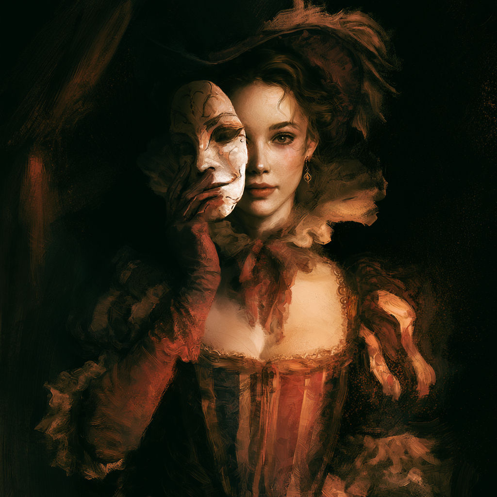
First challenge: pick a model. Actually, pick more than one. Keep in mind your cover is a marketing tool, not a representation of a scene from the book. I’ll keep pounding that lesson in best I can… Also, pick a background if you want to, but you don’t have to. There are other options. I grabbed two images for this tut, in the hopes of keeping it simple. If you look into photocompositing you’ll learn that ‘many’ is a good number of images. I used Pixabay, for free images I can use without worrying about copyright. There are quite a few free sources, paid are even better as you’ll see less of other covers using the same element (although that’s still not a guarantee). Also, don’t just grab an amateurish photo that you or your friend did in their garage. Trust me on this, it’s going to look like garbage even after you filter the heck out of it. Lighting is important, costumes are important, expressions are important… although I have painted a smile on a grumpy model. It’s not optimal, though, and selecting a good photo to begin with is crucial. If you want it to look good, start with good ingredients.


Next week I’ll be back with a Filter Forge tutorial, and to answer any questions I can’t answer in text via comments.


20 responses to “Cover Art: Make it Painterly”
hand me links to your source images, or a psd, and I’ll show you a version run through Painter…
Corel? I have that, but was trying to use tools that were cheap/free. Which Filter Forge isn’t, but that’s a ‘nother post.
ok, i did a couple tests… i really need to install it on the otehr machine and use the tablet.
Are you overpainting it? Or applying filters?
clone painting
Willing to do a tutorial? I don’t think most people will have Corel Painter or want to buy it, but it’s possible. More tools are always useful – and you, unlike me, are an expert.
If you don’t have Painter, and miss the occasional $25-or-less deal on Humble Bundle (usually but not always for Painter Essentials; last time it was full version of Paint Shop Pro with Painter) … you can scrape by with Krita, which is free. If you’re as far from expert as I am, you won’t care about the differences.
Yup – I picked it up on the Humble Bundle along with other stuff. I’ve been slow at playing with it, though.
Just so I’m clear – this isn’t art I’m planning on using. I just grabbed it for the tut. I have a psd if you’d like it, my email is cedarlila at gmail dot com, and I have dropbox.
I did a couple test versions using the autopainting tool and them painting back in some detail. Not as good as hand-painted would be, but it does look painterly. Emailed them to you a few min ago.
They had an 80% off offer on Filter Forge, so I bought it. Now I wait for your tutorial… 😉
*rant on* I had to replace a missing laptop (loooooong story). And discovered that the mini USB doesn’t push enough power to run an optical drive, making the new computer about 50% less useful than the old missing machine. Keep this in mind if you are thinking about updating equipment – will it power any accessories you need to power? *rant off*
I need to dig back into Gimp and FilterForge, just to work on my skill set. I use them once in a blue moon, and remembering how to layer images, then tinker and add filters has a steep re-learning curve.
A number of the external drives have dualtailed cables that allow you to plug them into two USB ports, so as to get enough power to make them work with low-power USB ports.
I haven’t needed to use them with any of my laptops — they all have had enough power from one port — but I can see those cables as being useful for some of the laptops (apparently, like yours).
Apple’s mini-USBs won’t work with a double-adapter. I tried, several ways. Could be that this particular machine is the problem, but it’s still worth considering (“Hmm, can run an accessory or be connected to power, but not both. Not good problem to have.”)
That is one thing I made sure of with this – I have a USB3 (I think that’s the name, the blue one) which provides more power. And a powered desk USB hub as well.
I tinker with art daily, not like this, but various programs. It’s my relaxation time. There are so many great, and free, programs out there now for arting around with. I buy some, too, because shiny tools! LOL
Running a photo through several filters often get Good Results.
I did that with “Jewel of the Tiger.”
Very cool. I’ll have to see what Manga Studio let’s me do.
For Painting/over-painting and filter manipulations there is also PD Howler, it usually runs between $40 and $75, depending on the sale. It is a full painting software like Corel, but also has some 3D capabilities and animation capabilities. It’s my software of choice. It’s on sale at DAZ.com at the moment, but you can also get it at thebest3d . com.
I used to be on the site thebookcoverdesigner . com for premade and custom covers. It is very hard to get digital work accepted there (3d rendered and then painted) and they are heavy on the custom photo manipulation. I hadn’t sold anything for a year, so they killed my store. such is life. But, anyway…the reason I bring that up, is the differences I’m seeing in what is accepted there (very stringent rules) and some of the things I’m seeing in other places.
I know there is the old “But you can spot an Indie cover a mile away” prejudice. But I see books with “Indie” covers that are selling just fine. I would guess it’s because of author familiarity…but, maybe it’s something else. I begin to wonder if what I am seeing is not what other people see. I know I have a problem with colors and other people not seeing the same thing…so maybe I have a problem with covers, too.
Is there a question in there? No, probably not, just my ramblings.
I know the PD howler dev. He’s a pretty talented 3d artist as well as a developer, i worked with him at Unnnamed Vfx Studio.
Cool! He works hard on it. I wish he had a better job now, so that he could afford to work on it more.