by Sarah Hoyt
Cover Me! I’m Going In!
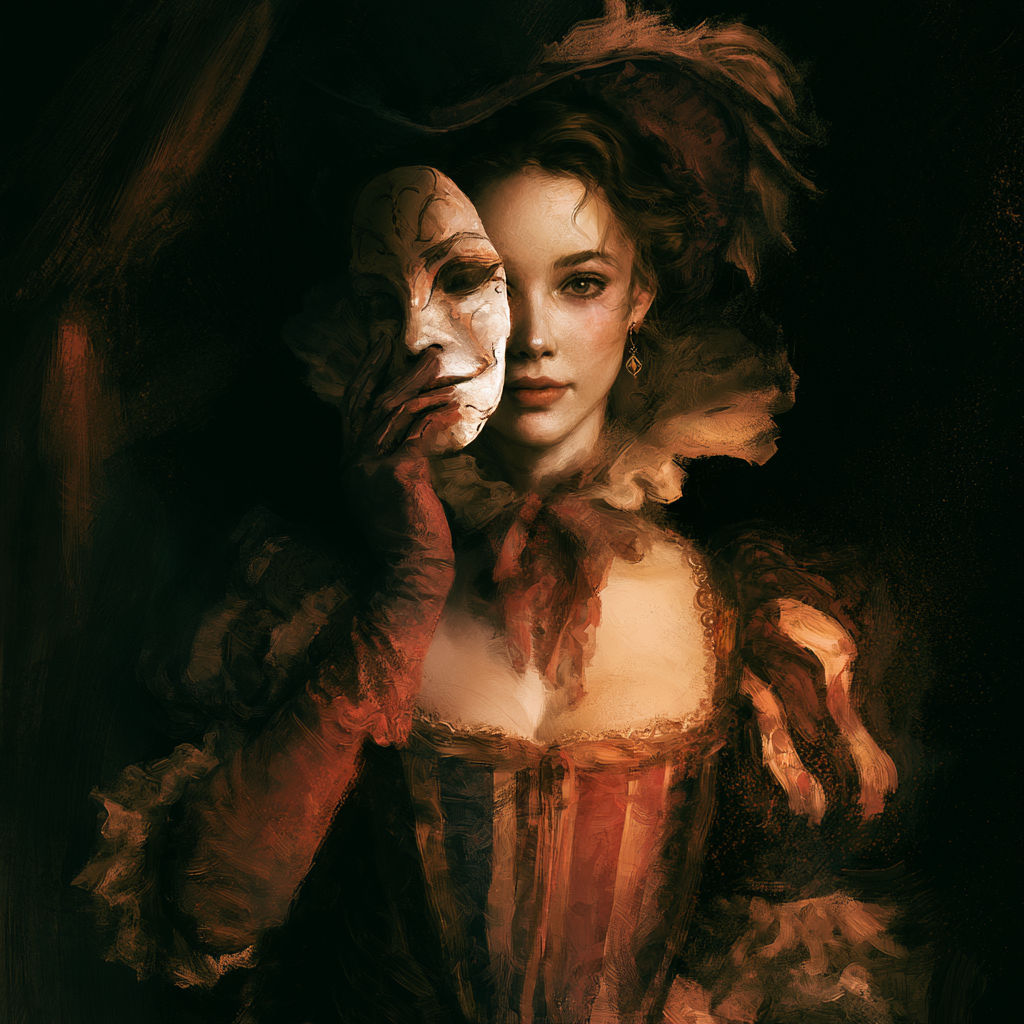
I was brought in by Amanda to do the segment on covers because I’ve more or less taken over this duty at Naked Reader. The various people who did cover design and art selection/direction before were sweet and about as clued in as I was. In fact, one of my first things out with Naked Reader Press, I did the cover which is now up to be redone, because it was wrong, wrong, wrong, miles and miles of wrongitude. That was A Touch of Night, which I’d drawn the art for, too (so, sue me.) I might actually keep the art, since it could be worse [Grin] but that blue border and the lettering… How bad is that lettering? Can you read it? No, I didn’t think so.
![]() The A Touch of Night cover just screams “amateur.”
The A Touch of Night cover just screams “amateur.”
So, how did I come to make this mistake? Oh, very easily. I had been trained by years of covers. What do I mean by that? Well, take the book that was on my bedside table this morning, Georgette Heyer’s Frederica from 1965 (when I’m not feeling well, I not only read stuff I’ve read before, and often light stuff, but I tend to read only the — happy — ending.)

Now, we can all agree, right? that whoever designed this cover did not intend to scream “Amateur”. But the sixties book market was quite different. I don’t actually KNOW as such, since — though I learned to read at four, that was a year later than this and — I wasn’t reading, much less buying, romances, but from what older friends have told me, you bought books from the corner store often from one of those spinning racks. With the book about at your eye level — and if not, you knelt, I think, or at least I used to — that cover is great. The author name, which is the important thing, is still readable. But the title just doesn’t quite come across in the digital age, does it?
These are the books we grew up looking at and loving and they formed our idea of “good cover” only, of course, times have changed.
How much have times changed? Oh, boy… well… First they changed so that you had to see something that caught your attention on the shelf of a megastore, and picked it up. This led to any number of wrap around covers and what I call “brocade and embroidery” particularly for what they considered a “prime” title or a “classy title” covers. The publishers were going for feel and impression, rather than in any way representing the book:
![]()
And for a slightly different feel, something from the thriller isle which still shows that concern with “let’s get the customer to pick up the book and give it more attention” — here’s the first Repairman Jack I read (we’ll return to this.)


Hosts is a little better, because it’s from a slightly different era. It was given away for free at World Fantasy 2001 — which means the publisher was pushing it.
Unlike the other two, which came in around that time, too, and quite unlike Frederica, the cover for Hosts takes in account a new reality — Amazon. While most of the books were still sold in paper (correction, most of the books still ARE sold in paper) Amazon was coming up from behind to become a leading outlet for those, which meant how things looked in thumbnail mattered, at least if your publisher had a clue. (Many publishers STILL aren’t Sherlock Holmes.) So you see on that cover that you can read the title and the author’s name in high contrast. But you can also tell the title was foiled (covered in foil, not “curses, foiled again” in a way that makes it harder to read electronic. that was because electronic was a negligible market and that short of shimmer and fade on the title meant it was foiled, which is an expensive process and therefore signified to your mind “pushed.”
In fact, you should go to the Repairman Jack site and look over the cover retrospective. In particularly, look at the Young Repairman Jack series which came out wholly in the electronic age and see the difference. But, you’ll say, the difference is also that it’s YA. Right… but no. Look at the very last of the Repairman Jack titles, Night World — that’s a title fully in the electronic age and they finally got the message. See how the title is HUGE and the art recedes in importance? Right. That’s part of what’s happening. Let’s do a quick retrospective of “highly pushed titles” (Pushed = what the publisher paid big bucks for and wants you to believe is the best thing since sliced bread) over the last few years, shall we?
Do you see how the covers become more and more “inconic” and stripped down, till all that is left of the art is usually a highly memorable image, having more to do with logo-making and image-making than with actual “art” as we used to think of it for a book. The contrast is particularly great if you compare it to the brocade (or small details) era of just ten years ago.


Now mind you, not all publishing houses have got the memo, and a lot of them too, aren’t doing a lot of their selling in ebooks,(Yet) or — the idiocy — are trying to discourage selling that way, under the belief if they keep their fingers over their ears and scream “there’s no place like home, auntie Em” they’ll be back in the — for them — halcion days of the nineties. As sad as that is, most of the houses HAVE got the memo and as you can see the covers of the their headliner books have changed a lot over the last ten years.
Now, for a snapshot of the amateur leagues, let’s head over to smashwords, where most of the books are self published. I am NOT picking on these people — my early covers for Goldport press were as bad or worse. Here are some books up on the first page when I looked this morning, while writing this post:
Okay, is there any chance, no matter how remote you’d think that was a traditionally published book? Well… no. First of all the book “orientation” is wrong. It’s wider than it is tall. And while you often see that in printed children’s books, the rest of the cover also screams “amateur.” The type is so small you can barely read the title. the author name IS there, but runs off the page on Smashwords, and I guess it didn’t copy. And while the cover is a gorgeous photograph, with tons of visual interest, and has a doggy on it, it is a photograph, which almost by itself, these days, screams “self published” (except in some sub-genres, though I’ve found even including a photograph as PART of the cover seriously brings my sales down in GP. Go figure. People are internalizing the new signaling, I’d guess.
I’ll confess to you I didn’t check if the next book is self or traditionally published. It might VERY WELL be traditionally published, because it’s poetry, where covers are always screwy at best. However, as a cover it screams “amateur” — that is, if you can read it at all.
I can’t. Oh, it’s the right aspect, though it came up poster size, taking up the entire window, and when I reduced it, I might have done it violence, and it’s a painting or someone at least treated a photograph with one of the “brush stroke” simulating programs, to look like a a painting. But that title and the author’s name… what is that, exactly.
So, so far, let’s go with our lessons, shall we “no fonts so fancy you can’t read them,” “No fonts so small you can’t read them” and the right aspect for books. (Aspect meaning orientation and size. Set your program for nine inches by six inches, the size of a trade paper back. Unless you’re using sigil where Amanda tells me, at least the cover to go on the inside needs to be 590 pixels x 750 pixels. I recommend making a different one for the inside, then, because otherwise the “aspect” instinctively says “textbook.”
More random examples of covers up on Smashwords this morning:
Photograph AND the title and author’s name sideways. I’m not sure why but… oh, no. Also, the contrast makes both almost impossible to read and they’re WAY too small.
And this last one: The picture actually works, for what it is, though to me it says “WWII fiction” instead of a contemporary article.
Yes, I know if I look at details I can tell it’s far more recent than WWII but the faded look first gives that impression. HOWEVER the letters are still too small. FAR FAR too small. yes, they can be read, which is good, but they trigger our mental “self published” triggers.
None of this is written in stone, okay? You can still look in the kindle paid bestsellers and find astonishingly “antique” looking covers. The Help’s cover comes to mind. But then if you step back and ask yourself what THAT marketing strategy was you think “movie + marketed to ‘literate’ people” and you realize it might very well look that way on purpose.
I’ve found that the covers that do best for me (by and large) have the following characteristics: relatively simple art (I’m no advertising maven, and I have so far fallen short of finding a “branding” type image. Large type,usually in Times New Roman or one of the other simple fonts (remember fonts are copyrighted. You can’t just pick one up off the web without making sure you have the rights to it. OTOH if you’re using a program to make the covers and the program is freeware OR licensed to you, you’re fine.) Large enough that it can be read from a distance, or in thumbnail side. No tilting, funny fonts, running blood or anything of the sort, unless VERY EXCEPTIONALLY because of the book it is. (I tilted the title of ConVent because it is supposed to be a convention banner, also, italic — PROVIDED IT’S LEGIBLE, which a lot of it isn’t) can work for romance.) Usually a tag line somewhere there — which is too small to read in thumbnail but readable if they click on it. Don’t ask, but this gives the impression that it is a printed book, even when it isn’t. When I can, I use a drawing rather than a photograph, though photographs are de-rigueur for certain types of books — just go look at the books that have done well in your subgenre FIRST — that, btw, NEVER includes SF or historic romance.
So, where do I find this art? Do I just take it off the web? No. Art is copyrighted, and I try not to steal others’ work. Do I commission it? Well… this is a little difficult. If I end up bringing novels out with Goldport, I probably will commission the art, unless, of course, I happen to find art that fits so wonderfully that there is no point (It happens. My collection Five Far Futures is one of those — look below.) However, for short stories, it’s a numbers game. I get most of my money from QUANTITY not from individual shorts (tons of people don’t buy shorts, etc.) So… Well… go here and you’ll find any number linked, including public domain sources. Most of my art comes from Dreamstime because it’s a large enough site to have a lot of things and their search engine is actually pretty good once you understand the logic of terms used (which might make you cry for the general education or psychology of the users, but that’s something else. For instance, if you search for handsome man, you come to realize most photographers have no clue what that word means — occasionally either of those words.)
If you’re publishing only in ebook, you can usually get away with buying the extra small size because your eye simply can’t see details past a certain point, not on the screen. So, go for it, then expand the image to the size you need. Now, if you’re printing, you’ll have to buy the larger size or resign yourself to extreme pixalation (which sounds like a reality show.)
Keep in mind a few things: first, if like me you have a bunchaton of covers to make, you’re not always going to hit a homerun. In fact, if most of your covers are meh but professional, you’re ahead of the game. The cover doesn’t necessarily have to reflect the content. In fact, if Baen rejects A Few Good Men (I hope not, but they might. It’s a “risky” book — not risque, but risky — for many reasons, the cover I’d like is a man in a tattered shirt (war tattered, not romance-tattered) holding up an arm, which holds a futuristic weapon. From his wrist hangs a broken manacle. Behind it, a tattered American flag (very tattered, I found a nice image of it practically in ribbons, which I am saving to show artist) and there might be a flying car/air-to-space in the distant horizon. Now, my character was never shackled, but he was imprisoned for fifteen years. Symbolically that works. (On other levels too.)
Keep in mind too, that you’ll get better with practice (save for those days you’re “off”) and just keep doing it. And keep in mind that as long as it’s electronic you can always mess with it. For instance, I need to go do something about the cover of Nocturnal Serenade because it doesn’t come across at all that there’s a sexy woman silhouette behind the letters. Amanda is going to kill me, but I’m going to muck with it next week, sometime.
The only other advice? If you think your title and author name is large enough — bump it up a little. This is where most of us err. Also, for the love of heaven, make your name either the same or close to the size of the title. name of author has been used for so long to indicate “known, well selling author” that people look at little ones and the back brain goes “ignore” — so, make yourself a lead author. Go for it. You have my permission.
Okay, now some of the covers that I made which PROBABLY don’t suck:


9 responses to “The Road To Publication 7”
Well, when I think of “Bad Covers”, I think of Bad Cover Art or Cover Art that has nothing to do with the story.
Draw one in the dark, hardcover. COFF.
I got one worse than that. A few years ago, I saw a book titled _The Green Millennium_ by Fritz Leiber. The cover art showed a naked woman riding a green tiger with goblinish swordmen. I thought it was a sword & sorcery novel but it was far from that. I finished it but I’ll never purchase that book.
Here’s a link to my book. Comments on the cover would be appreciated.
I went through a lot of versions– fonts, graphics, colours– to get there. I think it works, but I could be wrong
Try this one without the Amazon link…
Not sure if this will work though…
Scott,
Obviously not Sarah, but my suggestion would be to put the title at the top, instead of the line about Part 1 and then bring your name up closer to the title and make your name larger. Remember that folks buying your book through the kindle store, et al, are seeing it maybe on the Amazon web page, but often are looking at it on their e-readers. That means smaller images, etc. You want the title and your name to stand out. Everything else can be put at the bottom of the page and in smaller font.
Good luck!
It’s pretty good. I’d consider putting the “part one” line under the title, because above it makes me think it’s a media tie in (No, I have no explanation for this, and it could be completely wrong.) But, hey, it’s miles and miles better than 99% of the stuff out there.
Thanks Amanda and Sarah.
I’ll fiddle a bit more and see what happens.
At least this time I saved the photoshop version and not just the jpeg so I don’t have to start from the start.
[…] off, I want to thank Sarah for stepping in last weekend to give us that wonderful post on covers. For those of us who have been brought up shopping for books in bookstores, or even at the local […]