
The purpose of the cover is to sell the book. Fonts and layout are part of that. There are a few hard and fast rules, including not using dark red on black, don’t use interior fonts (Times New Roman) on a cover, don’t use something that cannot be read.* Considering how the cover will look when shrunk into a thumbnail on an electronic book sale site is also important. The rest of the rules change over time, and vary with genre, with which country you are selling in**, subgenre, and copyright. Too, you want to beware of blending in too well, which is what is happening with a number of trad-pub histories of the American Revolution right now***.
So, when can you break the rules? When you know what they are, and you are aiming at a very specific readership, and you are willing to take a leap.
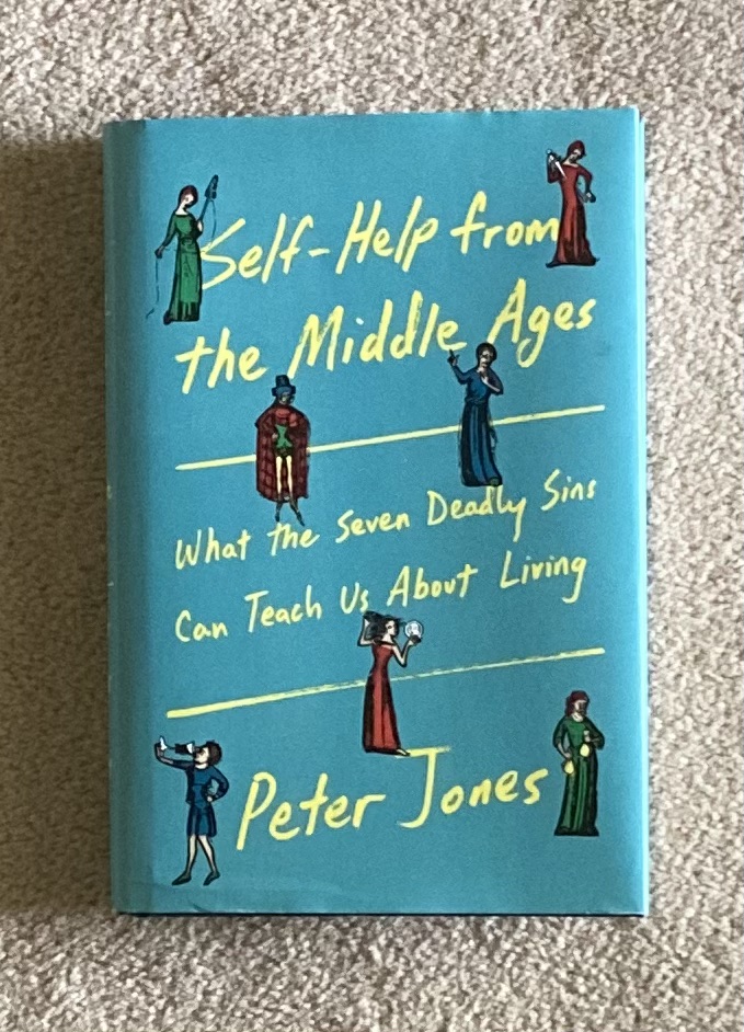
If you look at the cover in thumbnail, it appears to be a chick-lit or women’s fiction book, based on the colors and the font. It would blend in on those shelves in the fiction section. It is eye-catching in nonfiction, because right now, medieval history leans toward images related to the subject of the book (portrait, representative image from art, artifact from the time), with serif fonts, generally in a three-color pattern aside from paintings. This one stood out like a Great Dane at a cat show.
The publisher took a risk, because the book is non-fiction, but it is not just medieval cultural history. It is a study of what medieval writers said about the Seven Deadly (Mortal) Sins, how that differs from modern interpretations, and how the medieval ideas apply to modern people. The author uses his own experiences as examples of the Big Seven, and uses that to frame the chapters in the book. So it is history, it is theology, but it is also self-help and autobiography as well. Which element should be emphasized in order to attract eyes and buyers?
The publisher chose to play up the modern chatty, self-help side of the book. By using that font and color combination, the title stands out from other history titles. It also stands out if the book is put into Christian Non-Fiction, and self-help. However, it is not too modern, because of the small illustrations taken from manuscripts that illustrate some of the Big Seven.
It worked. When I took the book with me to a medical appointment, several women asked about it, and took photos of the cover. One said she’d talk to her book club about reading it. The publisher achieved his goal. The cover got eyes on the book, and people talking about it, and potentially interested in reading it.
So, what’s the lesson for us fiction writers? First, focus your cover design on the most important or most-likely-to-sell aspect of your book. This cover won’t interest someone looking for serious scholarship and translations of the Desert Fathers or later writers. Two, know the fonts, color combos, and design elements currently being used in the genre and sub-genre you are focusing on. Three, if you are being different, temper that difference enough that you don’t turn away potential readers. The subtitle was enough to make me pick up the book and thumb through it, then glance at the bibliography.
Being strange can work, IF you do it right, with care for your market.
*There are metal bands with logos so intricate that I can’t tell what the name of the group is. Not a good way to sell books to new readers.
**What is sci-fi in the US is not the same in France, and what says “historical fiction” in Germany is quite different from in the United States.
***All use the same fonts on the cover, all have the same layout, all use a battle scene or cropped image of the signing of the Declaration of Independence at the bottom of the cover. When three or more are lined up, I can’t remember which one is which.





 Mad Genius Club
Leave a comment