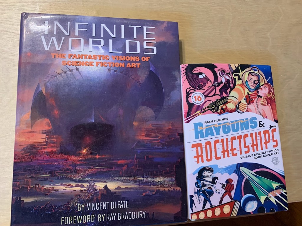
I bought this book a year or two back, and I find that I dip into it occasionally, for fun and for research. I was a bit disappointed when I received it, so it took me a long time to consider doing a review. I was disappointed in one major thing: it’s thick, but not big. If that makes sense. For the price and the concept, I was expecting coffee table art book size, and what I got is a hardcover, yes, but trade paperback sized which means the art…
I’m getting ahead of myself. Rayguns & Rocketships by Rian Hughes is a lovingly curated collection of British Science Fiction art, specifically pulp covers. You see why I bought it!

Despite my disappointment over size, this book really is packed with artwork, and as a study for the kinds of pulp covers I find myself doing, it is a rich resource. For one thing, although there are certainly strong parallels, the British covers differed from their American cousins in many ways.
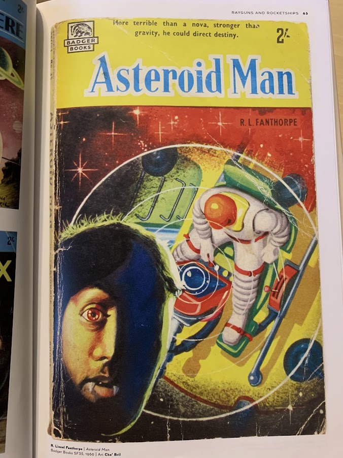
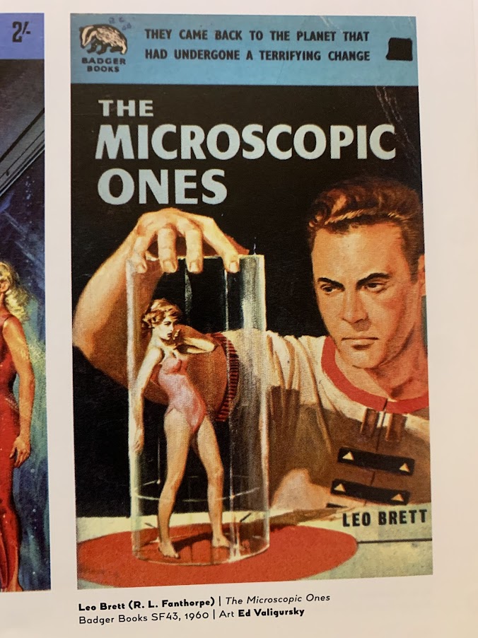
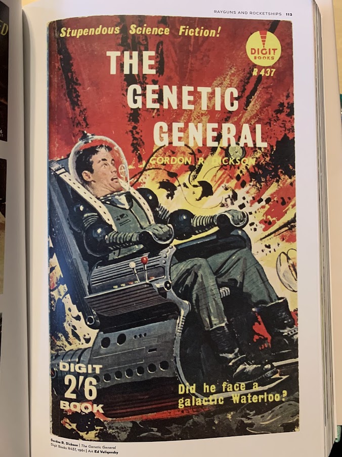
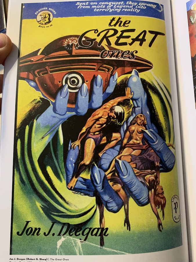
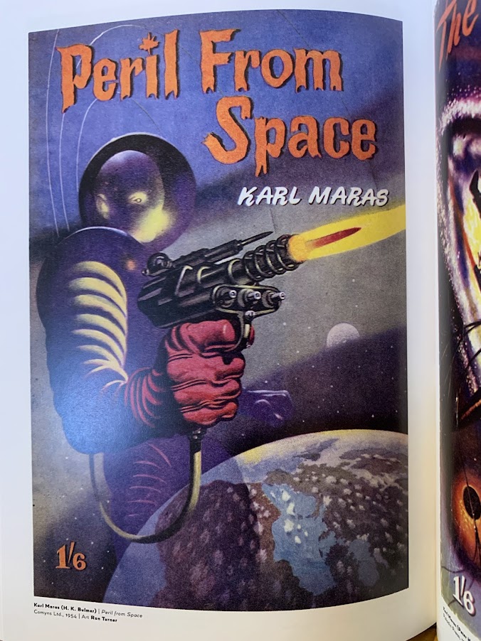
Up to and including the ridiculous plot elements as depicted on the covers. No, I’m not talking about the ones you just scrolled past…
The book is a lot of fun just to open at random and see what you get. Might work as an art prompt that way, or even better, a writing prompt. See, some of the covers were drawn from the title. The same title that was handed to an author who was told something like this on a given Friday, ‘write me 4000 words on this, make it a thriller! due on Tuesday.’ The cover artist and the author likely never even spoke to one another. This led, as I’m sure you can imagine, to some amusing mismatches.
Readers didn’t necessarily care. The cover art told them this was the kind of story they wanted to read. Sheer whimsical escapism. Action, adventures, weird things far from their daily humdrum.
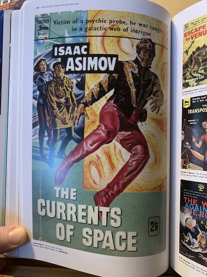
I think you can kind of tell when the story was doing something that the author hoped would be literary. I still think the red boots/pants onesie was a fashion faux pas.
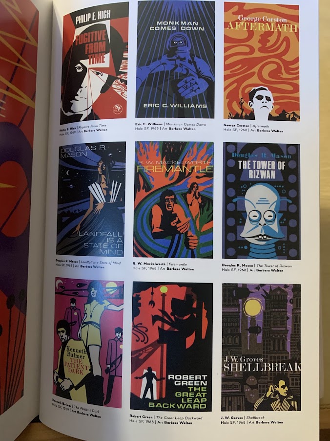
I’ve been sharing full-page images, but the majority of the book is thumbnails. The author clearly wanted to pack as many exemplars into the space he had. I wasn’t too sure about this at first, I like being able to see the details, but on second thought I realized since I have to design for thumbnail it worked for my purposes. Most readers will see a book on Amazon or other retailer site and the cover will be the size of their thumbnail, which is a challenge for cover artists to sell the book so a reader will tap on it to embiggen and pull up the blurb.
Would I recommend this book? If you can get it through your library, absolutely. I wouldn’t say it’s worth the $50 retail price, unless you are seriously studying a certain era of SF art. On the other hand, the Vincent DiFate book Infinite Worlds, which I bought based on Ben Yalow’s recommendation, is wonderful and I do recommend that even if you aren’t designing your own covers. There is so much art in there worth resting your eyes on, while your brain whirrs into motion building a story from the image.


Leave a reply to Cedar Sanderson Cancel reply