Last week’s post was about the physical, hold it in your hand and give it to a potential reader. This week is about the promotional materials that are only ever electrons. Don’t discount that, though. Chances are more eyes will see the electronic than will the physical.
Whether or not you use social media, chances are good that your fans do. Creating great visuals which can readily be shared increases your reach beyond the immediate connections you have. Creating visuals people want to share is much more of an art, with a sprinkle of luck. I don’t, myself, try to create visuals that will ‘go viral’ because that’s unpredictable. I’d rather have visuals that do the job of recognition, inform, and intrigue.
Part of your job as an author is to brand yourself. No, not with something hot. Put that down! I mean to create a cohesive ‘look’ for your work and company. This can be in part a logo, but it’s also going to be about color palette and font choices. This isn’t something you’re likely to figure out immediately, but you should be aware that it’s a thing, and one you need to lean into. You want there to be a recognition by the readers when they see your graphic, that it’s yours. This doesn’t apply to book covers, by the way, those need to stand on their own with their specific sub-genre. It can inform the book cover design, though. I’m using Raconteur Press’s materials again for examples, as this is one of the things I worked to create for them from very early days.

The origin of RacPress is Lawdog, and in working up the new covers for his books, I was using leathers (ostrich, in the above example). The worn paper, aged and coffee-colored with ground-in dust, like an ancient treasure map, suited this. It has become the backdrop to everything from the promo squares, to the postcards from last week, to a gigantic eight foot square booth banner that will be printed up soon. The Press leans into pulp fiction, and I grabbed that idea and ran with it, for everything from the weathered paper to the color palettes that hark back to a Golden Age of illustrations and cover art.
The other thing you want your graphic to do is to inform the potential reader. What is it you want them to know about? A new book release? Where can they find it? Don’t assume you can share the graphic, with a separate link. They will inevitably get separated in the sharing process. You want to make certain they can locate the book, or you, or both. You can include a link with the graphic, but it’s not necessary if you clearly have the book title, the author name, and a retailer where they can find it (particularly if you aren’t on Amazon, as most readers will look there, first, and shrug and wander off if they can’t find you, assuming that the book isn’t published yet).

The graphic ought to tell the reader a little something about the books, in the above banner, that they are science fiction romance. This can both attract those who are looking for romance, and warn off those who can’t stand the admixture of feelings with their science fiction.

With the promo squares, I try to intrigue the viewer. Catching their interest, in a very few words, and getting them to do the hard work of tracking down the book (or in the above example, the website), is vital. Promise of a good story, or a chance to send in a good story for publication, may be enough. You don’t have a lot of space here – use it wisely. Leave some ‘white space’ to allow eyes to rest and give your design the ability to bloom. Resist the urge to make the font tiny and fit in more. Instead be catchy and silly and urgent, or choose one or two of those, and it will be enough. Let your book cover shout, and give it just a little support, and they will come! (I am predicating all of this on having a really good book cover, which you do because you’ve been reading my past articles on how to get that.)
There are, in general, three formats to use when creating web graphics. The square is near ubiquitous, and has the advantage of showing well without cropping on Facebook, Instagram, Twitter, and more. The banner is useful for me, as I use it to become the ‘background’ banner for my profile, which evades the algorithms to an extent and makes it more visible. There’s a third option I rarely format for, which is the vertical (sometimes called story) graphic.

The reason I rarely create a graphic for this format is that a book cover alone works here with minimal cropping. The above was grabbed from the shareable images generated by substack for a post, and it’s a great example of the kind of thing you want to do. There’s a link, short and sweet but not totally obscured as to where it’s taking you. There’s a snip of the post in this case, but a tiny book blurb fits well under a headline telling the reader what this is about.
Backgrounds! When it doubt, make it plain. I do work with art under art, but that’s a trick, and when you aren’t sure, don’t. It’s easy to make the graphic cluttered instead of cohesive. There’s a reason I adopted the worn paper for Rac Press, it’s not going to fight with any of the book covers, or take away from them. However, you can do art under art, just be aware that you want to keep the background in the background, not overshadowing the covers or the wording.

This teaser graphic is using a layer to darken the background art, allowing the covers to really pop off of it. It’s also an example of my changing font up to mesh with the genre of the books. I generally don’t include the press logo on web graphics, partly because the colors in it don’t always work with the cover palettes. Something to think about when commissioning or creating a logo. Keep it simple, very simple, or have alternatives.

So. How? Well, I use Affinity Photo, and I create templates. This allows me to replace images at the click of a button, swapping them out without having to figure out angles (on the tilted covers I put on square graphics). You do not have to do that. You can achieve the same things using GIMP, or Canva, or for that matter Procreate Pocket on an iPhone (I’m sure there’s an Android analogue, I just don’t know it. Possibly in the comments?) that will allow you to generate a graphic. For Squares, I use 1080px by 1080px, banners are 1920x1080px (and when rotated to the portrait vertical position, are also the Story graphic size). You don’t need a large image for this purpose, and in fact smaller is better so the compression algorithms of social media don’t mangle your resolution and make it blurry.
So there you are. Have fun with it! Don’t limit it to new releases, this can be a fun way to promote older books, with the added benefit of being able to snag a snappy phrase from a review to intrigue the readers instead of having to come up with your own tiny blurb.

Any questions?

6 responses to “Promotional Ephemera”
I feel like this is good advice and exactly what I need and my brain has just turned to mush trying to digest it all. There is so much!
Maybe I just need to come back to this after about a gallon of coffee….
A fabulous summation.
And double yes to keeping it legible. If a prospective fan can’t read it, you lost.
I make the vast majority of our Instagram posts using Canva. I use the free option and I can still do most of what I want but it’s taken me two years to get as practiced as I am today. I made templates for our author quotes to make them faster to generate. Standardizing our posts (of whatever type) makes them faster to create.
If you want to see what I do, look up peschel_press at Instagram. I try hard to make us stand out in the stream of images and maybe, sometimes, I succeed.
We use a plug-in to make our Instagram posts repost on our website along the side. The same plug-in makes those posts show up on our Facebook page (I think), so my efforts do triple duty.
I also use Canva to make our signs for the real world, gift certificates, bookplates (each book in my fiction gets an appropriate, unique bookplate), fleurons, chapter heading art, banner art, and so on.
Then, because Canva doesn’t allow me to do a lot of things (I have the free version), I send it on to Bill who works his magic using Affinity Photo and Affinity Design.
I can’t say enough good things about Affinity! We use their software trio for our own designs and books all the time.
ok love the new Pixie Noir cover…
thank you! It is, finally, what I’ve always wanted for the art but lacked the tools to create until very recently.
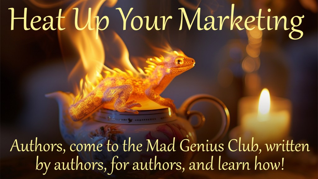
[…] Y’all see the salamander in yesterday’s post? […]
[…] Read more…. […]