
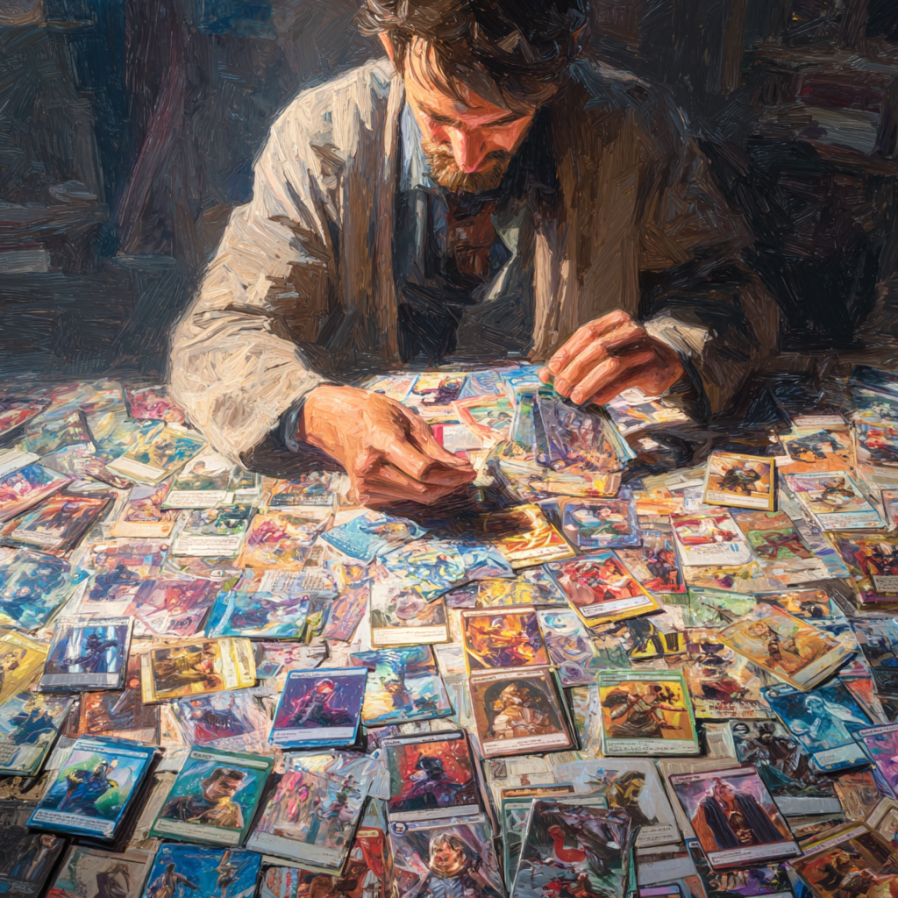
Doing covers is its own craft, with its own learning curve. And even if you never aspire to making your own you should learn what makes a good cover, so you know when a cover is bad. And if you aspire to making your own…. well, that’s a whole other ball of wax.
When I do my promo posts, there’s always one or two covers that are genuinely atrocious. And they’re not even the ugliest, nor — sometimes — done by the author/amateurishly put together. And when I try to explain to them why the covers are terrible, they get offended.
My favorite one being the writer — a good writer, I’ve read him — who is selling a post apocalyptic novel that looks like a nature-adventure book and who told me he’s not changing it, because he paid the artist to do exactly what he wanted.
All that might be true, but he’s not going to sell much that way, unless people know him from other things. So, if you are going to pay someone good money to do a cover “as you want” you should know what the cover is for.
Now it’s possible you aspire to do your own. Even at this time, there are good reasons — mostly monetary — to do your own covers. And to be fair, you can do basic photoshop cover okay off the gate. Not wonderful but okay. (We’ll discuss generic genre covers too.) Better than pay a lot for art that doesn’t fit the bill.
Unfortunately doing your own means you have to devote considerable time to learning it to get even slightly good.
When we started this madcap adventure 11 years ago, there was really no way around it: if you wanted a cover and you were an indie author without deep resources, your only choice was to learn to do for yourself.
You see, The cover designers at the time either worked for the big publishers at what amounted to small fortunes or fell in the category of “literary and little.” It’s hard to explain the objections to that last category until we get a little deeper into this, but let me give you an example:
Say you hired Billy Wagglestaff to write you a jingle about cornflakes. Billy nodded, got a faraway look in his eyes, and two weeks later delivered Hamlet.
Hamlet is undeniably a better work than a cornflake jingle. It is more… culturally valuable, more enjoyable and will stay in the mind longer. But it does a lousy job of selling cornflakes.
So who cares about cornflakes? You do. If you’re in the business of selling them.
Which is why getting a “real artist” or someone who did beautiful drawings was not going to earn you anything.
Back then, metaphorically speaking our chances were to pay between two and five thousand dollars for an experienced, commercial cover artist, money we might never recover. (I still never know how much an indie book will make the first year. Okay usually more than that. But back then we were running on shoestring and spit, and risking money that could be used for kids’ college books for a cover on something that might sell $500 worth of book was hardly worth it. And that was me, with experience, a track record and a fan base. For the average indie, just dipping his toe in the writing business, paying for a cover was foolhardy.
So… So we did our own.
Now, back then I had 5 years of art classes and according to my art teacher was two years away from “cover worthy art.” (I was taking like 10 hours a semester, mostly because it is fun for me and made my daddy happy. In fact he offered to pay for a degree in art, if I wanted to take it. I told him no, I already had a poorly-paying freelance career. I didn’t need a second. Now I’m so out of practice, it’s not even funny, but I’ve been thinking of enrolling again, since there are classes near us, and I still enjoy it. Actually I wonder if new-state has the cheap over-55 classes….)
Anyway I knew some art, and was proficient in photoshop, and we made our own covers and most of our first efforts were painful. My own blindness and where I hit my head again and again is “fonts.” The perception of what’s “historical” and what’s “horror” is apparently different if you grew up in Europe. (Shrugs.)
Still better than “literary and little.”Because at least it was about the cornflakes, not a Danish Prince.
Out of necessity we learned. Cedar and I took the same cover design workshop. Other people just practiced and practiced and practiced. (And that makes a big difference, I’m slightly out of practice now.)
We got better. For some years now, my bottom has been somewhere around mid-to-low list in a Trad pub house, the job they give to the intern or assistant and which is done to “good enough” level.
My best is way better than that, but-unfortunately- depends on inspiration. Unless I have a good idea what to do, I’ll get frustrated and put up something that looks terrible. Also, I haven’t had enough time to look at the more recent cover styles. (Fantasy has changed a ton, and SF is following suit.)
Which means this year alone, I’ve laid out a thousand for covers I just couldn’t seem to get right. There are now reasonably priced artists and at the end of the series I’Il give you names and contacts. Also places to buy ready-made and/or decent graphics just needing the lettering. But here Is the thing: you still have to know what the cover is supposed To do and what it can do. And what in a cover matters or doesn’t
I guarantee 90% of what you think matters in a cover doesn’t. And vice-versa. And you must know what matters and what a cover is supposed to be, because when that artist/designer hands you Hamlet, you’ll have to explain why it won’t sell cornflakes and why he must prostitute his art to give you a jingle.
Stay tuned. Same Bat channel. Same bat time. Next week:
Covers, What Are They Good For? (Turns out an amazing lot.)


40 responses to “The Great Cover Up”
I did my own covers for short stories. The more I understand about what’s good or not, the harder it becomes to do my own. Also, photoshop just laughs at me.
The bottom line is that the cover is a sales tool for your book, and unless you know how to do advertisements, it’s harder than it looks. A great piece of advice at a cover design panel was to look at the mid-list sellers in your genre (preferably sub-genre), not the bestsellers. Why? Because the bestsellers are selling the *author*, not the book. The great example is to look at the covers of A Song of Ice and Fire (Game of Thrones in its literary incarnation) over time. The first covers are highly artistic, selling “this is a fantasy.” Later covers get more abstract, and over time, GRRM’s name gets larger and larger on the cover. If you put a modern cover up against the first covers, they look like two different series.
Exactly – looking at the covers of the Outlander books – they get simpler and more symbolic.
I couldn’t even begin to afford original art for my first novel, B. Durbin provided one of her photographs, and the artist copied the general concept of the first cover for Memoirs of a Geisha – sepia photograph with pastel titles in an “historic” looking font. Still works, although eventually I might have to re-cover all my books.
The Civil War novel will use a photograph I took at a reenacter event, of the line of Union soldiers advancing with their flag and their officer with his sword drawn. It will definitely signal “Civil War” battlefield…
All of them are getting simpler and more symbolic, though.
To look good in thumbnail, and because it’s an Outlander novel, with a TV miniseries to go with it,
Yes, but you have to remember the big names drive the “look” of the time, so everyone is trying to play to that now.
But is that the best for your sales? Take GRRM’s name off of it, and will the typical fantasy reader want to pick up the solid blue book with a hand holding a sword, or the scene with the guy in black riding a horse outside a castle while petting a giant wolf? I know that to signal genre, you’re supposed to follow the conventions, but it seems to me that with fantasy and sci-fi in particular, you can make it pretty clear that this book is about unicorns/spaceships/aliens/vampires without following the BPH conventions.
This is an honest question, not me trying to be snarky. I could see “you must follow the trends or everyone will think you’re a hack,” but I could also see readers looking at yours and thinking “hey, this isn’t as bland as all the other pap out there, let’s see if the inside is interesting too.” Do we have any data on which works better?
I actually don’t know, but the houses are now following, so it’s starting to become the “respectable” signaling.
Oh, sure, I’m just wondering if, given how the current treads at the houses are turning more people off than ever, if “respectable” is the last thing you want to signal.
That and the fact that my name on the cover isn’t going to convince anyone to click, so even if the big houses just have a name and a symbol, I kind of feel like I need more.
Honestly? I don’t know.
The going covers for science fiction are all ships in space, which strikes me as bizarre for Darkship Thieves, which is character oriented. So I’m going my own way, as I usually do. Shrug.
Eh. My taste froze with Boris Valejo, whose works decorate my office.
I also think highly of Tom Kidd (for a different sort of book) and Michael Wheelan. In cover art, as in writing, I find myself in this diminished world, wondering what happened to the giants.
Wheelan, Vallejo, Royo, Hildebrandt, Achillios (sp?) Have their coffee table books, love the work! There is starting to be a turn towards that again with Indie Fantasy, as has been said. Here’s a website to peruse of a friend, who is doing very well in Indie covers (Europe based, so might be something hitting there first?) https://www.facebook.com/UweJarlingArtist
IF you don’t do FB you can find him on the WayBack machine. His website is currently down due to Server going under.
.
The answer is: it’s complicated. Why is it complicated? Because the market is made of individuals readers, who do not act like perfectly uniform widgets, and do not have perfectly uniform tastes. There’s fantasy, yes, but then there’s high fantasy “I want something like The Sword of Shannara”, there’s low fantasy “I want something like the Witcher.” There’s urban fantasy “I want something like Jim Butcher” and then there’s the urban fantasy that’s mushing into paranormal romance “I want something like Laurell K Hamilton”, but then there’s almost-magic-free, moster-heavy urban fantasy “I want more like Monster Hunter International!”
There’s epic fantasy “I want something like Brandon Sanderson”, there’s medieval fantasy “I want something like LadyHawke or Willow”, there’s boarding school set is a secret magic society “I want something like Jagi Lamplighter’s The Awful Truth About Forgetting”…
If your cover is too far off any trend in the subgenre, current or historical, then it won’t signal to the readers that it’s what they’re looking for… and then you’ve just lost one of your most powerful tools for attracting attention, and will have to work a lot harder to get their attention.
A further note on “and historical” – to some extent, what you describe is happening. Indie covers for scifi and fantasy hue a lot closer to the book covers of the eighties and nineties than the current house covers… and that’s a semi-deliberate design choice of “You remember when this was fun instead of grey goo and politically correct screeds? Yeah, this book is what you can’t find anymore in the bookstore!”
In the last ten years, the covers have gotten a lot more sophisticated, and trends have taken on a life of their own completely independent of the trad houses – but frankly, I would be completely unsurprised at a return among the top-sellers to Boris Vallejo and Larry Elmore style covers, if they could get the sales to justify ROI… *precisely because it does promise a very specific style of fun*
I would *love* a Vallejo, or a Frazetta style cover. I cannot create one, nor can I afford one, however. Those of us writing in weird genres might have to skew closer to mainstream genres, I think. I write what is, frankly, low to mid grade pulp sci-fi in a zombie apocalypse in space setting. That’s already fairly niche. Not one legged cyborg isikei cultivation dystopia reversal progression, but not mainstream by any means.
What I had in mind originally was a space station corridor littered with debris and a horde of zombies charging at the main character in mighty hero stance, back to the audience, to give it the pulp cover look. Lacking time and skill, I went with generic hard sci fi space station above Earth.
There are freelance artists out there doing decent cover work for a lot less than I expected. One of the fellows I was recommended even does unlimited revisions until it fits your vision, and generally charged 200 or less, but this was last year. There are AI art creations that, while not the best, can put out workable covers fairly quickly that fit generic and high fantasy, too.
I’ve seen some good indie covers and some really questionable ones lately. But I still want my Vallejo/Frazetta style covers. That, to me, is a good signal for “quality.”
Talk to me! Let’s brainstorm and see what we could do for you!
I’m broke, working odd hours, and the story’s not even finished. If you like, you can find it by clicking on my name or going here:
https://www.royalroad.com/fiction/52036/dr-zs-zombie-apocalypse
Once the story is finished, edited, and polished up (there needs to be editing done. Cutting out the fat, reinforcing the themes, fleshing out the characters a bit, tidying up any horrid bits of storytelling or plot holes.
The cover, and even the title, are more or less placeholders for now.
That doesn’t mean we can’t brainstorm! Brainstorms are free. Sometimes having someone cheer you on can be a big help towards that finishing, editing, etcettering (is that a word? lol)!
I had a polite disagreement with a cover artist over the first Merchant book. The artist (who does work for Big Publishers as well as free-lancing) wanted to do an epic fantasy cover with the main character and an evil wizard having a magic fight on board the deck of a sailing ship. The artist was very, very disappointed when I pointed out that while the design sounded wonderful, it didn’t fit the book or the sub-genre and wouldn’t work.
Oof.
“That sounds fantastic for a book that I might like to read but have not written” situation.
Yes. The artist was . . . nonplussed by a middle-aged, middle-class, non-wizard, non-swordsman main character in a medieval-flavored fantasy.
If you want a few examples of Sarah’s recent covers look at my last couple of books (Mackey Chandler) on Amazon. I still remember when she saw one of my covers and shrieked in horror – “Oh my God, NO. That just shouts LIT*ER*A*TURE!
Now I’ll be honest – I think the cover matters about 10x as much on a hardcover book jacket than on a Amazon e-book thumbnail – but matter it does. I’ve made my own covers for short stores that only sell a few hundred bucks a year. However if you write series you need continuity of font and style from book to book. Sarah knows what she is doing enough she is doing my next cover I’ll need in about a month.
She did the cover of my last novel – a nice plain cover with a historical photograph, after telling me that my own comp was just to complicated and messy.
Hides face.
I’m opinionated, ain’t I?
Yes, but it’s an honest opinion and we are all the better for it. (Including the book itself which has sold very nicely ever since. We always thought that Great-Aunt Nan should have been a cover girl, since she was tall and slim and elegant … even in that ghastly uniform.
If you’re doing your own text and layout in a program that deal in layers, be sure to name each layer with what’s going in it: font name, font size, what effects you did to it (like how many gaussian blur on the drop shadow layer, things like that.)
I made my current batch of covers for the Jaiya metaseries after noting a trend towards more and more abstract art on both the conventional fantasy side and the romantic fantasy side, and deciding it was more important that the books look coherent and nod towards the quasi-Indian setting than to have the covers hint towards the plots in any coherent way. (Well, that and the fact that the Ancestors of Jaiya prequel series are all over the place: the first one takes place at a fighting tournament, the second on a balloon, the third in the aftermath of the murder of a man who won’t stay dead, and the fourth in the middle of an invasion that was a pretext for some Raiders of the Lost Ark style hijinks.)
I *know* my covers suck. The sci-fi is sci-fi, but it screams “I am hard sci-fi!” when it’s actually mushy soft sci-fi. Really though, it’s post apocalyptic zombie pulp done as sci-fi. And the cover doesn’t signal that *at all.*
One of these days I’m going to replace it with something that at least hints at what is actually in the book. And probably change the title. Because the title says YA, or perhaps LN, and not particularly good YA or LN either.
Got to finish the story first, though. There are, I think, two or three more major plot points before the Big One, and the tying up of a few loose ends. I am, apparently, bad at keeping things neat and short. New projected ending is somewhere above 150k. The post-edit is probably going to kill me.
….. add “WITH ZOMBIES!!!” in lurid colors and drippy font?
Lol! I like it!
“Dr’ Z’s Zombie Apocalypse: WITH ZOMBIES!” heh. The zombie hand gripping the earth, half in shadow, has been done before, but that was another one I considered before taking the lazier option.
…I’d probably at least pick that up….
Yeah. I need to get the thing I’ve been working on finished and off to the editor so I can find out just how hard it actually is to do covers.
This so the fanfic thing, so certainly not spending money on a cover, but did want to give it a try. Have some ideas after all.
When I was first wanting to do cover illustration was back in the 80’s with Vallejo style covers (they were the best!). And I studied and read and studied to do the covers that were on-point at that time. BUT, I didn’t paint with oils, so I improved my colored pencil and got closer and closer to oils, but it still wasn’t cutting it, and it took FOREVER to finish a larger piece. So, while I sold a few images, no cover came of it. And then Digital came along, and started being acceptable for covers, so I started learning that. And then life happened and I was doing more writing and learning that craft and doing a lot of historical sewing and acting.
Finally, came back around to covers (for my own writing if nothing else), and realized I needed to do something else to get some speed and better looks. And also started realizing that covers had changed – drastically. So, started learning about that, and covers to genre, rather than scenes (made me sad), and started doing that “practice” thing. And started getting some traction. Like any other skill/career/job/serious hobby, you have to keep up with the styles, the learning and the techniques, AND be willing to pivot when that changes to the whims of the reading world.
Soon, I will have website! And then it will be a matter of pricing, enough to be worth my time and materials, but not so much that it scares people away. A careful balance.
yeah, I know.
I LOVE pastel painting, but unless I start doing YA coming of age or some such, it’s not likely to help.
I DO want to do it though.
You could always do a pastel of a completed cover and then sell it as an original piece.
One of the things in the digital art world that is working to get images in galleries, is to print the digital image, spray fixative to give it some tooth (or put it on watercolor or other thicker paper, but have to watch for ink spread) and then use, colored pencil, pastel, gold or silver leaf, inks, etc to “enhance” the image. Then it’s just Mixed Media, and they are accepting them in galleries.
So, best of both worlds. And make some more money!
Okay, this might be too specific a question. But I just finished writing a synopsis/abridgement of the Divine Comedy with a few comments of my own. The target audience is homeschool teenagers plus all the people who have never touched the Divine Comedy or think they can’t manage. (Like the person who said to me, “I looked that book up. It is really old!” after we had a conversation about my project.) That is, this is a super beginners’ book. I found a beautiful picture of Dante that is in the public domain from the National Gallery of Art but it looks too … hardcore? … for my audience. I wondered if I put it through a filter that basically leaves a sort of flowery outline would that make a good cover.
Maybe run it through a comic filter? (Pun only slightly intended).
Run it by some home school teens and their moms?
I mean, mine would probably like something that looked hardcore, but mine read Dante in translation, so not exactly target market anyway.
This. I mean it’s completely outside my experience. My kids weren’t even big on YA ever. They read it, sure, along with EVERYTHING ELSE. A few years there, it was like tossing stuff into a cement mixer, and losing the battle because I couldn’t shovel fast enough.
I’d go with what Holly and Sarah are suggesting. The YA that i look at is either fiction (cartoon-like covers, or “Original Twilight covers but with more stuff”) or textbook-type non-fiction (“stuff everything in the book onto the cover!!!!!”).
i need to make more