
There is a recurring and recursive argument I have with other writers about covers. (This is the post I should have written last week, only I was too tired to even process.)
It started with my then BFF when she first struck out indie (a decade ahead of me, because I still had a lot of contracts and it’s hard to leave that safety behind) and it goes on every time someone sends me a book to promote on Sunday whose cover is so appallingly bad that I can’t put it up as is.
It goes something like this: “No one cares about covers. I don’t care about covers, so no one cares about covers.”
This — she said — is nonsense. And that applies to all of you out there who think you don’t care about covers. Because you do.
No? Then how do you shop for books? If you buy in paper, your selection is relatively limited. “Whatever is on the shelf, I read the back cover and then decide” is a valid method. But if you’re indie mostly you’re selling to people buying an ebook on Amazon. This means you will find yourself scrolling past possibly hundreds of books. You’re not reading EVERY back cover. You’re just not, sorry.
So, without even realizing, you DO apply an heuristic of elimination you might not even be aware of. It goes something like this: Title I can’t read, no. Funky title, no. Cover with indistinct stuff, no. Dear Lord, is that a parrot or a sex toy on the cover, no. Is listed in sci fi but looks like travelogue, no.
It is the ones your eyes go to that you’ll even read the back of. Whether you know it or not.
And the ones your eyes go to have a combination of factors.
We’ll exclude immediately “I know the author” and “I have read the other books in this series” because DUH you’re going to buy those, even in a plain green cover with yellow Times New Roman letters. (At least supposing you like the author and the series.)
So from there, there are several factors that influence your buying. In no particular order: The cover is attractive in and of itself. The cover perfectly matches the genre and feel you’re looking for. The cover is easily read. That’s an intriguing cover. That’s an interesting title.
Of those, when you’re looking at an eye-glazing infinity of books, I’d say the most important are two: Matching the genre and feel AND having something interesting that stands out, in combination. (Ie match the genre and feel, but not so much you look like “generic cover number 21”.
And here I’ll digress for “feel”. Last week I told you to go look at covers of the bestsellers in the fields you write in (Appalling covers in the bestseller slot mean the field/genre/subgenre is under-served, btw.) but …. There’s always a but, right?
Having self-identified what I actually write in science fiction as “Gonzo retro-futurism” my covers are…. well…. there isn’t a subgenre for that. When I brought Darkships out indie all the space opera covers were two ships facing off in space, or planets with a ship…. which is great if you’re writing either “exploration” SF or mil sf. But that’s not what Darkship Thieves is. It’s a character-oriented science fiction setting intensely human story. So…. I went to when such stories used to be published for the cover. Same, btw, with bells on for No Man’s Land. Having tried three covers and having people interpret them as either mil sf or YA sf, I realized it was going to be a b*tch to cover. And honestly, I considered the “high class” cover of a ruby held by a hand type of thing. BUT it didn’t really work, partly because those highly symbolic covers don’t work without big-budget push. Until I was in a conversation with my first readers and they pointed out that “What it needs is a seventies cover, because this is the type of book that did well/was published in the late seventies/early eighties and no one has published since.” So it got a retro cover. This makes it a bit of an odd duck, but matches the FEEL of the book. (Which is a big time odd duck.)
Anyway, to illustrate — and trust me, I could do this entirely with my own attempts at covers, except my main computer, which has those is still stored and… hopefully will be unpacked today — I’m going to post a series of covers and I want you to tell me what genre/feel you think they have. I’m using the same title, author name for all. BTW, the title sucks. It just does. Note also that I’m not doing things like optimizing the front, doing different pairings of fonts for title and author, etc. I’m simply not putting in that much effort for samples. Also I want you to concentrate on the picture for now. The rest will come.
Now, what you’re looking for is a fun science fiction adventure, which is what this imaginary author has written. It also has a race that looks like elves, a strong romance component and a mystical feel.
(We’ll discuss all of these next week.)
These are your covers:
#1
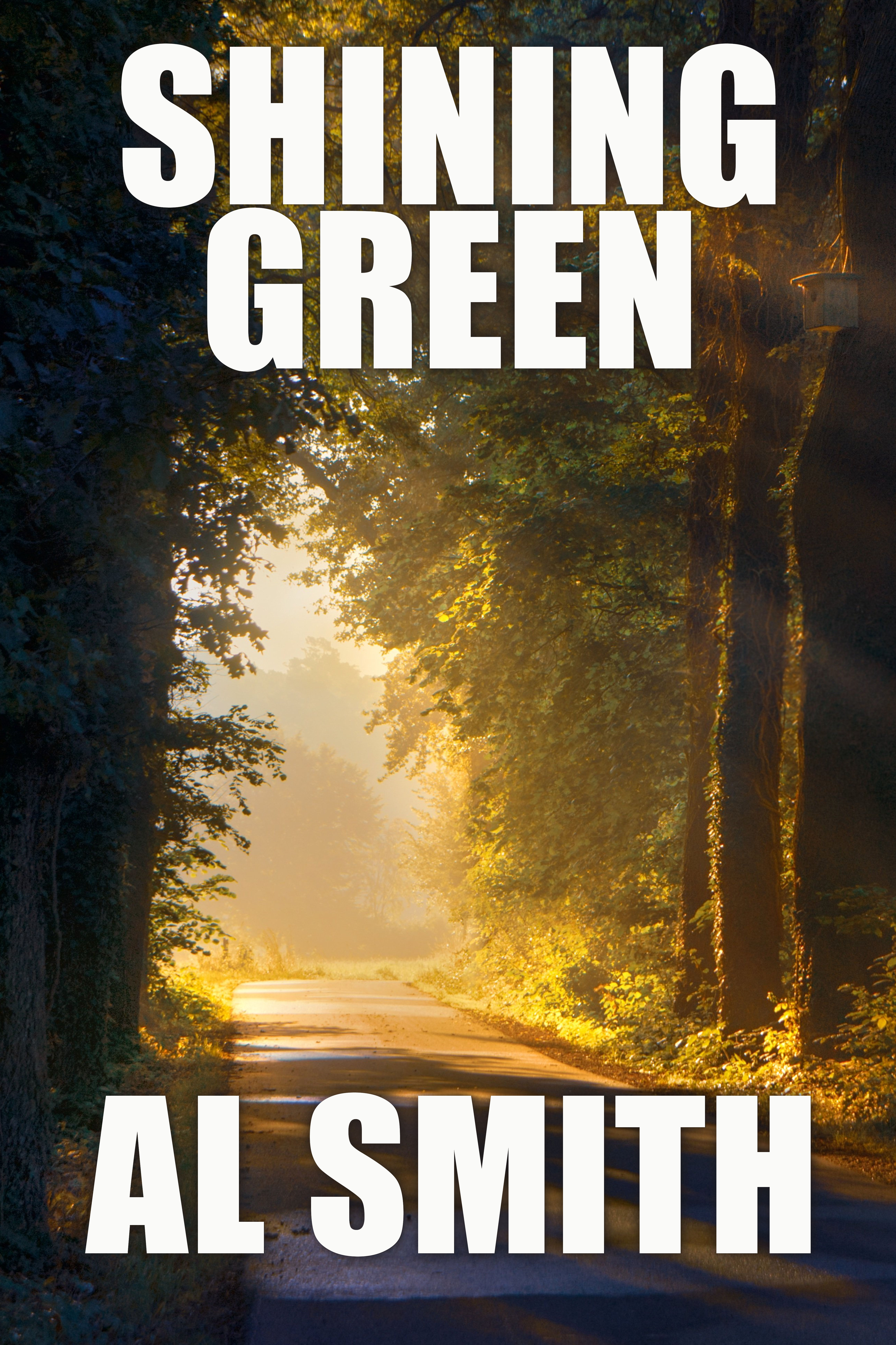
#2
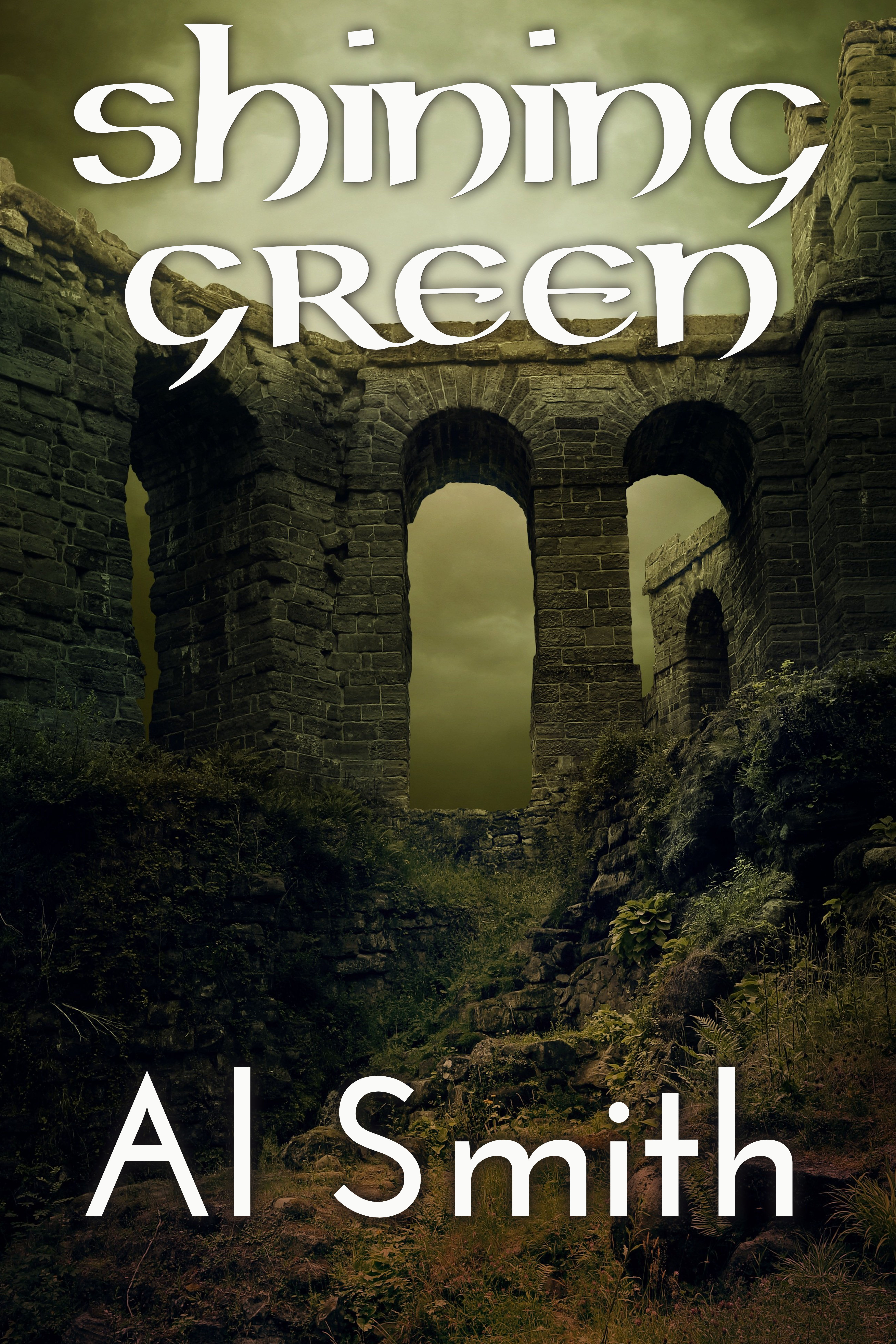
Sample 3
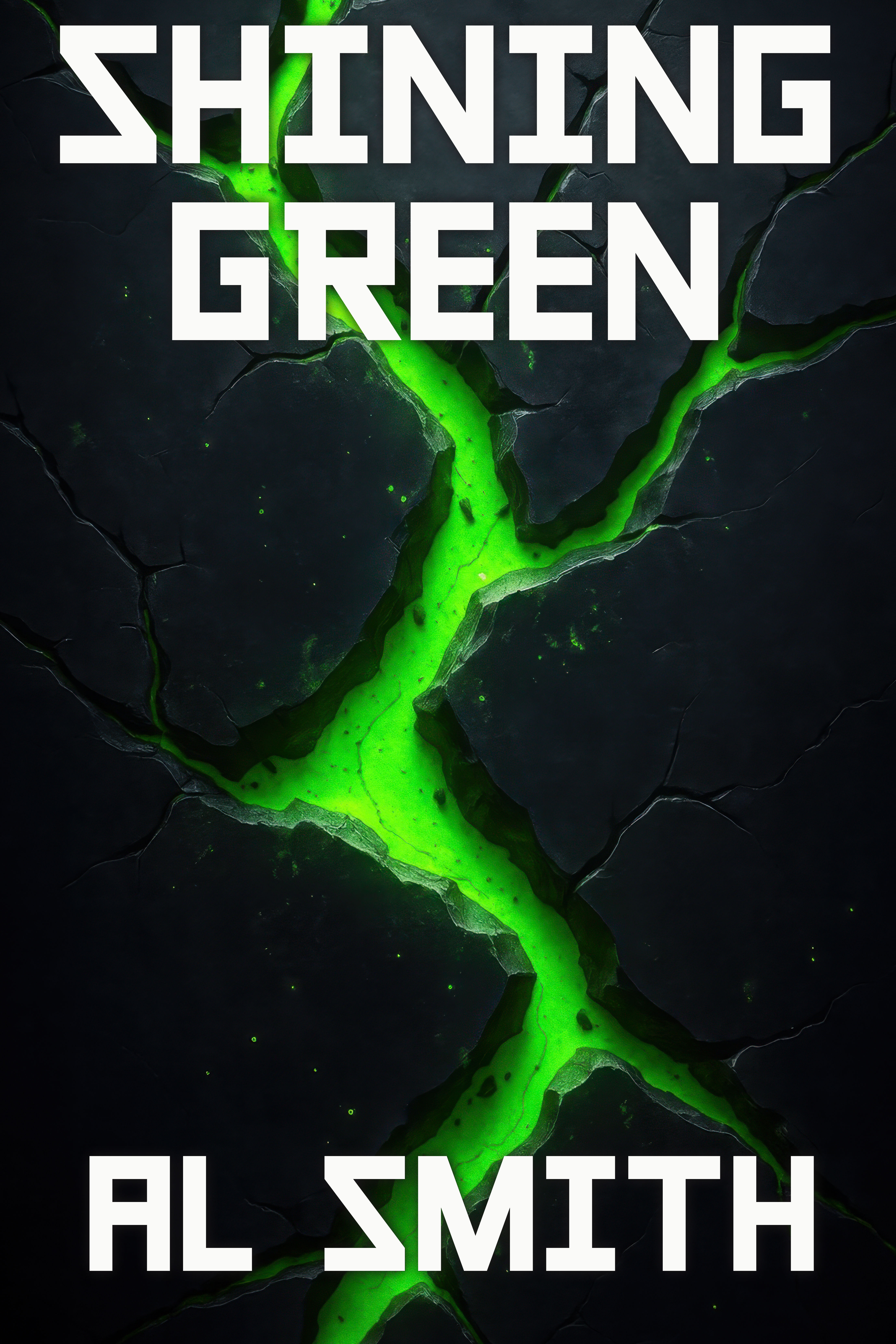
Sample #4:
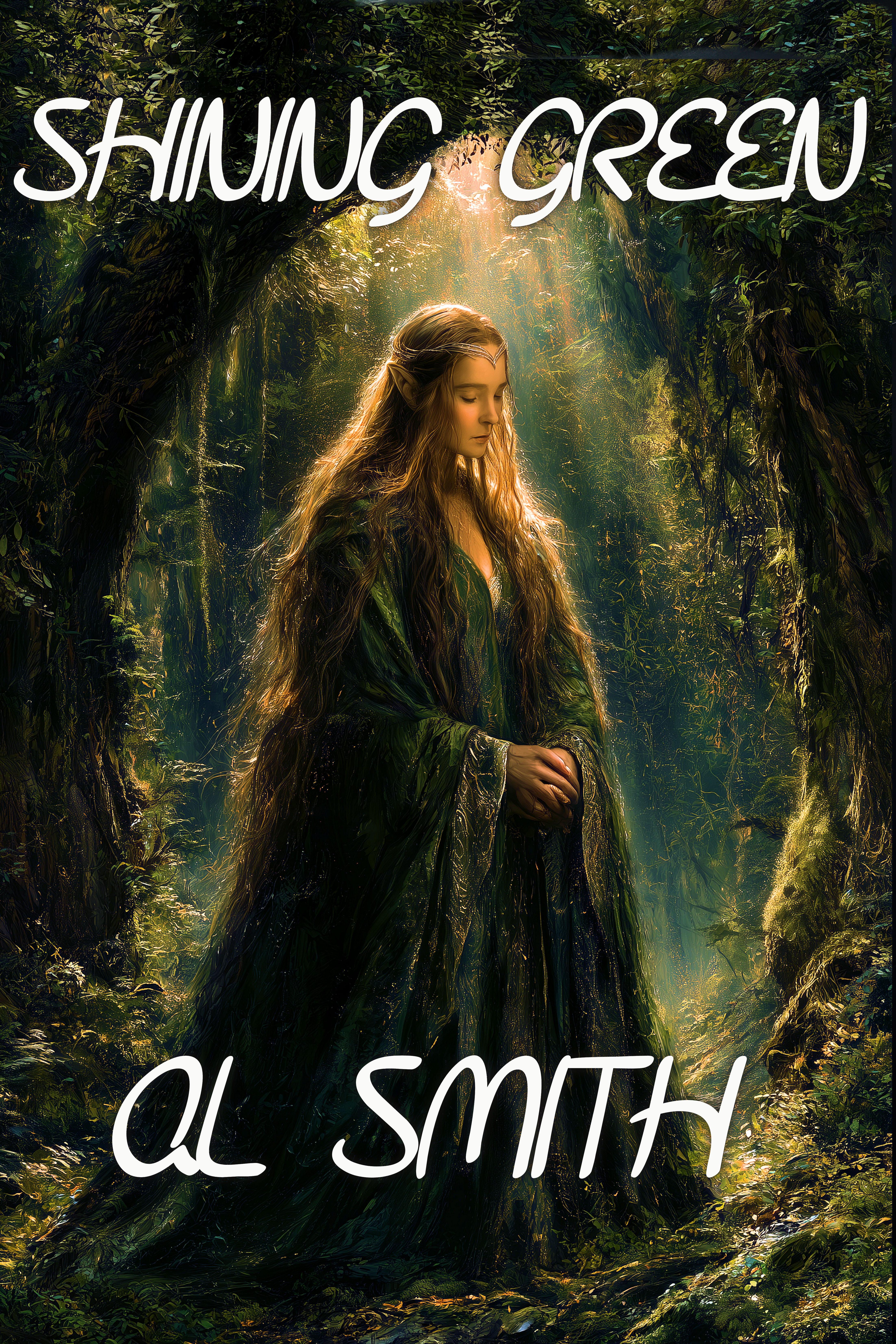
Sample #5:
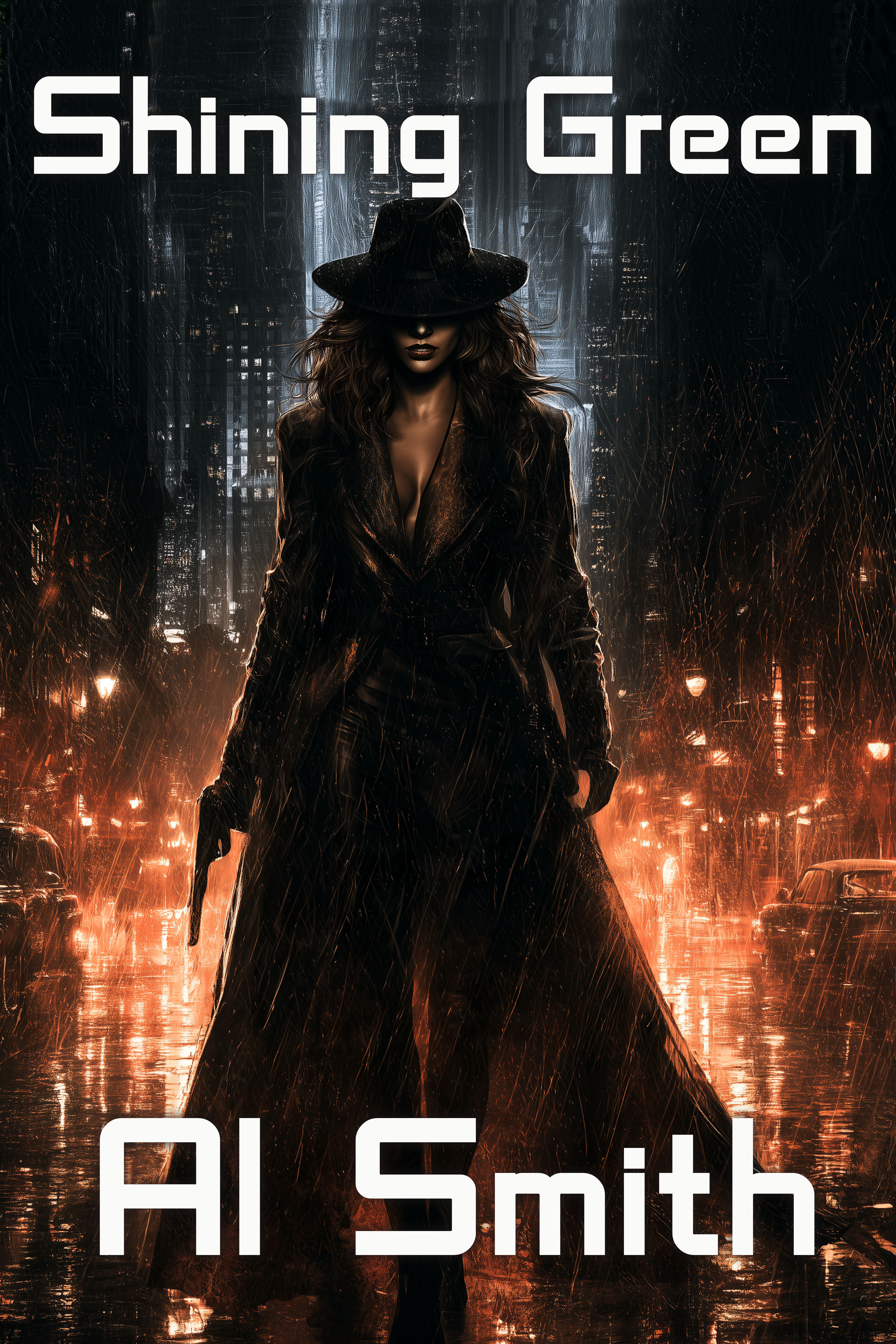
Sample #6:
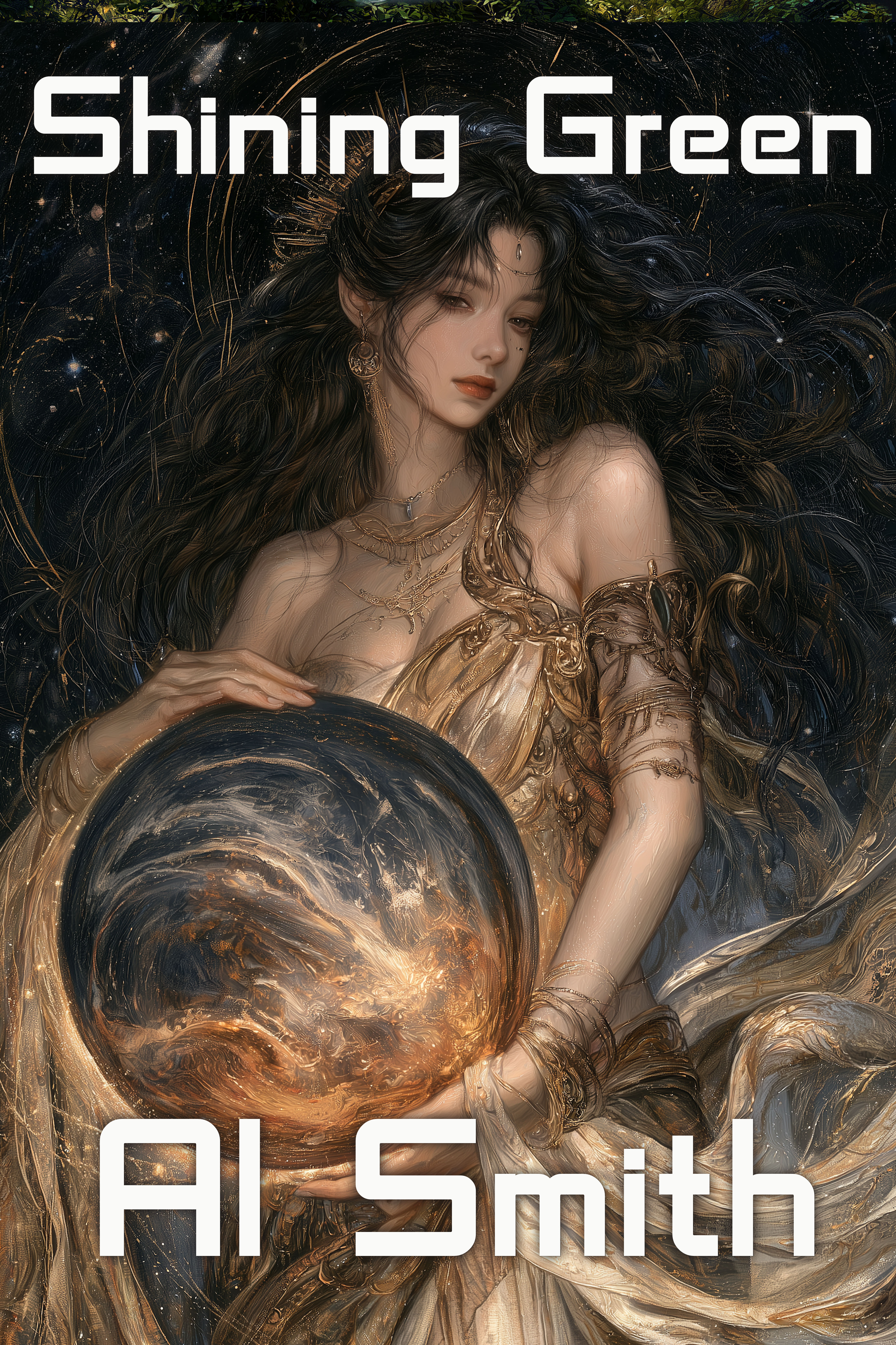
Sample #7
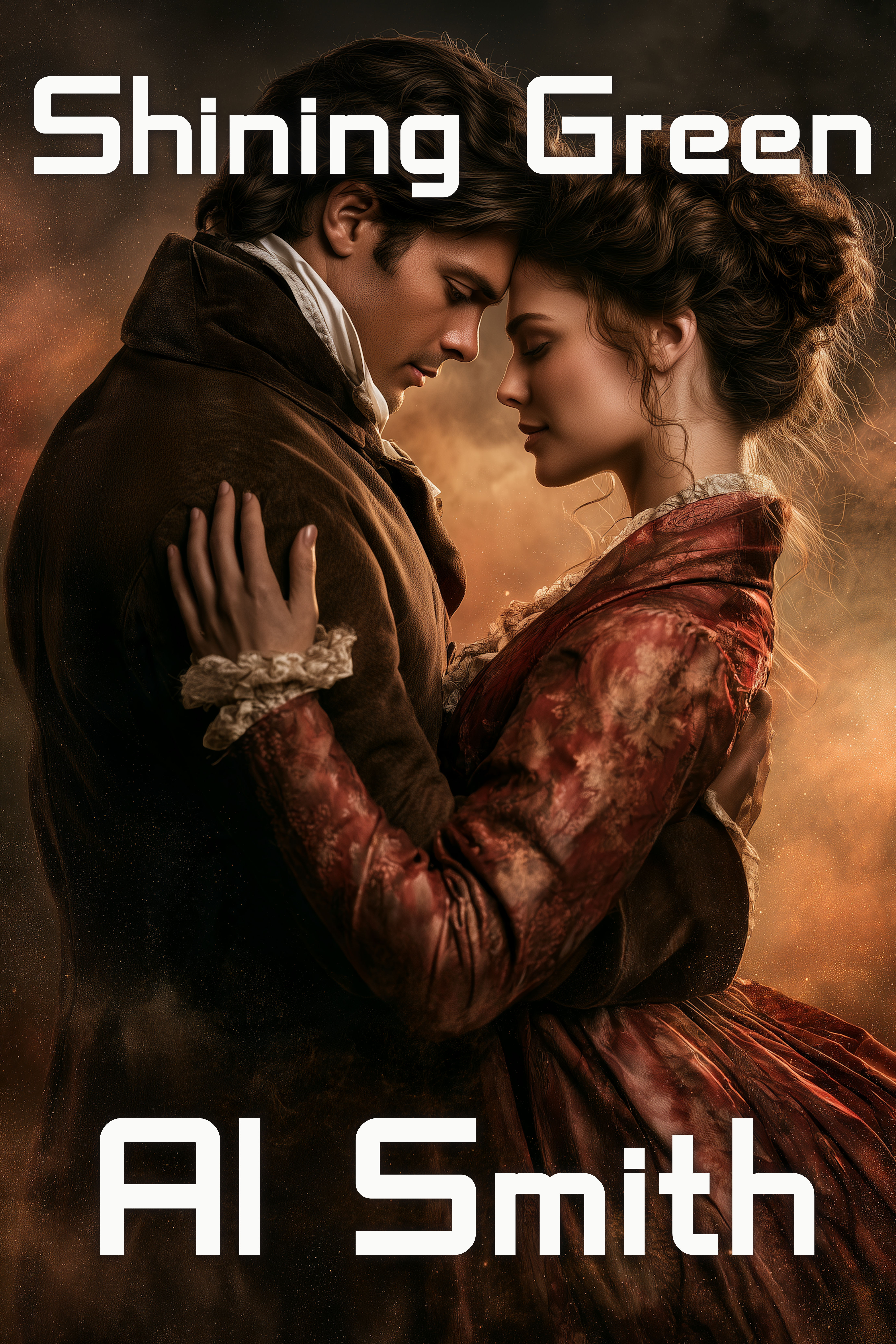
Sample #8:
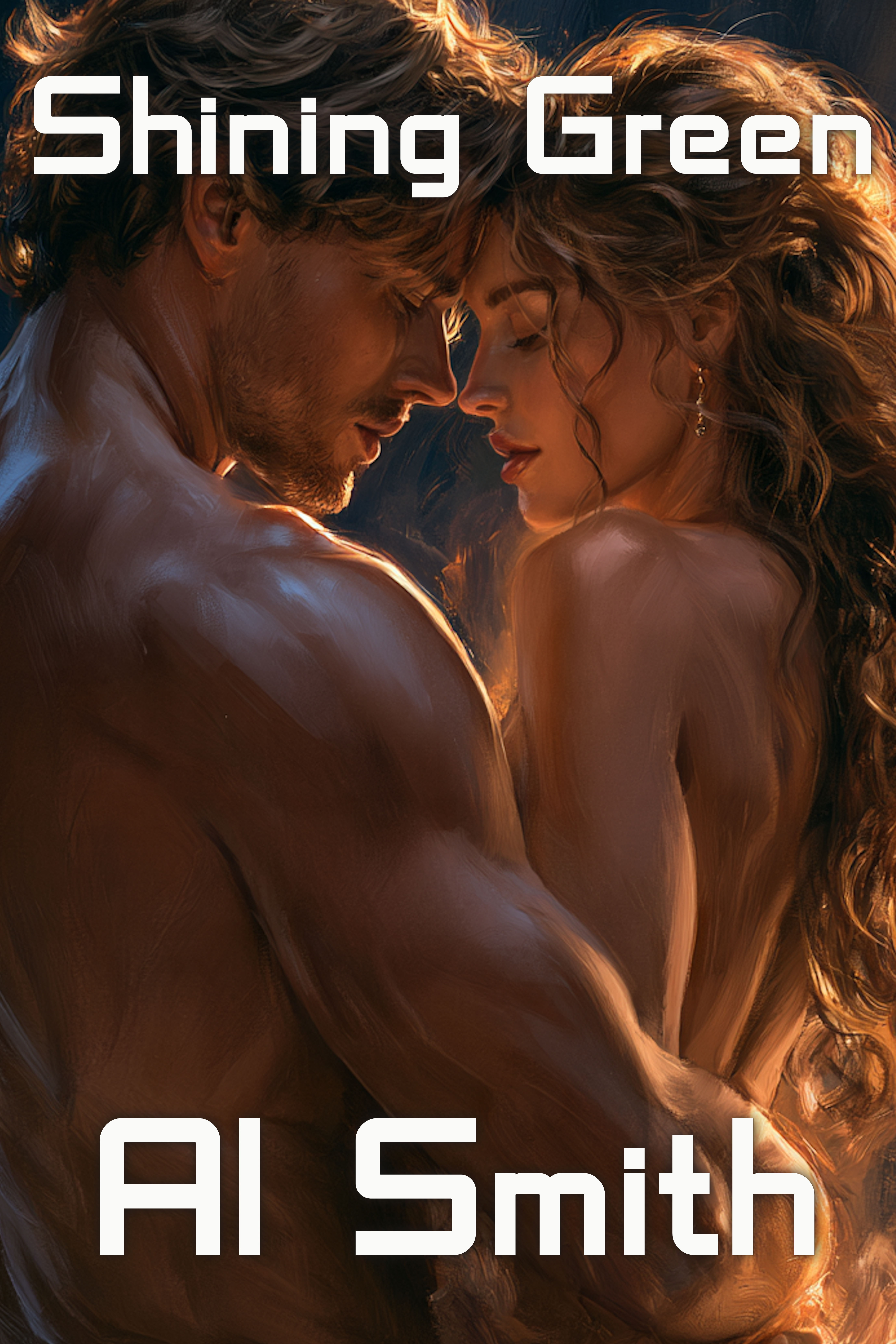
Sample #9:
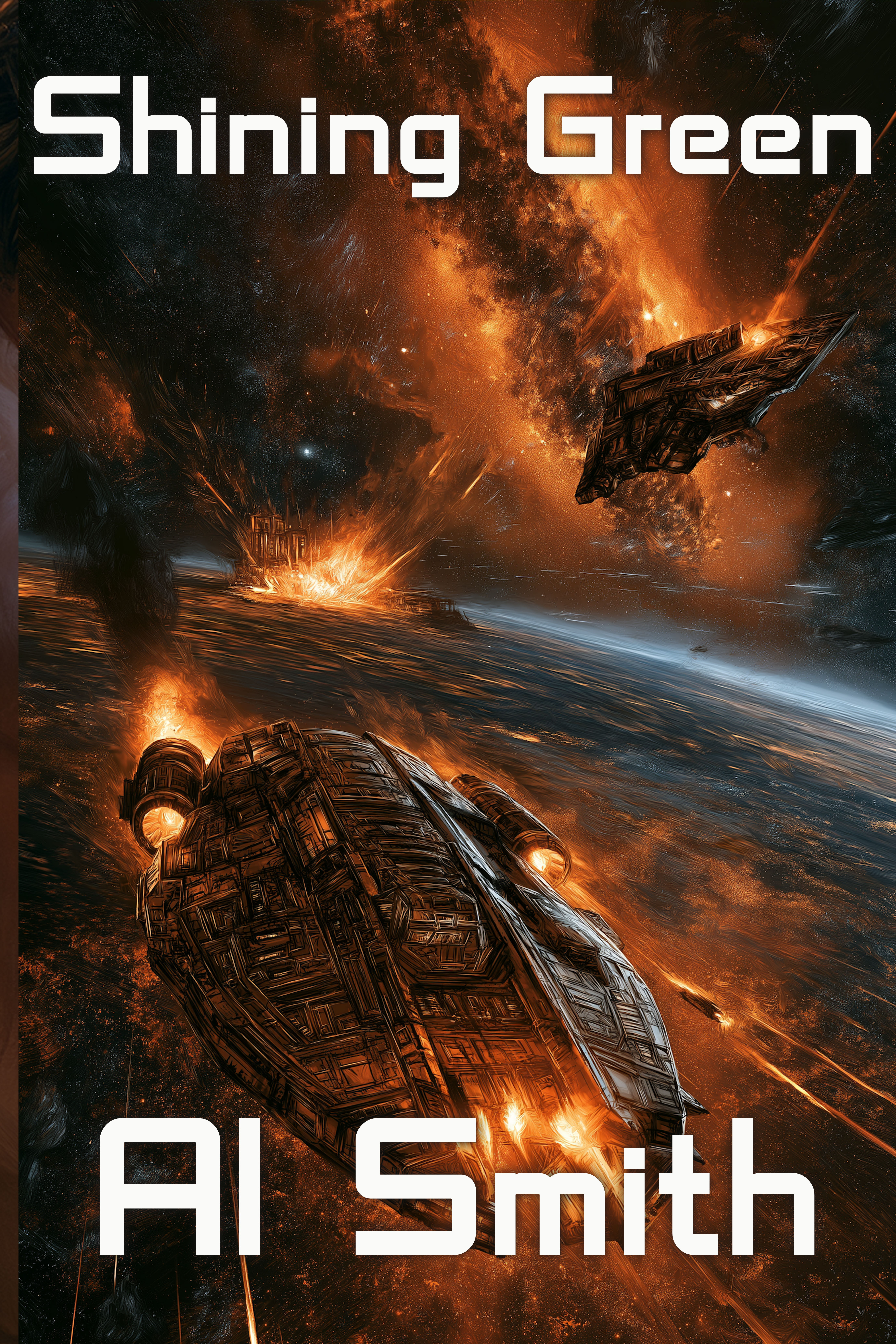
Sample #10:
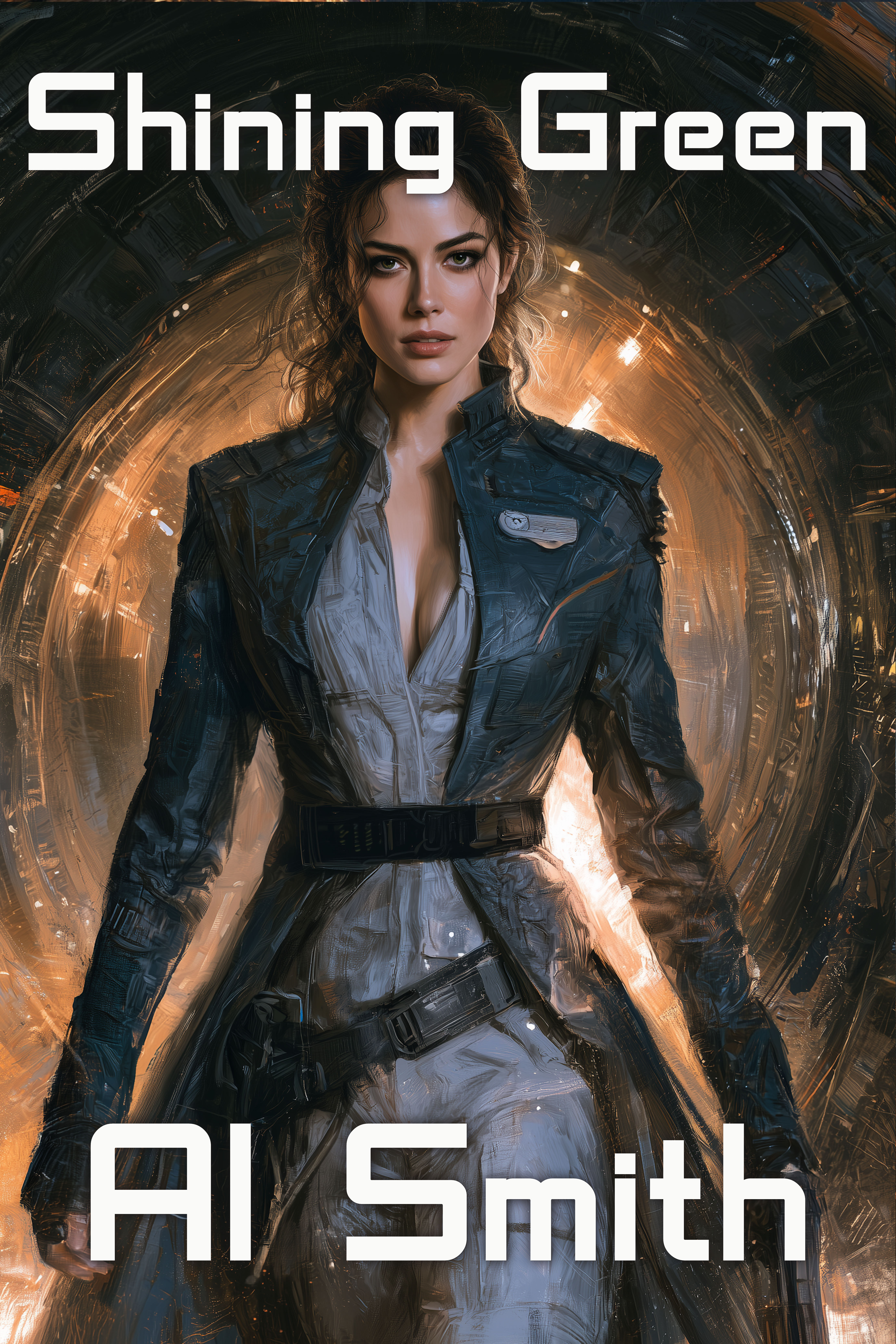
Sample #12:
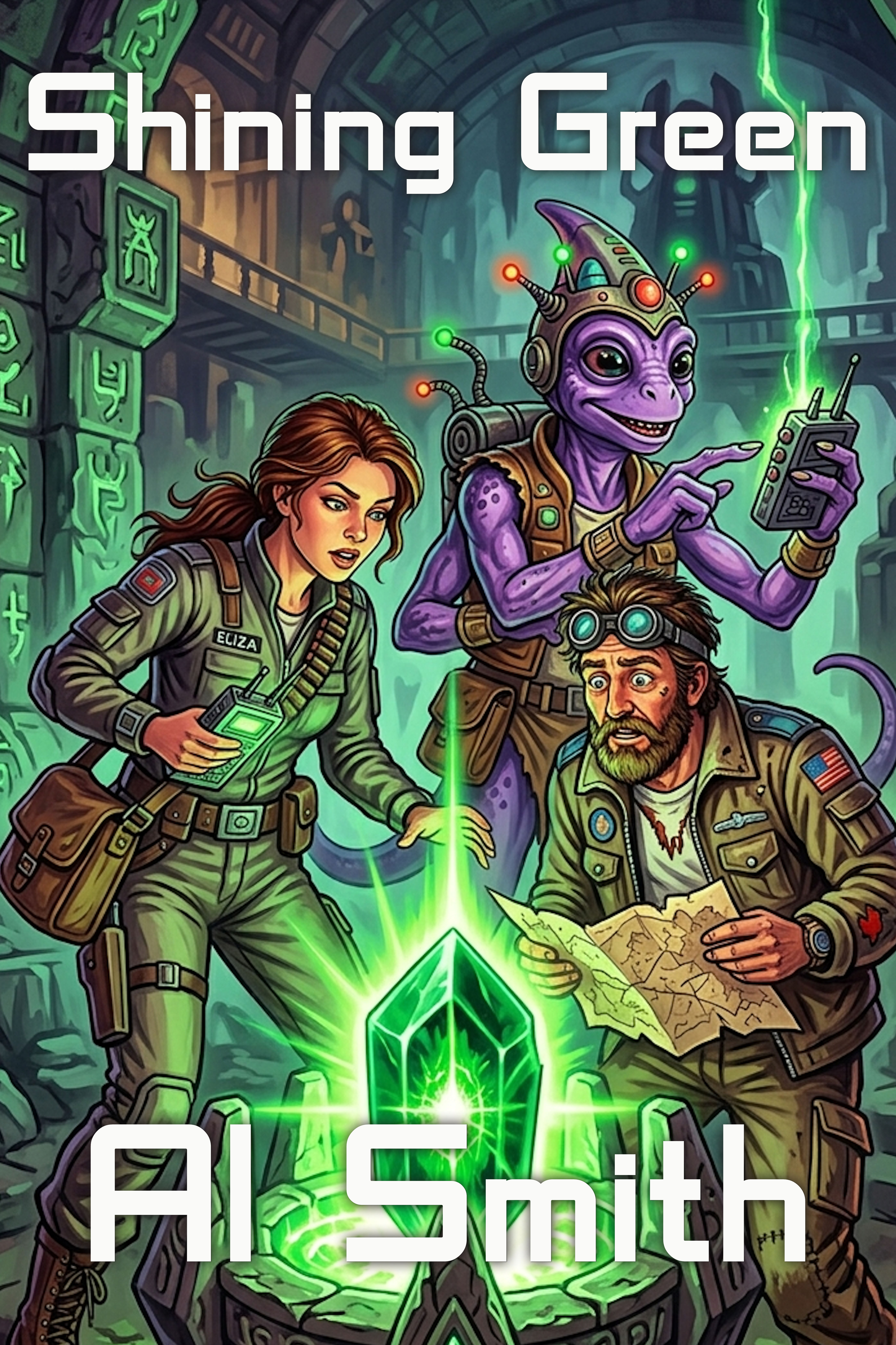
Which one would you use for your book, if you were Al Smith? And why?


38 responses to “What’s Covers Got To Do With It?”
Probably #10 for the story you described.
There were numbers when I wrote this.
Spot on!
I’d go with #10. Several scream “steamy romance/3rotica”, one is hard sci-fi/space opera, two are epic fantasy or close to it, one’s urban fantasy or dystopia. And a horror/sci-fi or just horror. Two are “desperate author slaps cover together.” [BTDT, so I’m not throwing a stone.]
A book’s cover is the first promise it makes to the reader.
It had BETTER be saying the right things, and the book able to deliver on them.
PRECISELY.
Every one of those covers is for a wildly different book.
I’ve seen the same thing with bad covers.
Covers matter! They say “come to talk to me.”
Then the back jacket copy says “take me home.”
But if Reader doesn’t pick up the book in the first place (come talk to me), they’ll never take it home.
So, this is tangential. About judging a book by a cover. I went to a men’s bible study at church and the selected book (about sexual purity) was written by a guy about a decade ago. They had current hardcopies on hand but I wanted the ebook instead. Nevertheless, I noticed the current cover design. BUT Amazon had an older cover design. Under the author’s name was “foreword by…” Other Guy (who’s more famous than author). Someone got Other Guy to write a foreword & put his name on the (older) cover.
Trouble is that Other Guy announced that he’s not a Christian any more and that gay sex is OK. This annoyed this bible study attender and was utterly disqualifying given the topic of the book.
I decided to look into why the book cover discrepancy. After Other Guy became toxic the author and publisher agreed to memory-hole Other Guy. BUT Amazon didn’t get the memo. It still shows Other Guy’s name on both cover and the foreword slug line. I chose not to buy the book.
So, yeah, people judge a book by even an obsolete cover.
#1 Realistic fiction, probably “coming of age.”
#2 Sword and Sorcery
#3 Sci-fi Horror
#4 High Fantasy
#5 Cyberpunk
#6 Romantasy
#7 Historical Romance
#8 No, thank you
#9 Miltary sci-fi
#10 Also military sci-fi, though probably with more of a character focus. (I suspect you mean for this to be a space opera like DST, but to me, it seems too much like she’s wearing a uniform of some sort to ignore that.)
#11 The incredible disappearing book!
#12 Lit-RPG
I have eleven. I forgot to upload it. I is dumbass.
1: regency romance with no cover budget; 2: celtic fantasy with no budget 3: teenage mutant ninja turtle fanfic with the serial numbers filed off 4: high fantasy 5: paranormal or gaslamp fantasy 6: don’t remember now 7: regency romance with a cover budget, possible P&P retelling. 8: erotic romance, maybe published on one of the platforms that are less particular about covers. Space opera influenced by scifi media, might be homaging star wars, firefly or expanse, but probably not trek or galactica 10: girlboss scifi possibly with romance subplot; Ann aguirre’s grimspace novels probably close ish comps. 11: cozy fantasy adventure. I don’t know if I would use one of these for the story described, but am not the best judge.
1- no Indy has cover budget 😀
True!
Exactly this. Which is why the anti-AI pitchfork and torches brigade is so vexing.
Yep. As is assuming that because a cover is AI so is the interior. I’m a writer, not an artist. Okay. I COULD be an artist, but the time required would be so long it would hurt the writing.
Teenage MUTANT FANFIC?????
It’s the stuff glowing “mutagen green” XD
Heros in a half shell! Turtle power!
Team them up with their radioactive-ooze brother, Daredevil!
before looking at any other comments:
Inspirational
Time travel mystery
Radioactive superpowers
Romantic fantasy but not romantasy
cyberpunk bounty hunter …noir tone?
Mythic quest from/against goddess
Regency romance
spicy romance
milSF
girlboss SF
Future cyberpunk comedy, a bit slapstick (but you numbered it 12)
I might go with girl boss SF if we had a comic relief sidekick poking it’s head from behind her, just to stop her taking herself too seriously.
now to check what everyone else said 😊
This is closest to what I envisioned.
Of these I’d go with 10, Though I’d probably try and fiddle with it more myself…
Alright, on why since that seems to be major and I left it out.
#6 has been semi-popular but it reads as straight fantasy probably heavy intrigue and it’s easier to add elves to your space when the cover signals space, than it is to add space to your elves when your cover does NOT signal space.
#9 is likely to draw people who will look at the strong romance elments and goin “dang it, got suckered. I don’t want romance in my space battles. I can deal with kick ass space elves, though.” You do not want your audience thinking they got suckered.
#12 promises comic books in space. Either funny or graphic novel or that kind of over the top campiness. Even if it’s pure prose.
So #10 is the closest you get even though it’s not ideal. Girl on the cover, romance is on the table. Space elves aren’t signaled but the cover is generic enough to be flexible. I’d probably try to push the background tech elements harder to signal Sci-fi a little harder, personally, but of this lot it’s likely to catch the most right eyeballs and fewest wrong ones… (That last is actually pretty important. Fewest WRONG eyeballs. You do not want people walking into your chicken fingers restaurant because they had a strong hankering for a steak and thought it was a steak place. If you’re lucky they’ll just walk back out. If not they’ll complain to everyone that you’re not as advertised.)
The rest are just so off, they’re in the ‘book is steak, cover claims ice cream’. Someone biting into a thing that claims to be ice cream but is steak is going to be very annoyed.
I’m re-entering the fray with AI support. Next book will be released with decent SEO and AI-supported keywords, blurb, title. I will let everyone know how that goes.
Now the covers, because I was having a brief reconnaissance of the competition, I looked at the top sellers and recently released top sellers in SF on Amazon.
There are some -really- bad covers. Like, “did your 8 year old do this?” sort of bad, but without the childish charm of kid-art.
But they are “top sellers.” So, I don’t know what’s up. I’ll do what Sarah says and probably be alright. ~:D
Also, CATEGORIES. Amazon seems to have messed it all up, somehow. I want there to be “Gentleman’s Science Fiction Adventure Romance” but so far in my (quite superficial) searching this does not appear to be a thing.
But I guess a little AI will sort out the SEO. Then we shall see.
Most of the awful top sellers either are “name” or a really low served field. Lit RPG started that way.
#6 or #10 (#6 is my fav of the two)
They have a picture with elements of what you said, and the font to go with it.
the sans serif fonts all read as A I Smith… lol
On purpose, too, but not doing fonts today
“We’ll exclude immediately “I know the author” and “I have read the other books in this series” because DUH you’re going to buy those, even in a plain green cover with yellow Times New Roman letters.”
Well. I just blurbed a book by Neville Shute for Epoch Times. It’s a reprint (of course), and I wanted to expose my readers to Shute. My copy of the book (A paperback printed back in the early 1960s) had a really nifty cover showing part of the story.
The reprint? White lettering on a burgundy background. Win some, lose some.
I haven’t tracked it closely, but Shute’s esatate has been… odd, about ebooks. Plain covers, insanely overdone typography inside.
Okay, if after I’m gone, the kids do that, you’re allowed to yell at them.
I like the last one, but the one with the elf/world globe probably fits the genre.
I’d have to go, with #6 , myself for the “Now, what you’re looking for is a fun science fiction adventure, which is what this imaginary author has written. It also has a race that looks like elves, a strong romance component and a mystical feel. ”
To me #10 screams out some sort of time travel / Dr. Who type thing.
If I wanted something a bit more humorous sci-fi, I’d be reading the blurb for #12.
Catch with 6 is it reads as strict fantasy NOT science fiction or Science fantasy.
Precisely that.
#6 for the story presented.
But #3 is catnip to me, and would have me at least checking out the blurb.
i freely admit I use covers when deciding what to buy. If something’s got a cover that’s extremely low effort, why would I expect the stuff inside to be any better? (I have only a couple of hours experience working with Gimp and Inkscape combined. If I could do a better job, in a short afternoon, you’ve failed.)
#6 with different fonts. Elegant artwork that makes me want to know what’s going on.
Six is nice but would need some definite SF elements. Galaxies in the ball, or better yet, a spaceship.