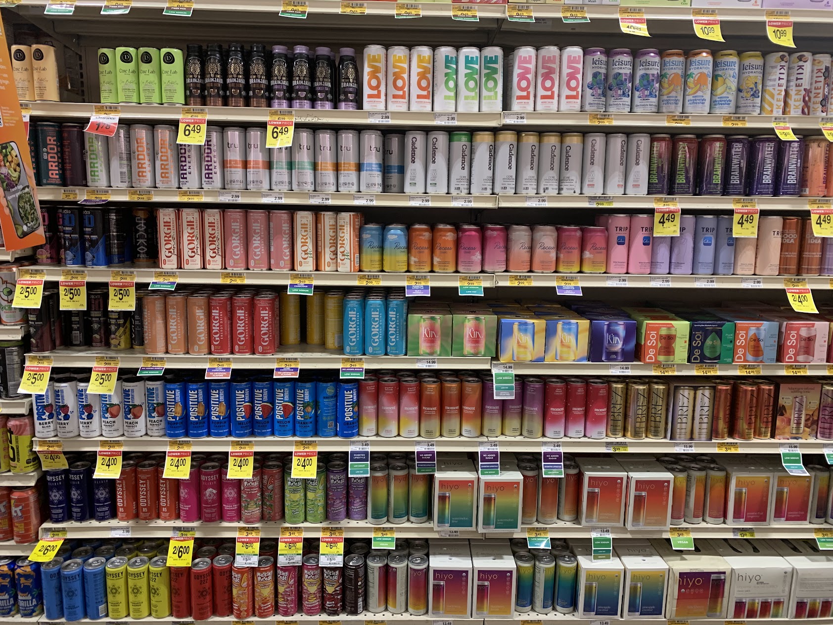
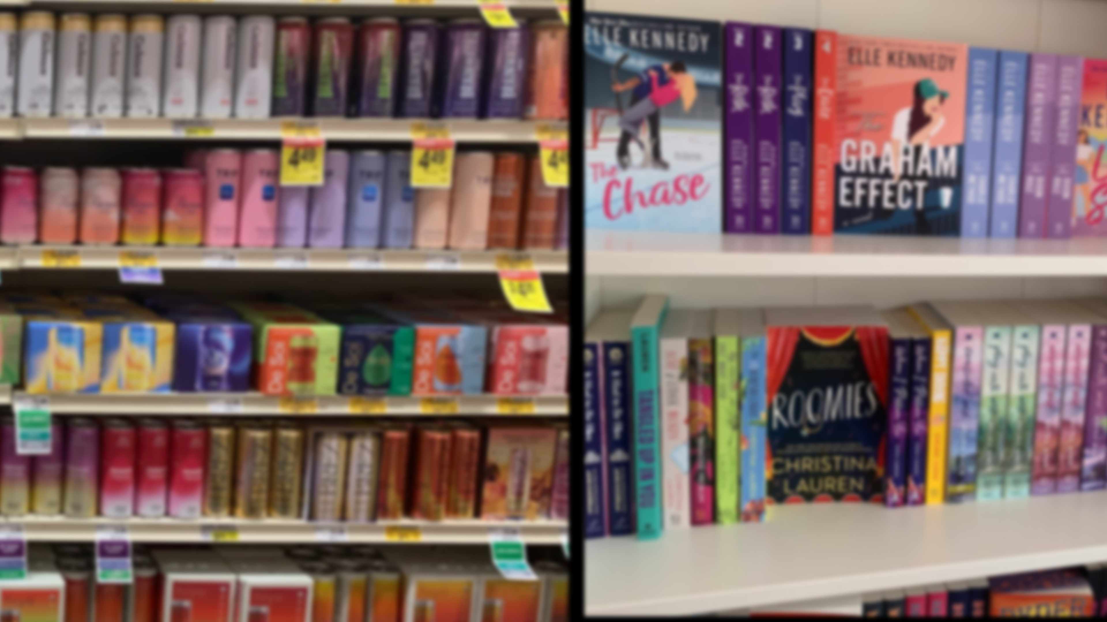
I was thinking about storytelling, marketing, and the role of both in selling art (well, anything at all) and had written about it on my personal blog recently. Which meant it was on my mind as I stood in front of a shelving unit at the grocery store and was struck by something that jumped out at me. Not a can launching itself off the shelf, but rather, the story the energy drinks were all clamoring to tell me.
What do energy drinks and book covers have in common? Design. There are similar stories being told here – not the stories between the covers, but the visual cues that you’re acculturated to read into the colors, the fonts, and the blurbs they present to you on their limited space and crowded shelves. I took photos of the energy drink shelves and a short time later, when I stepped into a new book store, I was struck immediately by the strong similarity resonating from these shelves back to the energy drinks. The cans were telling stories with the exact same tools book covers use: color, font, gradient, and vibe.
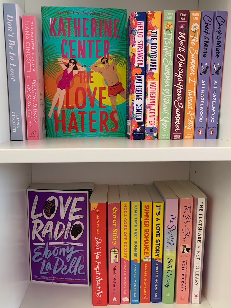
There are similar colors, similar fonts, similar gradients of those color palettes, in use on the books and the cans. In code, then, they are telling similar stories to get you to stop and see them. As I pointed out in my blog post, being seen is the ultimate marketing goal. We are bombarded by visual cues constantly. For our own sanity, we filter out most of this, and we learn what’s important, and focus in on those signals, the brain simply weeding out the ‘irrelevant’ messaging to the point where we stop seeing it entirely.
This, then, is why the book designer and the energy drink designer find a cohesion in their choices of colors and fonts. They are sending ‘look at me!’ signals to a certain audience that cues in on pastel gradients, rounded or cursive fonts, and that audience, trained to be attracted to those things, stops and starts to focus on that thing in front of them.
Look at the photos, and you’ll see color blocks that are similar: these are being marketed to women of a certain demographic. Women who are health-conscious, seeking out romances which will appeal to the happy warm escapism seeker. It’s specific, and it’s effective. There are drinks on the shelf that don’t fit the same design aesthetic, and it’s interesting to focus on those, seeing what’s different there. Drinks for men? Lean into words like bang, jolt, fuel, C4 (explosive) and use a different color palette. Books for men are going to use similar concepts if they are going to be effective in reaching their audience.
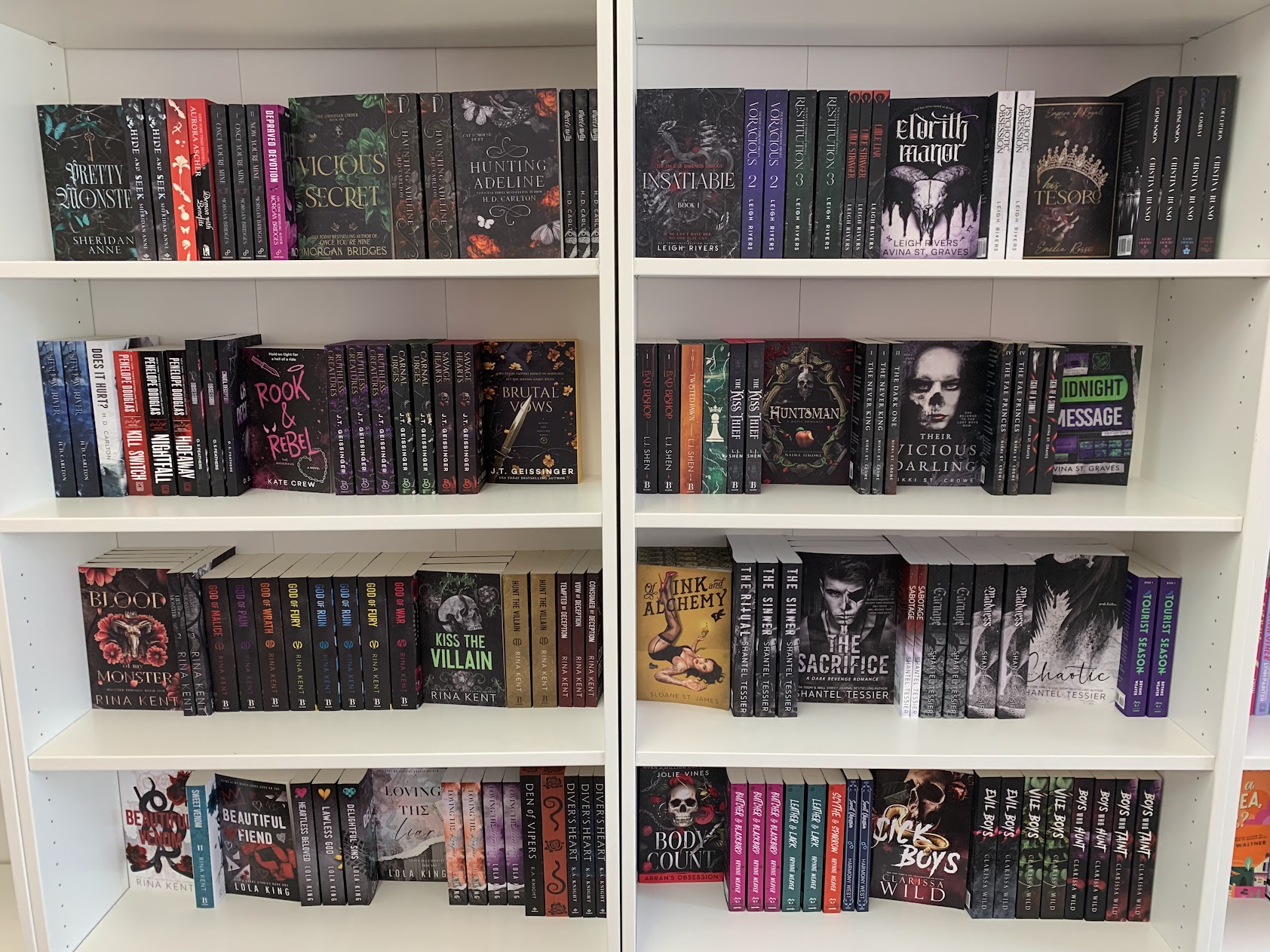
Not all women want soft warm colors and curvy lettering. Some prefer the darkness, with spiky letters and books that promise tantalizing thrills and danger to get their blood pumping while they read from their safe comfortable home. For those, there is a whole shelf of books decked out in the goth aesthetic, and energy drinks with names like liquid death and corpse reviver and bottles that look like something from an apothecary.
I found if I unfocused my eyes a little, and looked at the displays, the similarities became very clear. As a designer who has been doing this for a while, it was fascinating to see the parallels line up. I’ll never create the design for a drink can. I can use some of the loose concepts on a book cover, and likely will. What do you see, when you look at the marketing around you?
Paying attention to what stories are selling—not the words between the covers, but the marketing that hits the consumer between the eyes, shouting “look at me!”—will make us sharper writers and smarter collaborators with our designers. Next time you’re in a store, stop and really look. Unfocus your eyes on a shelf of energy drinks, then walk into the fiction section and do the same. Notice which covers and cans grab you first, and ask yourself why. Try going someplace you’ve not been before, and look at how the stories of the colors and fonts changes. A natural foods store looks very different than a wholescale club like Sams or Costco… most of the time. The designs that appeal to one consumer bewilder another market segment.
What colors, fonts, and visual cues are speaking directly to your tribe? What promises are they making before a single word is read? The answers will help you brief a cover designer more effectively, choose comp titles with intention, and write blurbs that harmonize with the visual promise instead of fighting it. In a crowded market, the books (and drinks) that get seen are the ones that speak the right visual language fluently. The grocery aisle is teaching a master class in visual storytelling. The only question is whether we’re paying attention.
 Mad Genius Club
5 responses to “The Grocery Aisle Master Class in Book Cover Design”
In the US alone, energy drinks are a 24 billion dollar industry. That shelf you see is a battlefield – one that each competitor has to pay to access. (Yes, unlike books where Amazon lets us load everything for free, beverage companies have to pay for shelf space… and there are very fierce wars going on in the contracts to lock the competition out of even getting on the shelf for the consumer to see in the first place. The Cola wars are still ongoing, even if the battle isn’t being played out on the television screen anymore.)
This is why you see “the pepsico company section” and “the coca-cola company section” in every gas store and grocery aisle… they are paying not just for the shelf inches to be accessible, but also filling it with their smaller brands to prevent another company from even being seen.
This also means that their branding is sharply honed, because with billions of dollars at stake and only one base design (with flavour variations) to capture attention and market share, with all their competitors right there visually and physically available, they literally can’t afford a flop.
Publishing, by comparison, is a fairly sleepy backwater, and thank goodness for that!
One last thing to note… most of the drinks are in the 2.99 – 3.99 range, with a couple in specific markets going up to 6.49. Sound familiar? Yes, the 2.99-5.99 range isn’t about the ebooks, it’s about the impulse purchase price of humans.
Which is annoying to my cheap self because it’s harder and harder to find the off brand that doesn’t cost an arm and a leg.
I hadn’t noticed the very apt comparison to energy drinks, but I did do the “how does it look on the shelf?” test. It failed.
I absolutely despise looking for fonts. I’m thinking of paying the $300 commercial license fee just to get it over with. But $300 for four words?
That’s not necessary. I use a creative Fabrica subscription for commercial fonts, the licensing allows for ebook and POD use. It runs about $60 a year on sale. You can also filter for “free” on DaFont, and find free fonts.
[…] time we looked at the visual language that energy drinks and book covers share. This time I wanted to talk about blurbs and promises they make, based on the blurbs from two of […]