For some time now, I’ve been doing a retrospective of the one Portuguese science fiction imprint when I was growing up, Colleccao Argonauta.
It’s impossible to overestimate the influence this imprint had on me, not just from the point of view of my eventual career, but because I’m not absolutely sure I’d be the same person if I’d never read some of this stuff.
However my dive back in time is not just an old woman’s nostalgia, but an effort to remember the passion back there at the beginning. And perhaps to find something that I missed the first time around.
You see, the Portuguese were printing to the net before it was cool. I mean, to an extent it made sense, because Portugal is a small market and science fiction was very niche. On the other hand, as more or less always the caution of print slightly less than you expect to sell” only works one way: at worst, it drives printruns steadily down. At best it doesn’t allow them to grow. Which I think might be what happened in Portugal, where I swear bookstores have gotten even weirder than here.
Anyway, the end result of this is that by the time I found the imprint, there weren’t many “leftovers” floating around and for popular authors — Heinlein, Asimov, Simak — there were lines outside the door on the days they came out to make sure that you grabbed one. This was my first contact with fandom, the really dedicated fandom, and in my experience they were mostly middle aged men. I was the weirdo female, and way too young waiting in line for the books.
The last time I did that I was for the release of Heinlein’s Number of the Beast (which I think was released in 3 volumes, so I can’t tell you which of them it was I do however remember this:) and I got caught by it and read it standing, leaning against a column on the train station on the way home, which is why my mom thought I had died as I let several trains go by without even seeing them…. until the book was done.
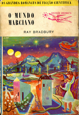
Anyway, as I’m doing this re-read I was struck by the covers. The covers I remember most are the later ones, because when I found the earlier ones the covers were faded and damaged. Also, to be fair, back then I had no clue what covers were supposed to signal or what they meant or any of it. I was the proverbial author who didn’t look at covers. I cared about the imprint and secondarily the author’s name. I mean there was only one imprint, and I was tight enough on money that I could only buy those books with great effort. It was my crack so I put everything into buying it. The cover didn’t matter.
But now I’m looking at these covers, from the early ones:


Which are weird, but actually interesting to look at.
It wasn’t till I was talking about it with a friend that I looked up some of the cover artist names and found out they were actually respected artists, whose paintings still sell amazingly well.
This was interesting, because back engineering who the publishers thought they were selling to was APPARENTLY sophisticated consumers of culture, who would appreciate this surreal, interesting paintings and elevate the whole experience. Or buy these as a mark of their specialness or soemthing….
Anyway, I very much like the early covers.
Then things went weird. Look, it was the sixties, and despite the fact this artist still has a name, the covers got– well, like they looked at the readers and decided the engineers were going to keep buying for the contents.
I mean, seriously? At least keep the drawn font so it stays on the cover:

But then they just started phoning it in:

seriously? what is that even?
Eventually it settled into the covers I remember:


Objectively these are terrible covers, but people kept buying because it was the only stuff available to them.
Now the books inside those covers are pretty amazing. And obviously at some point they just went from “These are high class weirdos” to “these are just weirdos and they’ll buy anything.”
Is there a lesson in this? Not really, I just wanted to show you a bunch of pretty stuff and then when they knew this strange science fiction stuff would sell and keep selling and how much easier it was to sell to a captive audience and the covers became awful in consequence.
You’re not selling to a captive audience. Don’t get sloppy. And don’t try to do the “this cover signals we’re high class weirdos” because your cover is not supposed signal your readers are art conaisseurs.
Instead, it’s supposed to signal the contents. And while some of those covers actually do, don’t try to imitate the style.
Years ago, on my blog, when we were all making covers from stock art and nail pairings and some (most) of them were objectively awful but also the best we could do, someone tried to convince us the covers here in the sixties and seventies — which seemed to be mostly geometric shapes on a colorful background — and got all salty when we told him it wouldn’t work.
But the thing is it wouldn’t work. No matter how much you love the styles of time gone by, what sells books, now, is books that look like they’re published now.
If you have an old-time looking cover, the best that can happen is that people will think “It came from Gutenberg” and then they’ll try to pay you 99c per novel and think they’re overpaying.
And the worst that can happen? Well, that’s that the cover will just look weird.
Look, I might stop my browsing for the earlier covers because subconsciously they’d remind me of the great stuff of my youth. Heck, I might even buy the weird silver ones for the same reason, because I bought (and hankered after) so many of those. But to any current readers in the US? They’re just going to look at it and flip past. And you won’t even get a sale.
So don’t do like either of those covers. Covers are not a thing that has a “right” answer. It only has a correct answer for a book, a time and a place.
So always know what the right cover is for right now.
The way to do that is look at bestselling covers right now. Not the ones from 70 years ago.
It’s not aesthetics (though aesthetics come into it, of course, a pleasing cover is always better. See above.) It’s marketing. You need to know what your market is, and your covers need to work for them.
Right now.


13 responses to “All Them Weirdos Together”
Back when the bad cover art site “Good Show Sir!” was still going strong, the owner would have stuff from the 1960s (odd) 1970s (Europe – wow, someone got into the good stuff!) (US – awkward but sort of recognizable) and 1980s (dated but genre was clear). Along with modern “interesting” covers, some with anatomical oopsies, a few that were just “duuuuuude, bad trip dude.”
Somewhere in the 1980s, I bought a Fred Saberhagen Berserker novel. A few months later, I saw the same cover art on a different book. I don’t have either example, so don’t know the circumstances of the reuse, but the stylized face for the illustration did a miserable job at implying content. OTOH, the artist was probably paid sufficiently well to afford more interesting pharmaceuticals.
Yeah some of those ’70s covers are wild in good ways and bad. And as absurd as some of them are, they’re still preferable to the graphic design dullness Big Publishing is smothering the bookshelves with.
Oh, yes – about a year ago, someone posted a series of the covers of all the latest releases from the Literary Industrial Complex … and none of them were the least bit enticing. Heavy on the primary colors and uninspired fonts. About the best you could say for them was they were legible in thumbnail size … but that was about it. There was nothing that would even begin to tempt someone to pick any of them up and read the blurb on the back cover…
And for grins and giggles, nothing quite equals the new titles that Longmire gave to a wide selection of risible romance novel covers…
https://worldoflongmire.com/features/romance_novels/
That’s been a favorite website for a very long time. I’m impressed that it’s still around.
Since when did A.E. van Vogt write a Star Trek novel?
He didn’t. Star Trek broadly “stole” ideas from him.
Ah. I was wondering about that last cover, which clearly has a ‘Star Trek’ style starship on it. Maybe the artist made that same connection?
Forget it Jack, It’s Portugal. Their respect for copyright is about China level.
Some of those weird covers are actually pretty cool. But they do date the publication. Personally, for fantasy at least, Whelan and Vallejo are my favorites. And John Harris did all those great SF covers in the 80s/90s.
I too love Whelan and Vallejo. who doesn’t?
A story I heard years ago had an artist who got tired of people complaining his art on covers didn’t have anything to do with the book. When he found he was to do a cover, he reached out to the author to create a scene from the story, working to get every detail right. When he turned the work in, the publisher said that it was too good for that story and used it for another book.