
I may have covered (you should excuse the pun) this topic before, but when I looked to give a link to a friend, I couldn’t find it. Also, it is good to revisit tutorials every couple of years as things do change. While this is targeted towards creating the pdf file you will need for an Amazon kdp paperback format, I know from the experience that the file so created will also work for an Ingram Spark paperback just as well.
I am, always, working with Affinity Photo for this tutorial. I think you will find that it is very possible with GIMP, as well. If you are still using Photoshop, I urge you to consider either of the above as a much better alternative to an Adobe subscription product which will potentially rob you of the rights to your own work. The Affinity Suite is very useful to any independent author in their business, and can be purchased once for a very reasonable price, and used for as long as desired with no further compensation or concern about potential IP violations.
The first step is to get the information that you will need to generate the template for your book:
Page Count – this must be the final formatted count, to the size the book will be with correct margins and gutters. I highly recommend Vellum for book layout that will give you a professional product which will not have issues going to print. You can rent time on ‘virtual’ computers with Vellum, if you don’t want to buy the software or a Mac computer upfront, as that is a significant investment. If you mean to make a living with a writing business, then you will want to consider this a necessary purchase in the long run.
Paper Type – this does make a small difference in the size of the book. Cream paper is slightly thicker than white. If you are publishing a novel, I do recommend cream paper as it will look and feel best for a fiction reader.
Interior Trim Size – A traditional trade paperback is 6×9″ but there are many options you can choose from. If you want to make a smaller book – and if your book is a shorter volume, like a novella, this will look better – the closest you will get to the mass market paperback size is the 5×8″ from Amazon. I do not recommend a custom trim size if you plan for your book to be available in expanded distribution outside Amazon, as this is not allowed with a custom size.
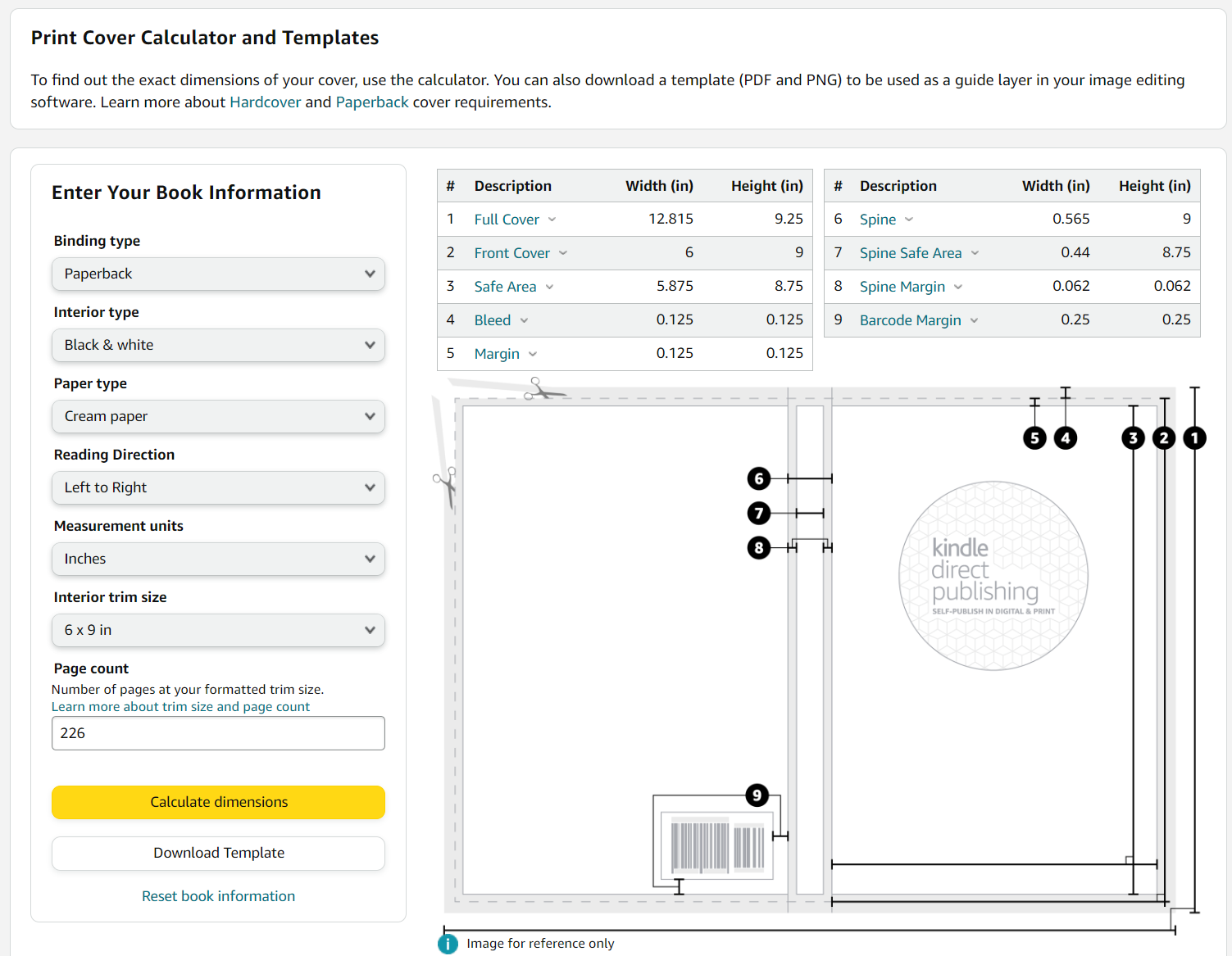
As you can see above, once you have all the pertinent information, you can easily generate a template. You also will have the measurements, should you prefer to work with those. I like the template, and I’ll show you why next.
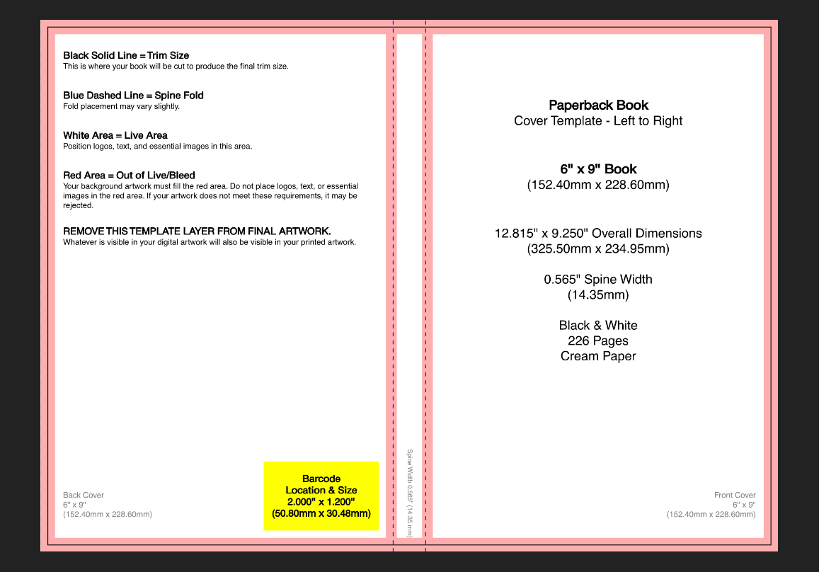
Begin by opening the template in your graphic design program. Note the pink ‘out of live’ areas, and be very wary of them. I’m working with the png file provided in the template download.
Once I have my base file started, I place the ebook cover on the workspace. I work with my layers file, because I will toggle off and invisible the artwork on this file, leaving only the text in place, so I can put art on the cover which is seamless. There are ways to work around not having art which will work for a seamless wrap, but for this tutorial I’m using a single art layer under the ebook layers. Don’t forget to go ahead and ‘save as’ a filetype that supports layers, with the name you choose, at this point so you can easily save as you work without saving into the png file the template starts out at.
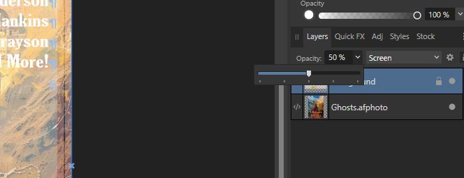
I have lowered the transparency of the template so I can easily see through it for layout of text, but can still readily see my cut lines and out of bounds areas. In Affinity Photo, if you doubleclick the embedded file you placed (Ghosts.afphoto in the layer list above) it will open in a new tab and allow changes to be made non-destructively to the original file.
Here is my workspace at this point:
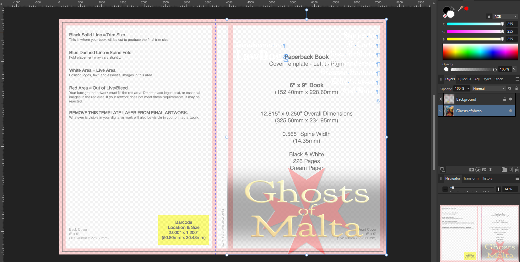
The text, being white, is effectively invisible right now. That’s fine, I’ll tweak it shortly.
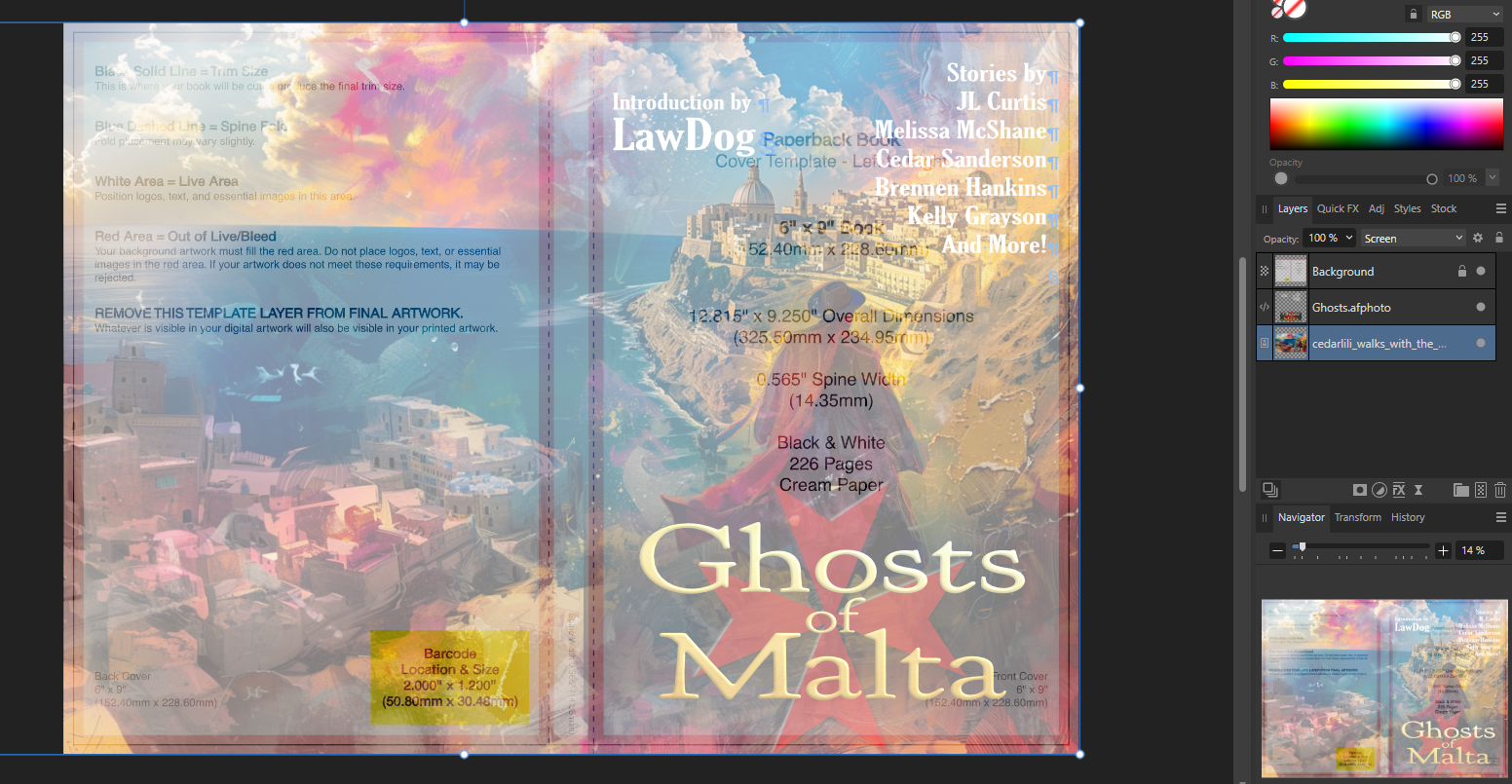
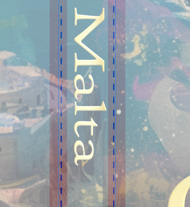
Now, I’ll take a look at the text elements to make sure that they are well away from the red (pink when transparent like this) zones. If not, I’ll open my ebook layers file and move them there, independently, until they are satisfactory. Next, create the lettering for the spine. If you hover over the top deely-boop, you’ll note that it will allow you to click on it with the cursor tool and rotate the whole text box. If you also hold down the shift key, then it will rotate in precise increments, allowing you to rotate a perfect 90% for placement on the spine in correct orientation.
Zoom in as you work on this, to ensure your lettering is not falling out of bounds. Don’t even allow it to touch the red.
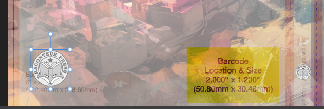
If you have a logo, I like to place this on the lower area of the spine, making sure it falls between the red zones, and duplicating it, place the second version, somewhat larger, in the lower left of the back cover area.
At this point, you are ready for your back cover material. What this is, is entirely up to you, but you may want to think about what it can do for your book. If you are selling copies in-person, this is where a potential reader is going to pick the book up, flip it over, and try to ascertain what’s in that gorgeous cover you worked so hard on. Here is where you want to further hook your reader. While an author bio may be desirable, keep it very short (likely no more than 100 words, mentioning other books more than any personal and irrelevant stuff) and keep it low.
For an anthology, we’ve learned that a compelling portion of the introduction can be the best lead-in, rather than trying to summarize all of the stories in such limited space.
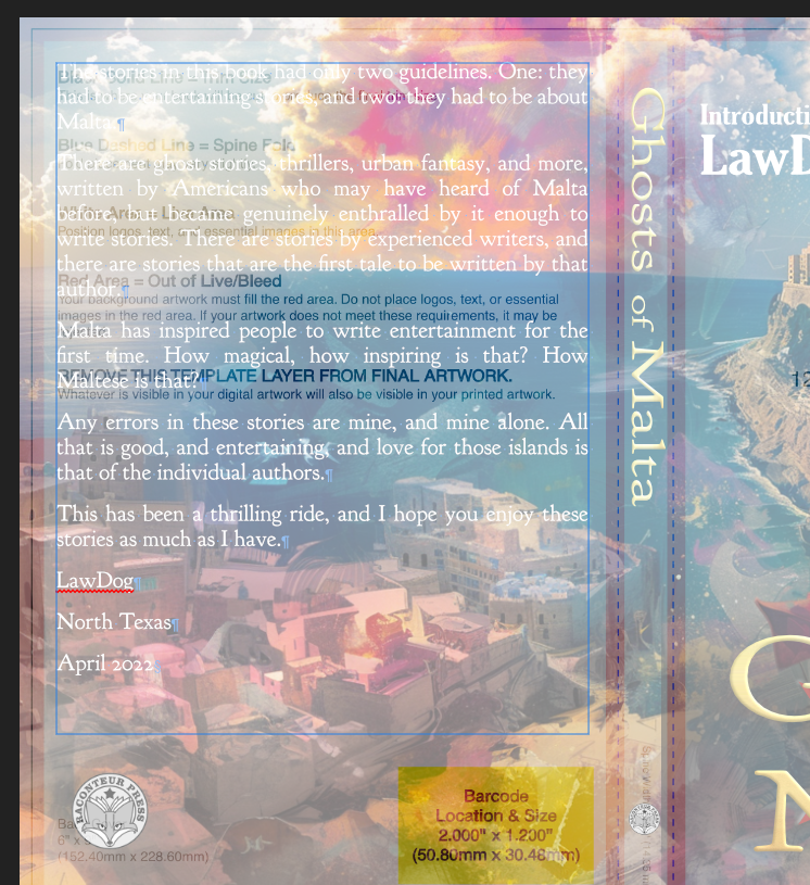
Generally speaking I opt to use a font here which is the plainer of the ones on the cover, or complementary to them. It should be readable, and I prefer to fully justify the paragraphs on the back cover for clean edges. You’ll note it’s hard to read – the transparent template isn’t helpful for that! – so I will make sure it’s legible by toggling off the template and choosing a better font color if necessary, or using a fill box below the text to allow it to be best readable on the art.
Having toggled off the template, I can see that the upper corner of the art with this white text on it isn’t easy to read. I’ll place a transparent, blurred, rectangle below it to increase the contrast.
Now, with the rectangle at 43% transparent and a gaussian blur of 100px, the art is still visible but the text is readable.
My final look at this is to consider the printing process. The sublimation of dyes to the paper often leaves the artwork darker than the appearance on a lit monitor. For this reason, I usually adjust the artwork lighter before sending it to print. Generally speaking, no more than 10-15% brighter is necessary unless your cover is very dark, and in that case you may need to reconsider your art choices as a very dark cover isn’t best at thumbnail.
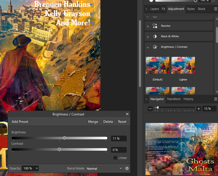
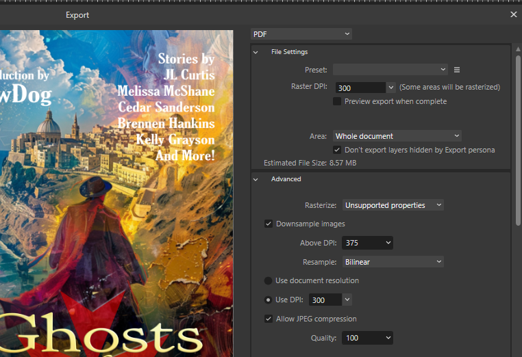
Finally, export the whole thing to a pdf file. You’ll want to be sure that it is flattened, with embedded fonts, so there’s no issue at the printer. To check this in Affinity Photo, open Advanced as in the screenshot below, and scroll down to be sure that ‘Include layers’ is not checked, and Embed Fonts is set to All Fonts.
Your final product will be a single seamless file, print-ready for a perfectbound paperback. The same thing can be done for a hardcover with a template from Amazon, which will only work for Amazon, as Ingram Spark’s version is quite different (and better in my opinion). Just follow the template! It makes it so much easier and faster.
Any questions?


19 responses to “Paperback Cover Layout”
Cover formatting is like a lot of things – it seems very complex the first time or two, then becomes more familiar and logical. (Until someone updates the software, or decides to change the required file type or size…)
There are always changes… Sigh. I’m doomed to update tutorials every so often, to keep up with all of it!
I looked up affinity photo. It looks like they also have a publisher/page layout program. Does anyone have any knowledge about this?
Yes, I have used it for several books – it is not best suited for a novel. However, it is fantastic for an illustrated book.
Oh, and should mention, it is the equivalent to InDesign, but easier to use.
Once long ago, I used InDesign for work every day. I still have an old computer with it. Can’t decide if I want to use that for layout or buy Atticus.
if I had a Mac I’d get Vellum.
I would not use either InDesign or Affinity Publisher to lay out a novel. You can actually do it well with Word, John van Stry did a recent tutorial on how to layout in that software. Atticus will be a decent alternative if you are willing to buy software for the purpose. Vellum is the best and easiest to use, but yes, you either need a Mac, or to ‘rent’ time on a virtual Mac.
thanks!
I just got an email from Affinity offering their suite for 50% off. I don’t know how long this will last, and am really struggling with whether to jump. Last time I looked at Affinity, the whole thing terrified me, seeming way too complex. But there are things I’d like to do that I know I don’t have software for…
I believe Affinity has their own learning resources, and I think it’s popular enough that you can find plenty of tutorial resources on the web, text and video. I think it’s worth paying the extra compared to GIMP.
For basic photo editing, there are also tools like Paint.NET – I still use it for cropping and such.
There are a lot of tutorials, in video and written format. There is an active and useful forum where you can ask questions. And you don’t have to use it all right away. I’m still learning, and I’ve been working with it for about five years now.
I love the hint at the new covers for the Malta series! I really need to polish my Malta story that didn’t get in, just in case there’s ever an opportunity to re-submit to something.
So… when I made the new covers I made up a cover which hasn’t got a book. Yet. Still have to talk the rest of the staff into it 😀
Leftovers of Malta? 🤪🤣
Seriously, thank you for posting this. I still want to do dead tree versions of my books but my near-total lack of artistic talent keeps getting in the way.
it won’t be leftovers – we don’t hold onto stories any longer 😀
When this one opens (likely next year sometime) we’ll be looking for fresh new story submissions.
So does Contract Day also mean Rejection Day?
Yes, and we are working very hard at notifying everyone within a week of the Contract Day. If you don’t hear, feel free to reach out!
Folks, I don’t know how many of you have seen this, but Adobe has lost their minds.
https://www.battleswarmblog.com/?p=58445
“Adobe has just changed the terms for subscription applications like Photoshop. Nothing big, just a demand of unlimited use of everything you ever create, forever. Oh, and you’re locked out of your existing work until you agree.”
They can pound sand. I never went to their cloud-based software because of the possibility of this kind of nonsense. CS6 is what I have, and that’s where I’ll stay.