
You know what the problem is with ebooks? They’re spineless, that’s what. Nothing to look at on the shelf, they just disappear when they aren’t wanted into the Kindle or what-have-you until they are summoned again. But some people like a spine, and others judge books by the size of their spine. For them we want to create a paper book, and it’s a different creature to create a print cover than to set up an ebook cover. For one thing, you need a much higher resolution image than you can get away with for an ebook. Minimum of 300 dpi for print. I know I’ve talked about spending a little more and buying a higher-quality image for this reason, and this is why. Createspace, which is the place I work with to get print copies of my book, will not approve an image that is less than 300 dpi (dots per inch, it’s a resolution thing. Lower dpi means a fuzzy, pixelated image. You don’t want that) for print.
The first stage to setting up a print cover is to get the template from Createspace. You will use this to lay out the cover so it fits the necessary guidelines. The size of your spine is dictated by the number of pages, and your paper choices, and other factors, so I can’t say what it will be. There is a formula for figuring it out, but it is so much easier to plug the information in and download the custom template.
Once you have the template, you can begin laying out elements on it. I will often work with the background layer set to a transparency that allows me to see the guidelines for the spine, bleed, and barcode. You want to be very aware of these. Live elements, which include any text, cannot go closer to a bleed guideline than 0.25 inches, or it will not pass review and will come back to be fixed.
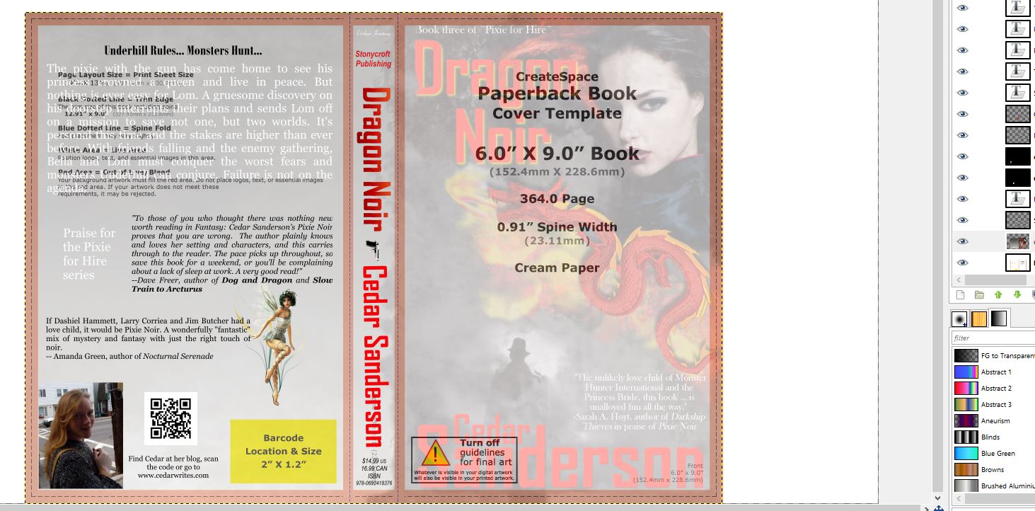
In the screengrab of the Dragon noir cover, you will see pink lines, those are part of the template, and you cannot have text over them. As you can see, with the art background transparent, it’s easy to avoid them.
Now let’s talk about what you will find on a spine.
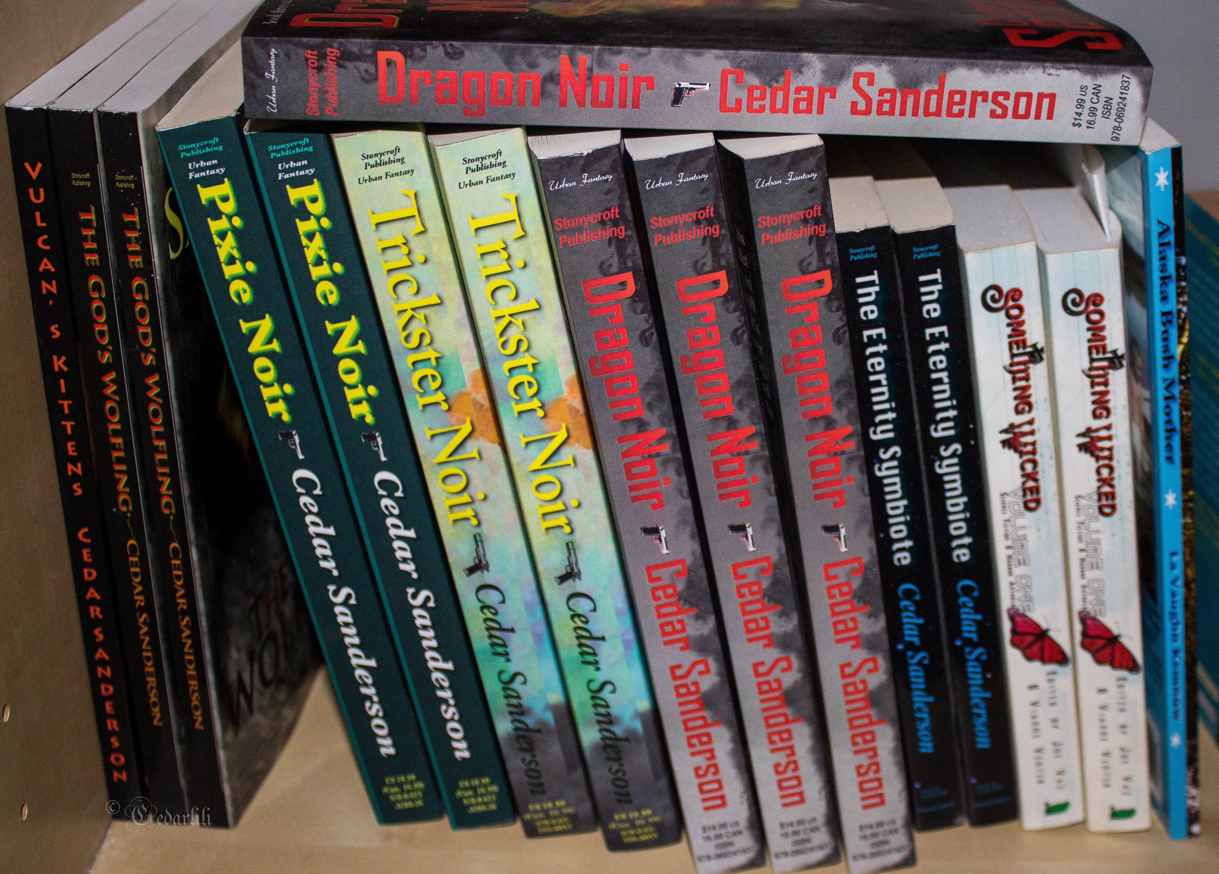
I used Baen trade paperbacks as a model for my later spines, when I had learned some things. And then I had books thick enough to put all the stuff on them. Vulcan’s Kittens and God’s Wolfling (which is on sale right now for a mere $0.99 shameless plug here) look thinner than they could for two reasons. I used bright white paper – cream is thicker, and easier to read on. I learned that much later, though. Also, had I gone with the 5×8 size you see on the Eternity Symbiote, they would have been as thick as it is. Ah, well, you can learn from my mistakes.
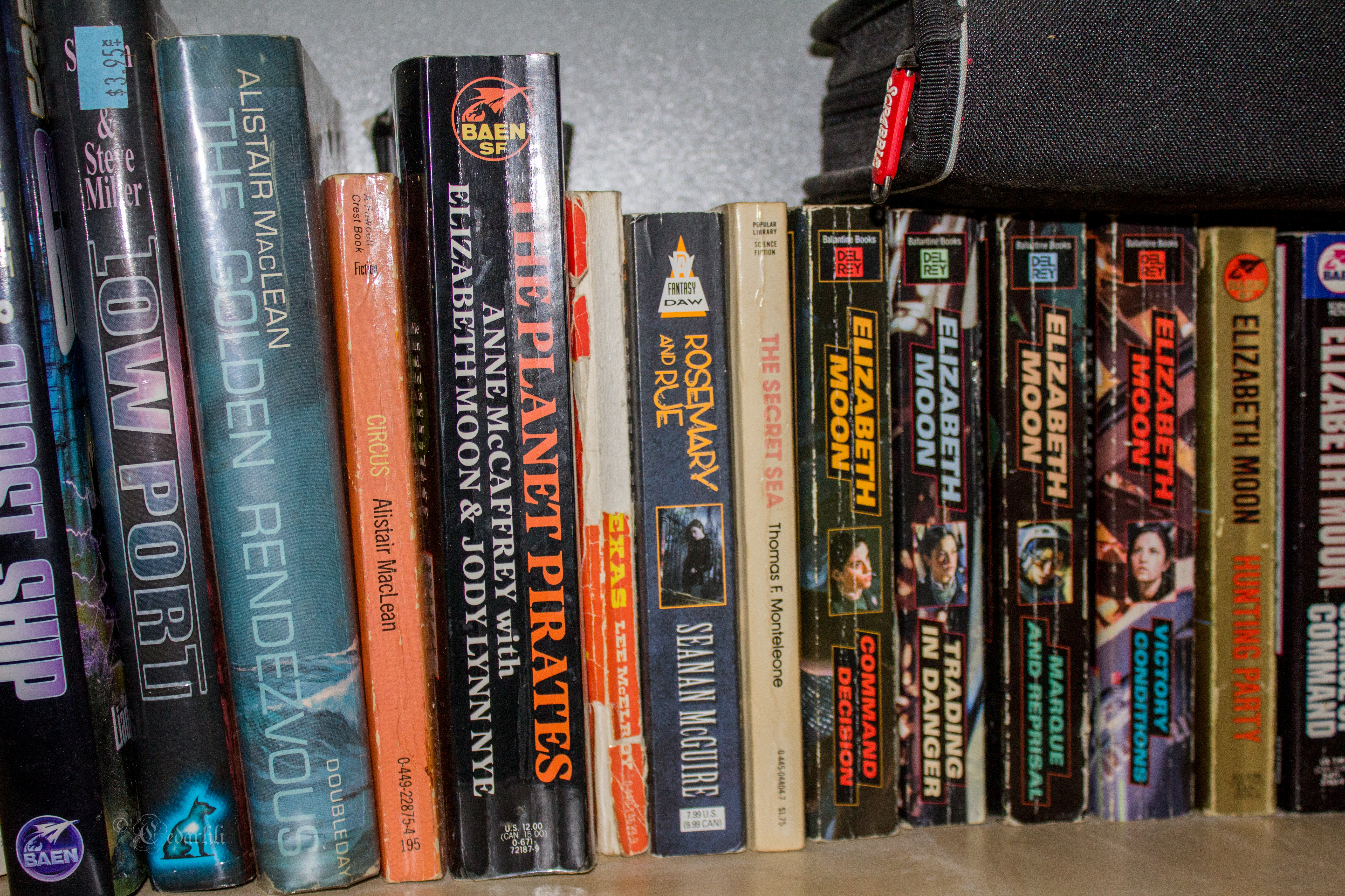
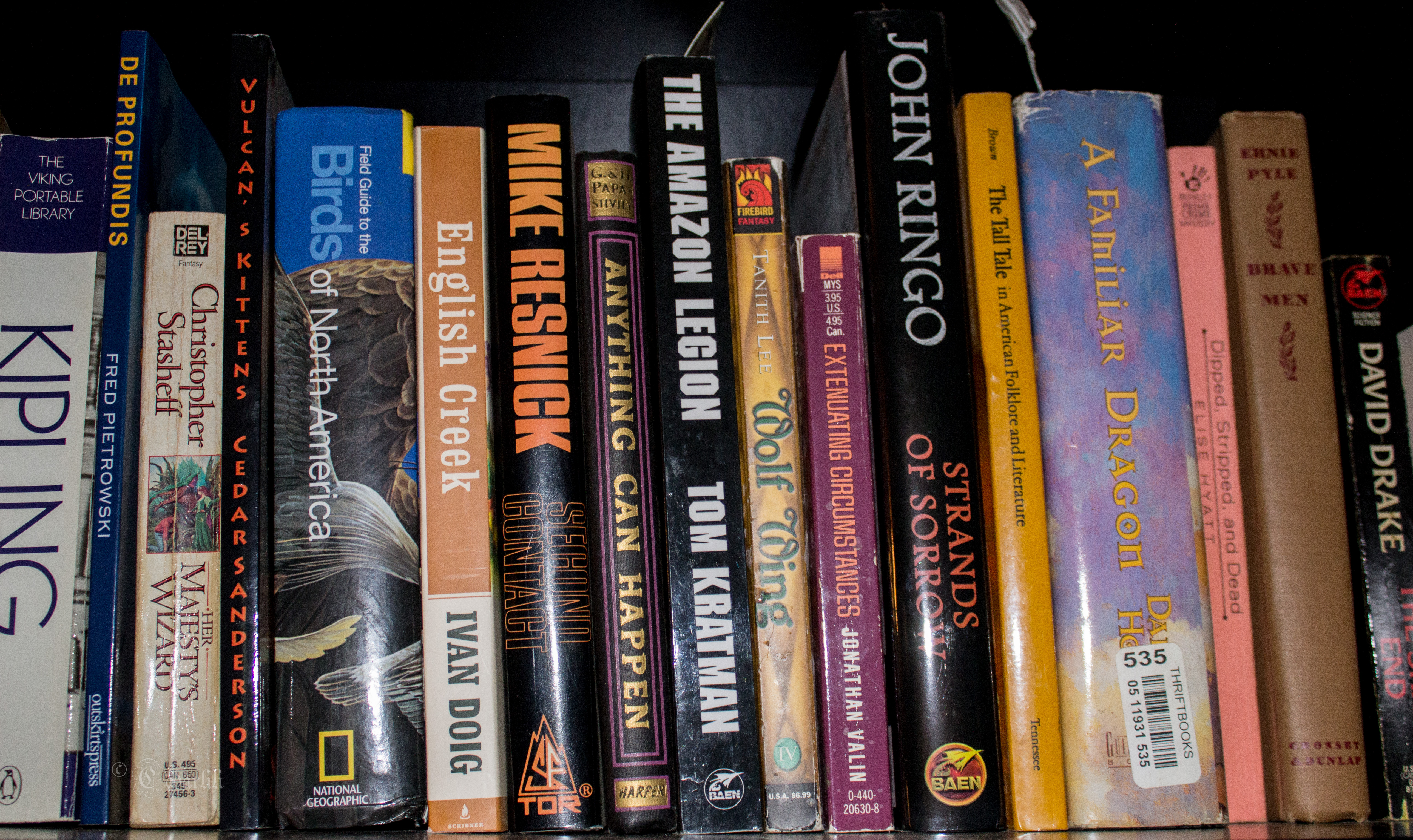
Book spines can carry a lot of information. After all, they are usually the first thing a shopper sees. I have been known to scan a shelf looking for the distinctive Baen Rocket logo. You can see it in a couple of places in the picture below.
On the other hand, you don’t want to try and put too much on there, and make fonts so tiny they can’t be read, or give it a cluttered look.
If you don’t have a clever logo for your publishing imprint, no worries. You can get away without it, although it’s a good thing to think about, as you can use it to tie many promotional materials together. But for now, you will want to have your name, and the title. Make sure they pop off the background art you are using. I don’t usually do the tricks I do on the cover to make the typography look raised, but I do drop shadows and gradient colors to create some life to the flat text.
I also put the name of my publishing company – Stonycroft Publishing – on the spine, at horizontal layout as you see on traditionally published formats. I started putting the price and ISBN on there, too. The idea is to make your book look like the other books so if and when a bookstore or library stocks it, then it doesn’t stand out in a bad way. Eye-catching is one thing, looking like something is missing is another, and not good. Now, I also put the broad genre of my books on the spine, but that’s just me.
Next week we’ll talk more about what goes on the back cover, and I will answer any questions in comments, or save the big ones for next week’s post.
Don’t forget to pick up a copy of The God’s Wolfling while it’s on sale. It’s less than a dollar today, and then tomorrow it goes up to $2.99 before returning to a pre-sale price on Monday. If you already have a copy, pass the word on to other people that they can get a good book for a bargain price (unless you didn’t like it…)


50 responses to “Get a Spine”
[…] Spine […]
Thanks, Cedar! This really helps.
You’re welcome. I will put up the other half next week, let me know if you have specific questions about covers.
Great information. I’m still spineless. Also, the Noir spines are truly excellent.
And, I have that Kipling, too!
Well, hopefully between this post and next week I can shed some light on the cover for a print book. I know we’ve written articles for the interior. It’s a tedious process, but so nice to have an ‘I love me’ shelf like the one in my picture. I don’t sell a lot in paper, but they do sell, and they are great for giveaways and out-of-hand sales.
That would be great. Did one yesterday and even knowing about eye-flow, it was a case of a blind hog finding an acorn. It also looked great in gray scale, so the blind hog found two acorns.
Oh, and that Kipling sulks, because it’s not allowed in the special glass-fronted case with the *old* Kipling books. But it’s the one that gets read.
Thanks, Cedar. I’m going to do a PoD for the WWI book, and this gives me some stuff to keep an eye on. (and you sucked me into taking _God’s Wolfling_ off the wish list and onto my “bought” list.)
Well, good! That’s why I run sales.
Let me know if you have any specific questions on the covers, it helps me know what I need to write on.
Cedar, this is helpful, with more complete and helpful information than I have seen anywhere else. One thing I don’t know how to do, though, is to set the background layer to transparency.
It depends on the program you are using to lay out the design with. In Gimp, you can edit the layer attributes to add alpha channel. If you just want to adjust the opacity, you can find that in the top right corner of the program, above the layers, and either click and slide it, or type over the numbers (where it says 100%)
I agree with everything here except putting the ISBN on the spine, especially at the bottom where your imprint logo should go. Readers scan spines for titles, authors, and imprints. In the decades I’ve been a consumer of print books, I don’t remember ever scanning for an ISBN. Unless there’s some reason related to retail bookselling that I’m unaware of, I think the ISBN can live on the back cover with the barcode.
Having an imprint logo is very important, by the way, and I suggest spending some time and money getting a good one. As you say, it definitely makes you look like one of the “big guys.”
The ISBN is not something that consumers scan for. But it is on the spine along with pricing if you are looking at a traditionally published book, and not an advance reader copy (which are not intended to be sold in stores). It is there for booksellers.
Yes, a logo is important, and they can be created fairly easily and cheaply. As a matter of fact, I will be putting up a tutorial on that in a couple of weeks, since I have one to do for a fanzine I help out with.
Cedar, I find the ISBN on the back cover, not the spine. Unless there is a technical term difference for that part of the back cover vs. the rest of the back cover?
Are you looking at a trade paperback? Yes, you will also find it over the barcode on most covers.
Yes, but they are non-fiction, so that may be the difference. The spines just have the title, author, and the publisher’s name or logo.
I took a quick picture of some of the trade paperbacks on my shelf, close enough to see the details! http://cedarlili.deviantart.com/art/Spines-537866825
Is an ISBN necessary, though? Serious question.
For a print book, it is. But you don’t have to buy an individual one, which is expensive, you can go for the $10 ISBN Createspace supplies.
Thanks, I’m getting ready to self publish my first book in the next couple of weeks and having these detail firmed up is really helpful.
I spent yesterday uploading my last two, to Createspace and to be honest, my spines are pretty plain. I put a lot of effort into the front and back, but never really thought of doing anything special on the spine.
Maybe I should change that.
As a casual graphic designer (school of hard knocks version), I’m going to just throw out there that FONT CHOICE is very important. It must be legible, attractive, not too unusual, and not too standard (that is, NOT Times New Roman.) Serif fonts are generally a better choice (sans serif is for legibility on computer screens) though there can be some stylistic reasons for going to a sans serif.
And also MARGINS. The biggest visual cue I’ve seen in between self-published and big-publilsher works is when the text seems “too close” to the edge. It’s a tricky amount to learn, but remember that your cover is like an old CRT television—expect the edges to be cut off as though it’s a matted picture. Some modern designers have pushed the text right to the edge, but again, it’s tricky, and a professional designer can sometimes get away with something that even a knowledgable amateur can’t.
Notice that in Cedar’s template example, the pink lines create a bit of a margin, and her text doesn’t butt right up against them, creating a bit more margin. It helps.
Yes it does, and there is a certain about of visually pleasing negative space that is necessary. I don’t think about it, any more, I just do it, so thanks for the reminder.
Font choice is… complex. I will usually use two on the front cover (one for title, one for author name) and then echo those to the spine. Rule of thumb is to never use a font on the cover that you would for the interior (no Times New Roman, no Arial, no Courier…). I know we’ve done posts on font choices, so if someone wants to know more, I’ll come up with a link.
Can you give some specific recommendations for a sci fiyee like fonts?
I’d suggest you try out dafont, and specifically their Sci-fi themed fonts. Be aware that not all the fonts on the site are free, or licensed for commercial use, so you will need to check that before you download and use. http://www.dafont.com/theme.php?cat=303
Huh. I’d’ve said the opposite: viz fonts. Sans serif for headers and titles, serf for blocks of text, as it’s more readable: i.e. helvetica, book an, etc.
But I do posters and hand bound books, so e-books may be a different animal. Maybe.
Inside an ebook it doesn’t matter much, as the individual reader can change the font and size to suit them. I have been using Georgia inside my print books recently.
Something to keep in mind about fonts: Licensing. Just having a fancy font might not mean you have the right to embed it. Frankly it’s over my head; just know it’s an issue.
Yes, that was what I was referring to when I cautioned about using fonts from Dafont. You want to check and be sure they are licensed for commercial purposes, not personal only.
Made my post mentioning licensing before reading this one. Sorry.
No worries. I reply through wordpress or email and don’t see all the comments at times, myself.
I think the margin issue is pushed first by not knowing how things work, as in seeing only the finished product on the shelves, and also by the rise of ebooks where it’s not as big an issue.
On fonts, in addition to finding fonts can set the mood, I cheat by examining published books. For the cover I did yesterday (non-fiction), I kept it simple: One font, sans serif, on the cover, using all-caps for the title and my name, and standard case for the sub-title and blurb. Most covers seem simple font-wise these days. Oh, and I went sans serif for an instructional book look, so that choice was a style issue.
I think sans-serif is best for math, engineering, and mil-sf. But if you’re doing fantasy, sans-serif would send the wrong message…
What software do you use for putting the graphics all together for this? I need to create my logo too, I know what I want, but mostly I’m finding photos that I’m going to have to edit to create a silouette image for my logo.
I use Gimp, mostly. You can, of course, use photoshop, but I am more comfortable with Gimp and can do it faster (always good in my life) with that program. And for logo graphics, you will want to make sure you are using a vector file that can be scaled almost endlessly. I’ll cover that in a post soon. I’m not sure that a photo can be used for an effective, clean logo. Art for a cover, sure.
Having come from the CorelDraw school from waaaay back, at work I like to do photo work in a program like Corel Photo-Paint or Gimp, and import it as a layer in a vector program like CorelDraw. Alas, CorelDraw suite is sort of a niche thing these days, with Adobe dominating the market, and both are pricy. I’ve used Inkscape some. Like CorelDraw, it’s a vector program. Since it has problems importing CorelDraw files, I don’t use it much at work (did I mention I have a large hat rack?), and will have to tinker with it to see if I can import images as a layer.
The good thing about Inkscape is that, like Gimp, it’s free, and runs on a variety of platforms.
I will have to look at it. I just gave up on Illustrator, I simply don’t have time to learn it. A friend in the business highly recommended CorelDraw, and with your second, I will look closely at it. Thanks.
My kids do all of their… actually, no, they use a number of different programs. My *oldest* uses Photoshop for artwork. It does pixel based like any other paint program. Illustrator might be worth it for the vector based “can resize without fear” aspects but… it’s nasty.
I need to buy a new Adobe Creative Suite before I loose my student discount. 😉
I don’t know if you can buy, any longer, I think it all went to a subscription account.
[…] Mad Genius club today, Cedar Sanderson is talking about formatting paperback book covers. Most of the post isn’t germane to e-books, but she does begin with this provocative […]
What info do you put in your QR code?
I generate a QR code specific to the promotional piece I am putting it on. The book has a URL link to my blog. The postcards I just had printed for the Pixie Series actually have a direct link to the first book in the series. It’s quick and easy to make the codes (and free!) so I play with them as needed.
Ok, what’s a QR code?
It’s a little square code that can be scanned with a smartphone or tablet to send them directly to a browser link. Very handy to save making people go to the effort of typing your info into a tiny browser bar on a phone. You can find places online to generate them, like this one: http://www.qrstuff.com/
Wow. Thank you. That is definitely useful information.
I can never remember what they’re called so I have to remember by calling them Quantum Rabbit codes. I have no idea why I cannot remember those two letters. 😉
Oh, yes. I whipped up my covers for my epubs, and then wrestled with the format to get my in-print covers.
Think I’ve got it more or less mastered. Since much of the work is the art.
Thanks for all the great information! Downloading software now. 😉
[…] the title matters more than the cover art as it’s the first thing they see. Remember, spines are important too, as we discussed last week. So once you have intrigued them with the title, attracted them with […]