I was sitting and having coffee with my husband this morning, chatting about everything from sweeteners to the potential topic of this post, and he suggested book covers. I’ve covered covers, I pointed out, and it hasn’t been that long ago. No, he said, talk about the three kinds of art you do. Which led to a confused sound from me, because I couldn’t think what three arts he was talking about. You do photos, drawings, and cover art, and they aren’t the same thing at all.
No, they are not. While some book covers can have a photo on them, that’s only ever non-fiction and frankly non-fic can just as easily have art on the cover as a photo in many if not most cases. Art as in drawings doesn’t belong on book covers either, unless it is a coloring book. Book covers is only ‘art’ in the sense that there is art, properly it’s a subset of design. You have to know what elements are needed in the art, to evoke the responses in a potential reader that will get them to pick up and read the blurb or just buy the book based on the cover alone.
This month I’m doing N’inktober, which is my version of the infamous ink drawing challenge for the month of October. I don’t have the time to sit down with actual ink, and tools to apply the ink to paper, and besides which, if I want to publish a sketchbook (and I do) having it already in digital will make my life so much easier. However, the pen-and-ink style isn’t what you’d put on a fiction book. Even if you think it is, it’s not. Humans like color. When I post a drawing, even a detailed one like…
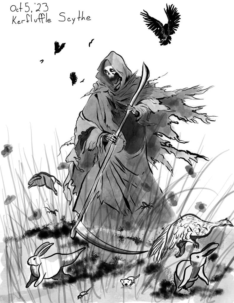
it needs color and full rendering, before it’s suitable for a cover. That’s part of knowing what design elements are necessary for a book cover. You can get away with very simple iconographic covers on a book, and sometimes that is the right thing. However, first do your research and make sure that you understand what’s selling in your particular sub-genre. If you go with a simple piece of art, you’ll likely be compensating with the fonts and layout of text, which is a whole ‘other complexity.
Photos are pretty much a no-go for a book cover. Yes, you can use them, as my husband put it ‘fuzzed up’ by running them through filters to make them look painterly. I have certainly done a lot of that in creating covers over the years, usually with multiple elements rather than a single image, and photocomposition is another skill you’ll need in your toolbox, even if you are using generative ai for the images, since it struggles with multiple characters in a single composition.

My photographs are wholly unsuited for a fiction book, and also most non-fic unless I ever get around to that native pollinators book I’ve been talking about for close to a decade now. Who knows? I might, when I’m a little old retired lady. This coming week I’ll be talking part in a Texas Pollinators BioBlitz, observing as many as I can. Should be fun! But not really helpful for book covers, no. And yes, some of my photography is art, but the above is science.
Which brings me to the third art, which isn’t actually art, I told him. It’s design. Knowing how to put all of the elements together to create a successful book cover doesn’t require a ‘real artist’ it needs someone who knows what those elements are, how to deploy them in a harmonious arrangement, and how to market.
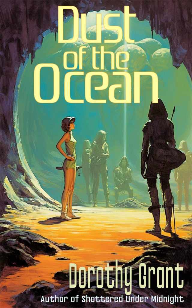
For Dorothy’s latest book, the cover art was difficult. Both of us knew it wasn’t a ‘standard genre’ but the initial art idea, while beautiful, wasn’t quite right for it. Since she’s published it, she has had so many comments on the cover. Thing is, when I work with her, it’s as much her as it is me. I have the skills, but she has an innate sense of design that is impeccable, and I learn every time we collaborate on one of her covers. Signaling retro SciFi was perfect for her work, as it was inspired by Andre Norton and has thematic elements that have fallen out of favor for much modern SciFi. It’s good stuff, and this cover harks back to the Golden Age when it was mostly* Good Stuff. The font was chosen with that in mind, as well, after pulling a bunch of old paperbacks off my own shelves and lining them up on the table to look at.

John’s book, on the other hand, needed a very modern SciFi look, specifically mecha and combat as it is very much a military-centric tale. I played more with the font treatment on his cover, as well, to evoke the gritty action of the book and the character on the cover. He was very happy with the result, and so was I.
Remember above I talked about color? John’s book has a lot of contrast in it, conveying the conflict within in a completely abstract way. The blue is drawn from the art – I often use the color picker to select a color from the artwork to begin while I’m working on font treatments – and it’s contrasting with the orange of the flames. I’ve also brought that orange onto the lettering, as a reflection of the lighting behind it. Lighting is perhaps the most important, misunderstood, and misused part of photocomposition and layout of text on the cover. If you don’t add any lighting or shadows to the text, it floats on top of the art, which might be what you want, but there are times I want to pull the text into the art and intertwine them inextricably. On Dorothy’s cover the title has a subtle glow of the orange sands from the bottom of the image, but not more than a hint. Here, I did want the words to really float above the art.
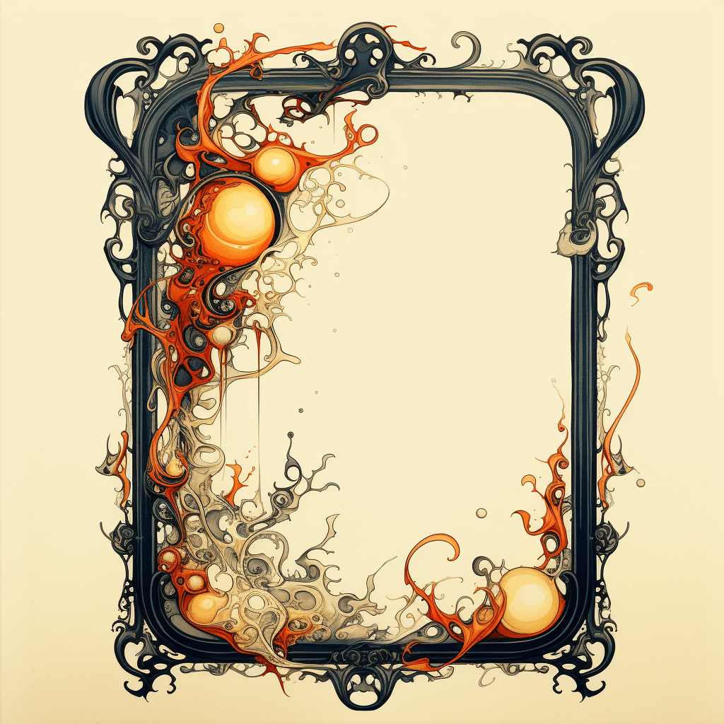
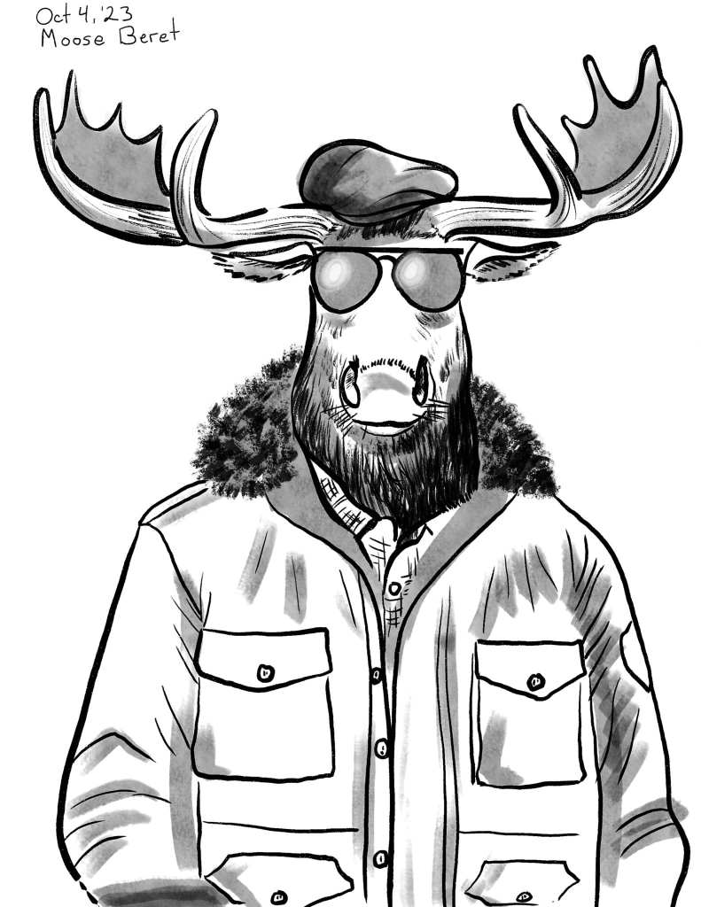
Like so many other things in life, it’s about knowing your own skills, and learning where those skills are thinnest. Do your research, and take some time to fully understand what the object of this art, this design, truly is. You can create something that looks good, but doesn’t fulfill it’s function. Or you can create art that is whimsically prompted by a list of prompts, and decide that you’ll take it later, push it further, and perhaps be able to use that for something. Art is evocative and you can’t always predict what direction the beholder is going to take it in. Sam Robb has been taking my daily N’inktober drawings and writing snippets of story for each of them, and it’s a wild and wonderful collaboration.
*Sturgeon’s Law applies to everything.



9 responses to “What Goes On… a Cover”
I saw that grim reaper drawing come up on Twitter. That’s really good work.
And I can’t quite tell if it’s reapering time, or if the Grim Reaper is shooing the local wildlife out of his vegetable garden, which makes it kind of hilarious.
True!
I will note that you can get away with coloring bits and parts of an B&W drawing IF those parts can be chosen as significant. Not here. (The big problem is that the reaper himself dominates, and shouldn’t be colored.)
Sam Robb’s story for that prompt, actually has the Grim Reaper playing with critters in the garden.. You should read it – hilarious!
I did a photo on a cover once. After a lot of filtering — “Jewel of the Tiger”
I’m replying not posting because I seem to have trouble posting to MGC but the ornate frame that you don’t know what to do with…how about the back of the Steam anthology with verbiage inside of it? Jolie LaChance KG7IQC
The frame screams “alchemy” to me.
You could use it to frame a blurb on the back, or use it to tie the scene and wordage together on the front, or user to to capture introductory quotes to chapters throughout the book.
Or back of a card deck with a monogram in the center.
Steampunk fantasy or alchemy? I could see a young lady in proper skirted steampunk attire sitting at a table inside the frame, looking through a hand-lens at something, or taking tea with an “unusual” guest.
It’s been interesting looking at covers for TradPub series that are by known older authors vs. newer ones. The authors who have series that started in the bookstore-only era tend to still be more elaborate than the newer “what’s-the-thumbnail-say” era authors. I do see a fair amount of photography on covers BUT I’ve been looking at environmental history and archaeology recently, and those have a set look.
There was a very brief period where EVERYTHING seemed to shift to cheap stock art realism. Now all the online stores seem to only show the older cover art except on the audio edition. (The local book store is the size of my living room and has a very poor sci-fi/fantasy selection. invariably the Literary flavors or hte classics which are a poor sample set.)